Dublin

Dublin: A Revised Network Plan

Map: National Transport Authority of Ireland

After many months of thinking about the feedback we got on our draft, a new version of the bus network plan for Dublin is out today!  At this site you’ll find:

  • Links to our revised report, and to the report on the consultation process, at the bottom of the cover page.
  • A map of the revised network.  (Detail about frequency is no longer on the website’s map but is in the maps and frequency tables in Chapter 7 of the report.)
  • Local area maps with more detail.  We understand that the National Transport Authority will be sending these maps to every household in Dublin.
  • A helpful tool that shows how any trip you select would be completed in the new network.
  • A little video explaining how a spine works.  (Here’s a written explanation.)
  • A way to provide feedback or ask questions.

You may recall that the last draft received a lively and sometimes hostile response.  That’s the whole point of drafts: as a starting point for conversation.  The new network plan won’t resolve every complaint, but it shows NTA’s best effort (with our advice) to reflect what we heard, and to integrate those comments into a functional and efficient network.

The heart of the network design, the frequent grid of spines and orbitals, is unchanged, but many services have been added or revised.

We are at the end of our engagement with NTA, so we won’t be as engaged in Twitter discussions about the details as we were in the last round.  But we will be watching this project closely.

Why Your Bus Network May Never Improve

Improving a bus network requires changing things.  Maybe you change a bus route number so that the system is easier to figure out.  Maybe this segment of a bus route would be more useful if it connected to other segments differently than it does today.  Maybe these parallel routes are just too close together, so that they are competing for the same riders while not coming often enough.  Maybe there are other problems that are barriers to people being able to get where they’re going, soon.

Figuring out plans to address these problems is my job.  I’ve done it for 25 years, all over the world.  And if you think it should be done in your city, you need to reckon with how hard it is.

To improve anything without massively increasimg the operating cost, you have to change things.  And when you do, people will say this:


And someone will say “save the ___!” about every single bus route in the existing system.

To satisfy these comments, the only solution is to leave the existing system exactly as it is.  That means keeping a network that does what it does mostly because it’s been doing that for decades and some people are used to it.

Changing bus networks is fiendishly hard to do politically, and this is why.  When I prepare government clients for a network redesign, part of my job is shock-therapy: they need to know who will be yelling at them, and what they’ll be saying, and how unpleasant that will be.  Because if they are not ready to sit through some of that, there is no point in beginning.

The other reason that is hard is that advocates of these plans do not speak up.  In Dublin, for example, we put out a network plan that makes public transport useful to vastly more people for vastly more trips.  The average Dubliner can get to 20% more useful places in 30 minutes.  But most of the the people who benefit won’t learn about the plan, or complete the survey.

The problem is that people falsely assume that the plan will happen anyway.  Therefore, people who like the plan don’t speak up because they take it for granted, while people who don’t like it think they need to scream bloody murder.  So the story in the press is mostly of people screaming.

The other problem with the screaming is that makes a lot of noise but doesn’t tell us what to do.

The authors of this petition think we don’t hear this comment, so they need to scream loud, with a petition.

But the problem isn’t that we don’t hear it.  It’s that the comment means either (a) the bus network should never change or (b) there are some things wrong with the plan, affecting some people on the 40D, and we need to look at those in the next round.

Usually it’s actually the latter.   “Save the 40D” may really mean something specific.  It may even mean something that the plan already addresses.  People may be reacting to the news that we’re “axing the 40D” without even looking into what the plan does instead, and why that might even be better for them.  Or, it may be a problem that we could fix in the next draft.

But if you just tell me “save the 40D” we don’t know exactly you want.  So apart from changing nothing at all, we can’t fix the problem in the next revision, which means you’ll continue to be mad.

Which could mean, in the end, that after huge amounts of stress and anguish, nothing changes (or improves) at all.

What is a Spine?

A spine is a really powerful network design idea that takes a moment to explain.  This is how a spine works, in an example from the Dublin bus network redesign proposal.

[That diagram is by Dublin-based graphic designer Kevin Carter, and uses a style common in the UK.  The National Transport Authority has hired Kevin to complete these diagrams for the other six spines.   If you’re on Twitter, follow him at @yascaoimhin.]

A spine is several bus lines designed to share a common segment, with the buses evenly spaced on that segment to deliver a very high frequency.  In this case, each spine branch runs every 15 minutes all day, so the common segment is every 3.75 minutes on average.

If you are in the inner city, where all the spines are running on their common segment, you just say “take any bus whose number starts with A”.  The result is a high-frequency network map that’s easy to draw a map of, and to learn, remember, and explain.

(That image is ours, from the summary report.)

In the case of the A spine, all four branches are every 15 minutes all day so the common segment is a little better than every 4 minutes all day.

The National Transport Authority also did an animation, here.

Many, many cities have a geography where this structure makes sense.  As you move out from the centre, the area to be covered gets wider but the frequency need gets lower, so you branch.  But you make it legible.   The inner city needs an extremely frequent line that’s easy to learn and remember, so we just explain that the A-spine is made of all the buses whose numbers start with A.  Presto.  You have a simple network of inner-city lines where the bus is always coming soon, exactly what people moving around in the core need.

Once you understand it, it’s simple.  But it takes a moment to learn, and different people learn it differently.

Dublin: Call Copenhagen

A few silly things (and many smart ones) have been said our proposed bus network redesign for Dublin, but the silliest is that it’s “North American.”

Actually, it’s European:

Copenhagen has much in common with Dublin. A maritime city and national capital about the same size and not that different in shape. It has a frequent heavy rail system like DART (marked S), and one metro line (marked M) but no trams.

Look at the bus routes.  The route numbers ending in A are high-frequency services all coming every few minutes and they form a spiderweb-shaped grid.  Look at 3A and 4A on the left.  They run north south on the west side and then curve to the right in the north.  We call those orbitals, because they orbit the city centre instead of going into it.  Intersecting them are a bunch of radial lines that go into the centre.  Wherever these lines cross (or where they cross rail lines) you can change easily.  That’s what makes it easy to go anywhere, not just into the centre.

Several areas, you’ll notice, are on only an orbital.  If you are on an orbital-only stop, you may have to change buses (or take a bus to a train) to reach the city.  The ticketing system, however, gives you unlimited use of the system for a fixed time.  NTA is proposing a similar 90-minute ticket, so that your fare never depends on how many times you change vehicles.

And if you don’t think people will use this kind of network if it requires them to change buses in bad weather:

DublinCopenhagen
Average daily low (January)3.9 C0.8 C
Annual precipitation758523
Days with rain or snow per year129157
Days with snow per year1621

We practice what we preach. My home town, Portland, Oregon, has almost exactly the same climate.  I change buses in the rain all the time.  In fact, sometimes I ignore my infrequent direct bus to the office and instead take two frequent buses, because with so much less waiting, I get there sooner.

Many European bus networks show the same principle in their design.  I chose Copenhagen because it’s especially comparable, and they draw an especially clear map.

Again, I don’t want to pretend this is easy.  But it’s certainly European (and Asian, and North American, and South American, and Australian) if you care about that.

Why We’re Used to Some Outrage at Network Redesigns

Here are some things that happen whenever a big bus network redesign is first proposed to the public. They are happening in the Dublin network redesign process right now, but to some degree they’ve happened on every project I’ve done over my 25-year career.

  • People assume that the plan is more final than it is, so they feel they need to gather forces in angry meetings and attack us, when in fact we want their detailed comments so we can address them.
  • We consult the public about the plan and they tell us, as we’re consulting them, that we’re not consulting them. (This is an understandable consequence of the previous point; people assume they’re being told when in fact they’re being asked.)
  • People say that while we’ve consulted some people, we haven’t consulted everyone in the right way.  (This is an understandable complaint, and often a valid one, but we will always get it no matter how much consultation is done. People rely on so many different information sources, and need things explained in so many different ways, that reaching everyone the right way is a potentially infinite task.)
  • Some people hear only that “there won’t be a Route 54” and begin holding rallies to “Save the 54,” without knowing or caring what service is proposed to replace the 54.  (Sometimes we’re just changing the number!)
  • Media headlines often inflame this confusion, with headlines about bus lines being “scrapped”.
  • People attack the whole plan because one local detail isn’t right.  (Many of the details that people are outraged about in Dublin are fixable, now that we have heard about them.  That’s why we’re consulting you about it now, to help us get the details right!)
  • Unions representing bus drivers, understandably seen as experts in some circles, will often put out their own messages tied to their own interests.
  • People attack the consultant.  (It’s not the first time my tiny 10-person firm has been called “corporate.”)
  • Some sympathetic person explains to me that people in their city or country are just crazy in some way, and I assure them that no, this is what happens everywhere, from Russia to the US to New Zealand, when a proposed network redesign comes out.  Because what everyone is doing is completely understandable in their situation.

Here, for example, is a deep dive into a current network redesign in Canberra, Australia (which I helped lay the groundwork for years ago).  You will see all of the themes I’ve listed.

What’s happened next, in all my projects, is that we collected the comments and fixed what was fixable, which turned out to include most of the details that had most inflamed people.  In most cases that addressed enough concerns that the plan moved forward and was a success.  It solved the problems it was meant to solve, and once people got used to it many of them discovered that it wasn’t as bad as they thought.

That doesn’t always happen, though. Sometimes elected leaders panic at this point and stop the plan, leaving all of the existing problems in place.

For me, there’s a reason to be happy about all the controversy:  It means people care.  The least controversial projects I’ve done were in very car-oriented places where few people (and no powerful people) cared what the buses did.  I would much rather be dealing with controversy.

The key thing is not to panic when we hear outrage at this stage of the process.  While was it was especially inflamed by misinformation in Dublin’s case, it’s a normal phase in the conversation.

And again, that doesn’t mean we’re not listening. The whole point is that we are listening, so we can make the plan better.

[Note: I will be mostly away from the internet, until the 20th August.]

Dublin: New Map of Where You Can Go, and How

As the public consultation on the Dublin bus network redesign ramps up, we’ve been working hard to get information out in as many ways as possible.

Today, at busconnects.ie, you’ll find an interactive map that shows you two things:

  1. Where Can I Go?  Click a location, and the tool shows you how the plan changes were you can get to, in 30, 45, or 60 minutes midday, including the average waiting time at the start of your trip.  It also shows you the change in the number of jobs or school enrolments that you can get to in that time.
  2. Show Routes.  This gives you an interactive layer showing all the proposed new routes, with the most frequent routes shown most prominently.  This is a good tool for exploring the new network, and seeing how you could make various trips within it.

Let’s look closer:

Where Could I Go?

Click “Get Started” and then click any point on the map.  Let’s select Priorswood in Dublin’s north east.  Then, in the upper left, you can choose whether you want to see what’s reachable in 30 minutes, 45 minutes, or 60 minutes.  Let’s choose 60 min.

See the legend at left.

  • Dark blue is the area that you can still reach in that time.  (You can reach it now, and in the new network you still can.)
  • Dark grey is the area that you can no longer reach in that time.  You can see a little of this on the east edge of the city centre, and around Malahide in the north.  (Yes, I know this looks too much like the light grey of the parks and bay, but if you look close you’ll notice the difference.  There are good but boring technical reasons[1] why we didn’t have a free hand in choosing colours.)
  • Light blue is the area that you can newly reach under the new network.  You can’t get to these places in 60 minutes now, but under the proposed network, you can.
  • The box “How Many Jobs Can I Reach?” shows you that the light blue area, minus the dark grey area, amounts to an increase in 1/3 in the number of jobs (and student enrolments) that you can get to in an hour.  We show these because there’s good data on where they are, but obviously this gives you a sense of your ability to get to all kinds of useful things: shopping, social opportunities, etc etc.

Want to dig deeper into these calculations?  See Chapter 8 of our full report.

Across all of Dublin, the average person can go 20% farther (i.e. to 20% more jobs and student enrolments, and thus other useful places) in 30 minutes.  But this tool shows you what that result is for any location, and where.

Many people have asked us for “travel time maps”.  That’s what this tool is.  Compare the 30, 45, and 60 minute results, and you’ll get a good sense of how long it will take to get somewhere, and whether that changes.

And yes, this is the midday outcome, which is usually also the outcome for the early evening and weekend.  Doing this calculation for the peak rush hour raises several difficulties [2].   The outcome will usually be the same in direction (positive or negative in the jobs reachable), though sometimes not as dramatic in the degree of change.  For outer suburban areas, peak express services may be proposed that give better outcomes than shown.

“Show Routes”

How would you get to those places?  The “Show Routes” tool shows you the proposed network with the high-frequency network highlighted in red, because it’s especially likely that a logical trip will go via those routes.  Note the frequency legend that appears in the lower right.

Roll over any route (like we did for the route serving Priorswood here).  It tells you that this is Route A1 and the yellow highlight shows you everywhere that A1 goes.  Now, it’s not hard to see how you’d go to another part of the city, because you can see where A1 crosses other routes going in your desired direction, and you can roll over them to see what they do.

Many people have asked us for a before-and-after trip planner, giving exactly how a trip would go before and after the change.  We are sorry we can’t provide that, but you can get most of that information from exploring this tool.  First, the “Where Can I Go?” tool will show you, pretty closely, what a travel time will be from any point to any other, and then the “Show Routes” tool will show you the network.  Follow the brightest lines (the most frequent services) that seem to go where you’re going.  That’s usually the fastest path.


Footnotes:
[1] Our tool required us to choose colours such that the “no longer reachable” and “newly reachable” colours add up to the “still reachable” colour, while still providing adequate contrast.  This turns out to be harder than it sounds.
[2] In short, the midday service pattern (which is also the pattern of much of the evening and weekend) remains the same for several hours, so we can coherently talk about a typical condition.  The peak service pattern, by contrast, is changing every minute, so the facts about how long a trip takes are also changing continuously.  The result of a peak analysis would therefore be hard to present as a general outcome that would describe most people’s experience.  (A peak analysis would also require making many more assumptions that would make the outcome less reliable.)  In general, peak results will be similar to midday results in direction (positive or negative) but may be less dramatic in the degree of change.


The Absurdity of Counting Bus Routes

When presenting a plan, I’ll sometimes be asked to count bus routes.  How many bus routes change in the plan?  How many bus routes still go into the urban core?

These questions have nothing to do with the quality or quantity of transit service.  They have nothing to do with anyone’s ability to get anywhere, or even with how much the service is changing.  The number of bus routes measures one thing only: the complexity of the service.

Here’s how this works:

A bus route is a path followed by some number of buses during the day.  A route may be followed by one bus a day or by a bus every two minutes; either way, it counts as one route.

The number of bus routes can also be changed by how they are named or numbered.  Say a bus route is mostly the same but has a branch on one end, where some buses go one way and some go the other. Is that one bus route or two?  The answer to that question changes the number of bus routes, even though the service itself is identical in either case.

If you want to talk about service quantity, the correct unit is service hours (or service km), where this means one bus operating in service for an hour (or km).

Why count bus routes then?  Only if you are making a point about complexity.  The number of routes in a network is a measure of how complicated the service is.  In this post, for example, I show how a three-route system gets everyone where they’re going faster than a nine-route system, with the added benefit that three routes are easier to keep in your head than nine.

In our Dublin bus network redesign proposal, the number of routes goes from 130 to about 100.  Stated in isolation that sounds like a service cut, when in fact we are just running more buses on simpler routes.  We are expanding service, and making it more useful, by reducing complexity.  Practically nobody is losing service; most people are seeing a measurable improvement

The more routes a system has, the more complexity you have to remember.  Spreading a service budget across more routes also means those routes are less frequent and therefore less useful.

And again, the real measure of a network plan is where people can get to in a reasonable amount of time.  In the Dublin proposal, for example, the average Dubliner can get to 20% more jobs (counting student enrolments) in 45 minutes.  That’s a real expansion in the liberty and opportunity that people experience in their daily lives.  Are you sure the number of bus routes matters more than that?


How Can We Study Things in Isolation? They’re Connected!

Whenever I present a bus network redesign plan, I’m always accused of ignoring important things.  How can I design a bus network, people say, without also planning for bus lanes, or bicycle parking, or road pricing, or parking policy, or urban structure? These things are all connected, they say!

Yes, they are all connected. But despite being connected, many planning tasks are separable:

  • Two projects are connected if they affect each other’s outcomes. For example, a network redesign and a bus lane project will certainly improve each other’s benefits over what either could do alone.  A rail line and a bus line parallel to it are competitors that will undermine each other’s outcomes, so they are connected too.  (Deep ecologists would say that almost everything is connected in this sense.)
  • Two projects are separable if one can be done before the others, and will achieve some benefits  by itself, even while waiting for the other connected parts to happen.

I know why people get anxious about this, because we all see situations where things were separated that really were inseparable. A rail line and a freeway are built side by side, without noting how each will reduce the demand for the other.  Maybe bus routes are designed without thought to connections between them, or worse, great infrastructure for bus connections gets built in a place where it’s not actually useful to the bus service.  A public transit service ends at a political boundary even though the demand doesn’t end there.  These are all examples of projects being separated when they were not really separable.

On the other hand, no human brain can focus on everything at once.  If we tried to do bus network redesign, fleet modernization, bus lanes, bike parking, road pricing, and parking policy as part of one project, it would never get off the ground.  Just co-ordinating the hundreds of experts needed to deal with all dimensions of such a project would consume most of our effort.

More important, in any project, everything moves at the speed of the slowest element, which is why it so often takes forever to get things done.

So separating projects is the only way for anything to happen soon. We are not denying that everything is connected. We are saying we have to start somewhere, and make some progress, even as other pieces of the puzzle are in the works.

Like any plan, a good network redesign effort requires clear thinking about separability.  A redesign is mainly a revision of the patterns in which buses run, but this process always identifies infrastructure and policy changes that are also needed. Sometimes these are truly inseperable:  The specified number of buses can’t meet at point A unless the facility there is enlarged to have room for them.  If the plan requires people to change buses at an intersection, we need to make sure there’s shelter and safe street crossings, and so on.  If the fare structure is penalizing changing buses, that needs to be fixed if our plan wants to encourage that.

But we fight to make the list of inseparable things as short as possible, because every time we decide that something is inseperable from the plan, that becomes one more thing that could stop the whole plan if it hits some kind of snag.  We ask:  Would the redesign still be possible, and worth doing, if some infrastructure or policy element doesn’t get done?  Sometimes this leads to good tactical thinking:  Can we do this necessary interchange quickly on-street, even while waiting for the funding and consensus to do the permanent facility that’s really needed?  Can we make some patches to the fare system while the ultimate system is still being worked out?

Another test is:  Does doing Project A without Project B actually make things worse?  If not, this is another signal that the projects are probably separable. The answer, for bus network redesigns, is almost always no.  By itself, redesign will achieve significant improvement even as it leaves a lot of other frustrating problems in place.  But getting it done may make other improvements politically easier if the result is that public transit is more visible, more used, and thus more widely valued.

So when people respond to a network redesign proposal by being angry that it doesn’t talk about bike lanes, electric buses, or road pricing, they’re confusing connectedness with inseparability.  Our network redesign study isn’t ignorant of those things just because we’re not talking about them.  We’re just talking about something different, something that’s also important and needs some attention.  A good network redesign, if allowed to succeed, will make all those other things easier.  And in any case, the redesign itself is important enough, and hard enough to explain, that it deserves the public’s full attention for a few weeks.

Everything is connected, but many things are still separable.  That’s a good thing, because if they weren’t, nothing would get done.

Dublin: A Bus Network for a More Liberated City

[Updated 2018 Aug 8]

For 18 months, our firm has been working with National Transport Authority of Ireland (NTA) to develop a redesign of Dublin’s bus network.  We studied every bus route, drew hundreds of maps of data and ideas, and spent a week locked in a conference room with experts from NTA, the bus operating company Dublin Bus, and staff from the local governments.  Once we had a rough plan we spent more months refining and analysing.  It’s been a long voyage to this point.

The plan is now released for public comment. The plan revises the entire network, creating a much simpler pattern that people can learn, remember, and explain.  A vast high-frequency network, in a spiderweb grid pattern, extends across most of the city, dramatically improving travel time for journeys in many directions.

Our key goal was improving access.  We wanted to speed up people’s trips, but we prefer to say that we wanted to expand the range of places that could be reached in a fixed amount of time.  We wanted people to get to more places, sooner, so that they would have more opportunities in their lives.   In short, we want public transport to give people more freedom.

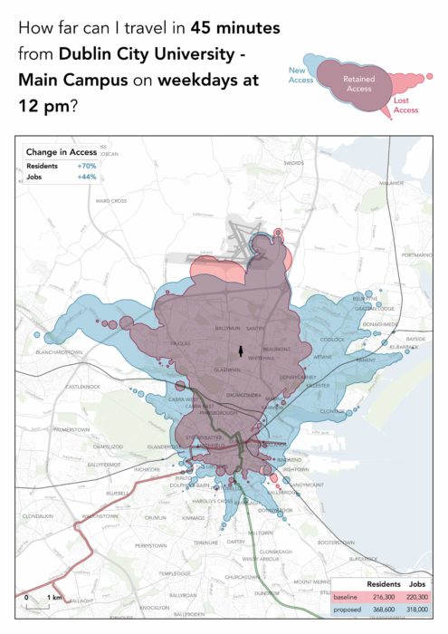
Here is what we were trying to do. Under the plan, in 45 minutes of travel time, a person near DCU gains access to the blue area and loses access to the red area. That means she can get to 44% more jobs and student enrolments (and other useful places). That’s freedom and opportunity! The average result across all of Dublin is a 20% growth in where you can get to.

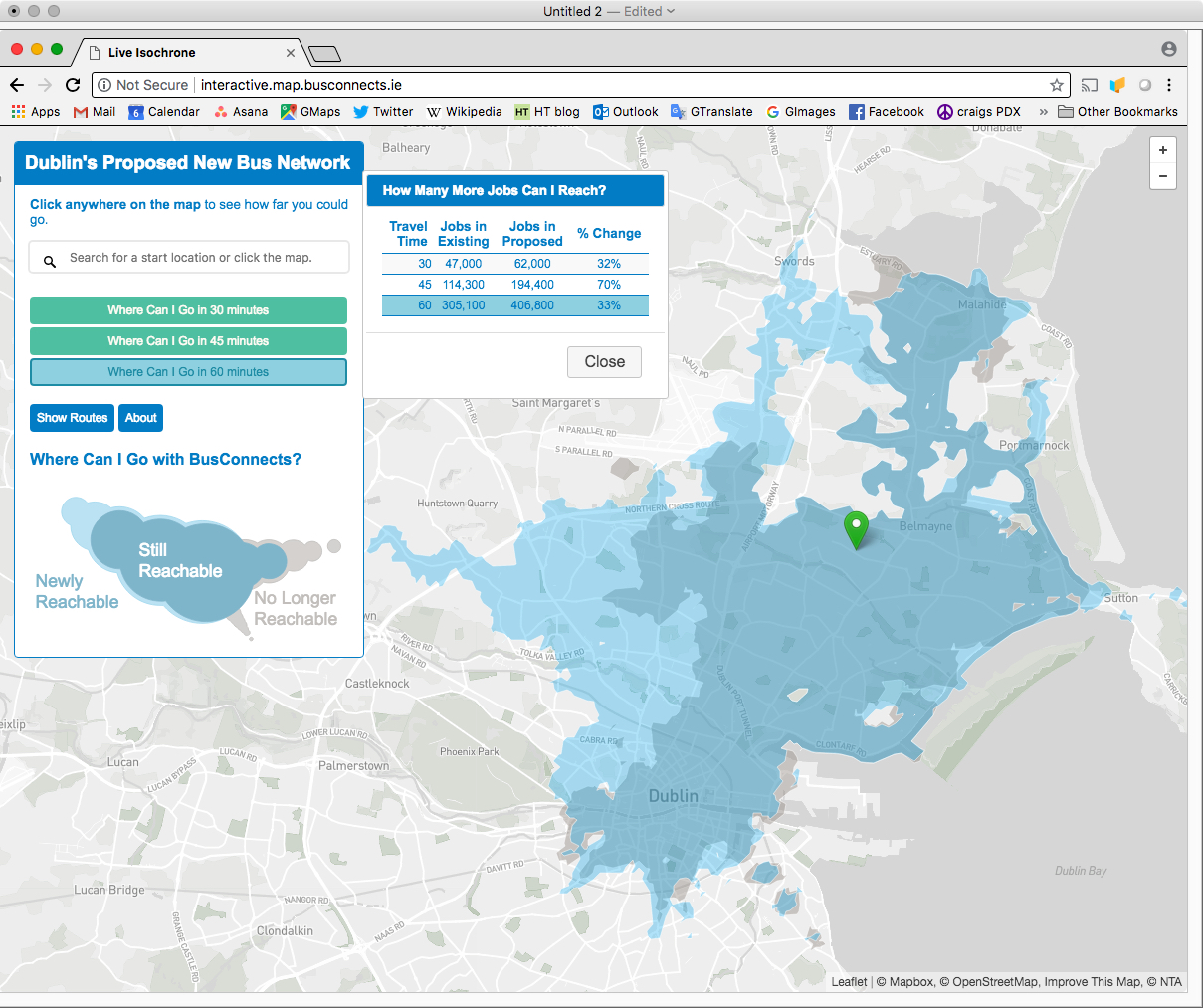
Under the plan, the average Dubliner can get to 20% more useful places in 30 minutes.  “Useful places” means jobs and student enrolments, which are easy to count with Irish data, but of course you can expect similar results for shopping and for all kinds of other destinations that give value to our lives.

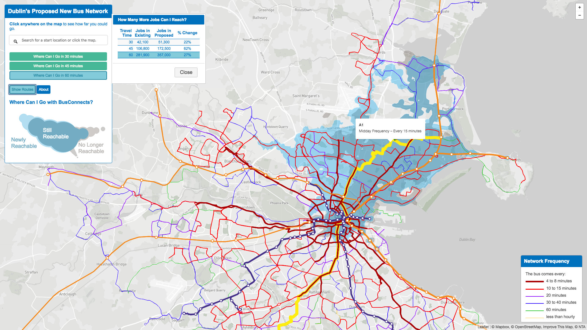
There are many ways to explore the new network, including maps, frequency tables for every hour of the day and week, and an interactive map tool that shows where you could go soon on the proposed network, and how you might get there. You can also look at a table showing how the plan affects every segment of every existing route.

But we hope you’ll also try to understand the principles at work.  For that, here’s a link to the summary report.  Also, don’t be afraid to browse the full report.  It is written in plain non-technical English with lots of interesting pictures, and it lays out every aspect of the plan, including the thought process by which it was designed.

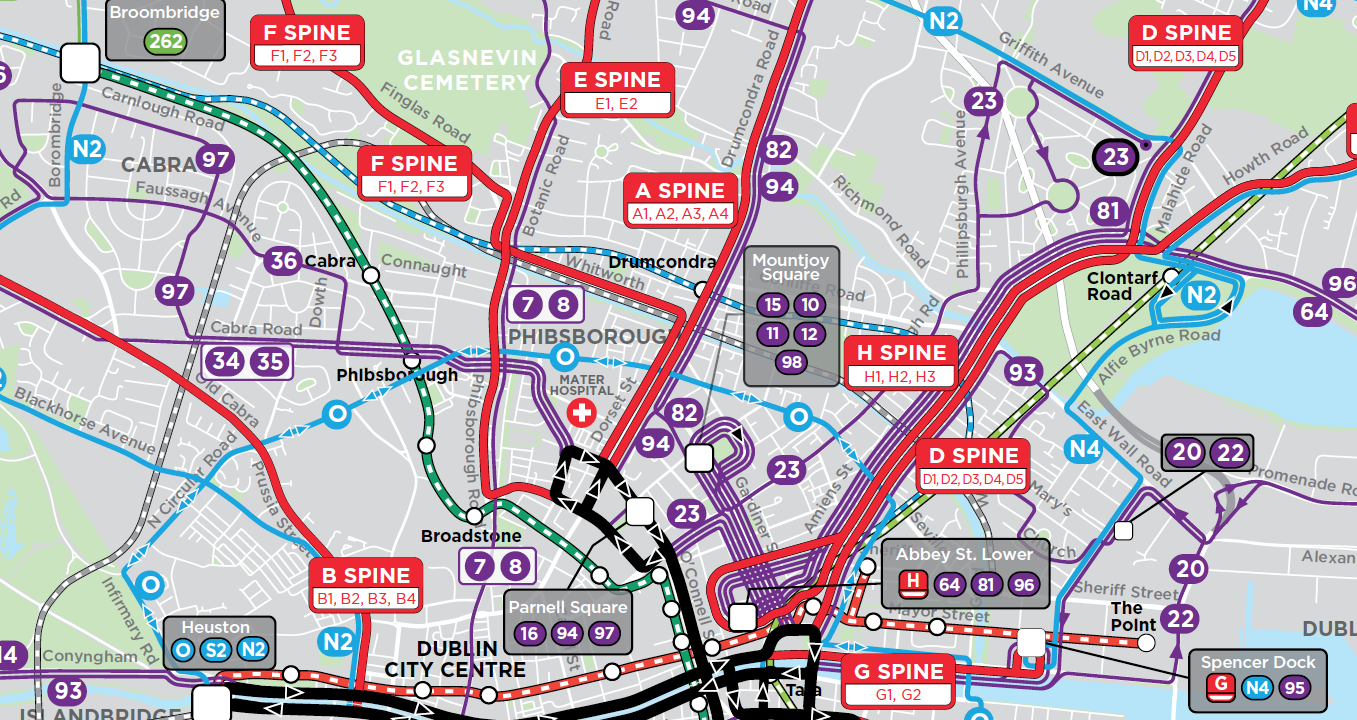
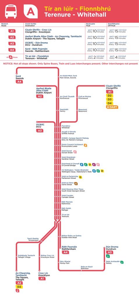
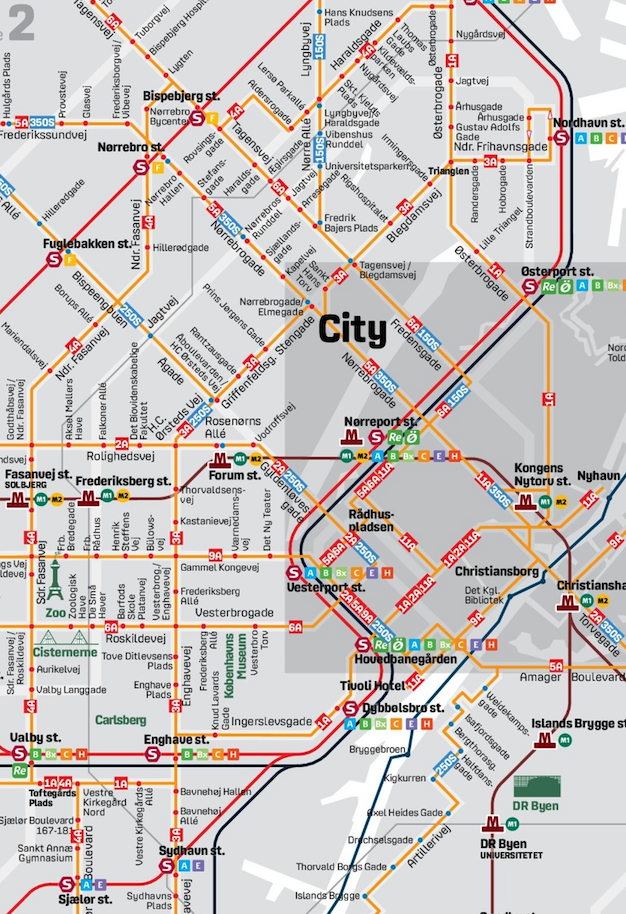
The maps are essential of course.  Chapter 7 of the full report lays them all out, but you can also see the main ones on the website (click to select a map, then click in the map window to see it fullsize).

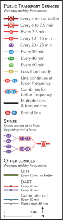
But to understand the maps, you must look at the legend.  Our firm’s usual mapping style is dense with information, but therefore contains a couple of things that you need to learn.  Most of the early expressions of panic and confusion have been based on misreadings of the map.

In our maps:

  • Colour means frequency.  Red means high frequency, and cooler colours mean lower.
  • The colours mean midday frequency; see the frequency table for frequency at rush hour and other times, and see here [select Map 3] for peak-only routes that may be relevant to your area.
  • Change in colour may not indicate that a route ends.It often means that the frequency changes but the route continues. Watch the route numbers to be clear, and remember, a spine like “A” is made up of Routes A1, A2, and so on, so where A1 becomes A, the bus keeps going.

A network redesign is both a big idea and 10,000 details. In recent presentations to the media and to local government councils, I focused on the big idea:

  • more service …
  • to more places …
  • so that you get there sooner …
  • with a little more interchanging (transferring in US parlance)

But of course the questions and objections were more about the details:

  • How dare I take away my direct route to the city?  Because it’s really infrequent and inefficient, and we can get you there sooner another way.  If we give you more frequent service to a nearby hub, we can connect you to much faster service to the city, so in the end, counting waiting time, you get there sooner.  We can also connect you to countless places you can’t get to now at all.  In any case, only about 8% of riders all day, and 5% during the peak, lose direct service to the city centre, and not all of those people are going to the city centre!
  • How can people change buses, or walk to a different stop in an intersection, when it’s windy and raining? The plan includes good shelter and attention to walking distances at every interchange point.  But people change buses in more brutal climates than Ireland’s: Moscow and Edmonton come to mind.  Most people have adapted to their climate. They know how to do things outdoors in it, and therefore can work with it when changing buses.
  • How will this affect older people and people with disabilities? There is an unavoidable tension between senior and disabled needs – which are much more inconvenienced by interchange – and everyone else.  A network designed solely around senior/disabled preferences for minimum walk and interchange is simply too slow to be useful for the rest of the population.  Again, attention is being given to making interchanges as convenient as possible, including for people with limited mobility.
  • Isn’t this connected to a lot of other things? How can you work on it in isolation? I address that one here.

Whether you live in Dublin or not, I hope you enjoy this work.  The full report is the most advanced piece of work our firm has done yet.  I can’t speak highly enough of the team at NTA, who have shown clarity and courage throughout this predictably difficult process.

If you do live in Dublin, you MUST complete an online survey.  There is a link to it here.  Yes, that’s a command. Too often, people take the attitude that public comment is just for show, and that the government is going to do what they want anyway.  When that happens, people who like the plan take it for granted, and people who hate it feel like they have to scream to get their  point through. So we get nothing but screaming, which makes the plan look like a failure.

On the survey, remember, we value specific comments.  If you like the plan but object to a detail, say that.  Don’t tell us that we’re stupid because we didn’t get your detail right.  There are only so many details we can get right without consulting the public, so that’s the whole point of this public conversation.