Tag Archives | Ridership

Cleveland: Tell us what you think about these alternative networks!

Our work on Greater Cleveland’s transit network is now available online, and we’re looking for people from the area to provide their input through this online survey.  The transit agency, GCRTA, hired us this year to help develop transit network alternatives that would illustrate what the transit network could look like if it shifted its focus more towards attracting higher ridership, and what it what the network would look like if it shifted towards extending coverage, as well as what the possibilities may be with different levels of funding.

The local newspaper, the Plain Dealer, has a great article about the networks and what they are intended to illustrate.

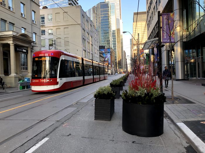
Cleveland is fortunate to have a relatively dense, and walkable pre-war era development pattern across much of the city, but as with most places in the United States, the trend over the past half-century has been the continual spread of residents and jobs to far-flung locations across the region. Since the region as a whole is growing very slowly, or not at all, this slow dispersal of the tax base poses a long-term challenge for the stability of transit resources and travel markets as more people and jobs flee to the margins of Cuyahoga County, or beyond.

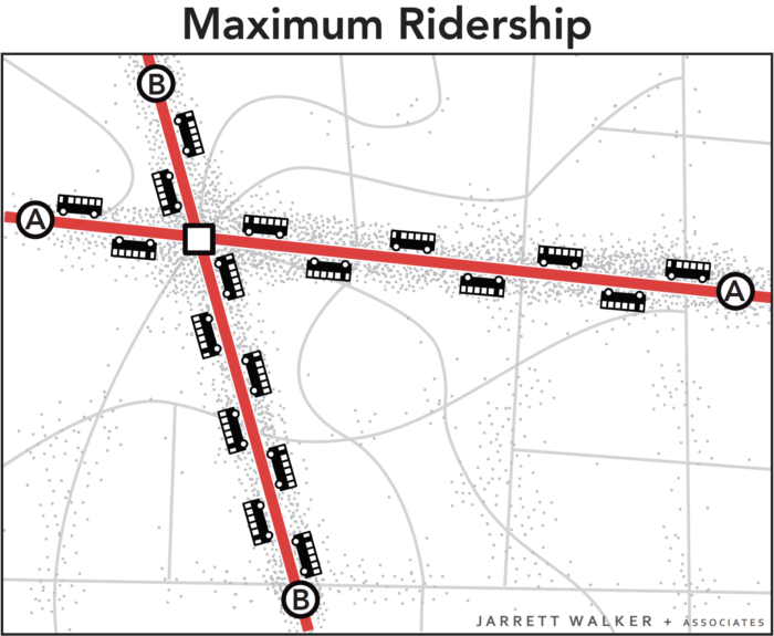
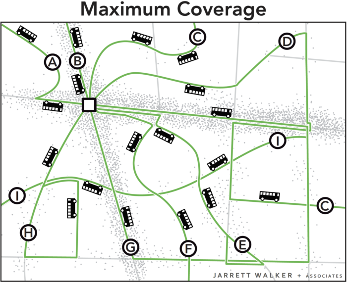
When operating resources are limited, as in GCRTA’s case, the ridership/coverage tradeoff is put front and center in any discussion of what transit can do. Today’s network extends to most, but not all, of the developed area of the county, and provides little high-frequency service within the dense, walkable core of the region. Reaching more of Cuyahoga County would mean curtailing frequency in dense areas even more. But building a robust frequent network would require pulling back from many of these lower-density suburban areas, as there is little waste or duplication to reallocate in the current service design of RTA’s network.

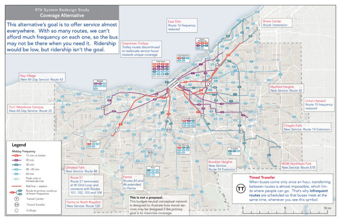
In this context, RTA has brought us in to help explore what the transit network could look like today, if different policy priorities were emphasized more strongly in network design. Further on in the project, we’ll also be developing alternatives for different financial scenarios. Right now, RTA is conducting outreach on two alternatives: a High Frequency Alternative which brings frequent service to most of the dense, walkable central areas of Cleveland and the inner-ring suburbs, and a Coverage Alternative, which spreads low-frequency service to more of county.

The purpose of these alternatives is to illustrate for the public, stakeholders, and the agency’s Board of Trustees the potential outcomes of a policy choice to focus more on ridership or on coverage. (You can click each map below to explore a larger annotated version).

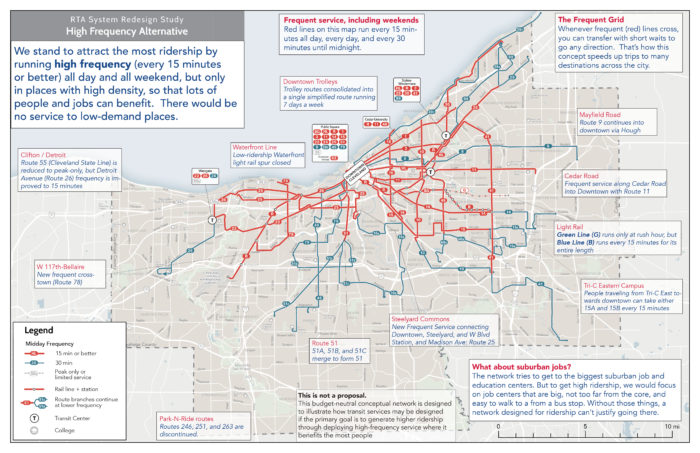
The High Frequency Alternative concentrates service so that lines run more frequently, reducing waiting times and making travel by transit more convenient. The network would reach fewer places, but where it does reach, trips would be faster than with the Existing Network.

As a result, over 40% more jobs would be accessible by the average county resident in an hour with the High Frequency Alternative. But on the other hand, the reduction in overall network extent reduces the number of people within a ½-mile walk to transit by over 20% from current levels.

You can compare the structure of the network on Cleveland’s east side to see this principle in action:

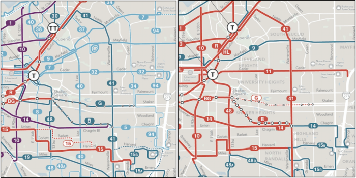
GCRTA Existing Network (left) compared with the High Frequency Alternative (right)

On the other hand, the Coverage Alternative spreads out service across the county, but spreading it out means spreading it thin. Frequencies would be lower throughout the network. This means that the network reaches more places but some trips would take much longer. Because these are budget-neutral alternatives, expanding the reach of the network requires reducing service levels on other routes, some routes that run every 45 minutes today would run every 60 minutes, and RTA’s single existing 15-minute bus service would run every 20 minutes. About 25,000 more people would be within a ½-mile walk of a transit stop, about a 5% increase from the Existing Network.

We hope these alternatives clearly illustrate the ridership/coverage tradeoff as it applies to Cuyahoga County and Cleveland. If you live in the area, please tell us what you think! You can learn more about the project and alternatives here.  Then, if you live, work or study in Cuyahoga County, be sure  take this short online survey.


Why Does Ridership Rise or Fall? Lessons from Canada

by Christopher Yuen

With only a handful of exceptions, transit ridership has stagnated or been falling throughout the US in 2017.  The causes of this slump have been unclear but some theories suggest low fuel prices, a growing economy fueling increased car ownership, and the increasing prevalence of ride-hailing services are the cause.

A few North American agencies have bucked the trend, including Seattle, Phoenix, Houston, and Montreal.  By far the biggest growth was at Vancouver, BC’s Translink, which saw a ridership growth of 5.7 percent in 2017.

But notice the big picture:  In a year when urban transit ridership fell overall in the US, it rose in Canada.

Transit ridership urban areas with populations of over 1M are included in this chart. Ridership of major agencies that serve the same region are added together. (Source: National Transit Database; APTA 2017 Q4 Ridership Report)

There are three interesting stories to note here.

1.  If You Run More Service, You Get More Riders

Canadian ridership among metro areas with populations beyond one million is up about 1.3% while regions of the same size in the US saw an overall ridership decrease of about 2.5% in 2017 despite the broad similarity of the countries and their urban forms.  Why?  Canadian cities just have more service per capita than the most comparable US cities.  This results in transit networks that remain more broadly useful in the face of competition from other modes.  Note, too, that Canadian transit isn’t cuter, sexier, or more “demand responsive” than transit in the US.  There is simply more of it, so more people ride, so transit is more deeply imbedded in the culture and politics.

2.  Vancouver Shows the Effect of Network Growth, Higher Gas Prices, Great Land Use Policy, and No Uber/Lyft

Vancouver’s transit ridership has historically been higher than many comparable regions as a result of decades of transit-friendly land-use and transportation policies, including an early regional goal to foster density only around the frequent network.  (The Winter Olympics also had a remarkable impact: ridership exploded in 2010, the year of the Olympic games, but then didn’t fall back after the games were over; apparently, many people’s temporary lifestyle changes became permanent.)  By North American standards, Vancouver is remarkable in the degree to which development is massed around transit stations.

But Translink attributes its 2017 ridership growth to continued increases in service, high fuel prices, and economic growth.  The 11km (7mi) Millennium-line Evergreen Extension just opened prior to 2017, directly adding over 24,000 boardings a day.  Fuel prices in Vancouver have also reached an all-time high, at $1.5 CAD / litre (4.4 USD/ gal), an anomaly in North America, although still lower than in Asia and Europe.  Economic growth has also been consistent, with the region adding 75000 jobs in years 2016 and 17.  Notably, ride-hailing services like Uber and Lyft are not available in Vancouver due to provincial legislation.

3.  There is Conflicting Evidence on the Impacts of Economic Growth on Ridership

Many commentators suggest economic growth to be a factor of the 2017 trends in transit ridership but there seems to be two conflicting theories, with economic growth cited as both a cause ridership growth and a cause of ridership decline. The positive link is obvious- economic growth leads to more overall travel, some of which will be made by transit.  Contrastingly, the negative link is based on the theory that increasing incomes allow for more people to afford cars.  Both theories seem plausible, but for both to be true, the relative strength of each must differ between cities.

Most likely, economic growth in transit-oriented cities is good for ridership, and growth in car-oriented cities, which encourages greater car dependence and car-oriented development, is bad.  This would explain the roaring success of Seattle, Vancouver, and Montreal, though it doesn’t explain why Houston and Phoenix are doing so well.

As North American cities work to reverse last year’s losses in ridership, they may best learn from Canada, and a select few American cities, to leverage economic growth for ridership growth.

Postscript by JW

For Americans, Canada is the world’s least foreign country.  There are plenty of differences, but much of Canada looks a lot like much of the US, in terms of economic types, city sizes and ages, development patterns, and so on.

So why is Canada so far ahead on transit?   All Americans should be asking this.  Ask: Which Canadian city is most like my city, and why are its outcomes so different?  We’ll have more on this soon.

Basics: The Ridership – Coverage Tradeoff

Is your transit agency succeeding?  It depends on what it’s trying to do, and most transit agencies haven’t been given clear direction about what they should be trying to do.

This post revisits a basic topic at the core of transit planning decisions that everyone engaged in conversation about transit should understand.

In the fictional town below, the little dots indicate dwellings, jobs, and other destinations. The lines indicate roads. Most of the activity in the town is concentrated around a few roads, as in most towns.

Imagine you are the transit planner for this fictional town. The dots scattered around the map are people and jobs. The 18 buses are the resources the town has to run transit. Before you can plan transit routes you must first decide: What is the purpose of your transit system?

Designing for Ridership

A transit agency pursuing only a ridership goal would focus service on the streets where there are large numbers of people, where walking to transit stops is easy, and where the straight routes feel direct and fast to customers. Because service is concentrated into fewer routes, frequency is high and a bus is always coming soon.

This would result in a network like the one below.

All 18 buses are focused on the busiest areas. Waits for service are short but walks to service are longer for people in less populated areas. Frequency and ridership are high, but some places have no service.

Why is this the maximum ridership alternative?  It has to do with the non-linear payoff of both high density and high frequency, as we explain more fully here.

Designing for Coverage

A network designed for ridership would not go to many parts of the city.  In the map above, someone who lived in the southeast part of town would not like this network at all.  That person is likely to want a network designed for coverage, not ridership.

In a network designed for coverage, the transit agency would spread out services so that there would be a bus stop near everyone. Spreading it out sounds great, but it also means spreading it thin.  The resources would be divided among so many routes that it wouldn’t be possible to offer much service on any of them.  As a result, all routes would be infrequent, even those on the main roads.  Infrequent service isn’t very useful, so not many people would ride.

The 18 buses are spread around so that there is a route on every street. Everyone lives near a stop, but every route is infrequent, so waits for service are long. Only a few people can bear to wait so long, so ridership is low.

In these two scenarios, the town is using the same number of buses. These two networks cost the same amount to operate, but they deliver very different outcomes.

Both Goals are Important

Ridership-oriented networks serve several popular goals for transit, including:

  • Reducing environmental impact through lower Vehicle Miles Travelled.
  • Achieving low public subsidy per rider, through serving the more riders with the same resources, and through fares collected from more passengers.
  • Allowing continued urban development, even at higher densities, without being constrained by traffic congestion.
  • Reducing the cost of for cities to build and maintain road and bridges by replacing automobile trips with transit trips, and by enabling car-free living for some people living near dense, walkable transit corridors

On the other hand, coverage-oriented networks serve a different set of goals, including:

  • Ensuring that everyone has access to some transit service, no matter where they live.
  • Providing lifeline access to critical services for those who cannot drive.
  • Providing access for people with severe needs.
  • Providing a sense of political equity, by providing service to every municipality or electoral district.

Ridership and coverage goals are both laudable, but they lead us in opposite directions. Within a fixed budget, if a transit agency wants to do more of one, it must do less of the other.

Because of that, cities and transit agencies that lack adequate resources need to make a clear choice regarding the Ridership-Coverage tradeoff.   In fact, we encourage cities to develop consensus on a Service Allocation Policy, which takes the form of a percentage split of resources between the different goals.  For example, an agency might decide to allocate 60 percent of its service towards the Ridership Goal and 40 percent towards the Coverage Goal.  Our firm has helped many transit agencies think through this question.

What about your city?  How do you think your city should balance the goals of ridership and coverage?   There is no technical answer.  Your answer will depend on your values.

Further Reading

Jarrett Walker’s Journal of Transport Geography Paper, which first introduced this concept, is here.


Toronto: A new King Street for Transit

By Christopher Yuen

For the past few decades, Toronto’s King Street, a frequent transit corridor through the densest and fastest-growing parts of the city, has been increasingly choked by car traffic. Built before the age of the automobile, and running in mixed traffic as was typical with legacy streetcar systems, the 504 King streetcar’s speed has deteriorated to just about walking speed on most days during rush hour. That was until three weeks ago, when the City of Toronto launched a one-year pilot project to restrict car traffic and give transit the space it needs to move. The Globe and Mail has a great piece on the significance of this project here. Details on the project and its design are available at the City of Toronto website here.

King Street Pilot Plan Diagram excerpt

The King Street pilot project prioritizes transit.

The new design of 4-lane King street was particularly thoughtful, given some of the constraints the corridor faces. While transit malls in some cities completely ban non-transit vehicles, existing high-rise parking garages that front onto King Street and businesses throughout the bustling entertainment district without back lane for loading and deliveries meant that vehicular access had to be maintained. Under the new design, left turns and through-travel are prohibited for cars and trucks at all major intersections- requiring drivers to turn right and use alternate streets.

At the approach to intersections, vehicles waiting to turn right form a queue in the right lane, out of the way of transit. At some intersections, cars receive an advance turn signal ahead of pedestrians to ensure the tail of the turning queue does not impede the streetcars.

Taken on a weekday at 4:00pm, this scene would have been much more chaotic with through-traffic blocking transit before the project. Now, cars are channeled to turn right at every intersection. (Photo: Alex Gaio)

Taken on a weekday at 4:00pm, this scene would have been much more chaotic with through-traffic blocking transit before the project. Now, cars are channeled to turn right at every intersection. (Photo: Alex Gaio)

Without through-traffic, having two lanes at the start of each block is no longer necessary, allowing for an important feature for efficient transit operations- far-side stops. Streetcar tracks in Toronto, and in many legacy systems, operate in the middle of the road. To board and alight, passengers must step into the roadway, protected only by a rule prohibiting motorists from passing open streetcar doors. As a result, stops have always been located on the near-side to reduce the risk of drivers making a right turn onto a transit corridor and immediately conflicting with passengers getting on or off a streetcar. Under the new design, streetcars stop on the far side of most intersections, beside barriers that effectively extends the curb to the second lane at the start of each intersection.

New far-side stops with a temporary curb-extension mean passengers no longer have to walk through a traffic lane to get on and off the streetcar. (Photo: Alex Gaio)

New far-side stops with a temporary curb-extension mean passengers no longer have to walk through a traffic lane to get on and off the streetcar. (Photo: Alex Gaio)

In addition to the obvious safety benefits of the new design, the far-side stops also allow transit vehicles to travel faster. Traffic signals along Toronto’s King Street already feature transit signal priority- they detect an approaching transit vehicle to hold a green light, or shorten a red light. With near-side stops, the unpredictable dwell times at stops would sometimes cause the traffic-signal to time-out, leaving the transit vehicle with a red light just as it closes its doors and is ready to get moving. Far side stops allow signals to be held for a streetcar to get through an intersection before stopping for passengers.

The new design also re-allocates curb space as loading zones, taxi stands and for new seating and patio space mid-block- all valuable features for a dense, mixed-use central business district which would not have been possible when all four lanes have been dedicated to the throughput of cars.

New public spaces like this will become especially valuable when patio season begins.

New public spaces like this will become especially valuable when patio season begins. (Photo: Alex Gaio)

Since its launch, public support has been for the most part, positive. The all-at-once approach to implementing this pilot across the corridor has ensured that the new inconvenience to some drivers has also been matched with a drastic, noticeable, and immediate improvement for everyone else. Across the twittersphere, Torontonians are reporting anecdotes of more consistent departures and trips taking half as they did previously.

Even among some taxi drivers, subject to the same turn restrictions throughout the day, initial skepticism appears to have eased.

Preliminary analysis of GPS data shows that the project is working, significantly reducing both the average and the spread of travel times.  However, it remains to be seen if enough drivers will comply with the new restrictions once the initial enforcement blitz is over. If New York or San Francisco‘s bus lanes offer any guidance, Toronto should introduce automatic camera enforcement along the corridor. Over the course of this one-year pilot project, municipal staff and the transit agency will be sure to monitor the situation closely and make adjustments based on actual results.

Cities, faced with growing populations and spatial constraints, must defend the right for transit to move if they wish to limit the negative impacts of traffic congestion. Toronto’s King Street offers a story of how that can be done quickly and effectively.


Christopher Yuen is an associate at Jarrett Walker+Associates and will be regularly contributing to this blog.