Transit agencies put a lot of money and effort into network maps, but are these maps really doing the job in helping people understand their travel options?
It’s easy to show where a route goes, but too often, maps give no information about whether a bus is likely to be coming when you need it. Without that, a transit map is like a road map that doesn’t show the difference between a freeway and a gravel road. It doesn’t show you how the network actually works, or what services might be useful to you.
Here’s a slice of the former official transit map of King County Metro in Seattle. The map appeared on the agency website and in printed materials, including signage at stops, all over the region.
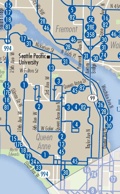
Seattle’s transit network map from 2010
(Two years after this post was first published in 2010, and a year after a similar argument appeared in Chapter 7 of my book Human Transit, King County Metro published a new map that responds to this post’s critique. You can also see a side-by-side comparison further down.)
The map above is not wrong, but it is misleading. Most of the transit agency maps I see are misleading in exactly the same way. The problem is that all of the bus lines on this map — both the graphic of the line and the line number bullet — look equally important.
If you look at almost any street map, a map designed for motorists or to give people a general sense of the shape of the city, you’ll see clear signals that the lines on the map are not all equal. A Google street map of this same area, for example, uses simple line-weight and color to visually distinguish three classes of road: (a) freeways, (b) local arterials, and (c) other lesser streets. We all use this hierarchy to organize our understanding of the city, regardless of our means of travel.
If a street map for a city drew every road with the same kind of line and label, so that Interstate 5 looked no different from the smallest gravel cul-de-sac, we’d say it was a bad map. But it’s not wrong, the mapmaker would say! No, it’s not, but it’s misleading. If we can’t identify the major streets, we can’t see the basic shape of the city, and without that, we can’t really make use of the map’s information.
The process of learning any network — roads or transit or any kind of geography — begins with identifying a few features as major, and then understanding how the other features fit around those. If you’re looking at a map of natural geography, you’ll notice the big rivers and mountains before you notice the small ones. If you’re looking at a highway map, you’ll understand the big highways first, and later, only as needed, you’ll study how lesser roads connect with those main highways. Transit customers and potential customers need the same ability to sort the mass of detail presented by a transit network.
On the map above, all the bus lines are solid blue lines with numbers. But in fact:
- Some of these lines have frequent all-day service. On these lines, a bus is probably coming in the next few minutes at almost any time of day.
- Some of these lines have infrequent all-day service. You’ll get a bus there, but you may wait a while.
- Some of these lines are peak-only. If it’s not rush hour, and you’re not going in the peak commute direction, these lines don’t exist for you.
- One of these lines, the 82, is a nighttime-only route. This line exists only when none of the others do, in the middle of the night.
What do we achieve by putting all of these lines on the same map and making them look the same? Well, the most powerful message seems to be: these are all buses, and all bus services are alike. A key secondary impression is: This map is complicated because bus service is intrinsically complicated.
Is that really the message transit agencies want to send?
Now I can already hear one response to this question. Of course we want people to figure out how to use the buses, but that’s what trip planning websites and mobile apps are for. Just tell us where you are, where you’re going, and when, and our website will give you detailed instructions for your trip.
There are three responses to that.
- First, some of us are spatial navigators, and need to understand our trip on the map rather than as a list of steps. Well, maybe your website gives us a map of the trip, so that’s maybe OK.
- Second, narrative instructions are brittle. They work if everything works perfectly, but if there’s any kind of disruption, we’re helpless. Only maps can show us where we are, and what our options are, at every moment of the journey.
- Third, narrative instructions do nothing to build a person’s understanding of their transit network, and of their city. And if you want to feel free in your city, capable of moving about at will to do things you want to do, that’s the kind of understanding you need.
That third and deepest kind of understanding is why people love the regular Manhattan grid. If you’re at Eighth Avenue and 16th Street and want to go to Second Avenue at 73rd Street, anyone can figure out how to do that, and about how far it is, based on locally available cues. Part of the joy of this part of Manhattan is the sheer effortlessness of basic navigation, the ease with which a basic schematic map can be stored in your head, even if you’re not a spatial navigator. It’s a place where a pedestrian can feel free to go anywhere, in any direction, without being confounded by complexity.
Most cities are more complicated than Manhattan, and most transit systems are more complicated than their cities. But I contend that transit agencies have an obligation to push back against that complexity, to make their systems look as simple as possible, to give their citizens (not just their riders) the clearest possible image of how their system works. We may not need this understanding to follow your website’s directions, but it will help us if our trip is disrupted and we have to improvise, and it’s essential if we ever want to feel free to use the transit system spontaneously, for our own purposes.
OK, but how do we decide which routes are “major”?
This question may sound like a recipe for decades of focus groups, but in my experience, the answer may not be so complicated if we just consider the basics: frequency, span of service, speed, reliability and ease of access.
Frequency and span of service, I suggest, are the most important indicators of majorness, because they are the answers to the question: “Does this service exist when I need it?” Notice that this is not a question about service quality, but rather about service existence. Until you’ve verified existence, all the other features of a service — even speed — are irrelevant details.
Conventional transit agency mapping advertises where the service exists but conceals when it exists, as though “when” were just a detail. In fact, when and where are equally important dimensions in determining whether a service can be said to exist at all.
In more practical terms, we know that in urban transit, frequency is an overwhelmingly important variable in determining usefulness. Modellers will tell you that the most onerous part of a transit trip — in terms of the potential to discourage ridership — is waiting. Frequency, of course, is the variable that governs waiting time. Frequency also determines whether connections are easy to make, and that in turn determines whether transit is really a network or just a pile of lines.
There are many degrees of frequency and span, but in general, most transit agencies’ service can be sorted into three categories of usefulness based on these variables:
- The Frequent Network runs often enough that you don’t have to plan your trip around a timetable. That typically means every 15 minutes or better all day, but it needs to be more frequent than that where aiming to serve relatively short trips — as in the case of downtown shuttles for example. If you aren’t willing to plan your life around a bus schedule, you are interested only in the Frequent Network.
- Infrequent All-day services are the rest of the service that runs all day. This network often relies on timed connections.
- Peak-only service exists only during the peak period. It mostly takes the form of long commuter-express routes that add lots of complexity to a system map but represent very specialized services for limited markets.
These three categories are useful in such completely different ways that I would argue they are at least as fundamental as the three basic categories of urban road — freeway, arterial, and local — that virtually all street maps clearly distinguish.
When these three utterly different services are drawn with the same line, as in most of today’s system maps, you get chaos. The chaos may be colorful and visually appealing, but it still conceals the most basic information we need. The complexity of peak-only routes, for example, obscures the simple structure of the all-day network, and the even simpler Frequent Network gets hidden behind both.
My recommendation is simple: In a bus network, the three categories of usefulness above should be represented by three kinds of line: a visually strong line for the Frequent Network, a lesser solid line for the infrequent all-day service, and some kind of dashed line for peak-only. More fundamentally, the test of a map should be that anyone can see the Frequent Network standing out from the rest of the map, and that anyone can see the total all-day network — frequent and infrequent — standing out from the more complicated and specialized peak commuter express services.
One way to do this, of course, is to provide separate maps of just the Frequent Network. Portland’s Tri-Met has had one of these maps for years, which looks like this. Los Angeles has such a map here, which is also interesting for the way it captures many other distinctions, including rapid vs local buses, bus vs rail, and even multiple transit agencies. (UPDATE: See also these examples from Vancouver, Canada; Leeds, UK)
But it’s also not hard to highlight the Frequent Network even in a more complex map of the entire system. In King County Metro’s updated map (which you can see in full here), you’ll see the maddening complexity of the whole system. But you’ll also see bold red lines for frequent BRT service and black solid lines for frequent all-day local service. These are the Frequent Network, the structure of services that busy people can potentially count on. Here’s a side-by-side comparison of pieces of King County Metro’s earlier map and their updated frequency map.
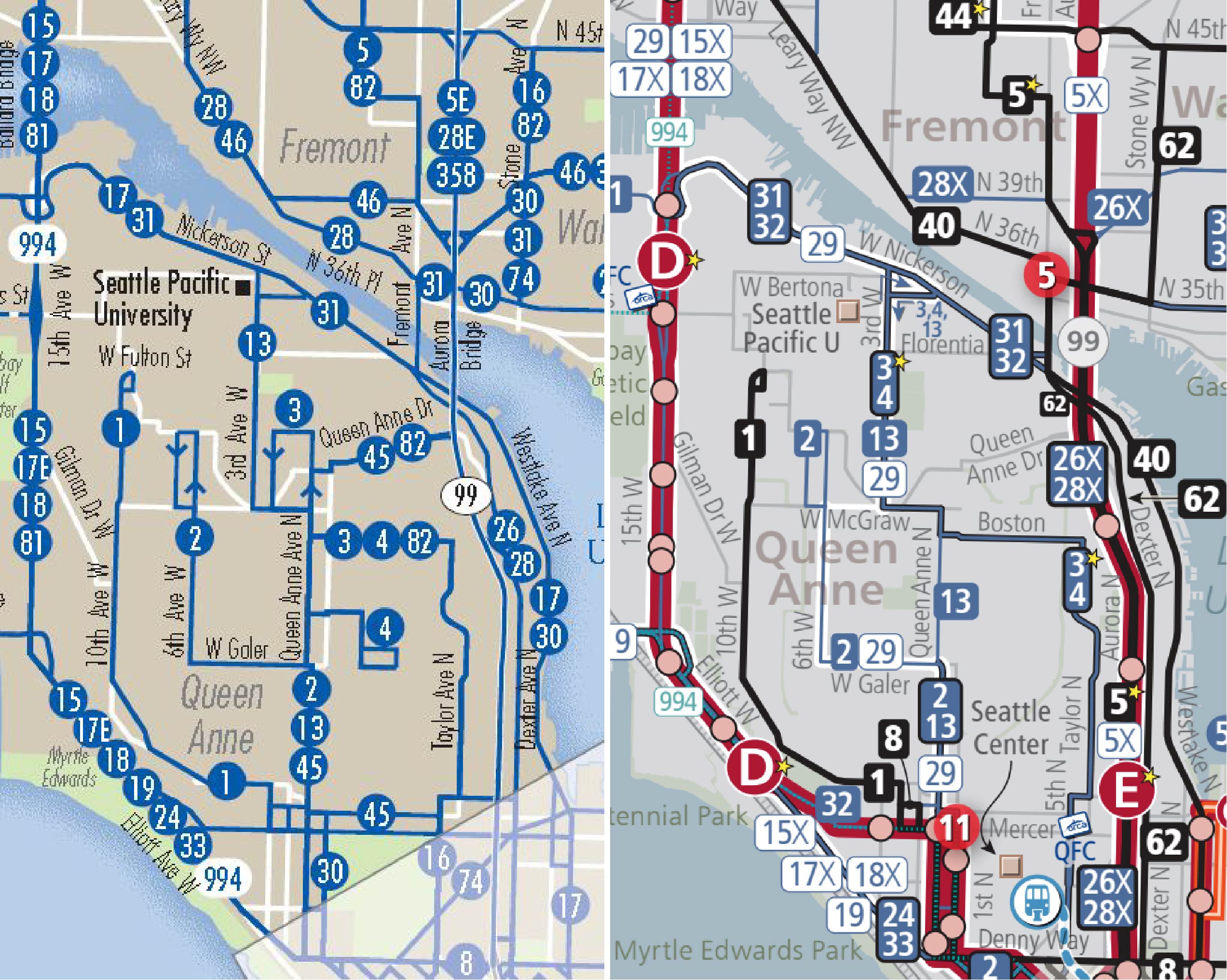
Seattle’s transit map 2010 vs 2020.
Another beautiful example of a full system map that highlights the frequent network is Santa Clara VTA’s map here. The thick red lines indicate BRT and frequent local bus routes.
Frequent Network mapping is also important for its secondary audiences. If everyone who wanted good transit had access to this map, they could make decisions about where to locate that would gradually re-organize the city so that people who valued transit were close to good transit, thus making better use of the transit system’s finite resources. The Frequent Network is potentially useful to anyone deciding where to live, where to shop, or where to start a business, and also the land use planners and developers who make the same location decisions. If you just show such people the map of all services, with no differentiation, they won’t be able to identify which services would really be useful to them, and will thus be less likely to make good location choices.
I have done quite a bit of work on this topic over the years, and have contributed to Frequent Network mapping decisions in several agencies. I’m happy to say that in the years since this post first appeared, the idea has spread widely in North America. The idea encounters some resistance, especially among people who want maps to highlight other things (agency turf, service brands, etc.) It also requires some difficult decisions about exactly what counts as frequent.
But without it, a map of the route is not really a map of the network. A network includes how the routes work together to get you places, and without frequency, you simply can’t tell.