There’s more data than ever, so there are more ways than ever to draw brightly colored maps of supposed transit facts. But that means it’s also easier than ever to take common types of confusion about transit and make them look like the outcomes of analysis. Your results will always reflect your assumptions, and a lot of transit analysis is still built on common mistakes that are completely obvious if you stop to think about them.
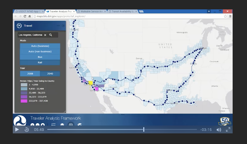
Case in point today, US Department of Transportation wants to undertake a National Transit Map project. This seems to mean drawing all the nation’s transit data feeds into a national database, which is certainly a good thing. But everything depends on the assumptions being made, and the initial video — recommended on Twitter by its narrator, Dan Morgan of USDOT — is not encouraging. The big mistakes can all be found in a 3-minute stretch starting at 5:00. Here’s the video.
The three big mistakes are:
- Implicitly confusing land area with population in visual representations. Starting at 5:00, the video presents a map of intercity access by car and train. The “discovery” from this analysis is that Amtrak doesn’t stop for several hundred miles as it crosses West Texas. It looks like a gap on the map, but it’s not a gap in reality because there are almost no people there. Of course, people draw maps like this all the time (we’ll see a lot of them during election season) but good analysis provides some visual cue to caution the viewer that land area, which is what jumps out on maps, has nothing to do with people. For example, this map could have been superimposed on a map of population density.
- Assuming that having transit nearby is more important than transit being useful or liberating. At 6:00 we see a map of the part of Salt Lake City in walking distance to transit, showing obvious gaps.
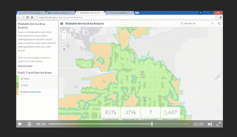 This makes the previous mistake (there’s no indication of whether anyone lives or works in those gaps) but more importantly, it gives the impression that the primary problem with transit is that it doesn’t cover more area. In actual transit systems with fixed budgets, the area you cover will be inversely related to the frequency, speed, and reliability you can offer, which means that a transit agency that spreads itself thin tends to offer services that are useless to almost everyone. This geometric fact is the basis of the ridership-coverage tradeoff problem. When we see analyses that imply that transit’s problem is that it doesn’t go enough places, we need to recognize this as implying an advocacy of coverage over ridership, and more generally an advocacy of spreading service so thin that none of it is useful to most people’s lives.
 - Focusing on peak hour service when discussing the access needs of poor people, even though most low-income people need to travel at all times of the day, evening and weekend. Starting at 6:55, we get an analysis that identifies poor people who do not have good access to rush hour transit. Poor people are rarely rush-hour commuters and they go many places other than the downtowns on which most peak service focuses.
I’m sure the analysts behind these examples thought that they were simplifying in a useful way. In my consulting work we simplify all the time. But we are careful to simplify in the direction of clarity about reality, rather than in the direction of helping people feel good about their often-false assumptions. The simplifications in this video — and of so much transit analysis still — are of the latter kind.
“which means that a transit agency that spreads itself thin tends to offer services that are useless to almost everyone. When we see analyses that imply that transit’s problem is that it doesn’t go enough places, we need to recognize this as implying an advocacy of coverage over ridership, and more generally an advocacy of spreading service so thin that none of it is useful to most people’s lives.”
Jarrett, I have to disagree with the comment quoted above. While the mapping exercise you are talking about may have some kinks to work out, it is bringing up a the issue of transit access which needs more attention in the USA.
Your comment that you made about coverage spreading service thin is not true at all. There are countless transit systems around the world that provide coverage to almost all dwellings and workplaces in an urbanized area, and also provide great service levels. An example of this would be the TTC in Toronto, any European transit system, and some American cities. In fact, you will not see any transit system that only provides good service to a small area deemed worthy of good transit ranking high on any lists for usage, mode share, or quality of life.
Your country has a serious transit access crisis, where almost half your population has no access to transit, even in urban areas. And where people do have access to transit, it is often so poor they cannot rely on it.
Approx. 45% of Americans have no access to transit. In Canada approx. 20% of Canadians have no access to transit. In Germany approx. 10% of Germans have no access to transit.
In all three countries this includes rural areas. So clearly the USA has a problem, and continuing to justify service gaps because it fits some ridership verse coverage theory is not addressing the problem.
A good point regarding overall funding levels, but you missed the “with fixed budgets” part which makes Jarrett’s statements absolutely true.
When I saw the feds were going to be coming out with this project, I thought of Jarrett immediately.
@Mike: Canada and Germany do not suffer from the crippling sprawl that dooms any transit agency that tries to “cover” suburban areas in the US. In many cases American cites have over-stretched and under-funded systems exactly because they are trying to be everything to everyone. As a transit user in an area that has it’s share of sprawl (Atlanta), I suffer from overly slow and often dysfunctional service. While this project is well-meaning, it could be too easily used to make those problems even worse.
@Randy: Visitors to Coast Meridian Road in Port Coquitlam, BC or Winston Churchill Blvd in Mississauga, ON may disagree with your comment that Canada does not suffer from sprawl. Vancouver’s Translink, being better funded than many American transit agencies, has decided to offer at least good service everywhere. The city of Mississauga has decided to invest in transit extensively, despite the city being car dominated, to the point where a city that had no Sunday bus service in the 1980s now has frequent bus service all day on several corridors.
Overall, since so many areas have no bus service at all I believe the very fact that there is some bus service is useful to at least some people. The difference in usefulness between 0 frequency and a bus every hour seems to me to be immensely greater than the difference in usefulness between a bus every hour and a bus every fifteen minutes. Detroit’s famous “Walking Man” who drew national headlines for his fifteen mile walking commutes due to a lack of bus service I am sure would have loved to wait even a full hour for an infrequent bus service.
I think the point Jarrett is trying to make – that Mike and Chris, you may have missed – is that just showing lines on a map that doesn’t take into account frequency can lead to a metropolitan area looking like it has “awesome” service because its lines cover the vast majority of the area. Meanwhile, another urban area might only have 10% of its land covered by lines.
But what if, when you look deeper at the schedules, you find out that in the first region, each line only has 2 trips a day, 1 day a week? And when you look deeper at the second region, you discover that the few lines that are offered are offered all 7 days a week for 20 hours a day at 15 min headways or better? Which region is offering a “better” service for the entire population?
I agree with his assertion that some attempt needs to be made for adjusting the map to show quality of service. However, most maps, including this one, just answers the question “is there a line passing through there?” which isn’t very useful for assessing what parts of the country need to improve their transit service offerings.
@ Dave,
It is simple. Both cities don’t offer good service. If you are in a built up urbanized area, then transit should go where the cars go. If you can get there by car, you should be able to get there by transit.
Having great service on a few corridors does nothing if only takes you to a handful of places.
This mapping exercise is going to show the gaps. And justifying these gaps by saying service is good on another corridor, does not address the fact that people cannot get where they need to go.
You’re advocating to increase the budget everywhere. Jarrett probably can’t decide the budget by himself, politicians do, so he advocates for what makes the best use of the money. Saying that suburbs aren’t transit-sustainable isn’t making excuses or demonizing them, it’s a fact of life and he has to work around it to make transit better, i.e. provide true useful mobility to as much people as you can.
Here in Europe there is coverage service everywhere, but there’s the same issue, people don’t complain about lack of transit, but about the fact that there is no late evening service, or it’s too infrequent, or connections are bad etc.
I guess the best way to avoid this issue would be to map how many jobs you can reach within 30 minutes from each place during midday, by transit, including half of the headway in the trip time of course (less for transfers if they’re synched, otherwise not).
But this is not the data they can gather and immediately map.
Jarrett isn’t complaining about maps being published, but about the conclusions some guy is making by seeing it and the way the data presentation pushes him to do that, which is a symptom of counterproductive thinking.
Instead of making excuses. Jarrett and all of us should be welcoming these maps, giving ideas on how to make them better, and bringing up the issue of transit access in the USA.
But as Paul Mees used to say. It is easier for transit planners to keep making excuses for poor transit and for demonizing the suburbs, than actually working to make transit better.
@asdf
“You’re advocating to increase the budget everywhere. Jarrett probably can’t decide the budget by himself, politicians do, so he advocates for what makes the best use of the money. Saying that suburbs aren’t transit-sustainable isn’t making excuses or demonizing them, it’s a fact of life and he has to work around it to make transit better, i.e. provide true useful mobility to as much people as you can.”
It is making excuses, because as we see in many cities, suburban areas can support very robust transit service and mode shares. But you have to provide the service.
The mapping exercise can of course show more details, but showing gaps is a a good first start.
We have got to accept the fact that there are serious transit coverage gaps in US cities, and that this is limiting access to jobs, education, health services, and leisure.
Again, it does not matter if you have great service on some corridors, because if you can’t access half your region by transit, then it is little help for anyone.
And yes asdf, sometimes you do need more funding. And instead of telling political leaders you can make do with less, maybe planners need to actually state what is required to operate a proper transit service. Our political leaders look for expert opinion, and telling them you can cut out a whole bunch of places from transit, because they don’t deserve transit, gives the wrong message.
Again, I understand these maps can be simplistic, and that people do need to critically think when looking at data like this. But let us also see the merit in some of this data.
So they made the wonderful “discovery” that the middle of nowhere has no train service but completely missed the fact that Phoenix might as well not even have have train service since our station is pretty far into the boonies.
How wonderful.