(Read in English here.)
Acabo de pasar una semana en Medellín, Colombia, una ciudad que cuenta con una de las redes de transporte público más reconocidas de América Latina. En este artículo, quiero ir más allá de los elogios que se le hacen a la ciudad —en su mayoría bien merecidos— y explorar algunos de los desafíos que surgen precisamente de sus éxitos. Algunos de estos desafíos son propios de países de ingreso medio como Colombia, mientras que otros se presentan en ciudades de todo el mundo.
Espero que este artículo sea útil tanto para quienes conocen América Latina como para quienes no, pero permítanme comenzar con un párrafo dirigido a estos últimos. Si solo tienen tiempo o dinero para visitar una ciudad latinoamericana en su vida, y especialmente si les interesa el transporte, les recomendaría Medellín. Su emplazamiento en un estrecho valle de paredes empinadas es espectacular, la gente es amable y el clima es templado durante todo el año. Es menos abrumadora que megalópolis como Bogotá, Santiago o Ciudad de México (aunque también las recomiendo). Tiene una fascinante historia reciente de recuperación tras haber sido una de las ciudades más violentas del mundo. Por otro lado, no está diseñada para los turistas ni hace grandes esfuerzos por entretenerlos. En resumen, Medellín los expondrá a todas las delicias y crisis del urbanismo latinoamericano en una ciudad de tamaño manejable. Si van, espero que este artículo los ayude a ser algo más que simples turistas del transporte, ayudándoles a entender cómo funciona —o no funciona— la red para quienes viven allí.
Empecemos por el mapa
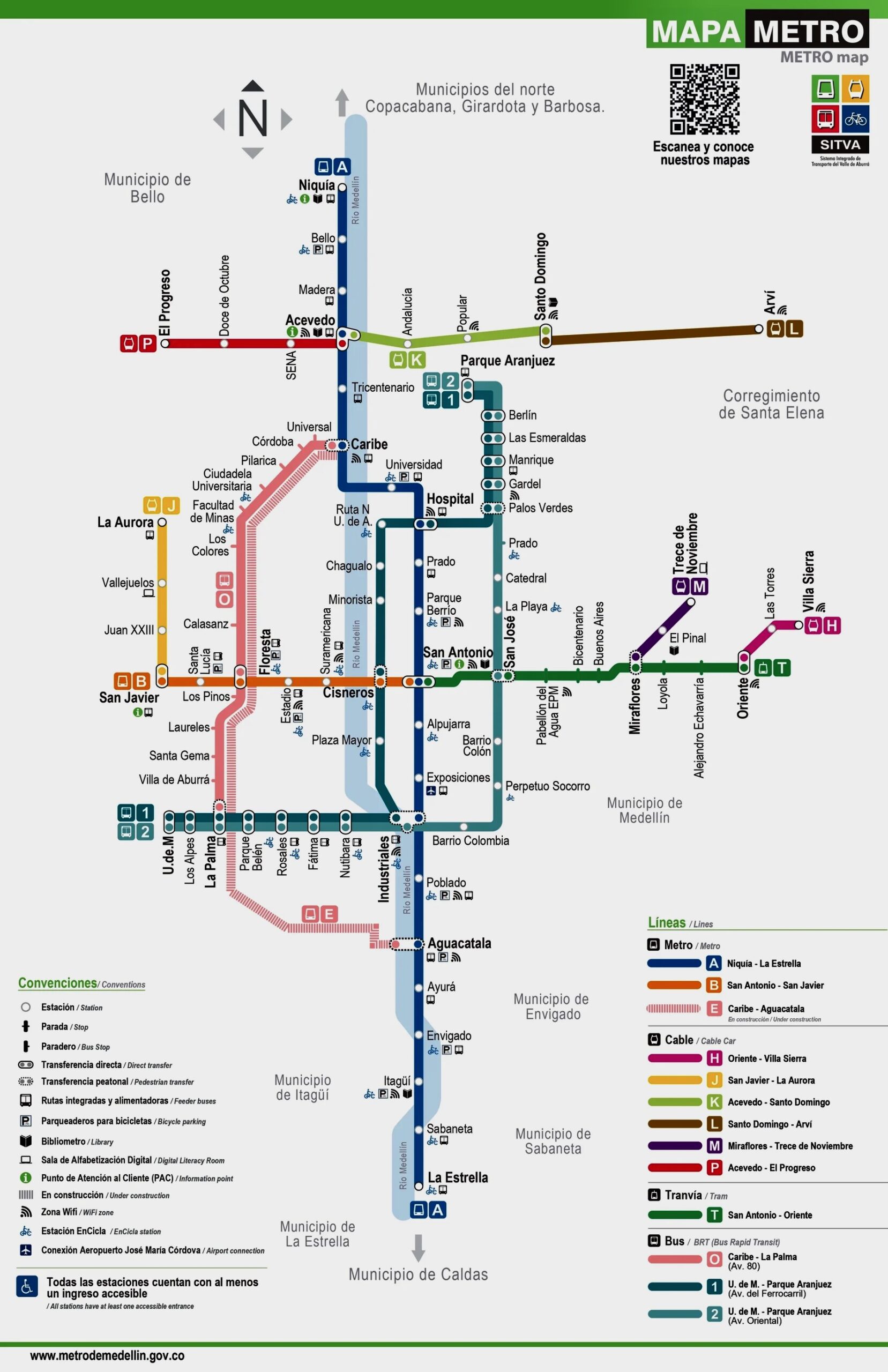
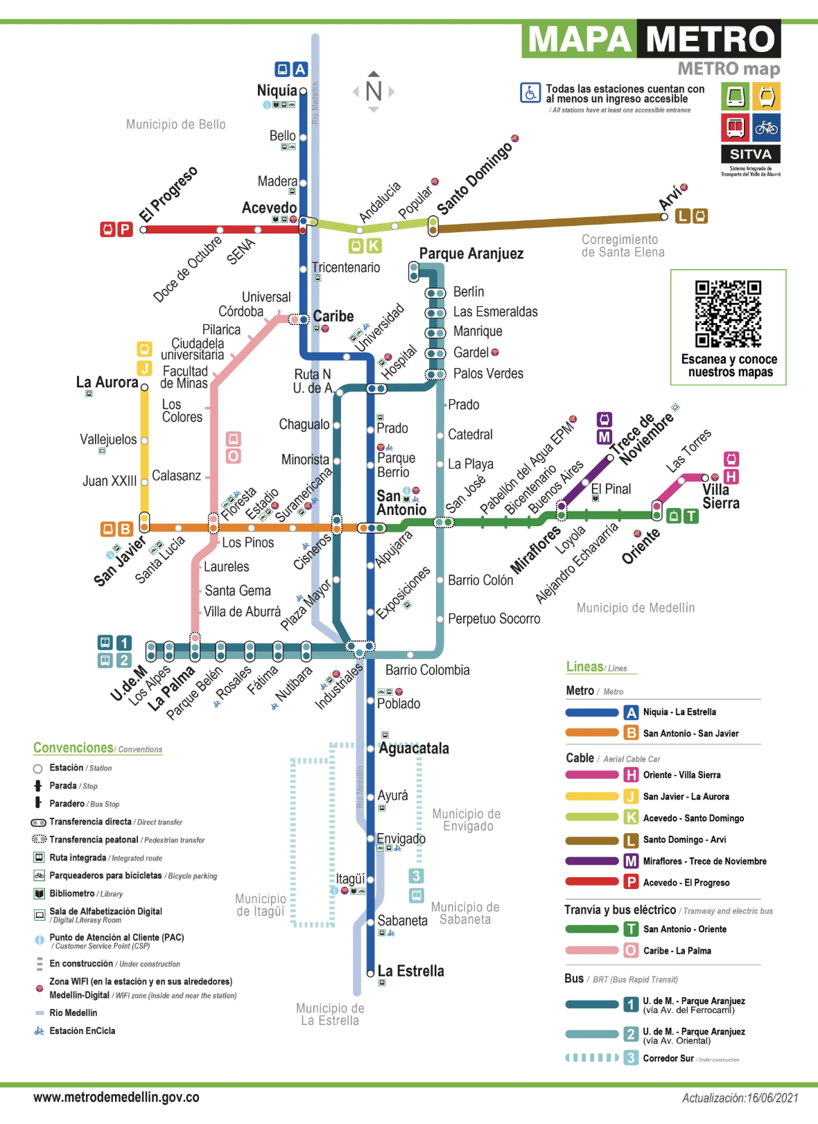
Una gran ciudad está estructurada por un gran sistema de transporte público, así que comencemos por el mapa oficial del metro de Medellín, que encontrarán publicado en cada estación. A este mapa volveremos a lo largo del artículo.

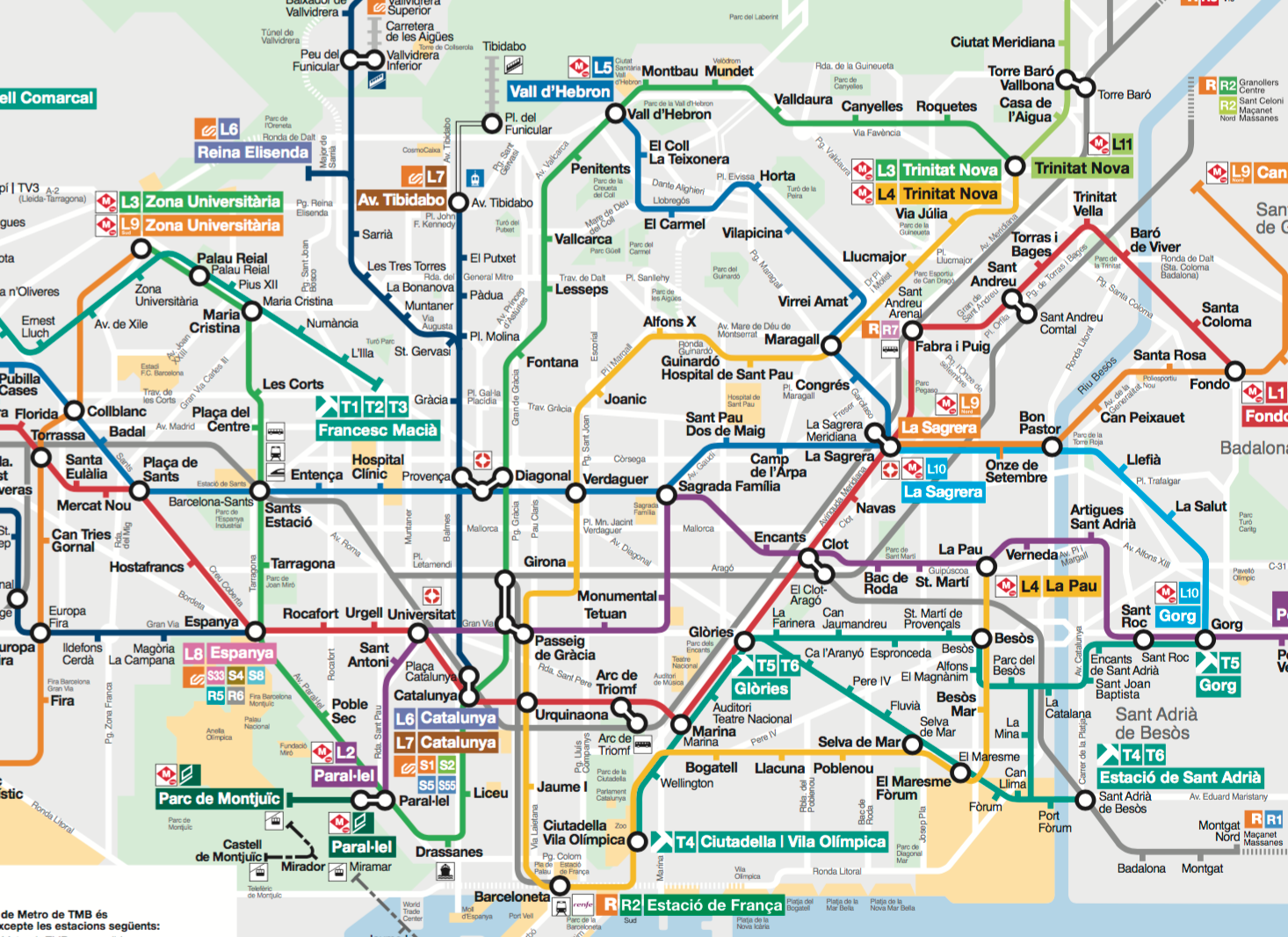
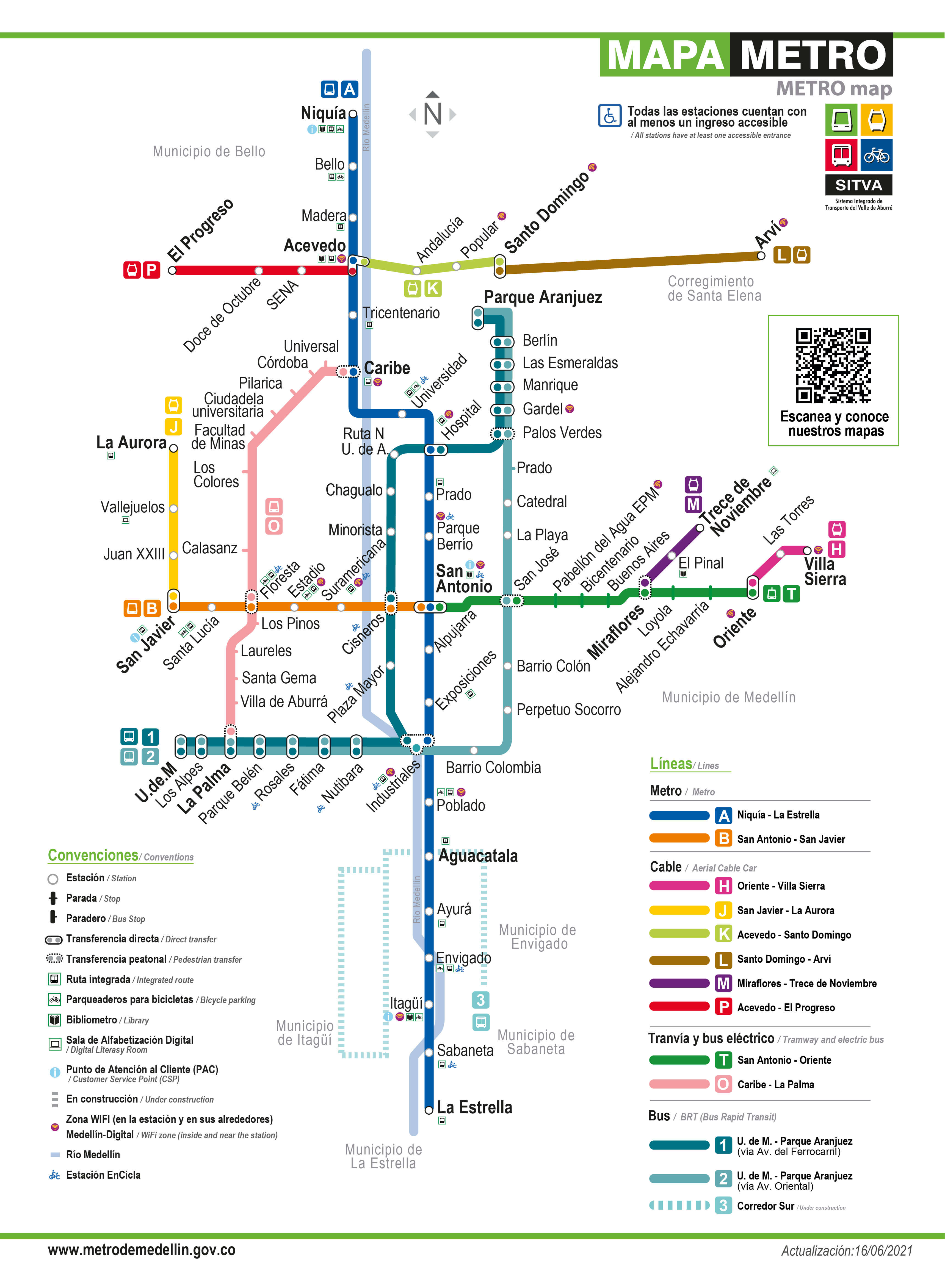
Mapa oficial de 2021 del «Metro» de Medellín. (La versión de 2026 tiene una complejidad adicional que veremos más adelante.) La línea azul claro en sentido norte-sur es el río, que suele verse de forma agradable desde el tren de la Línea A.
Aunque el mapa del Metro de Medellín utiliza un formato estándar similar al de los mapas de transporte rápido de todo el mundo, una mirada rápida revela la geografía inusual y los desafíos que plantea. La línea azul claro es el río. Las líneas largas corren de norte a sur. Las líneas de oriente a occidente son más cortas, ya que llegan hasta las empinadas paredes del valle.
Mientras que muchas ciudades maduras como París cuentan con redes aproximadamente en cuadrícula que ofrecen múltiples formas de hacer un recorrido, la red de Medellín es claramente de tipo troncal-alimentador, lo que significa que tiende a concentrar grandes cantidades de demanda en un único segmento o estación. Una enorme cantidad de viajes pasa por la estación central de San Antonio porque allí confluyen muchos corredores principales. Más adelante veremos por qué esto representa un problema y qué podría tener que hacer Medellín a medida que alcanza los límites de este tipo de estructura.
Tecnologías diversas: un solo «Metro»
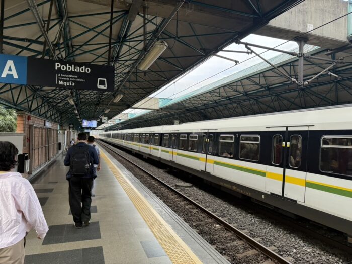
Si uno dice la palabra «metro» en Colombia, la gente pensará en trenes pesados y largos que circulan con mucha frecuencia sobre rieles, atendiendo estaciones de gran tamaño. Medellín tiene dos de estos, las líneas A y B. Pero la marca «Metro de Medellín» quiere que se vea toda la red de transporte rápido —más o menos— como el «metro», sin importar demasiado qué tecnologías la componen. Este cambio, de «metro» como sinónimo de «tren rápido sobre rieles» a «metro» como «red integrada de transporte rápido», ha ocurrido en muchas ciudades del mundo. Sin embargo, en la cercana Bogotá, si uno dice «metro», todos piensan en un tren (el primero está en construcción actualmente).
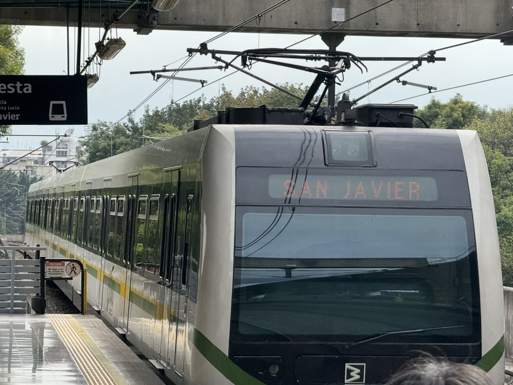
Las líneas A y B cumplen con las definiciones mundiales habituales de un «metro». Son trenes pesados de larga distancia, con alimentación eléctrica aérea, totalmente separados del tráfico. Tienen conductores humanos.
Pero aunque la Línea A norte-sur es el eje central de la red, la B es bastante corta, quizás demasiado. Ambas operan muy por debajo de la frecuencia máxima teórica que la infraestructura puede soportar, y la A en particular tiene altas aglomeraciones. (Por supuesto, gran parte del transporte público latinoamericano está saturado, pero en esta línea es un problema particular porque es el eje central por el que pasa una gran parte de la demanda de la ciudad. Más adelante hablaremos de las consecuencias de esto.)

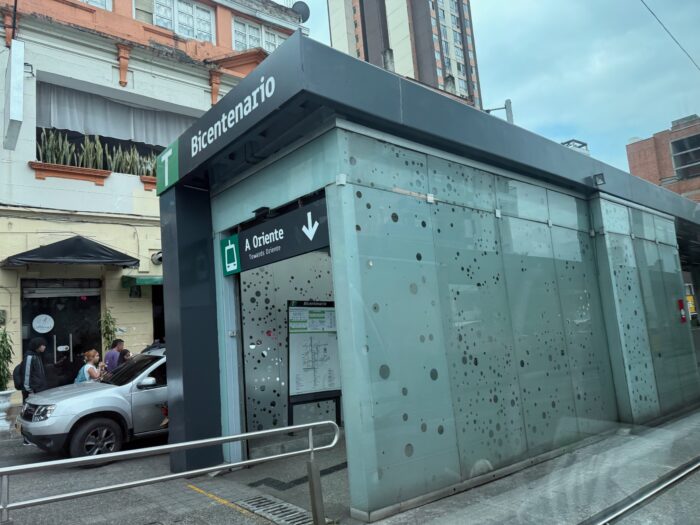
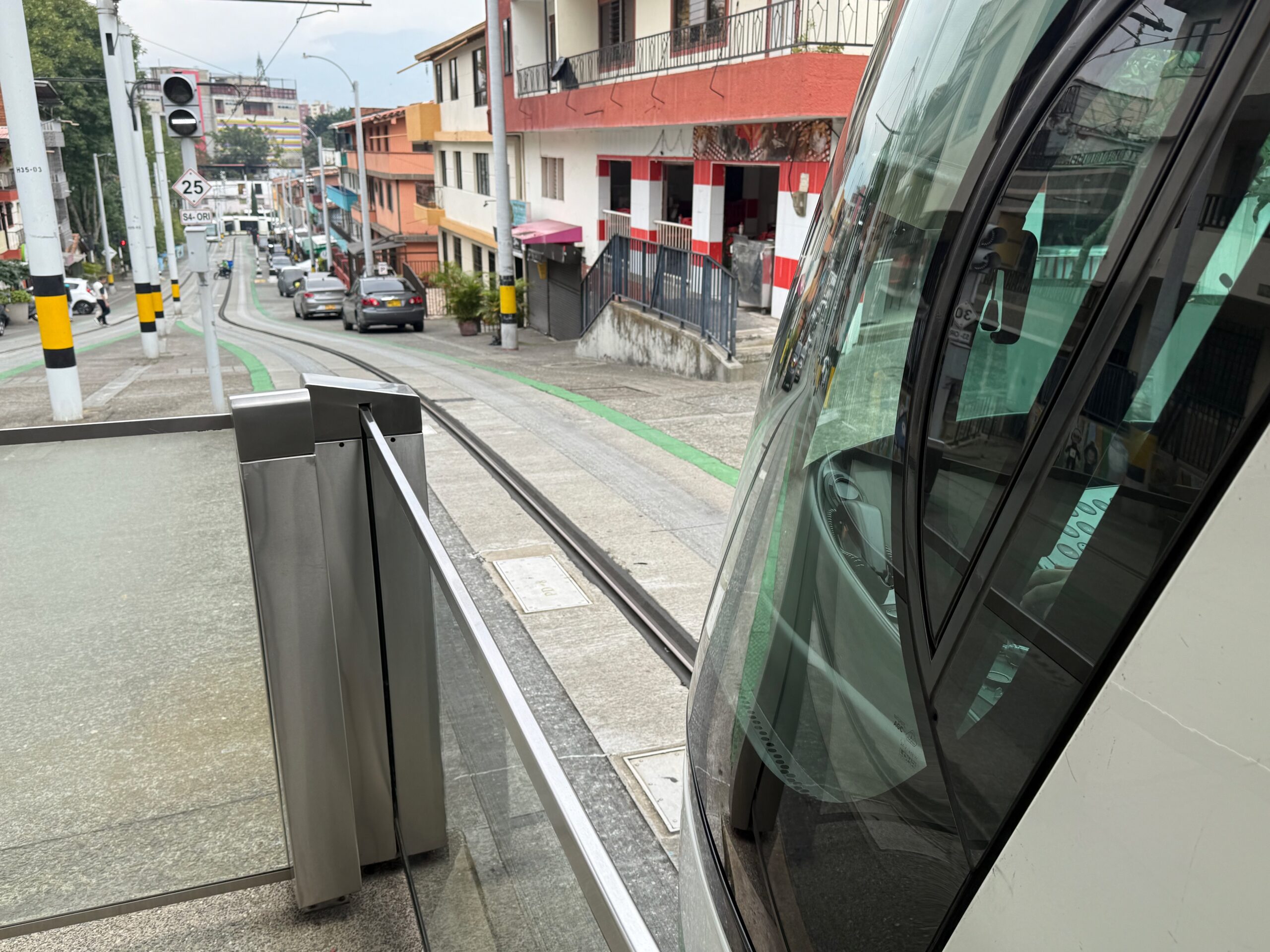
El principal eje hacia el oriente desde el centro es la Línea T, un tranvía que utiliza la tecnología de carril único con neumáticos de caucho Translohr.


En el mapa parece una línea de transporte rápido más, pero es mucho más lenta y algo más propensa a interrupciones. Su derecho de vía en calzada es teóricamente exclusivo, pero en la práctica es utilizado intensamente por motocicletas y fácilmente bloqueado por automóviles que giran o estacionan.
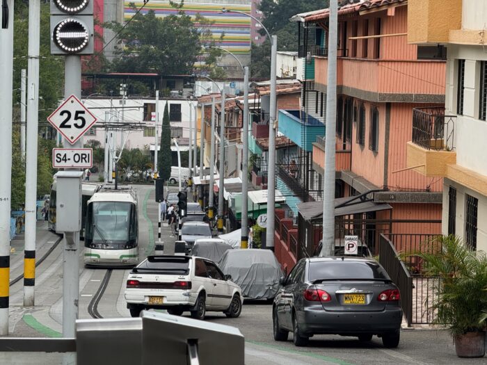
Este tranvía genera cierta preocupación entre los expertos locales en transporte, porque su fabricante tiene el monopolio de los repuestos y el servicio. Al parecer fue elegido por su capacidad para subir pendientes, ya que la inclinación máxima de esta línea es un poco mayor de lo que el tranvía convencional suele manejar.
El tranvía sí cuenta con estaciones de pago. Estas son interesantes porque han sido instaladas en una calle peatonal estrecha, ocupando apenas el ancho de un automóvil. Es exactamente el tipo de situación en que las estaciones de pago suelen considerarse imprácticas.
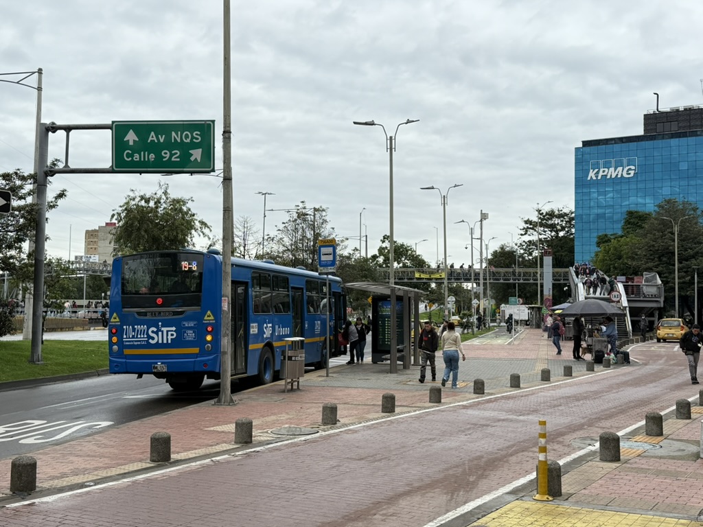
Luego están las dos líneas de Bus de Tránsito Rápido (BRT por sus siglas en inglés), las líneas 1 y 2. Son en su mayoría de alta calidad, con estaciones de pago y carriles exclusivos. Hablaré más sobre ellas a continuación, porque conforman los primeros elementos de una estructura de red en cuadrícula, corriendo paralelas a la congestionada Línea A y aliviándola en cierta medida. Las estaciones, en su mayoría angostas y ubicadas en el separador de vías anchas, son zonas de pago al igual que las paradas del tranvía.
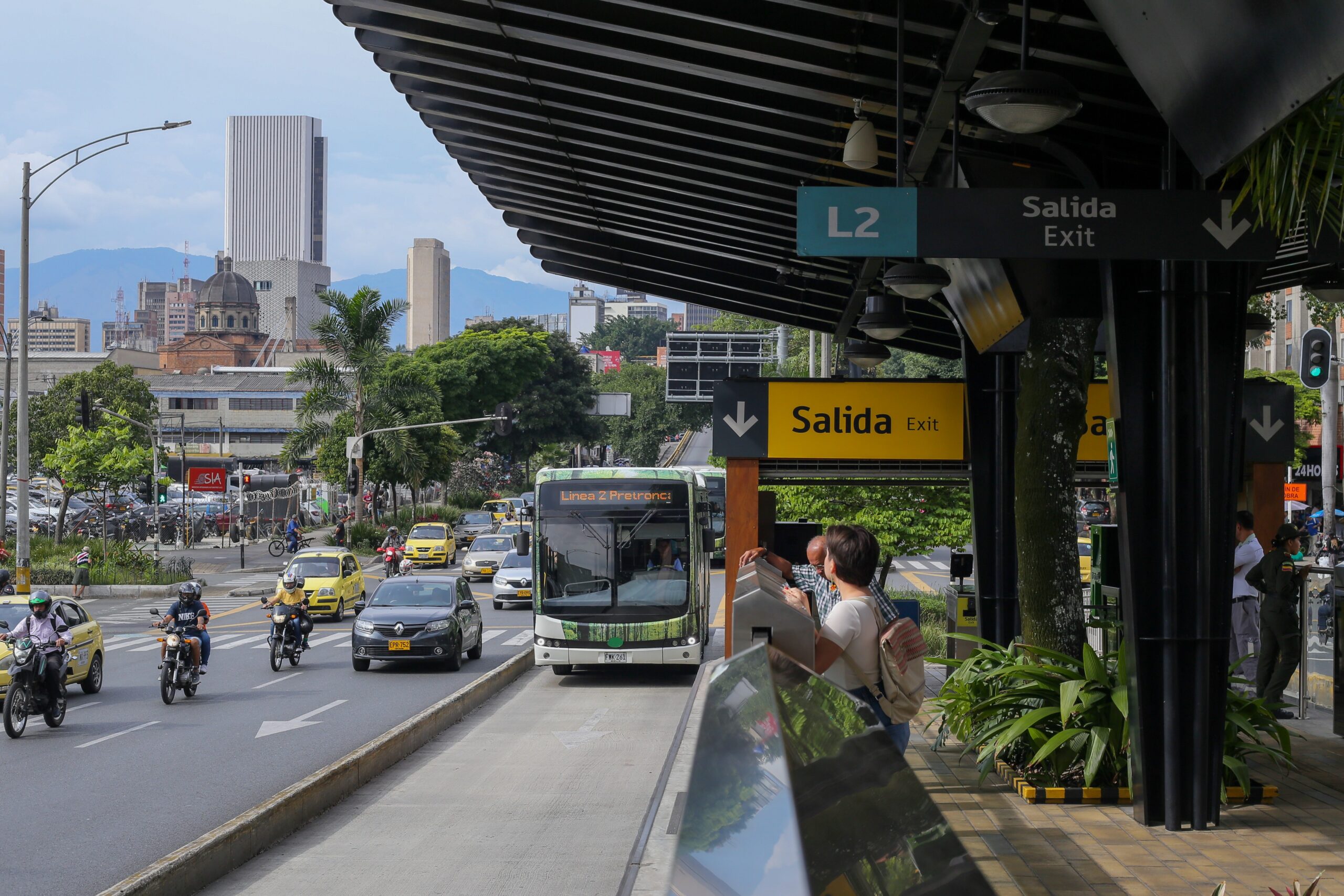
El Bus de Tránsito Rápido de la Línea 2 de Medellín. Obsérvense las estaciones completamente separadas con puertas de andén bajo, igual que en el tranvía.
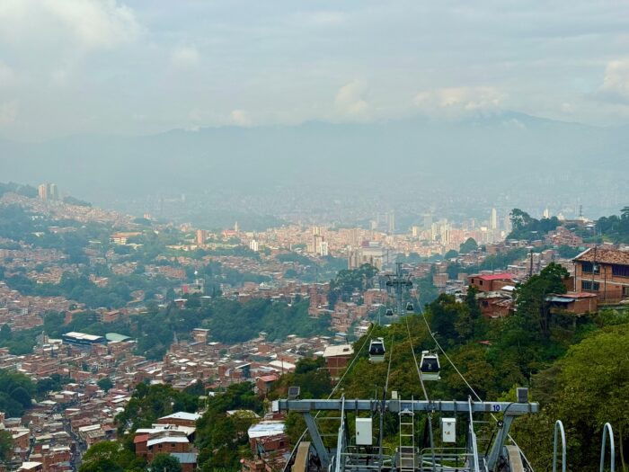
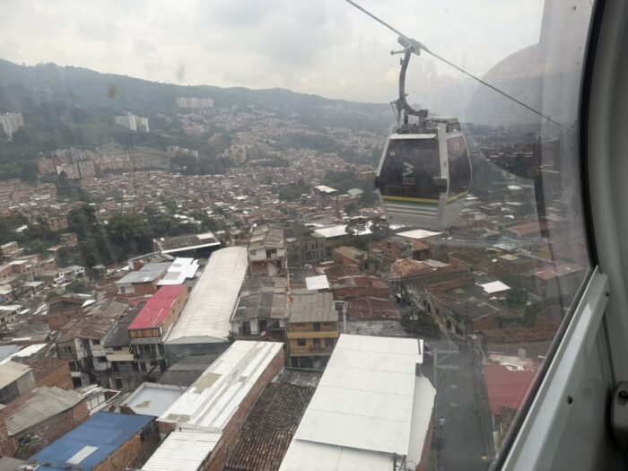
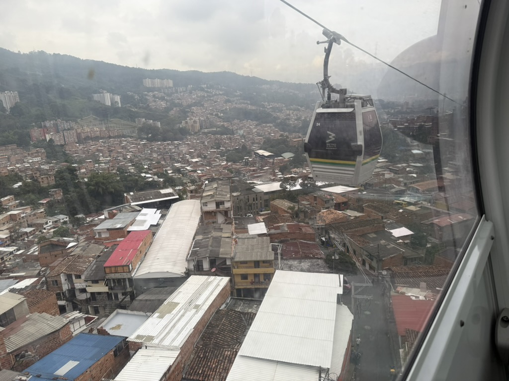
Probablemente ya han oído hablar de los teleféricos de Medellín. Estos espectaculares servicios, con una frecuencia prácticamente infinita, suben por empinadas laderas hasta barrios remotos, muchas veces de bajos ingresos. Son seis en total y parten de una estación en la red de tren o tranvía, llegando a barrios que de otro modo estarían aislados en lo alto de las montañas.
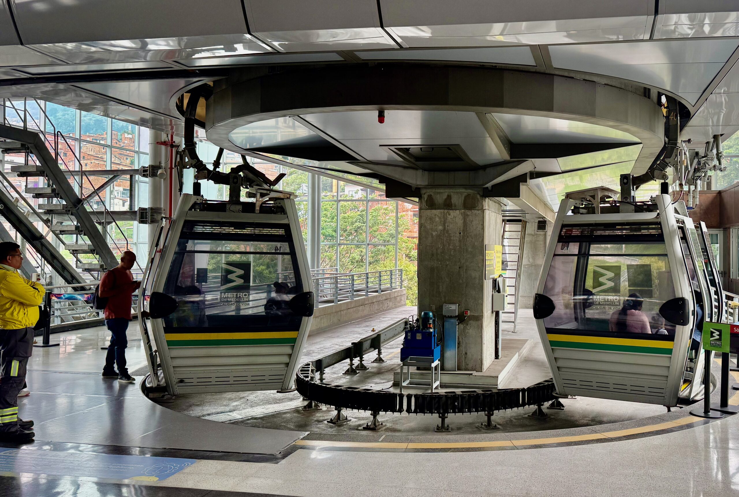
Estos teleféricos se están convirtiendo en una característica habitual de las ciudades montañosas de América Latina. Tienen un claro valor turístico, ya que se elevan por encima de las laderas ofreciendo vistas impresionantes. Pero su verdadero propósito es llevar acceso vital a algunas de las zonas más marginadas de la ciudad: comunidades de bajos ingresos desarrolladas de manera informal, que a menudo carecen de vías adecuadas. Los teleféricos redujeron drásticamente los tiempos de desplazamiento desde estas áreas, ampliando el acceso a oportunidades y atrayendo también algo de turismo.
Pero esperen, hay algo más. ¿Qué es esa Ruta O en el mapa, el servicio orbital del costado occidental? ¿Un «bus eléctrico»? Aquí está:
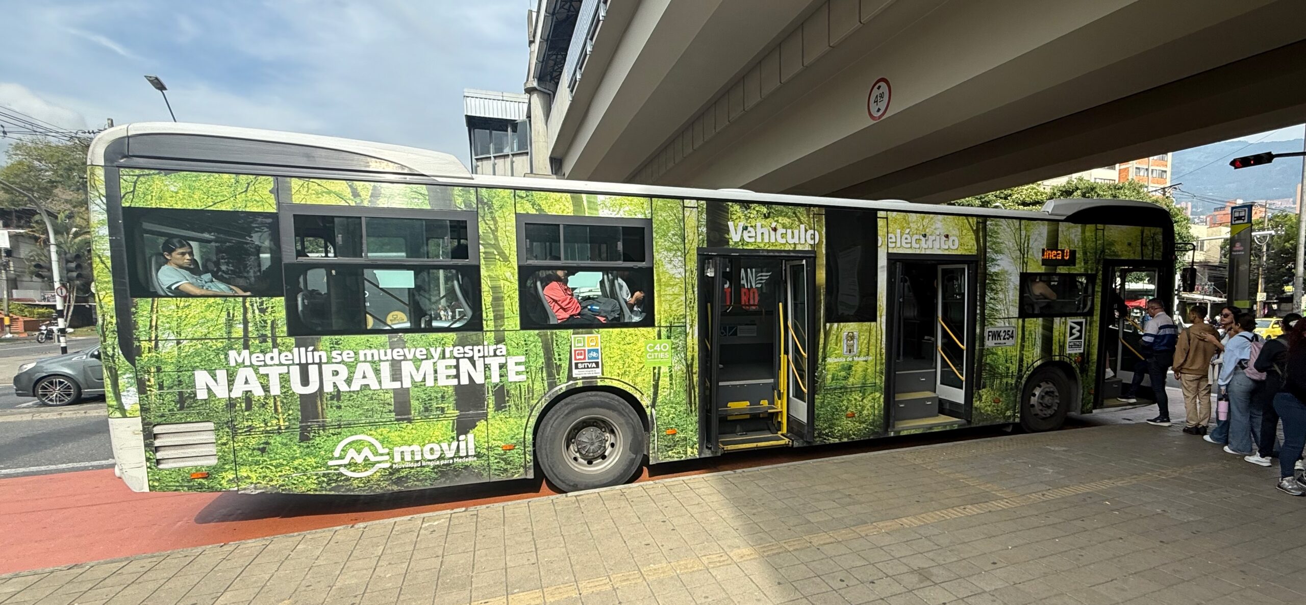
«Medellín se mueve y respira naturalmente», proclama el letrero. Pero ¿por qué aparece esto en el mapa del «metro», con una designación de letra? Tiene paradas más bonitas que una parada de bus convencional, pero está atrapado en el tráfico como cualquier bus ordinario. Esta es, de hecho, la única línea del mapa que no representa un servicio diseñado, al menos en teoría, para estar protegido de los retrasos del tráfico.
Sí, hay una historia detrás de esto: algo relacionado con un subsidio que llegó desde Bogotá para comprar buses eléctricos, pero sin suficiente planeación sobre cómo utilizarlos ni las instalaciones adecuadas para ellos. Pero dejemos eso de lado. Para verlo con optimismo, la Línea O es una forma de generar expectativa en torno a la futura Línea E. El mapa que ahora se exhibe en las estaciones incluye una actualización de este corredor: la nueva Línea E, actualmente en construcción, formará un arco orbital alrededor del costado occidental de la ciudad, reemplazando eventualmente el bus de la «Línea O». Esta es la versión más reciente del mapa del Metro, con la Línea E incluida como proyecto en construcción.
La Línea E será un tren ligero que circulará principalmente por una vía en el separador con grama, con estaciones controladas en el separador no muy diferentes a las del tranvía o el BRT.
¿Es bueno tener tantas tecnologías de transporte?
Pronto, Medellín tendrá cinco tecnologías de transporte rápido: metro pesado, tranvía, teleférico, bus de tránsito rápido (BRT) y ahora tren ligero. Cuando alguien quiere demostrar lo excelente que es el transporte de una ciudad, a menudo hace referencia a cuántas tecnologías de transporte diferentes hay. Pero en realidad, eso solo significa que es una gran ciudad para el turismo de transporte. La diversidad de tecnologías no dice nada sobre qué tan fácil es moverse por la ciudad, y puede ser un dolor de cabeza para la operación y el mantenimiento.
Solo el metro y el teleférico hacen cosas que ningún otro modo puede hacer. El metro pesado ofrece una capacidad que está fuera del alcance de cualquier otro modo. Los teleféricos se desplazan de una manera que atraviesa el territorio sin impactarlo demasiado; además, suben las pendientes más empinadas y ofrecen una frecuencia casi infinita al no necesitar un operador en cada cabina.
Pero los tranvías, el tren ligero y el bus de tránsito rápido se superponen en funciones similares. Si por arte de magia se pudieran convertir los buses de tránsito rápido de Medellín en tranvías o tren ligero, se reduciría la diversidad de tecnologías pero no cambiaría nada en cuanto a quién puede ir adónde y cuándo. Lo contrario también es cierto: con modificaciones menores, el tranvía podría ser reemplazado por buses que circularían a una velocidad similar, se detendrían en las mismas estaciones, subirían la misma pendiente y ofrecerían prácticamente el mismo nivel de velocidad y confiabilidad. Así que el hecho de que existan tanto tranvías como buses de tránsito rápido puede que no sea una virtud de Medellín, sino más bien un inconveniente —nuevamente, si uno se centra en la libertad de los habitantes y no en atraer turistas—. Si se tienen menos tecnologías, se tiene más de cada una, lo que permite todo tipo de eficiencias.
Para el turismo, sí, la diversidad tecnológica es atractiva. Pero no se vayan de Medellín creyendo que saben cómo es la experiencia de los locales. Porque si eso les importa, la forma de la red es más importante que las tecnologías.
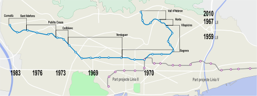
La red: superando el modelo radial
Miren nuevamente el mapa. Hasta que se agregaron las líneas de bus de tránsito rápido 1 y 2, la red del metro de Medellín era completamente radial. Todas las líneas emanaban desde un único punto, la estación San Antonio en el centro de la ciudad, o desde estaciones sobre esas líneas. En cada dirección que se alejara de San Antonio, la red parecía un árbol: un tronco único con ramas formadas por los teleféricos. (Los buses alimentadores verdes locales, no mostrado en el mapa arriba, serían las ramitas y hojas en esta metáfora. Hablaremos más de ellos abajo.)
Las redes radiales son comunes en ciudades donde hay un «centro» de importancia abrumadora, ubicado de forma céntrica, de modo que muchos viajes entre otros puntos pueden pasar por él sin desviarse demasiado. Medellín es en cierta medida así, pero también tiene grandes destinos —hospitales, centros comerciales, etc.— dispersos por toda la ciudad, y algunos de ellos no están bien atendidos por esta estructura.
Las líneas de bus de tránsito rápido 1 y 2 rompen con ese patrón, y la nueva Línea E de tren ligero lo romperá aún más. Estas líneas son el comienzo de un patrón de cuadrícula, que busca atender más viajes de cualquier punto a cualquier punto sin canalizar a todos por un único lugar. Una cuadrícula consiste en múltiples líneas paralelas que se cruzan con otro conjunto de múltiples líneas paralelas. El resultado son muchos puntos de intersección, no solo un nodo central, y una mayor probabilidad de que el viaje pueda hacerse por una ruta en forma de L razonablemente directa con una sola correspondencia.
Pero esta nueva estructura en cuadrícula que lucha por nacer estará limitada por las decisiones tomadas cuando se pensaba de manera radial. Miren el eje principal de oriente a occidente a través de la ciudad. Está dividido en dos: la Línea B (un metro pesado) hacia el occidente y la Línea T (el tranvía Translohr) hacia el oriente. Hay que hacer transbordo en San Antonio para seguir en la misma dirección a través de la ciudad, lo cual no es lo deseable en una cuadrícula. Como las líneas están interrumpidas, la Línea B no toca la Línea 2 y la Línea T no toca la Línea 1, de modo que si el viaje involucra este par de líneas (como bien puede ocurrir, dado que hay grandes destinos en todas ellas), habrá que hacer dos correspondencias en lugar de una.
En una cuadrícula verdadera, se quiere que cada línea continúe hasta cruzar la última línea de la cuadrícula que interseca, de modo que una amplia gama de viajes de cualquier origen a cualquier destino pueda realizarse con solo una correspondencia al cambiar de dirección. Pero el sistema de transporte rápido de Medellín siempre estará algo limitado por la desconexión entre las líneas B al occidente y T al oriente.
Ahora entienden por qué, mientras yo caminaba hacia el oriente desde la estación San Antonio con aspecto de turista, iba pensando distraídamente en una extensión de la Línea B en esa dirección, al menos hasta la estación San José, donde tocaría la Línea 2. Siempre estoy buscando cuadrículas, y cuando están rotas, busco qué haría falta para repararlas. En este caso es una tarea difícil, porque las tecnologías y los entornos urbanos son tan diferentes: la B es un metro pesado elevado, mientras que la T es un tranvía que circula íntimamente por una calle angosta. Pero una vez que se agregue la E, circulando de norte a sur en el occidente, este problema se volverá aún más molesto, y no me sorprendería ver en algún momento una propuesta para extender la B hacia el oriente.
¿Dos redes de buses? ¿Es mejor que una sola?
Hasta ahora he hablado de la red de transporte rápido, con la que me refiero a servicios que conectan estaciones ampliamente espaciadas y están protegidos de la mayor parte de los retrasos del tráfico. Pero una gran parte de los usuarios del transporte de Medellín no utiliza este sistema. Muchos usan buses locales que circulan principalmente en tráfico mixto. Como en la mayoría de las ciudades latinoamericanas, los buses son difíciles de descifrar, pero el problema es especialmente grave aquí porque Medellín tiene dos tipos completamente diferentes, presentados por separado.
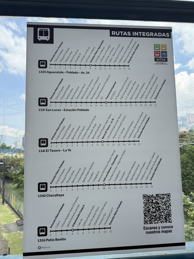
Muchas de las estaciones del metro cuentan con amplias redes de alimentadores, llamados formalmente «rutas integradas». Los alimentadores son financiados como parte de una red integrada con el metro y aceptan la misma tarjeta regional. Estos buses verdes tienen terminales designadas en las estaciones y se desplazan hacia afuera para cubrir alguna parte del área local. Estos alimentadores extienden la metáfora del árbol: son las ramitas y las hojas, llevando la red a un área más amplia de la que pueden alcanzar los troncos y las ramas principales. Estas líneas son en su mayoría bastante cortas y, aunque se pueden usar entre cualquier par de paradas, su diseño —y su demanda— están orientados de manera abrumadora hacia las estaciones.
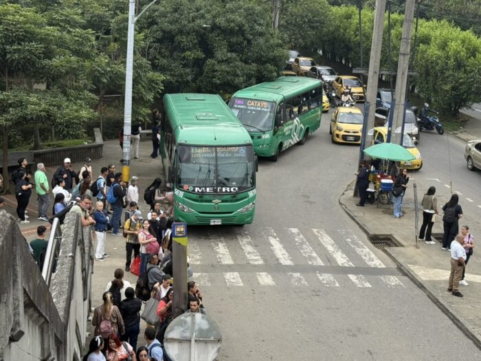
Buses verdes de las «rutas integradas» alimentando la estación Poblado del Metro.
En las estaciones hay mapas sencillos de líneas que publicitan estos servicios. El código QR en la esquina inferior derecha lleva a mapas individuales de cada ruta alimentadora, aunque como siempre añoré un mapa que mostrara todos los servicios juntos, para poder ver cómo interactúan.

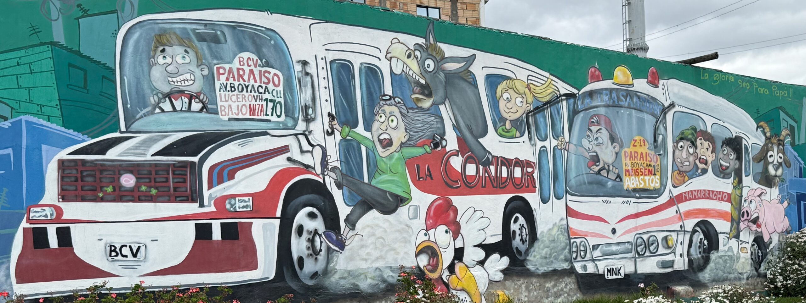
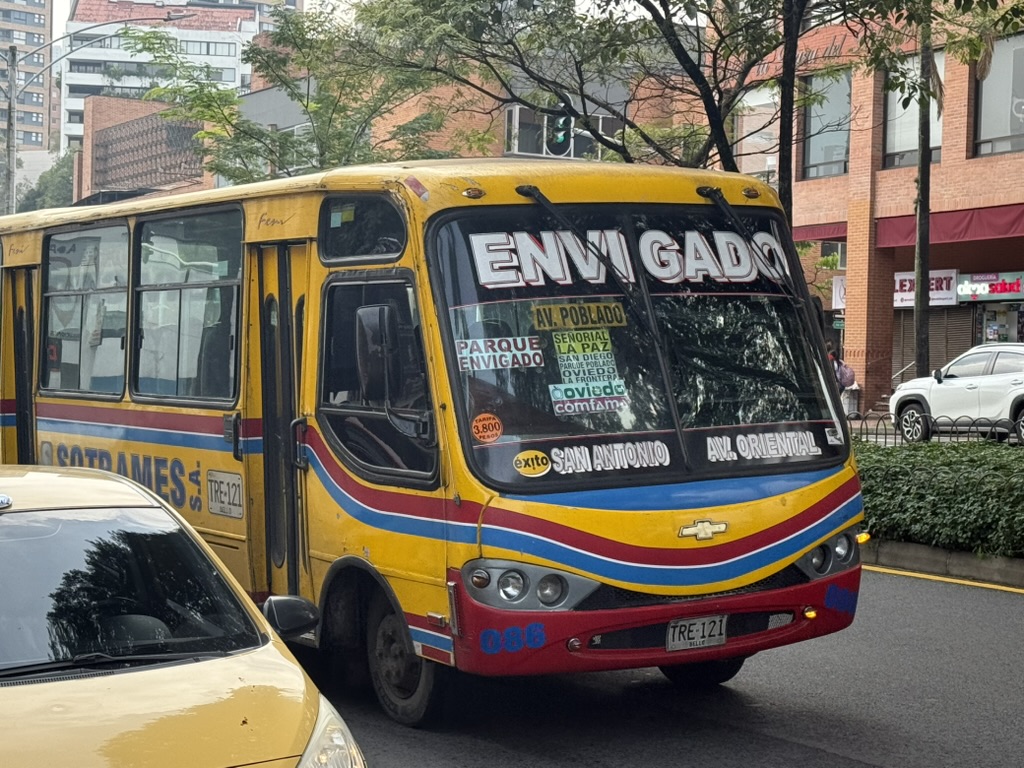
Pero también existe una red más antigua de buses que irradian desde el centro de la ciudad, circulando principalmente en tráfico mixto por las calles. Se reconocen fácilmente porque el nombre del sector que atienden suele estar pintado directamente en el bus, lo que indica que existen muchas empresas, cada una con un territorio geográfico limitado. Por ejemplo, los buses para los municipios del sur como Envigado y Sabaneta salen desde el centro hacia el sur, duplicando en gran medida la Línea A del Metro, antes de ramificarse para atender distintas zonas de estos municipios.
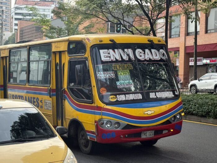
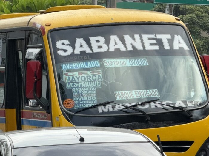
La mayoría de estos servicios hacen algo que también se podría hacer tomando el metro y transbordando a un bus verde. Por ejemplo, si uno va desde el centro hacia un punto del municipio de Sabaneta, al oriente de la línea férrea, puede tomar la Línea A del Metro hasta el final en La Estrella y luego un bus alimentador, O puede tomar el bus amarillo de Sabaneta directamente. En este último caso, se evitará la molestia de cambiar de vehículo, pero también tendrá que soportar el tráfico durante casi todo el trayecto, mientras los trenes del metro pasan a toda velocidad a su lado. Por supuesto, los buses más antiguos también hacen cosas que la red metro+alimentador no hace tan bien. Los alimentadores del metro no llegan a todos lados, y sin duda hay viajes y horarios en los que los buses más antiguos son tan directos que resultan más rápidos aunque estén atrapados en el tráfico.
Mientras tanto, la red metro+alimentador es algo rígida y tendrá dificultades para adaptarse a medida que la red se vuelva más descentralizada, ya que el supuesto de que la red siempre sería radial orientó el diseño de la infraestructura. En la estación Poblado de la Línea A, por ejemplo, hay dos terminales de buses integrados en la estación, uno en el costado oriental y otro en el occidental. Se pueden ver buses alimentadores esperando en ambos extremos, aunque desde arriba parecen más azules que verdes.
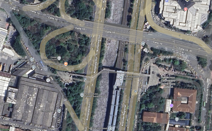
La estación Poblado de la Línea A del Metro se ve aquí justo a la derecha del río. Un puente peatonal conduce al oriente y al occidente hacia las terminales de buses. Nótese cómo los buses solo pueden acceder a las terminales dando la vuelta. Un bus que cruzara la ciudad de oriente a occidente por la Calle 10, como requeriría una estructura en cuadrícula, no podría detenerse en la estación.
Los alimentadores del costado occidental de la estación sirven zonas más al occidente, y los del costado oriental sirven zonas más al oriente. Esto funciona bien cuando podemos imaginar que todos se dirigen a la estación de la Línea A. Pero ¿qué pasa cuando aparezca la Línea E, circulando de norte a sur más al occidente, y alguien al oriente de la Línea A quiera llegar a ella? No va a ser fácil, porque toda la infraestructura fue diseñada bajo el supuesto de que los buses que servían la estación siempre terminarían allí. Esta persona que viene del oriente de la estación tendría que tomar un bus verde desde el oriente de la línea férrea hasta la estación, luego cruzar la estación caminando hasta la terminal del costado occidental, y tomar otro bus verde para continuar. Tiene el mismo problema que existe con las Líneas B y T en San Antonio: necesita transbordar para seguir en la misma dirección, y eso implica varios transbordos para completar muchos viajes probables en un patrón de cuadrícula.
Es difícil imaginar la infraestructura que resolvería este problema. Todo en esta zona está diseñado bajo el principio de que los costados serán alimentados hacia la troncal, pero nunca necesitarán cruzarla. Y sin embargo, la Línea E pronto aparecerá, y este problema aparecerá con ella.
Conclusión
Si estuviera asesorando a Medellín, trataría de crear un espacio de trabajo donde pudiéramos al menos trazar y analizar cómo podría verse una red completamente integrada, y qué podría lograr, para que la gente pudiera ver cuánta mejora sería posible sin aumentar el subsidio operativo. Puedo imaginar las complejidades que encontraríamos. Por ejemplo, la Línea A del Metro está congestionada y probablemente no podría absorber a todos los que actualmente usan los buses que la duplican. Pero la línea en sí tiene capacidad de reserva: con más trenes, podría operar con mayor frecuencia, y por supuesto se podría considerar la automatización para aumentar aún más la frecuencia si fuera necesario. Así que no pretendo que sea fácil. Pero sé que descubriríamos posibilidades que nadie ha considerado, porque siempre ocurre así. A pesar de todas sus llamativas tecnologías, la próxima gran mejora en el acceso a oportunidades solo puede surgir de hacer más efectivos los abundantes servicios de bus. Con el tiempo, eso significará una sola red de servicios que funcione de manera integrada.


