Maps

Bus Service in England: The Need for Clearer Maps

Map of Cambridge bus services, showing the extreme complexity.

When different operating companies all plan their own bus service, the combined network is really complicated!

It’s a time of rapid change for urban bus services in England.[1]  Since Margaret Thatcher’s privatization reforms of 1985, these services have been subsidized but not really controlled by government.  I wrote here about Thatcher’s vision for privatized public transport, including why it has been teetering for some time and is now being swept away.

Now, all over England, governments at the county or shire level have been looking at whether and how to take control of their public transport, so that they can offer coherent networks and fares, integrate public transport planning with town planning, and ensure accountability to the public.  Right now, most of these conversations are happening at a procedural level, but now it’s time to look at maps, and try to figure out what an improved and integrated network would actually look like geographically.

Right now, though, maps are a problem.  As we have wandered the transport websites of the UK, we’ve found maps by operating companies, showing only their services, but a shortage of good maps done by governments showing how all the services interact.  So we drew one, as an example, and a lot can be learned about England’s challenge by staring at it for a bit.

On my tour of the UK last summer, I spent a day in Cambridge, site of one of the UK’s most elite universities.  I was fortunate to be hosted by Andrew Highfield, an assistant director at the Cambridgeshire-Peterborough Combined Authority (CPCA), which manages transport for Cambridgeshire and its cities.  If he hadn’t been showing me around, the service would have been incomprehensible.  Many operating companies, trained to see each other as competitors, intersect here and cover different parts of the shire.  They have their own signs and shelters, each advertising their own services, and each draw maps of just their own services, if they draw maps at all.

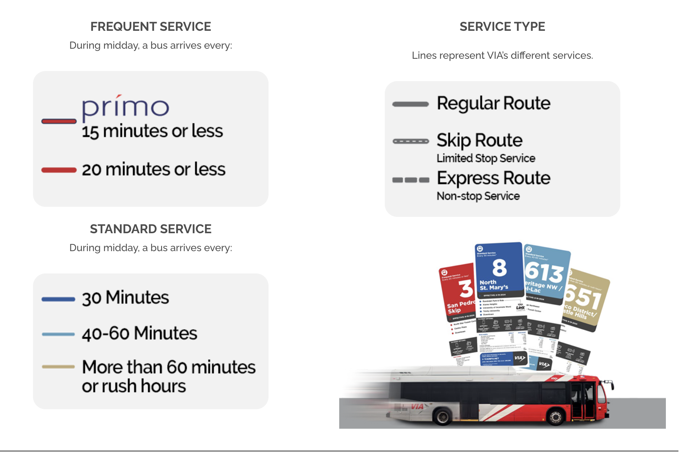
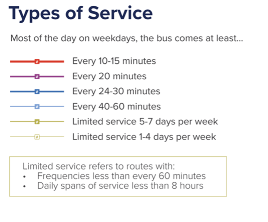
After my visit, the CPCA commissioned us to draft a map for them.  Our mapping style focuses on what matters to the customer and not what matters to anyone else.  Instead of highlighting operator brands, we highlight frequency, the single most important variable about a service that is not always shown on maps. We use hot colors for high frequencies so that these jump out visually against the background complexity of lower frequency services.

Here is a PDF of our map.  As you can see, it’s very complicated, but the complexity of the service, as it’s evolved through the privatization era, is part of the point.

Since I’m now going to make some observations about the network, I should first announce my ignorance.  I can’t claim to know Cambridge that well.  I’ve spent a day there, and haven’t explored the shire around it at all, though of course I’ve poked around in aerial maps and Street View.  So nothing I say here should be taken as a recommendation.  Only at the end of long study of the network, and many conversations with local people, would we be in the position to do that.

However, this map should be useful for people in Cambridgeshire to understand what they have, and to think about how well it fits with the demands of the communities that they know well.  So the most important point of this article is: Every local authority should have a map like this!

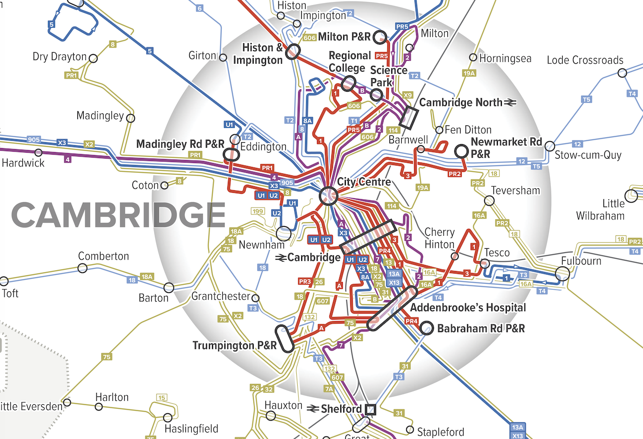
What can we see?  First, let’s zoom into a slice of Cambridge itself.

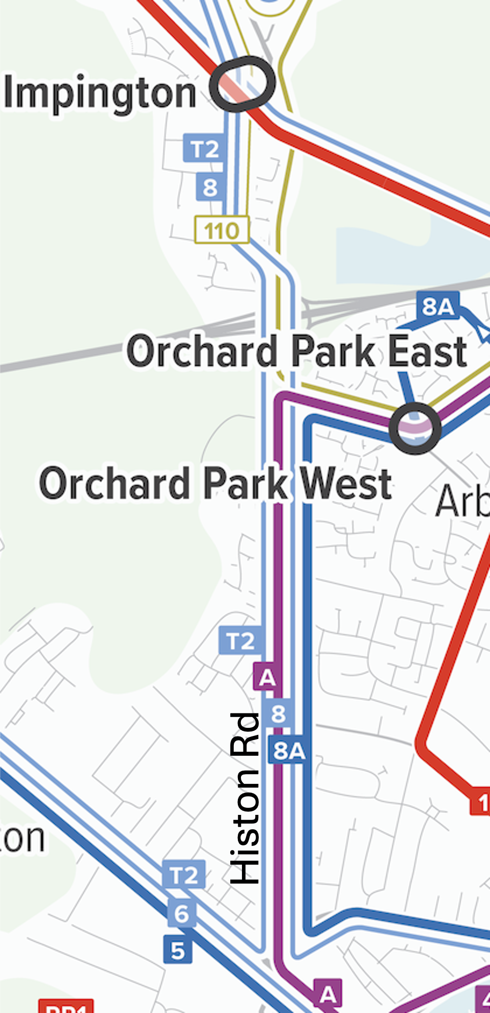
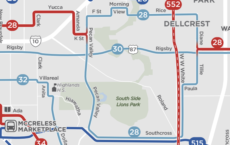
Overlapping services on Histon Rd. in the NW of Cambridge

One of the first things I look for in a network is heavy overlap of low-frequency services, because this means there’s enough service to deliver a higher frequency if the service were organised differently.   So looking at our map of Cambridge, my eye immediately went to Histon Road in the northwest part of the city, served by A, 8, 8A, and T2

There’s enough service here to deliver a frequency of every 10 minutes or better, but instead there are four blue or purple lines, indicating less frequent services overlapping.  This means long gaps at some times and a pile of buses running together at other times, even when everything is running on time.  These routes look like they were drawn separately, by different people at different times with different goals, which is not what you do when you’re trying to build an integrated and efficient network.

Histon Road, by the way, looks like this, mostly the two-story built form typical of urban fabric in much of the British Isles, more than enough to generate demand for service that’s always coming soon.

What these people have now, in return for low frequency and uneven spacing of buses, is direct buses to lots of places.  Is that better or worse?  In most cases, higher frequency, even requiring connections, delivers better access to opportunity.  But an actual network plan would be the chance for the community to consider these tradeoffs and figure out what they want.

Cambridge’s Park-and-Ride structure is also interesting.  Because space is limited in the city centre and car parking is expensive there, park-and-rides around the edges are designed to intercept motorists from the surrounding area, giving them a cheap way to get to Cambridge without contributing to its traffic and parking demand.  What’s more unusual is that these facilities have their own dedicated direct routes, with numbers starting with “PR” that run frequently all day.  Other local routes may duplicate them for a long distance:

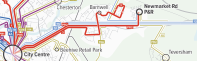
Routes 3 and PR2 can easily be described as being different services with different markets, but we usually get the best public transport for everyone by maximizing the diversity of people on any one vehicle.  So it’s more common to serve Park-and-Rides with peak-hour services to provide high capacity where demand is high, but to provide a more basic service at other times, one that serves other markets along the way.  (For example, should those intercity buses, 12 and T5, stop at the P&R to contribute to a total frequency product with less duplication?  Maybe.)  Again, I am not making a recommendation here!  That would only come after much more study of demand and some public conversations about goals.  But this may be an example of over-specialized service, one whose market is too narrowly targeted to justify being served with these nonstop links.

Now let’s zoom out to the whole map.

It’s rare to see 10-minute frequency on a long intercity link, but there’s one here, formed by A and B from St Ives into Cambridge, running in the Cambridgeshire Guided Busway.

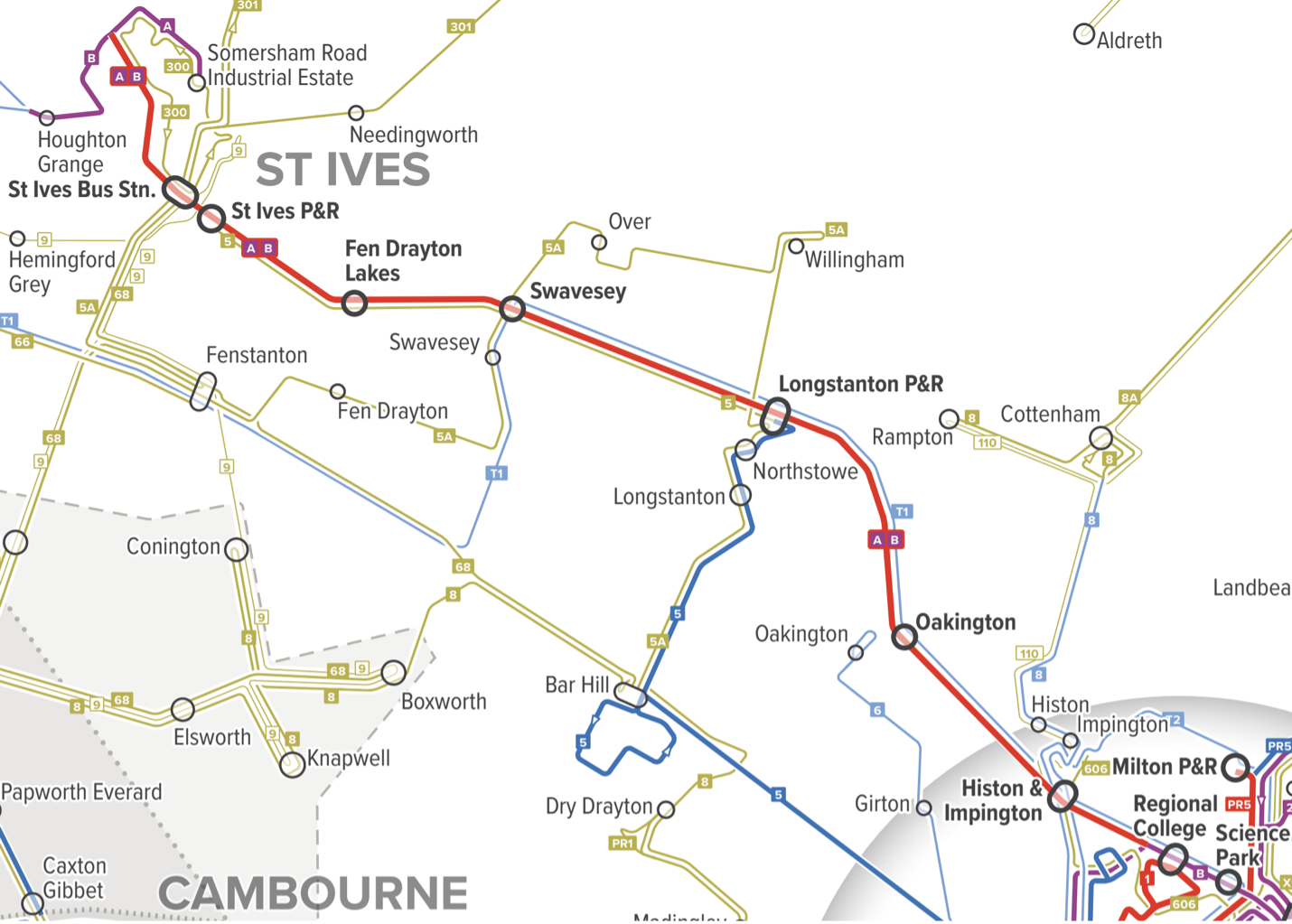
But as it approaches Cambridge in the lower right corner of this map, it splits into two purple (every 20 minutes) branches, which later rejoin in the city centre.  So there’s frequent service along the rural link, and to central Cambridge, but not to anywhere in northern Cambridge.  This makes some sense from a commute perspective, since there are commute destinations on both branches, but when you’re trying to organise service within a city, the key is to build up simple patterns of high frequency rather than piles of different routes.  So it’s awkward to have the frequency go down, because of the branching, right as the line from St Ives reaches the area of highest demand.  Maybe this is the right pattern, but it deserves a closer look.

Finally, with our map you can marvel at the incredible complexity of rural services in England:

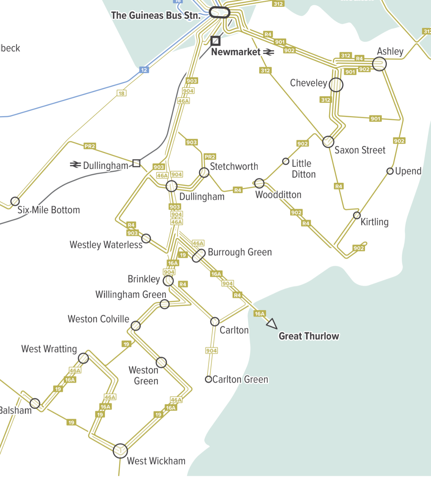
Most of these are one or two trips per day, many scheduled around schools but open to the public.  Some are just a few days a week.  It is hard to call this a network, because these services are mostly not intended to work together.  Instead, each looks micro-designed around a particular constituency.  Could this system be much simpler and thus more frequent — running, say, a few times a day instead of just once or twice?  Possibly, but again, it would require a full plan engaging the community.  My goal here is just to reveal the patterns that suggest possibilities, and to show why our mapping style is key to showing you what you have.

Update:  I will be in the UK for most of September 2025, continuing to promote my book!  Let me know if you have an event idea or if your organisation would like to sponsor a short training course.


[1]  Transport in the UK is a “devolved power,” which means that policy can be different in England, Wales, Scotland, and Northern Ireland, not to mention the various other semi-autonomous islands.  This means that Wales, Scotland, and Northern Ireland govern transport through their own parliaments, but the UK government plays the same role for England, since there is no separate English government.   (About 83% of the UK population is in England.)

San Francisco Bay Area: A Consistent Regional Mapping Standard?

In the San Francisco Bay Area, the regional transportation planning body, the Metropolitan Transportation Commission (MTC), has launched a major effort to improve the coordination between the region’s 27 transit agencies.  One element of this, just unveiled, is a regional standard for transit network maps.  The goal is to have all of the region’s maps evolve toward the same style, so that it’s easier to explore the entire region’s network.

MTC has now released the first sketches of the design standard, which you can find starting on the 20th slide of this document.  I’m generally delighted.  The recommendations look very much like what I’ve been promoting for years: reds to denote high frequency (15 minutes or better) and less prominent colors for lesser frequencies.  They 0bserve that three major transit agencies in the region already do this.

We’re flattered!  We drew AC Transit’s map, and probably influenced the other two, as we helped San Francisco MTA (SFMTA) with service branding and also led the redesign of the VTA network, both in the mid 2010s.  Our study mapping for our VTA network redesign was all in this style.

Here are the proposed colors of the regional standard:


In our maps we use those reds with those meanings, but I’m puzzled by the two blues. To me, that darker blue is more prominent and eye catching than the light blue, so shouldn’t it represent the higher frequency? In all of our firm’s maps, we use pale blue to represent a lower frequency than dark blue, but I’m curious if others disagree.  Here is our public-facing map of San Antonio, for example.

Finally, whenever you use color to show frequency, you have the problem of what happens when the frequency changes along a line, often because of branching.  The draft MTC standard shows this example for where a red line, representing the combined frequency from two overlapping routes, separates into two blue lines:


We’ve learned from long experience that most people need more help understanding that the route continues even as the color changes, mostly because people have seen many other maps where colors distinguish the routes from each other.  So we always show a fade from one color to the other, as in this San Antonio example where Route 28 separates and rejoins:

We also make sure there’s a legend item clarifying this:

So anyway, that’s what we know about transit mapping.  We hope MTC thinks further about these details before imposing a regional standard.

So if you’re in the Bay Area, and you want to share your own comments with MTC, this page has an email address to write to.  Click “Public Engagement and Staff Contact” partway down the page.  But this is a great initiative!

San Antonio Welcomes New Map with a Splash


Source: Landing page for new system map at website of Via in San Antonio, at https://www.viainfo.net/newmaps/

For a couple of years now, our firm, which is mostly known for transit planning consulting, has also been making network maps for transit agencies.  Not “interactive maps,” which invite you to chase flickering, vanishing content around a little screen, but good old physical maps — the kind you can post in a bus shelter, or on your wall.  Like most of what we do, there’s an advocacy angle: Even in the age of trip planners, we really believe in static maps.  They help people see the structure of the network and how it works with the structure of the city. They invite exploration.  And they are especially useful for educating all the decision-makers in the community who do things that affect public transit, like deciding where important destinations will be located.

So we’re really excited that our map for San Antonio’s transit agency Via is not just published, but published with a splash, welcoming everyone to “the new colors of the city.” Those colors, of course, are our firm’s usual way of showing frequency clearly. Hot colors for high frequency, because those catch the eye, and cooler colors for lower frequency.  A slightly darker red signals the Bus Rapid Transit service, locally called Prímo.

Finally, here’s a bit of the map, but you can download the whole thing here.

Those dark red lines are the frequent network, where service is always coming soon.  Want to build something that will need transit?  Build it on those red lines!  Thinking of relocating and want transit to be good?  Locate there!  Sending that signal is one of many reasons that transit agencies should still have beautiful static maps, and spread them far and wide.


Transit System Maps Still Matter

A slice of our system map for AC Transit.

A slice of our system map for AC Transit.

As transit information tools have gotten better, some transit agencies have stopped offering a system map to the public.  Often, a website offers me trip planning software and route by route timetables, but not a map.  If it’s there, it’s often difficult to find.

We think system maps are essential.  They’re not just for everyday navigation.  They’re for exploration and understanding.  Some people prefer narrative directions, but many people are spatial navigators, and they need maps.  They’ll understand details only if they can see the big picture.

Another way to think about system maps is that they show you where they could go, and how.  They give you a sense of possibility.  (It’s the informational dimension of access to opportunity.)  Maps also show visually how different services work together.  Finally, good system maps help people make better decisions about where to locate, or even where to build things.

One of our most fun projects this year was a new system map for AC Transit in greater Oakland, California.  You can see the whole thing, including its legend, here.  (To be fair, we’re not the only people who do these. Our friends at CHK America do them, and I also love the work of the European designer Jug Cerovic.)

The style of this map is very similar to that of the maps that we’ve always used in our planning studies.  The key is the visual hierarchy that makes frequent lines more prominent than other lines, and makes all-day lines more prominent than peak-only lines.  (In older standard mapping styles in this region, peak-only express lines were often the brightest red, even though they don’t exist the vast majority of the time. It was very confusing.)

As transit planners, we use this style for all of the maps that appear in our studies.  In fact, red=frequent in absolutely everything we do, whether it’s a map, a chart, a planning game toy, or a pen used to draw routes inside a course or workshop.

We take pride in having been among the first to bang this drum.  I was making the case back the 2000s (really, in the 90s) and there’s a chapter on it in my book.

We’re excited to be in the business of public-facing system maps.  They don’t have to be this precise; they can be done at various levels of design at various costs.

But if a system map doesn’t exist, people can’t understand all that your transit system can do.

Helsinki: A Transit Map by Jug Cerovic

A while back I did a post on the subway maps of the Paris-based Serbian designer Jug Cerovic.  His style is to look for distinguishing features in the geometry of the network structure, and highlight these to give a sense of order.

He has a new one of Helsinki …

helsinki-metro-map-v-1-3

… but the cool thing is not just the map but his explanation of his design process, which I highly recommend.


The Pleasure of Track Maps

If you’ve never seen a subway track map, I suggest you look at this one, for New York, by “radical cartographer” Andrew Lynch. Most track diagrams are not to scale, and look like they’re meant to make to make sense only to insiders.  But this one is beautiful.
nyc track map b


What’s more, it’s accurate in geographic scale, though of course the separation of tracks can’t be on the same scale as the network.  Still, New York’s subway is both huge and full of details, so this is no mean feat.  Only 22 insets were required, to zoom in on tricky segments.

Gazing at a good track map can give you an appreciation for the heroics involved in moving trains around in this limited infrastructure. Switches and extra tracks are very expensive underground, which is why they are never where you need them to handle a particular incident.  This, for example, is why a track closure at one station may continue through several stations nearby.

Gaze at this piece of the Bronx, and marvel at what a train would have to do to get from Jerome Yard to a station on the Orange (B+D) line.  I presume they don’t have to do this very often, but in a pinch, they can.

nyc track map a

I spent a delighted hour with it.

Luxembourg: A New Official Frequency-based Map

Maps that help people see which services are coming soon are remarkably rare in Europe, for a variety of complex reasons.  Some European systems have such high frequency overall that it may seem unnecessary, but there are usually still significant frequency contrasts that matter.

luxemburg map jug cerovic

Now, there’s a great example out of Luxembourg.  The Paris-based Serbian designer Jug Cerovic has been featured here before, for his interest in making networks clearer by emphasizing a core geometric idea.  Not just for beauty, but as a way of combatting the mental overload that complex maps can cause.

Luxembourg’s transit system has just rolled out an official network map by Cerovic.  It highlights frequency with wide lines, including such details as how wide frequent lines split into narrow infrequent ones.  (Detailed PDF is here.)

unnamed-3

Obviously this is a diagram, seeking network clarity rather than precise fit with local geography. The core geometric idea is the pentagon, a feature of the Luxembourg CBD that he uses, but not to excess, in arranging patterns. He explains his design process here.

UPDATE:  For comparison, this was the previous map. (H/t @ParadiseOxford)

Luxembourg map old

Portland: New Transit Map Underscores Frequent Network

By Evan Landman

Evan Landman is an associate at my firm, Jarrett Walker & Associates, and serves as a research assistant and ghostwriter on this blog. He tweets on transit and other Portland topics at @evanlandman

For years on this blog and in our projects, we've stressed the importance of highlighting and emphasizing transit agencies' Frequent Networks on customer information of all kinds.  Portland's agency TriMet has traditionally been a best practice example here, given their extensive Frequent Network branding down to the individual stop level, but curiously, their system map has not embraced this idea so wholeheartedly. Today, TriMet's new system map changes that, introducing a cleaner, more readable map, which does a much better job of highlighting the agency's premier bus services. 

Let's compare the two, starting with the old map that has just been retired:

Screen Shot 2015-09-30 at 3.57.57 PM

Portland Central Eastside, TriMet map (early 2015)

This Southeast Portland shows the core of the city's Frequent Network. The Frequent Network is symbolized with a thicker line weight, but every line still has its own individual color, presumably to make it easier to trace each individual line across the network. However, the effect of this choice distracts from the important information contained in the line weight property, because the wide diversity of bright colors climbs to the top of the visual hierarchy, though the colors communicate nothing about the nature of the service on each line. 

The legibility of the map is not aided by the large number of points of interest shown, with both text and symbols frequent overlapping the most important features (the transit routes). TriMet's old map was certainly not a bad transit map by any means, and deserves enormous credit for being one of the first to explicitly show frequency at all, but in the years since, many of TriMet's peer agencies around the country have focused even more heavily on frequency to produce truly useful and innovative maps.

Now compare the image above with the same area of the new map:

Screen Shot 2015-09-30 at 3.57.38 PM

Portland Central Eastside, TriMet map (late 2015)
 
This is a map that truly focuses on communicating the usefulness of the transit routes. The most important factor for usefulness is frequency, which is obscured when every line on the map is the same color, or a different color, or colored by a less important attribute, like which corner of the city it serves. 
 
Here, weight and color are both deployed to differentiate the Frequent Network (heavy, dark blue) from other less frequent routes, but without the riot of color of the older map. When we compare the legends of each, the difference is subtle, but the when deployed on the map, the difference is dramatic.
TriMet Map ComparisonThis new map makes one thing very apparent: anywhere near a thick, dark blue line, a bus is always coming soon.
 
It is also a clearer, more traceable map! Where the old version employed the common convention of using color to distinguish routes and make it easy to tell where they travel across the city, the new map uses line displacement and simplification in a much more sophisticated manner to accomplish the same task.
 
For example, examine the path of the 10-Harold: on the old map, its line appears to end at Hawthorne and 12th, where it joins the 14-Hawthorne to head into downtown (it's actually beneath the 14's line, if you look closely). With the new map, it is much clearer that this route overlaps with the 14 in this segment, just by the way in which the two lines have been separated from one another. Now that color is now longer necessary to distinguish each route, it can be used for a more important purpose: showing frequency.
 
Apart from the increased focus on frequency, this map also succeeds by reducing the amount of non-transit information, with fewer points of interest labeled. Those that are present have symbols and labels drawn with a brown color much closer to that of the map's background, reducing the effect of collisions with transit features, and diminishing the level of visual "noise" competing with the transit network structure for the reader's attention.
 
It's fantastic to see an agency like TriMet continuing to work to improve its customer information. Even in the age of real-time data and mobile trip planning, a transit agency's map is often the only place where the entire system is documented in a way that an average person can understand. City transit networks are complex, and the best maps, like TriMet's, are designed to reduce that complexity, focusing on the most important aspects of the service for the people who ride it. 
 

Can Design Learn from the New Zealand Flag Debate?

If you care at all about visual communication — and if you aren't blind from birth, then you do — you should be following the remarkable debate about the New Zealand flag.  National flags are so enduring that it is hard to imagine a graphic design task with higher stakes.  Revising one triggers a profound argument about national identity, which ultimately comes down to a couple of questions:

  1.  One or many ideas?  Can the nation come together around one image or idea, or must there me a mash-up of several to satisfy different groups or points of view?
  2.  Fashionable or enduring?  Graphic design is so much about fashion and fun that identifying an image that will make sense for decades is harder than it sounds.  Yet that's what a flag must be – and the greatest company logos have mastered this challenge as well.

To review, the current New Zealand flag looks like this:

2000px-Flag_of_New_Zealand.svg

The Union Jack and the Southern Cross, the latter a distinctive constellation that is also on Australia's flag.   (With all due respect to defenders of this flag, both images are about New Zealand's tie to other countries, countries that the nation's identity has lately been separating from. I also understand the view that flags should never change on principle; that is a different debate.)

The New Zealand flag seems disconnected from the evolving palette of national identity.  National  imagery rarely uses the flag's colors.  Sometimes it uses blue-green colors that echo the textures of the landscape; you will find these in the customs hall at Auckland Airport for example.  Increasingly, though, the government uses black.  The association of black with New Zealand comes from another image that is so universal that some visitors probably think it's the flag already:

2000px-NZ_fern_flag.svg

This image is most common in sports, as it's the logo of most national teams including the famous All Blacks of rugby, but it long ago spilled over into the general consciousness as an unofficial symbol of the country.  

If I may reveal botanical interests more suited to my other blog, this is not just any random leaf or frond.  It's based on the underside of the spectacular Silver Fern, Cyathea dealbata, one of the  tree ferns that define so many New Zealand rainforests (top on left, underside on right).

P1090269

Sports and tree-hugging in one image!  This would seem to make the silver fern a winner across the cultural spectrum.  It might also remind you of another former British colony that tired of its Union Jack, and forged a new identity out of botany:

Flag_of_Canada.svg

The Canadian flag was adopted in February 1965, so it just turned 50.  Like the Silver Fern in New Zealand, the maple leaf had been hanging around in Canadian imagery for a while.  So it's not surprising to see the fern so prominent in New Zealand flag ideas.

So how has the debate gone?  Well, the government's earnest committee canvassed the country and came up with these semi-finalists:

New_zealand_flags_01-818x635

It's remarkable how much consensus there was on which images matter: the Southern Cross, a gesture toward the old flag, plus two main expressions of the fern: the frond and the spiral form called the koru.  (The latter, common in Maori imagery, is based on the shape of a frond as it just unfurls.)  

When you look at that field of contenders, does your eye go to the busier ones or the simpler ones?  Mine went to the simplest, the ones with a single idea, not a collision of several, and the ones that looked enduring by virtue of not trying to be sexy.  For that reason, the original silver-fern-on-black still looked right to me.  

But the people who chose the four finalists felt differently:

Four-promo

… at which point, all hell broke loose.  There are many complaints, including that three of the four are too similar to represent a choice, and that #2 is already selling plastic plates:

But the real problems are these:

  • #2 and #4 are both mash-ups, obviously collisions of multiple unresolved ideas.  A mash-up suggests that the country is too divided to revere any single image.  If Canada — a far more diverse country in terms of landscapes and identities — could avoid this mistake, New Zealand certainly can.  (British Columbia is another matter …)
  • Except for #3, they are all over-designed, with an attention to today's graphical fashions instead of any thought about what might stand the test of time.  This is equivalent to saying that they call attention to the designer.

What do you gain, designer of finalist #1, by flipping half of the silver fern image into negative, and making the frond leaflets more rounded so that they no longer resemble the plant?  How is this better than the simple silver fern on black?  Only that a graphic designer obviously designed it, in a way that is supposed to look cool.

But a flag is supposed to outlast its designer, and the design fashions of the moment.  Remember, the Canadian flag was designed in the 1960s.  If their design competition had been seeking something as "contemporary" and "designed" as New Zealand's final four, they might have found inspiration in one of these:

Images-2

13340495-flower-power-groovy-psychedelic-hand-drawn-abstract-notebook-doodle-design-element-on-lined-sketchbo

Flower-power-groovy-psychedelic-hand-drawn-notebook-doodle-design-elements-set-on-lined-sketchbook-paper-background-vector_100479673

Fortunately, they didn't.  You can't tell, looking at the Canadian flag, that it's an artefact of the 1960s, and that's the whole point.  A flag has to have a sense of timelessness and simplicity, which is why you must reject  any design that calls attention to the cleverness of the designer or relies on design fashions of the moment.   The creativity it requires begins with the willingness to disappear as the creator.  None of the finalists displays this.  

How is this debate relevant to this blog's concerns in public transit?  If you really want to sell public transit, teach people to count on it.  Make it seem solid and enduring, not just sexy and ephemeral. Go for the simple, solid idea that will still make sense — practically and aesthetically — decades from now.  

London-underground-tube-train-sign-blank-english

And this principle extends even beyond graphic design, to debates about whether transit technologies should be chosen for "fun" or reliability.  

Do you notice how insecure companies change their logos and liveries more often than confident ones do?  Do you notice how they use flashy look-at-me images instead of clean and enduring ones?  

Flashiness, fun, and novelty may attract customers, but only simplicity and reliability retains them. Which message do you want to put forth about your transit system, or your country?