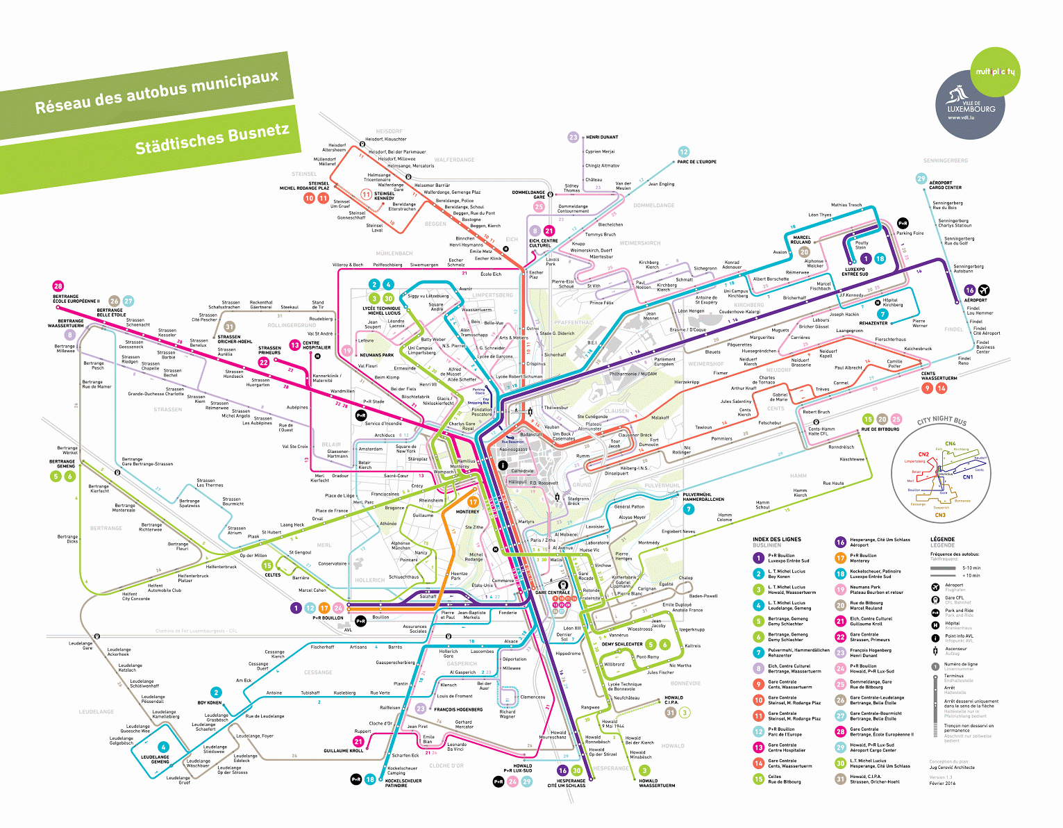
Maps that help people see which services are coming soon are remarkably rare in Europe, for a variety of complex reasons. Some European systems have such high frequency overall that it may seem unnecessary, but there are usually still significant frequency contrasts that matter.

Now, there’s a great example out of Luxembourg. The Paris-based Serbian designer Jug Cerovic has been featured here before, for his interest in making networks clearer by emphasizing a core geometric idea. Not just for beauty, but as a way of combatting the mental overload that complex maps can cause.
Luxembourg’s transit system has just rolled out an official network map by Cerovic. It highlights frequency with wide lines, including such details as how wide frequent lines split into narrow infrequent ones. (Detailed PDF is here.)
Obviously this is a diagram, seeking network clarity rather than precise fit with local geography. The core geometric idea is the pentagon, a feature of the Luxembourg CBD that he uses, but not to excess, in arranging patterns. He explains his design process here.
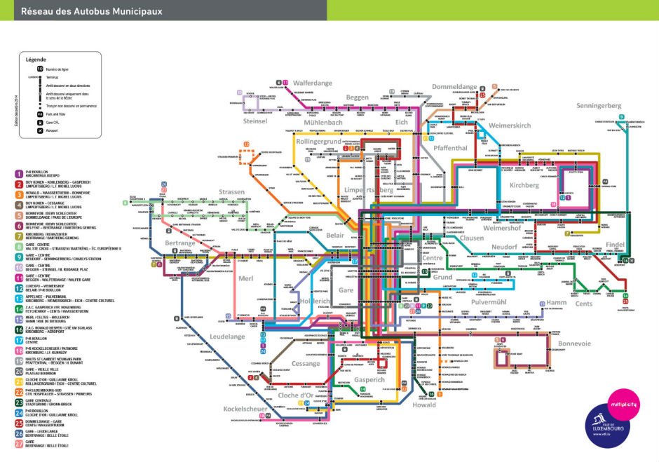
UPDATE: For comparison, this was the previous map. (H/t @ParadiseOxford)


I like the use of colors on this map so that readers can easily follow an individual line’s route. Maps of larger bus networks that do not differentiate routes by color have limited usefulness. They are more cluttered due to an abundance of route number labels, and it’s hard to follow a route’s path without the plethora of labels along the route. The result: occasional transit customers conclude the system is too confusing because they are unable to quickly grasp the accessibility offered by the lines near their home or work location.
We can have the best of both worlds. Differentiate high-frequency service from the rest of the network with thick lines and with larger, distinctive number (or letter) labels. Differential rail from bus by showing rail as a hashed line rather than a solid one. Differentiate low-frequency and non-structural peak-only service with the thinnest line weight.
Now for color. As in gardening, reds, oranges and yellows “pop” or move to the foreground, while blues, lavenders and greens recede to the background. So,use warm colors for frequent services and cool colors for standard services. the combination of line weight and warm colors will lift the frequent network above the rest of the system so that the frequent network is easily grasped in its entirety while simultaneously allowing readers to instantly see the route of an individual line.
Much better than the previous map, however still a very big problem: The map does not display WHERE the buses go. The San Fransisco map is much better for this reason.
OOps. Missed the Reply button. See comment below.
@swim: I’m not clear on what you mean when you write that the map doesn’t display WHERE the buses go.
it’s written in the legend, plus you can see it on the map, just look at the number.
@Swim I wonder. The small circle center right is the night bus routes. Is that a geographic representation? So how about another circle with the line weight proportions and colors from the system logic map but none of the stations in another perhaps somewhat bigger circle drawn geographically. Then add some words some way to identify geographical landmarks or neighborhoods.
I think what Swim meant is that there are no street names written next to any of the lines, so unless you already know where they go you might not know where to actually go to board the line you want. Compare with San Francisco, where on the map you know that Route 5 foes down Fulton Street because it says Fulton Street on the Transit Map. It’s a common problem with schematic rather than geographic maps.
I recently used the NYC subway map as a good example of how to tell you where the system takes you. I’m not saying the NYC subway map is perfect, but despite not being totally geographically accurate, the fact it overlays some of the street grid and some major landmarks (such as the Met) makes it really easy to use not just to navigate the system itself but to give you a sense of where you’ll be once you get to the other end. Because absolute distances aren’t to scale, you might get burned on deciding to get off and walk to your final destination rather than making a transfer to a line that gets you closer to where you’re trying to go, but in a bit more of a relative sense, you can tell where you’re going to wind up without having to already be familiar with the city.
The DC Metro map is, on the other hand, a great example of a map that is really just almost useless for anything other than navigating the system itself. It gives you EXTREMELY little information about where any specific stop actually is if you don’t already know. It’s also even worse than NYC’s map in terms of distorting distances to the point where two stations which are actually quite a long walk apart can be made to look pretty close together, making the ability to figure out “should I make a transfer or should I get off and walk” problem even worse than it is in NYC.