Values

Basics: The Ridership – Coverage Tradeoff

Is your transit agency succeeding?  It depends on what it’s trying to do, and most transit agencies haven’t been given clear direction about what they should be trying to do.

This post revisits a basic topic at the core of transit planning decisions that everyone engaged in conversation about transit should understand.

In the fictional town below, the little dots indicate dwellings, jobs, and other destinations. The lines indicate roads. Most of the activity in the town is concentrated around a few roads, as in most towns.

Imagine you are the transit planner for this fictional town. The dots scattered around the map are people and jobs. The 18 buses are the resources the town has to run transit. Before you can plan transit routes you must first decide: What is the purpose of your transit system?

Designing for Ridership

A transit agency pursuing only a ridership goal would focus service on the streets where there are large numbers of people, where walking to transit stops is easy, and where the straight routes feel direct and fast to customers. Because service is concentrated into fewer routes, frequency is high and a bus is always coming soon.

This would result in a network like the one below.

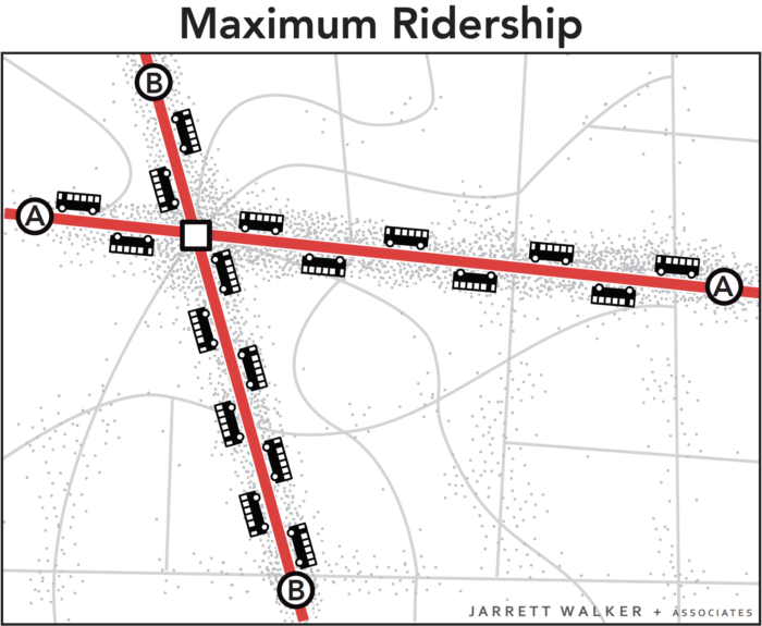
All 18 buses are focused on the busiest areas. Waits for service are short but walks to service are longer for people in less populated areas. Frequency and ridership are high, but some places have no service.

Why is this the maximum ridership alternative?  It has to do with the non-linear payoff of both high density and high frequency, as we explain more fully here.

Designing for Coverage

A network designed for ridership would not go to many parts of the city.  In the map above, someone who lived in the southeast part of town would not like this network at all.  That person is likely to want a network designed for coverage, not ridership.

In a network designed for coverage, the transit agency would spread out services so that there would be a bus stop near everyone. Spreading it out sounds great, but it also means spreading it thin.  The resources would be divided among so many routes that it wouldn’t be possible to offer much service on any of them.  As a result, all routes would be infrequent, even those on the main roads.  Infrequent service isn’t very useful, so not many people would ride.

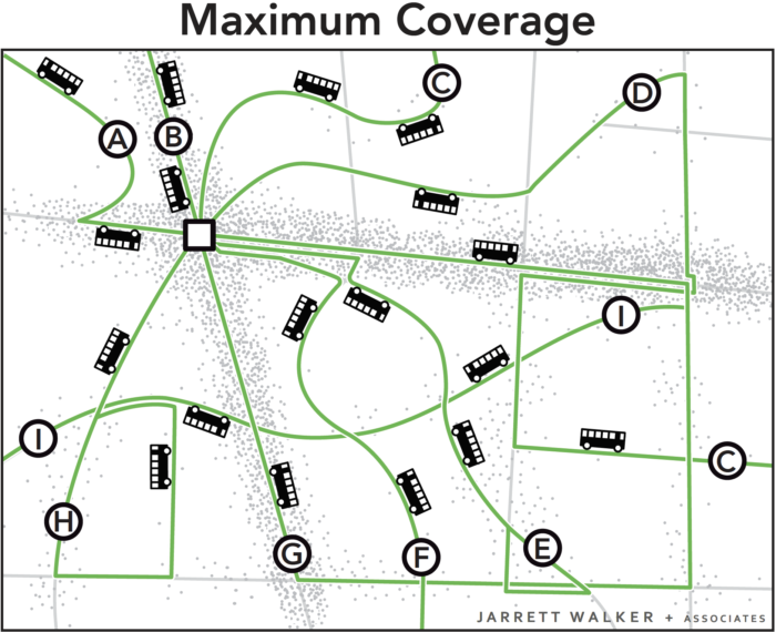
The 18 buses are spread around so that there is a route on every street. Everyone lives near a stop, but every route is infrequent, so waits for service are long. Only a few people can bear to wait so long, so ridership is low.

In these two scenarios, the town is using the same number of buses. These two networks cost the same amount to operate, but they deliver very different outcomes.

Both Goals are Important

Ridership-oriented networks serve several popular goals for transit, including:

  • Reducing environmental impact through lower Vehicle Miles Travelled.
  • Achieving low public subsidy per rider, through serving the more riders with the same resources, and through fares collected from more passengers.
  • Allowing continued urban development, even at higher densities, without being constrained by traffic congestion.
  • Reducing the cost of for cities to build and maintain road and bridges by replacing automobile trips with transit trips, and by enabling car-free living for some people living near dense, walkable transit corridors

On the other hand, coverage-oriented networks serve a different set of goals, including:

  • Ensuring that everyone has access to some transit service, no matter where they live.
  • Providing lifeline access to critical services for those who cannot drive.
  • Providing access for people with severe needs.
  • Providing a sense of political equity, by providing service to every municipality or electoral district.

Ridership and coverage goals are both laudable, but they lead us in opposite directions. Within a fixed budget, if a transit agency wants to do more of one, it must do less of the other.

Because of that, cities and transit agencies that lack adequate resources need to make a clear choice regarding the Ridership-Coverage tradeoff.   In fact, we encourage cities to develop consensus on a Service Allocation Policy, which takes the form of a percentage split of resources between the different goals.  For example, an agency might decide to allocate 60 percent of its service towards the Ridership Goal and 40 percent towards the Coverage Goal.  Our firm has helped many transit agencies think through this question.

What about your city?  How do you think your city should balance the goals of ridership and coverage?   There is no technical answer.  Your answer will depend on your values.

Further Reading

Jarrett Walker’s Journal of Transport Geography Paper, which first introduced this concept, is here.


Can Design Learn from the New Zealand Flag Debate?

If you care at all about visual communication — and if you aren't blind from birth, then you do — you should be following the remarkable debate about the New Zealand flag.  National flags are so enduring that it is hard to imagine a graphic design task with higher stakes.  Revising one triggers a profound argument about national identity, which ultimately comes down to a couple of questions:

  1.  One or many ideas?  Can the nation come together around one image or idea, or must there me a mash-up of several to satisfy different groups or points of view?
  2.  Fashionable or enduring?  Graphic design is so much about fashion and fun that identifying an image that will make sense for decades is harder than it sounds.  Yet that's what a flag must be – and the greatest company logos have mastered this challenge as well.

To review, the current New Zealand flag looks like this:

2000px-Flag_of_New_Zealand.svg

The Union Jack and the Southern Cross, the latter a distinctive constellation that is also on Australia's flag.   (With all due respect to defenders of this flag, both images are about New Zealand's tie to other countries, countries that the nation's identity has lately been separating from. I also understand the view that flags should never change on principle; that is a different debate.)

The New Zealand flag seems disconnected from the evolving palette of national identity.  National  imagery rarely uses the flag's colors.  Sometimes it uses blue-green colors that echo the textures of the landscape; you will find these in the customs hall at Auckland Airport for example.  Increasingly, though, the government uses black.  The association of black with New Zealand comes from another image that is so universal that some visitors probably think it's the flag already:

2000px-NZ_fern_flag.svg

This image is most common in sports, as it's the logo of most national teams including the famous All Blacks of rugby, but it long ago spilled over into the general consciousness as an unofficial symbol of the country.  

If I may reveal botanical interests more suited to my other blog, this is not just any random leaf or frond.  It's based on the underside of the spectacular Silver Fern, Cyathea dealbata, one of the  tree ferns that define so many New Zealand rainforests (top on left, underside on right).

P1090269

Sports and tree-hugging in one image!  This would seem to make the silver fern a winner across the cultural spectrum.  It might also remind you of another former British colony that tired of its Union Jack, and forged a new identity out of botany:

Flag_of_Canada.svg

The Canadian flag was adopted in February 1965, so it just turned 50.  Like the Silver Fern in New Zealand, the maple leaf had been hanging around in Canadian imagery for a while.  So it's not surprising to see the fern so prominent in New Zealand flag ideas.

So how has the debate gone?  Well, the government's earnest committee canvassed the country and came up with these semi-finalists:

New_zealand_flags_01-818x635

It's remarkable how much consensus there was on which images matter: the Southern Cross, a gesture toward the old flag, plus two main expressions of the fern: the frond and the spiral form called the koru.  (The latter, common in Maori imagery, is based on the shape of a frond as it just unfurls.)  

When you look at that field of contenders, does your eye go to the busier ones or the simpler ones?  Mine went to the simplest, the ones with a single idea, not a collision of several, and the ones that looked enduring by virtue of not trying to be sexy.  For that reason, the original silver-fern-on-black still looked right to me.  

But the people who chose the four finalists felt differently:

Four-promo

… at which point, all hell broke loose.  There are many complaints, including that three of the four are too similar to represent a choice, and that #2 is already selling plastic plates:

But the real problems are these:

  • #2 and #4 are both mash-ups, obviously collisions of multiple unresolved ideas.  A mash-up suggests that the country is too divided to revere any single image.  If Canada — a far more diverse country in terms of landscapes and identities — could avoid this mistake, New Zealand certainly can.  (British Columbia is another matter …)
  • Except for #3, they are all over-designed, with an attention to today's graphical fashions instead of any thought about what might stand the test of time.  This is equivalent to saying that they call attention to the designer.

What do you gain, designer of finalist #1, by flipping half of the silver fern image into negative, and making the frond leaflets more rounded so that they no longer resemble the plant?  How is this better than the simple silver fern on black?  Only that a graphic designer obviously designed it, in a way that is supposed to look cool.

But a flag is supposed to outlast its designer, and the design fashions of the moment.  Remember, the Canadian flag was designed in the 1960s.  If their design competition had been seeking something as "contemporary" and "designed" as New Zealand's final four, they might have found inspiration in one of these:

Images-2

13340495-flower-power-groovy-psychedelic-hand-drawn-abstract-notebook-doodle-design-element-on-lined-sketchbo

Flower-power-groovy-psychedelic-hand-drawn-notebook-doodle-design-elements-set-on-lined-sketchbook-paper-background-vector_100479673

Fortunately, they didn't.  You can't tell, looking at the Canadian flag, that it's an artefact of the 1960s, and that's the whole point.  A flag has to have a sense of timelessness and simplicity, which is why you must reject  any design that calls attention to the cleverness of the designer or relies on design fashions of the moment.   The creativity it requires begins with the willingness to disappear as the creator.  None of the finalists displays this.  

How is this debate relevant to this blog's concerns in public transit?  If you really want to sell public transit, teach people to count on it.  Make it seem solid and enduring, not just sexy and ephemeral. Go for the simple, solid idea that will still make sense — practically and aesthetically — decades from now.  

London-underground-tube-train-sign-blank-english

And this principle extends even beyond graphic design, to debates about whether transit technologies should be chosen for "fun" or reliability.  

Do you notice how insecure companies change their logos and liveries more often than confident ones do?  Do you notice how they use flashy look-at-me images instead of clean and enduring ones?  

Flashiness, fun, and novelty may attract customers, but only simplicity and reliability retains them. Which message do you want to put forth about your transit system, or your country?

How good are we at prediction?

Transportation planning is full of projections — a euphemism meaning predictions.  Generally, when we need a euphemism, it means we may be accommodating a bit of denial about something.

Predicting the future, at a time when so many things seem to be changing in nonlinear ways, is a pretty audacious thing to do.  There are  professions whose job it is to do this, and we pay them a lot to give us predictions that sound like facts.  I have the highest respect for them (all the more because what they do is nearly impossible) but only when they speak in ways that honor the limitations of their tools.

Good transportation planning does this.  at the very least, it talks about future scenarios rather than predictions, often carrying multiple scenarios of how the future could vary.  Scenarios are still predictions, though; they're just hedged predictions, where we place several bets in hope that one will be right. 

I will never forget the first time that I presented a proposed transit plan and was told:  "that's an interesting idea; we'll have to see how it performs."  The speaker didn't mean "let's implement it and see what happens."  He meant, "let's see what our predictive model says."  You know you're inside a silo when people talk about prediction algorithms as though they are the outcome, not just a prediction of the outcome that is only as good as the assumptions on which it's built.

What's more, we seem to be really bad at predicting curves, or even acknowledging them as they happen.

Actual_projected

Something really important happened in the US around 2004, which experts call the "VMT Inflection."  Vehicle Miles Traveled in the US — the total volume of driving — departed from a linear growth path that it had followed for decades, and went flat.  Here's the same curve looking further back.  Around 2003, you could be forgiven for thinking that this steady slope was something we could count on. 

VMT rising

(At this point an ecologist or economist will point out that the VMT inflection shouldn't have been a surprise at all.  This graph looks like what a lot of systems do when their growth runs into a capacity or resource limit.  The VMT inflection is a crowdsourced signal that the single-occupant car is hitting a limit of that kind.)

So reality changed, but the Federal projections didn't.  Even as late as 2008, when the new horizontal path had been going for four years, Federal projections claimed that the growth in driving would immediately return to the previous fast-rising slope.  Again:

Actual_projected

This isn't prediction or projection.  This is denial.  

All predictions rest on the assumption that the future is like the past.  Professional modelers assume their predictive algorithms are accurate if they accurately predict past or current events — a process called calibration.   This means that all such prediction rests on a bedrock idea that human behavior in the future, and the background conditions against which decisions are made, will all be pretty much unchanged, except for the variables that are under study.

In other words, as I like to say to Millennials:  the foundation of orthodox transportation planning is our certainty that when you're the same age as your parents are now, you'll behave exactly the way they do.

We describe historical periods as "dark" or "static" when that assumption is true.  Over the centuries of the European Middle Ages or Ancient Egypt, everyone acted like their parents did, so nothing ever seemed to change except accidents of war and the name of the king or pharaoh.  Our transportation modeling assumes that ours is such an age.

Historical progress arises from people making different choices than their parents did, and there seems to be a lot of this happening now.  

What we urgently need, in this business, are predictions that try to quantify how the future is not like the past; for example, by studying Millennial behavior and preferences and exploring what can reasonably be asserted about a world in which Millennials are in their 50s and are in the position to define what is normal, just as their parents and grandparents do today.

We already know that the future is curved.  (With rare exceptions like the growth of VMT from 1970 to 2004, the past has been curvy as well).   Millennials are not like their parents were at the same age.  There will be major unpredictable shocks.  There are many possible valid predictions for such a future.  The one that we can be sure is wrong is the straight line.  

My work on Abundant Access – part of the emerging world of accessibility studies — is precisely about providing a different way to talk about transportation outcomes that people can believe in and care about.  It means carefully distinguishing facts from predictions, and valuing things that people have always cared about — like getting places on time and having the freedom to go many places — from human tastes that change more rapidly — such as preferences and attitudes about transit technologies. It's a Socratic process of gently challenging assumptions.  Ultimately, it's part of the emerging science of resilience thinking, extending that ecological metaphor to human societies.  It posits that while the future can't be predicted there are still ways of acting rightly in the face of the range of likely possibilities.  

Imagine planning without projections.  What would that look like?  How would we begin?

“running transit like a business”: digging under the slogan

Now and then, the media (New York Times, Atlantic Cities) rediscovers Mark Aesch, the executive who turned around the performance of Rochester, New York's transit system, and even succeeded in lowering fares.  (Aesch now has his own firm promoting his consulting services, to the transit industry and beyond.)   Here's a sample of what Aesch did:

[The Rochester authority] has, for instance, reached agreements with the local public school district, colleges and private businesses to help subsidize its operations, warning in some cases that certain routes might be cut if ridership did not increase or a local business did not help cover the cost. In recent years, income from these agreements has equaled or exceeded the income from regular passenger fares.

On the one hand, bravo.   Aesch was ready to push back against the near-universal tendency of  government agencies to save money by dumping the costs of their own choices onto the transit authority.  

But at it's core, Aesch's work in Rochester expresses a value judgment that shouldn't be hidden behind puff-words like "creative" or wrapped in the mantra of "business":  Fundamentally, Aesch was willing to cut low-ridership services — or what I call coverage services.  And so, it seems, was his elected board.  

That's very unusual in North America, for democratic reasons.

Demands for coverage service — defined as service that is unjustifiable if ridership is the main goal — are powerful forces at most transit agencies.  Practically any American transit system could drastically improve its ridership by abandoning service to low-ridership areas and concentrating its service where ridership potential is high — which is what "running transit like a business" would mean.  Ridership goals also meet other goals important to many people, including maximum impact on reducing vehicle miles travelled, and maximum support (through high-intensity service) for the dense, walkable and attractive inner-urban redevelopment.

But coverage goals have powerful constituencies too, including outer-suburban areas that get little or no service when agencies pursue ridership goals, as well as people with severe needs — seniors, disabled, low-income, whose travel needs happen in places where high-ridership service is impossible.  

My approach to these issues as a consultant is never to brush aside coverage goals through a mantra like "run transit like a business," but rather to start by being clear exactly why most transit is not run like a business, and coverage goals, enforced by elected officials, are one major reason.  I then encourage communities and ultimately transit boards to form clear policies on how much of their budget they want to devote to coverage, so that the rest can be devoted to chasing ridership unequivocally.

Like many slogans, "running transit like a business" can sound like just good management, but it is actually a strongly ideological stance that values some transit outcomes (low subsidy, environmental benefits) over others (social service needs, equity for all parts of the region that pay taxes to it). 

If an elected board chooses that path, and understands what it's sacrificing, then fantastic: I'm ready to help "run transit like a business."  But if an elected board decides that transit needs to be pursuing goals other than ridership — as practically all of them in the US and Canada do — I'm equally ready to help with that.  Most of all, I recommend having a clear conversation about what goal the agency is pursuing with each part of its budget.  The key is to notice that these are different goals, that both reflect valid government purposes, and elected officials have to choose how to divide their resources, and staff effort, between these competing goals.  

(My professional approach to this issue is explained in Chapter 10 of my book Human Transit, and here).

Again, what's most impressive about Aesch is that even in a city where transit plays a minor role, he refused to let the transit agency be forced to subsidize the needs of other agencies without their financial participation.  Crucial, this required credibly threatening not to serve these agencies' needs.  Many transit agencies I've known in similar cities simply have not had the management culture — or elected board — that was ready to be that forceful. 

But simply cutting low-ridership services is a value judgment, not a technical decision.  It reflects a community's about the community's view about why it runs transit.  In an ideal democracy, making those decisions is not the task of managers or consultants.  It's what we pay elected officials for.