My new (October 2026) article on this question is here! In it, I try to address the issues that come up over and over in campaigns. I hope it will be useful not just for this US election season, but for many in the future. Read it here.
Basics
Should Service Cuts be Random or Planned?
Like most people who plan public transit, I hate cutting service. Most cities that I work in have obvious markets where more transit would attract more ridership and expand the possibilities of people’s lives. So of course I hate taking service away.
But sometimes we have to. Ever since the Covid-19 pandemic, there have been two large reasons that transit service can’t be sustained:
- Lack of funding. Large agencies that relied on fare revenue, especially those that moved large volumes of people into city centers before Covid-19, are having trouble balancing their budgets. Some face “fiscal cliffs” that will require new funding to stave off service cuts.
- Lack of staff. Across the world, authorities and operating companies are struggling to hire and retain bus drivers. The problem has stabilized in many places but doesn’t seem to be going away.
There are two kinds of service cuts, random and planned. When you hear discussion of service cuts, it’s usually about planned cuts. But the alternative to planned cuts is random cuts, so it’s important to know what those are.
Random cuts happen in the course of operations, when not enough drivers show up for work. There are always a certain number of drivers calling in sick, and agencies manage this by paying some spare drivers to be on hand at the operating base, to fill in whatever runs would otherwise be missed. But during the Covid-19 pandemic, these processes were overwhelmed by the number of employees not coming to work. Even today, many US agencies are failing to deliver some of their scheduled service due to lack of staff.
These cuts are random and unpredictable. In many cases, a particular bus never pulls out of the operating base in the morning because the driver of that bus didn’t show up, and there weren’t enough spare drivers on hand. So every trip that bus was going to do will just not be served. In other cases, operations managers are more proactive at reassigning drivers so that the most urgently needed service is saved. In either case, the customer experience is that sometimes their bus doesn’t show up, and there is no way to plan ahead for that because it might happen today but not tomorrow. It all depends on who showed up for work that morning and what decisions were made on the fly at the operating base.
This is a very bad situation, and it’s sadly routine. Why is it still happening at some agencies so long after the pandemic? Because many decision-makers are deciding that random cuts are better than planned cuts. Let’s look at why this happens, and why it’s almost always the wrong choice.
During the pandemic, I happened to be working closely with San Francisco Muni, and one thing that really impressed me is that all through the crisis, they made every effort to plan their scheduled service to match their shrunken workforce. It was chaos in the first months of the pandemic, as it was everywhere, but as soon as they could, they intentionally designed a stripped down network that they could operate reliably with the reduced workforce they still had. Ever since then, as the workforce as grown, they have been gradually and strategically bringing service back. They currently report that over 99% of their scheduled service is operating, far above what many agencies are achieving. Why? Because they designed the scheduled service to be operable in their actual situation.
But to do this, they’ve had to endure a lot of outrage. Riders unite against planned service cuts, because they’re visible and intentional. There’s a staff person putting them forward who makes an easy villain. Sometimes that staff person will even be framed as advocating the cuts, which is ridiculous. Professional transit planners are almost all transit advocates. They want to expand service. If they’re proposing to cut it, it’s because the alternative is worse.
If an agency lacks the staff to run its schedule reliably, then a refusal to cut service in a planned way will just cause more service to be cut randomly. Planned cuts mean that you know that the bus you use will know longer be there, but you can be confident that that one two blocks away, or the one five minutes later, will be there. You will grumble, but it’s likely you can adapt to that. Random cuts, on the other hand, undermine the transit experience for everyone, and do so in a way that nobody can plan for. Sharing the pain among everyone may seem fair, but it’s also a good way to drive away a much larger share of the ridership.
So every time you hear a transit authority debating service cuts, ask what the alternative to the planned cuts is. Is there really a pot of money that can keep the service running? Or is there a workforce limitation, as there is in many cities, that will make an uncut service inoperable? If it’s the latter, then you can make a big show of opposing the scheduled service cuts. But all you’ll have done is condemn riders to random cuts, day after day, which will do far more to undermine confidence in the service.
Basics: Why Aren’t the Buses Timed to Meet the Trains?
Short answer: Because the buses are timed to meet each other, and this is harder than it looks.
Long answer: If you’ve used public transit in an area that has infrequent trains, including the suburbs of many cities, you’ve probably wondered why the bus and train schedules aren’t coordinated. Why didn’t they write the bus schedule so that the bus would meet the train?
First of all, let’s gently note the bias in the question. Why didn’t you ask why the train wasn’t scheduled to meet the bus? We assume that because trains are bigger, faster, and more rigid, they are superior and buses are subordinate. You’ll even hear some bus routes described as “feeders”, implying that they have no purpose but to bring customers to the dominant mode.
But it’s rare for an efficient bus route to have no other purpose than feeding the train. Public transit thrives on the diversity of purposes that the same vehicle trip can serve. At a busy rush hour time, you may encounter a true feeder bus that’s timed to the train and will even wait if the train is late. But most bus services carry many people locally in their area, on trips that don’t involve the train connection. For these networks to work, they have to connect well with themselves, and this is harder than it looks.
We’re talking here about infrequent bus routes (generally every 30 minutes or worse) and infrequent trains. When frequency is high, no special effort is needed to make the connection work.
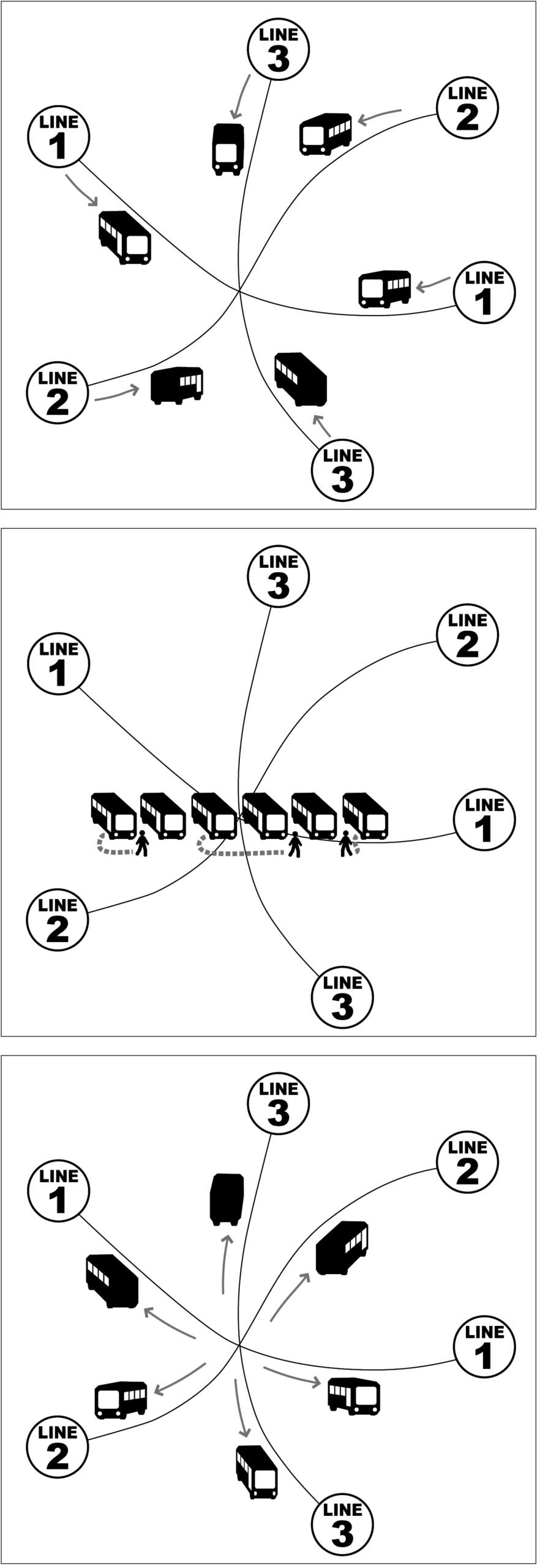
Pulse scheduling. Buses of many lines are coordinated so that buses meet at the same time each hour, allowing fast transfers despite low frequency.
Infrequent transit networks have a huge problem. There’s not just a long wait for the initial bus or train. There’s also a long wait for any connection you may need to make to reach your destination. We often combat this problem with pulse scheduling. At key hubs, we schedule the buses to all meet at the same time each hour or half hour, so that people can make connections quickly even though frequencies are low. We design the whole network around those connections, because they are so important to making the network useful.
That means that the whole schedule has to have a regular repeating pattern. As much as possible we want this pattern to repeat every hour, so that it’s easy to remember. We even design route lengths to cycle well in this amount of time, or multiples of it.
If the train schedule has a similar pattern, we will certainly look at it and try to match our pattern to it. But the timing of a pulse determines the schedules of all the routes serving that point. Sometimes we have lattices of interacting pulses at several points, which can make an entire network interdependent. You can’t change any of these schedules without changing all of them, or you lose the fast connections between infrequent bus routes that makes suburban networks usable.
Sometimes, an infrequent trunk train service will also present a repeating hourly cycle in its schedule, and if so, we’ll look at that and try to coordinate with it. But at most this will be possible at a couple of stations where the timing works well, because of the way the local bus schedules are all connected.
More commonly, especially in North America, we face an irregular regional rail or “commuter rail” schedule, where there may be a regular midday pattern but there’s often no pattern at other times. The pattern may often shift during the day for various reasons that make sense for the train operation. All this is toxic to timing with the local bus network. Local bus networks need that repeating hourly pattern to be efficient and legible. For example, if at 1 PM the train pattern suddenly moves five minutes earlier, the bus network can’t adapt to that without opening up a gap in its schedules that will affect lots of other people.
Usually, the regional rail network and the local bus network are part of different transit authorities, which makes this an even bigger challenge. A particular problem in multi-authority region is that different authorities may have different schedule change dates, sometimes baked into their labor agreements, and this prevents them from all changing together at the same time. But the core problem isn’t just institutional. Merging the authorities won’t solve it. No efficient bus system – working with sparse resources and therefore offering infrequent service – can make timed connections with a train schedule at every station, and especially not if the train schedule is irregular. It’s just not mathematically possible.
The best possible outcomes happen when the rail and bus authorities have a relationship that recognizes their interdependence rather than one based on a supposed hierarchy. That means that the rail authority recognizes that the local bus authorities can only connect with a repeating hourly schedule pattern, and tries to provide one. It also means that rail schedule changes are made with plenty of warning so that there’s time for bus authorities to adapt.
With the decline of rush-hour commuting due to increased working from home, transit demand is even more all-directions and all-the-time. It no longer makes sense to just assume that one trip – say, the commute to the big city – is superior to another, like the local trip to a grocery store or retail job. All possible trips matter, and we get the best transit network when authorities coordinate to provide the best possible connections for all of them.
Basics: Access, or the Wall Around Your Life
What if we planned public transit with the goal of freedom? Well, it’s hard to improve things that you can’t measure, but now it’s becoming possible to measure freedom, or as we call it in transport planning, access.
Access is your ability to go places so that you can do things. Over the last few years, I’ve come to believe that may be the single most important thing we should be measuring about our transport systems — but that we usually don’t.[1] Access isn’t a new idea, but as our data gets better it’s becoming easier to measure, and it could potentially replace many other measures that are groping toward the idea but not quite getting there.
We calculate access, for anyone anywhere, like this:
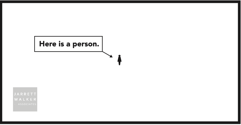
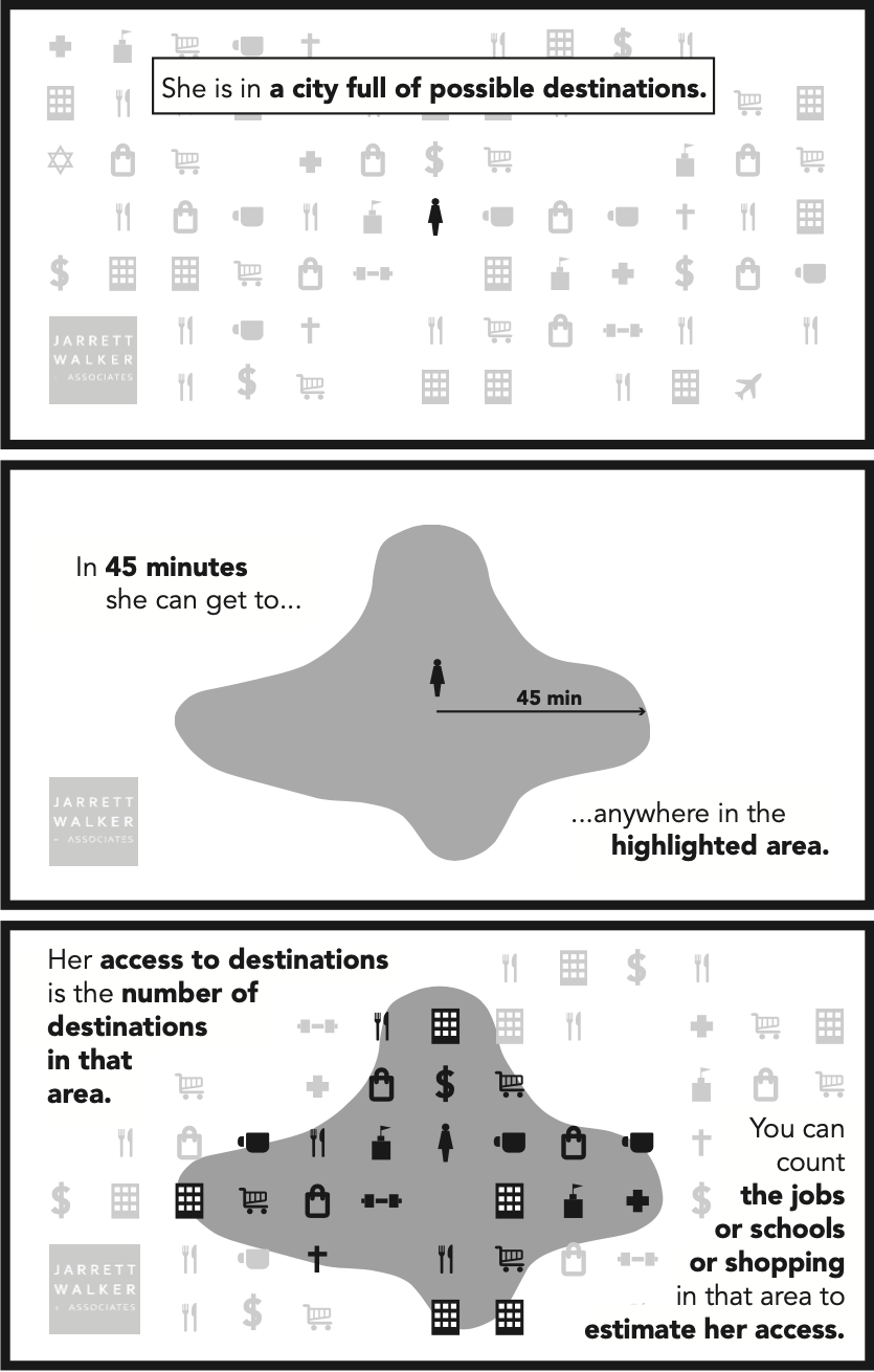
Whoever you are, and wherever you are, there’s an area you could get to in an amount of time that’s available in your day. That limit defines a wall around your life. Outside that wall are places you can’t work, places you can’t shop, schools you can’t attend, clubs you can’t belong do, people you can’t hang out with, and a whole world of things you can’t do.
We chose 45 minutes travel time for this example, but of course you can study many travel time budgets suitable for different kinds of trips. A 45 minute travel time one way might be right for commutes. For other kinds of trips, like quick errands or going out to lunch, the travel time budget is less. For a trip you make rarely it might be more.
But the key idea is that we have only so much time. There is a limit to how long we can spend doing anything, and that limit defines a wall. We can draw the map of that wall, and count up the opportunities inside it, and say: This is what someone could do, if they lived here.
Access is a combined impact of land use planning and transport planning. We can expand your access by moving your wall outward (transport) or by putting more useful stuff inside your current wall (land use). We can use the tool to identify how much of a place’s access problem lies in the transport as opposed to the development pattern.
We can calculate access for any location, as in this example, but we can also calculate the average access for the whole population of any area. In the first draft of our bus network redesign for Dublin, Ireland, for example, we found that the average Dubliner could reach 20% more jobs (and other useful destinations) in 30 minutes. To discuss equity, we can also calculate access for any subgroup of the population: low income people, older or younger people, ethnic or racial groups, and so on.
Why Access Matters
People come to public transit with many goals that seem to be in conflict, but it turns out that a lot of different things get better when we make access better:
- Ridership tends to be higher, because access captures the likelihood that any particular person, when they check the travel time for a trip, will find that the transit trip time is reasonable. Ridership goes up and down for all kinds of other reasons, but access captures how network design and operations affect ridership. [2] In our firm’s bus network redesigns, we’ve been using access as a key measure of success for about five years now, and it consistently leads us to ridership-improving network designs.
- Emissions and congestion benefits all improve, because they depend on ridership, which depends on access.
- Economically, the whole point of a city is to connect people to abundant opportunities. People come together in cities so that more stuff will be inside the wall around their lives. When we measure access we’re measuring how well the city functions at its defining purpose.
- As for equity or racial justice in transit, well, isn’t equal access to opportunity at the core of what these movements are fighting for? Access describes the essence of what has been denied to some groups through exclusionary development planning and exclusionary transport planning, so it helps us quantify what it would mean to fix those things. This, in turn, could help justice struggles avoid a lot of distractions. Because in the end, access is …
- Freedom. Where you can go limits what you can do. If we increase your access, we’ve expanded the options that you have in your life. Isn’t that what freedom is?
When we improve access, with attention to who is benefiting most, we improve all of those things. It’s this remarkable sweep of relevance that makes access analysis so interesting and potentially transformative as a way to think about transportation.
Access Compared to Common Measures
Most methods for studying or improving transit assume that we should care about (a) what people are doing or (b) what people want to do.
Data about what people are doing includes travel behavior data, which are the foundation of much of the accepted methods of transport planning. In public transit, ridership data is in this category. Ridership is the basis for transit’s benefits in the areas of congestion and emissions, and also of fare revenue.
However, what people are doing isn’t necessarily what people want to do, or what they would do if the transport network were better. Much of what people do may just be the least-bad of their options given the city and transport network as it is. This problem leads to various methods of public surveying to “find out what people want,” in some sense. But there are lots of problems with that, mostly lying in the fact that people are not very good at knowing what they’d do if the world were different in some major way.
Access takes us outside of both of those frames. Instead of asking “what do people do?” or “what do people want to do?” it asks “what if we expanded what people can do?”
Access analysis does not try to predict what you’ll do. In fact, it doesn’t need to predict human behavior at all, which is a good thing because human behavior is less predictable than we’d like to think. Access calculations are vastly more certain than almost anything emerging from social science research, because they are based almost entirely on the geometric patterns of transport and development. [3]
Instead, access starts with one insight about what everybody wants, even if they don’t use the same words to describe it. People want to be free. They want more choices of all kinds so that they can choose what’s best for themselves. Access measures how we deliver those options so that everybody is more free to do whatever they want, and be whoever they are.
What Access Analysis Can’t Do
Will access analysis of transit put the social sciences and market research out of business? Of course not.
- We need to understand how different users experience public transit, and how the experience can be better designed to meet those various needs.
- We need to know exactly who won’t be served by access based network design so that we can decide what actions to take for those people, if any.
- We need to keep exploring the relationship between access and ridership so that we can identify the factors that sit outside that relationship and must be considered.
- Access analysis would also become more powerful if we had better data on the locations — to within 1/4 mile (400m) or so — of various non-work destinations: retail, groceries, medical, and so on — so that we could better assess people’s ability to get to such places.
But in 30 years of listening to public comment, I’ve heard enough times that people want to go places so that they can do things. So let’s measure how well we’re delivering that, and let’s ask ourselves if that’s more important that some of the things we measure now.
Further Reading
This post could have been much longer; in fact, I hope it will become a book. Meanwhile, here are some great resources:
- The 2020 Transport Access Manual is the first comprehensive explanation of access and how it can be applied to various questions. It’s the work of a team led by professors David Levinson (University of Sydney) and David King (Arizona State University). Full disclosure: I had a role and wrote some snippets.
- The University of Minnesota’s Accessibility Observatory, founded by Levinson and now led by Andrew Owen, is one of the main research centers on the topic. For several years they’ve been publishing Access across America, an atlas showing where people can get to from various places by car, transit, etc..
- On the philosophical issues about freedom vs. prediction, and why it’s important to separate physical knowledge from social science knowledge, see my fun Journal of Public Transportation paper, “To Predict with Confidence, Plan for Freedom.” Seriously, it’s fun.
- On what high-access public transit tends to look like, here’s a fairly evergreen 2013 post of mine, with downloadable handout, on how some of the big debates of transit planning line up with a goal of high access for a community.
I will update this post with further links.
Endnotes
[1] In the academic literature, what I’m calling access is usually called accessibility. Both of these words have contested meanings, because both have been used specifically to refer to the needs and rights of people with disabilities. I follow the recent Transport Access Manual in using access as the less confusing of these two words. Of course, we are talking here specifically about spatial access — the ability to do things that require going places — which is not the only kind. However, a lot of the ways that people are cut off from opportunity do turn out to be spatial. Transportation (i.e. access) is a major barrier to employment in the US, for example.
[2] This paper, for example, establishes a relationship between transit access and public transit’s mode share, one that is especially strong for lower income people.
[3] There are exceptions. Traffic congestion, for example, is a human behavior that affects the access calculation.
The Fishing Pier Problem in Public Transit Equity
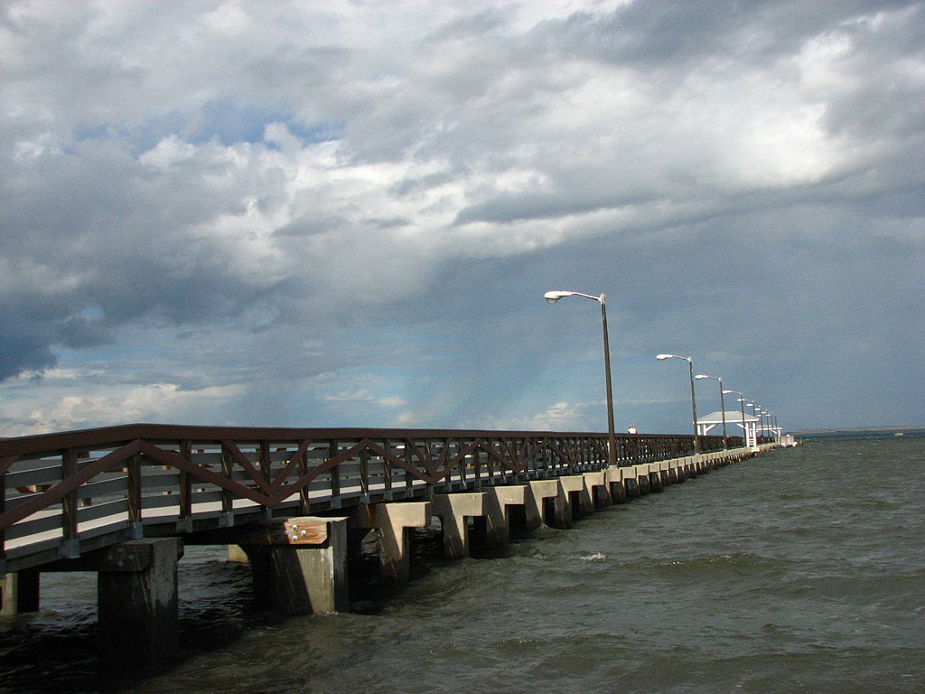
Photo: Heditor6, Wikimedia Commons
Have you ever heard people say: “They got that transit improvement in their neighborhood! We deserve to have one in our neighborhood!”
But does this demand always makes sense?
Imagine a city on a lake or ocean, where neighborhoods near the water tend to be wealthier than those inland. Suppose the city has a plan to build several fishing piers, but all the proposed piers are in the wealthy neighborhoods on the waterfront. Isn’t that unfair?
No, I think you’d say, because fishing piers only work if they’re on the water. If you were concerned with equity, maybe you’d propose a program that helps inland people get to the waterfront fishing piers quickly. But you wouldn’t support an inland elected official’s battle to get a fishing pier on dry land in their neighborhood, because it wouldn’t be useful for fishing.
In short, the point isn’t to equitably distribute fishing piers. It’s to equitably distribute the ability to fish.
In the transit business, when a cool new thing is created somewhere, you always hear the rest of the city say: when do we get that cool thing? You’ll hear this about everything, from subway lines to Bus Rapid Transit to little vans that come to your door. Enormous amounts of money get spent trying to act on this principle.
The typical pattern goes like this:
- Cool new transit thing x is introduced, and deployed in one or two places in the city where it makes sense. (Let’s build a fishing pier on the waterfront!)
- Other neighborhoods demand the same thing, often claiming it’s unjust or inequitable that they don’t have it. (Why don’t our inland neighborhoods have fishing piers?)
- Often the cool new thing is actually built in those other neighborhoods that demand it, but it doesn’t work well there, because the geography is wrong for it. (A fishing pier is actually built inland, extending across a patch of grass, but nobody uses it.)
The marketing of cool new transit things can make this problem worse. The more you put out the message that light rail or BRT or microtransit or “Metro Rapid” is cool and different and better than “ordinary” buses, the more mad people will be if their neighborhood just gets ordinary buses. That leads to political pressure to bring the cool new thing to a place where it just doesn’t work very well, which in turn leads to the cool new thing failing, just as an inland fishing pier will fail.
You’ll get the best transit mobility if we use the tool that works with your geography, even if it’s different from what works in other places.
So perhaps it makes no sense to equitably distribute any cool transit thing. It makes sense to equitably distribute the ability to go lots of places quickly on transit.
How would our transit debates be different if we did this?
What is a Spine?
A spine is a really powerful network design idea that takes a moment to explain. This is how a spine works, in an example from the Dublin bus network redesign proposal.
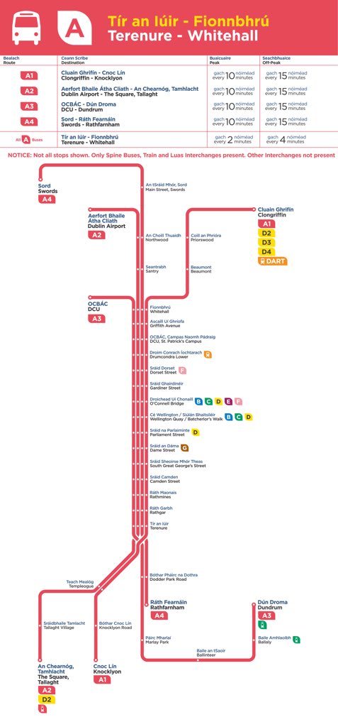
[That diagram is by Dublin-based graphic designer Kevin Carter, and uses a style common in the UK. The National Transport Authority has hired Kevin to complete these diagrams for the other six spines. If you’re on Twitter, follow him at @yascaoimhin.]
A spine is several bus lines designed to share a common segment, with the buses evenly spaced on that segment to deliver a very high frequency. In this case, each spine branch runs every 15 minutes all day, so the common segment is every 3.75 minutes on average.
If you are in the inner city, where all the spines are running on their common segment, you just say “take any bus whose number starts with A”. The result is a high-frequency network map that’s easy to draw a map of, and to learn, remember, and explain.

(That image is ours, from the summary report.)
In the case of the A spine, all four branches are every 15 minutes all day so the common segment is a little better than every 4 minutes all day.
The National Transport Authority also did an animation, here.
Many, many cities have a geography where this structure makes sense. As you move out from the centre, the area to be covered gets wider but the frequency need gets lower, so you branch. But you make it legible. The inner city needs an extremely frequent line that’s easy to learn and remember, so we just explain that the A-spine is made of all the buses whose numbers start with A. Presto. You have a simple network of inner-city lines where the bus is always coming soon, exactly what people moving around in the core need.
Once you understand it, it’s simple. But it takes a moment to learn, and different people learn it differently.
The Absurdity of Counting Bus Routes
When presenting a plan, I’ll sometimes be asked to count bus routes. How many bus routes change in the plan? How many bus routes still go into the urban core?
These questions have nothing to do with the quality or quantity of transit service. They have nothing to do with anyone’s ability to get anywhere, or even with how much the service is changing. The number of bus routes measures one thing only: the complexity of the service.
Here’s how this works:
A bus route is a path followed by some number of buses during the day. A route may be followed by one bus a day or by a bus every two minutes; either way, it counts as one route.
The number of bus routes can also be changed by how they are named or numbered. Say a bus route is mostly the same but has a branch on one end, where some buses go one way and some go the other. Is that one bus route or two? The answer to that question changes the number of bus routes, even though the service itself is identical in either case.
If you want to talk about service quantity, the correct unit is service hours (or service km), where this means one bus operating in service for an hour (or km).
Why count bus routes then? Only if you are making a point about complexity. The number of routes in a network is a measure of how complicated the service is. In this post, for example, I show how a three-route system gets everyone where they’re going faster than a nine-route system, with the added benefit that three routes are easier to keep in your head than nine.
In our Dublin bus network redesign proposal, the number of routes goes from 130 to about 100. Stated in isolation that sounds like a service cut, when in fact we are just running more buses on simpler routes. We are expanding service, and making it more useful, by reducing complexity. Practically nobody is losing service; most people are seeing a measurable improvement
The more routes a system has, the more complexity you have to remember. Spreading a service budget across more routes also means those routes are less frequent and therefore less useful.
And again, the real measure of a network plan is where people can get to in a reasonable amount of time. In the Dublin proposal, for example, the average Dubliner can get to 20% more jobs (counting student enrolments) in 45 minutes. That’s a real expansion in the liberty and opportunity that people experience in their daily lives. Are you sure the number of bus routes matters more than that?
Basics: Slower Speed is a Service Cut
Does your transit agency have a recent history of operating speed that looks like this?
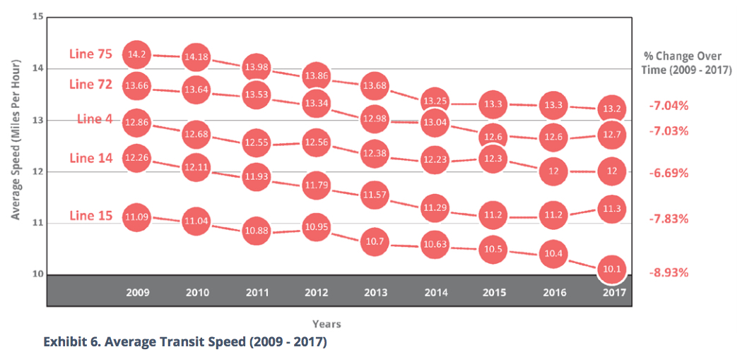
Source: Portland Bureau of Transportation, Enhanced Transit Corridors Plan, Feb. 2018, page 9
This is the “boiling frog” problem of bus operating speed. In a dense and growing city, it’s not unusual to see speeds falling by about 1% a year, as in this data for Portland’s busiest lines.
If you’re going to analyze how service levels relate to ridership, you have to think about speed. Speed is not just a disadvantage for the customer; slower speeds are also a service cut.
You, the customer, want to go a distance, but the transit agency will pay for your service by the hour. So the quantity of service you experience will be governed by how easily hours turn into distance — in other words, by speed.
So if a transit agency budget grows by 1% a year but speed is falling 1% a year, the customer should expect slower speed and no other growth in service.
When measuring the service quantity that affects ridership, then, look at service miles or km, not service hours.
Basics: The Ridership – Coverage Tradeoff
Is your transit agency succeeding? It depends on what it’s trying to do, and most transit agencies haven’t been given clear direction about what they should be trying to do. Different people have different goals for transit, and those goals lead to different kinds of network.
To see why, look at this little fictional town. The little dots indicate dwellings, jobs, and other destinations. The lines indicate roads. Most of the housing and destinations in the town area concentrated around two main roads.
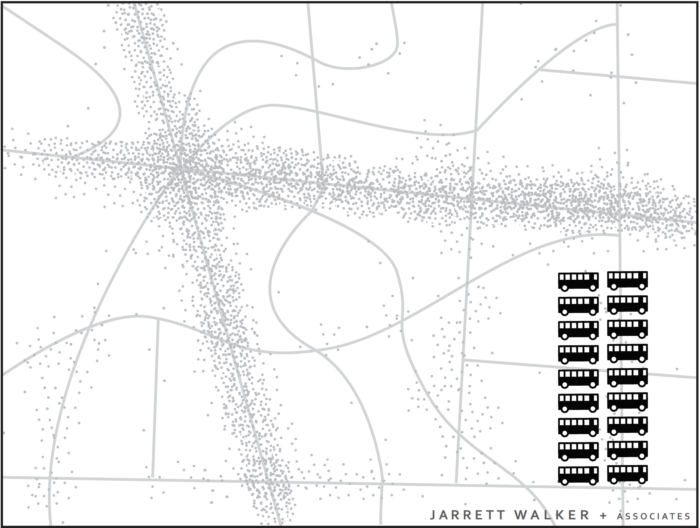
Imagine you are the transit planner for this fictional town. The dots scattered around the map are people and jobs. The 18 buses are the resources the town has to run transit. Before you can plan transit routes you must first decide: What is the purpose of your transit system?
Designing for Ridership
A transit agency pursuing only a ridership goal would focus service on the streets where there are large numbers of people, where walking to transit stops is easy, and where the straight routes feel direct and fast to customers. Because service is concentrated into fewer routes, frequency is high and a bus is always coming soon.
This would result in a network like the one below.
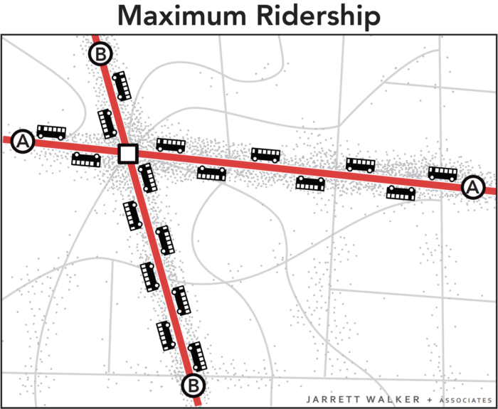
All 18 buses are focused on the busiest areas. Waits for service are short but walks to service are longer for people in less populated areas. Frequency and ridership are high, but some places have no service.
Why is this the way to maximize ridership? Frequency tends to have huge payoffs. Most people find a bus coming every 15 minutes to be more than twice as useful as a bus coming every 30 minutes. Frequency also makes it easier to change between buses, which expands the range of destinations people can reach. So when we concentrate frequency where the most people will benefit from it, we tend to get the best ridership results. If you want to read more about this, see here.
Designing for Coverage
A network designed only for ridership would not go to many parts of the city at all. If you think a transit agency owes some service to everyone in the community, you want a network designed for coverage. To achieve this goal, the transit agency would spread out services so that there would be a bus stop near everyone. Spreading it out sounds great, but it also means spreading it thin. The resources would be divided among so many routes that it wouldn’t be possible to offer much service on any of them. As a result, all routes would be infrequent, even those on the main roads. Infrequent service probably isn’t coming when you need it, so it isn’t very useful, so not many people would ride.
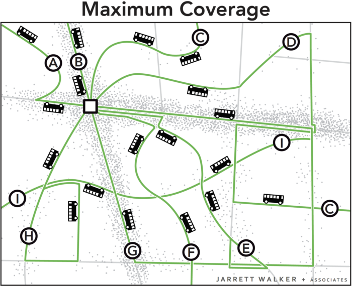
The 18 buses are spread around so that there is a route on every street. Everyone lives near a stop, but every route is infrequent, so waits for service are long. Only a few people can bear to wait so long, so ridership is low.
(By the way, in the coverage network I could have used on-demand or “microtransit” vans instead of buses on fixed lines. This is another tool for providing low-ridership coverage service.)
In these two scenarios, the town is using the same number of buses. These two networks cost the same amount to operate, but they deliver very different outcomes.
Both Goals are Important
Ridership-oriented networks serve several popular goals for transit, including:
- Reducing environmental impact through lower Vehicle Miles Travelled.
- Achieving low public subsidy per rider, through serving the more riders with the same resources, and through fares collected from more passengers.
- Allowing continued urban development, even at higher densities, without being constrained by traffic congestion.
- Reducing the cost of for cities to build and maintain road and bridges by replacing automobile trips with transit trips, and by enabling car-free living for some people living near dense, walkable transit corridors
Coverage-oriented networks serve a different set of goals, including:
- Ensuring that everyone has access to some transit service, no matter where they live.
- Providing lifeline access to critical services for those who cannot drive.
- Providing access for people with severe needs.
- Providing a sense of political equity, by providing service to every municipality or electoral district.
Ridership and coverage goals are both important to many people, but they lead us in opposite directions. Within a fixed budget, if a transit agency wants to do more of one, it must do less of the other.
Because of that, cities and transit agencies that lack adequate resources need to make a clear choice regarding the Ridership-Coverage tradeoff. In fact, we encourage cities to develop consensus on a Service Allocation Policy, which takes the form of a percentage split of resources between the different goals. For example, an agency might decide to allocate 60 percent of its service towards the Ridership Goal and 40 percent towards the Coverage Goal. Our firm has helped many transit agencies think through this question. Here is an explanation of how this conversation played out in a typical US transit agency.
What about your city? How do you think your city should balance the goals of ridership and coverage? There is no technical answer. Your answer will depend on your values.
Further Reading
Jarrett Walker’s Journal of Transport Geography Paper, which first introduced this concept, is here.
Basics: The High Cost of Peak-only Transit
How often have you heard that rush hour is when transit really excels? When you see all those crowded buses and trains, for just two hours or so, it seems like transit’s really proving its value.
Not so fast. Transit systems that run at a low level all day but then ramp up hugely during the peak can be very, very inefficient. That’s because putting out a bus or train to run just for 2-3 hours entails the following big marginal costs:
- You must get someone to report to work for a short shift. This usually means that you pay them for more hours than they work. Some agencies are also prohibited, in their labor contracts, from using part time drivers, which are really the only way to serve these short shifts efficiently.
- Peak demand that flows in only one direction, as in the classic American single-centred city, also generates the huge inefficiency of moving all those vehicles, entirely or mostly empty, back in the reverse-peak direction.
- The peak determines the number of vehicles that must be owned and maintained.
Sometimes, peak ridership is so much higher than midday that the fare revenue makes up for all these inefficiencies, but not always.
In fact, my experience with American bus operators is that few of them have really counted the cost of their peak-only services. Transit agencies should know and report the true marginal cost of a peak-only vehicle hour as distinct from an all day vehicle hour (including all-day buses that continue through the peak.) We know peak-only service is expensive, but we’d have much clearer conversations if we knew exactly how much.