Throughout my career as a public transit planner, I’ve dealt with city planners and developers who are quite sure that bus service of any kind is irrelevant to city building. Most city planning professionals get little training in public transit, and for years, much of that training came laced with assumptions that rail is the only public transit that really matters.
So it’s not surprising that in many developed countries, not just the US, the design of cities presents countless barriers to efficient and liberating transit service provided by buses. Some of these barriers reflect an anti-transit or at least anti-bus ideology, but in my experience, most of these barriers were created thoughtlessly, by people who were focused on something else.
I know this because I can often see how a tiny change to how something had been built, one that wouldn’t alter its nature or its economic viability, would have made good bus service possible. Most of my transit planning work, however, must deal with the built environment as it is, so I often have no choice but to present a plan that presents inferior service because that’s what the physical situation mandates.
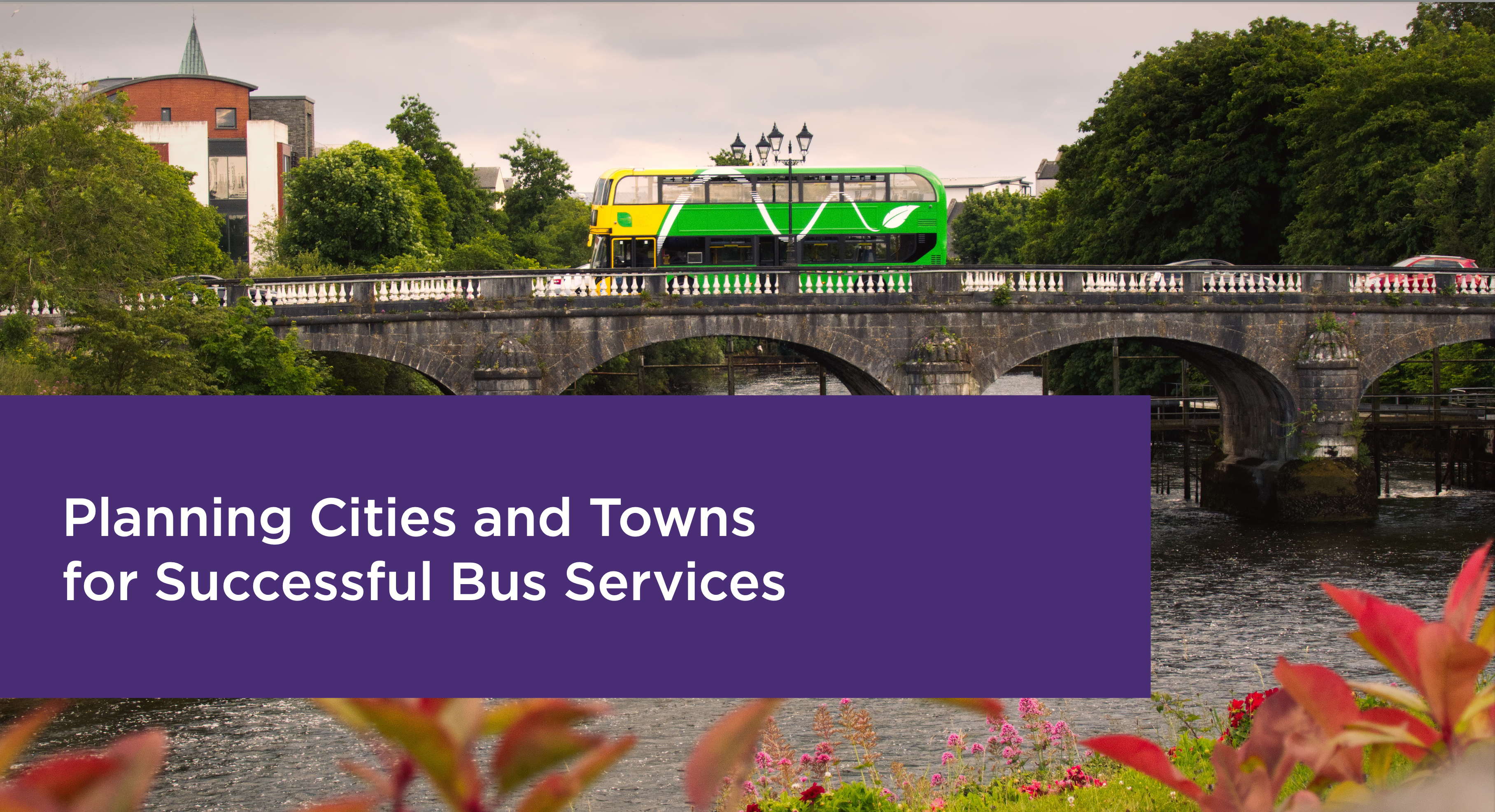
The new edition of my book is much more forceful about these issues than the first edition was. But meanwhile, we’ve been at work on a document designed to educate and hopefully inspire the city building professions on how to take buses seriously. It’s called “Planning Cities and Towns for Successful Bus Services,” prepared by our firm (mostly written by me and my colleague Michelle Poyourow) for the National Transport Authority of Ireland (NTA). The NTA intends to use this document to educate town planners and developers on the need to consider the usefulness of bus service when doing any kind of planning task. The document is a free PDF and you can download it here.
While the document is in an English suitable to Ireland and the UK, and focuses on problems that tend to arise in Ireland, it is perfectly readable to any English speaker and is relevant all over the world. Here is the core statement:
All decisions about how to lay out an area or design a road are decisions about public transport. In fact, they are collectively as powerful as any routing or service decisions made by a public transport operator. [Note to North American readers: In your context, “operator” means “public transit operating company or agency”.]
This has long been well-understood in the context of railway services. A railway station is widely-understood to be a major infrastructure investment whose return depends on the surrounding built environment. For this reason, railway planning is accompanied by an intense focus on development in the areas around stations. During the planning phase, these station-area plans make a big contribution to the expected benefits of the line and help to justify its construction.
Given the scale of investment being made in Ireland’s bus services, a similar focus on the built environment is needed around bus services just as it has been provided around railway stations.
The opening chapter explains the principles of network design, and shows how networks interact with development to create access to opportunity. The second chapter then lays out Three Essential Actions to make cities work well with buses:
- Organise development around the Frequent Network
- Make it easy to walk to service.
- Make efficient and useful bus operations possible.
Each of these is explained in detail, showing exactly what city planners, transport planners, and developers need to be doing to achieve these three essentials.
The final chapter is a series of case studies looking at how the principles apply to different development types: residential, retail, medical, and so on.
North American readers will notice that we’ve included many North American examples. While North Americans are used to feeling inferior to Europeans when it comes to transit and urbanism, there are many good ideas in North America that Europeans can benefit from. That’s part of why our little firm is working now to develop a European practice.
This report came about after a long collaboration between our firm and the NTA on planning the redesign of urban bus networks across Ireland. (We began with Dublin in 2016, and the improvements there are beginning to roll out. Similar redesigns are completed and in line for implementation in Cork, Galway, and Limerick, and we are working on the last, in Waterford, now.)
A great aspect of all these projects has been the active collaboration of the most senior leaders of the NTA. In particular, NTA’s Director of Transport Planning and Investment, Hugh Creegan, personally attended everyone one of the intensive staff workshops in which we hammered out every detail of the network designs with planners from the local government and bus operating company. (In Dublin, for example, these workshops ran all day every day for two weeks.) It is rare for such a senior official to delve so deeply into detail, but it meant that when we suggested this project to him, he immediately saw the need.
I hope readers all over the world will find this manual useful. And if you would like a similar manual for your part of the world, we would love to collaborate with you on one.
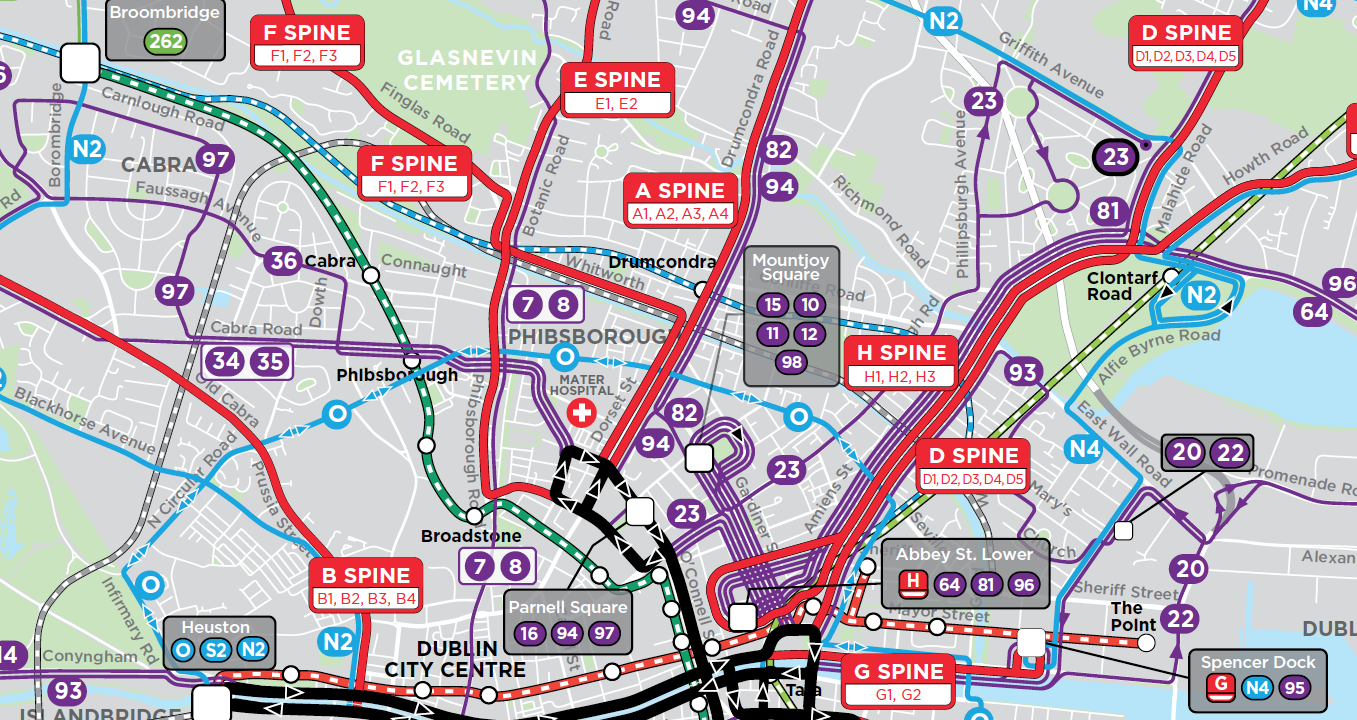
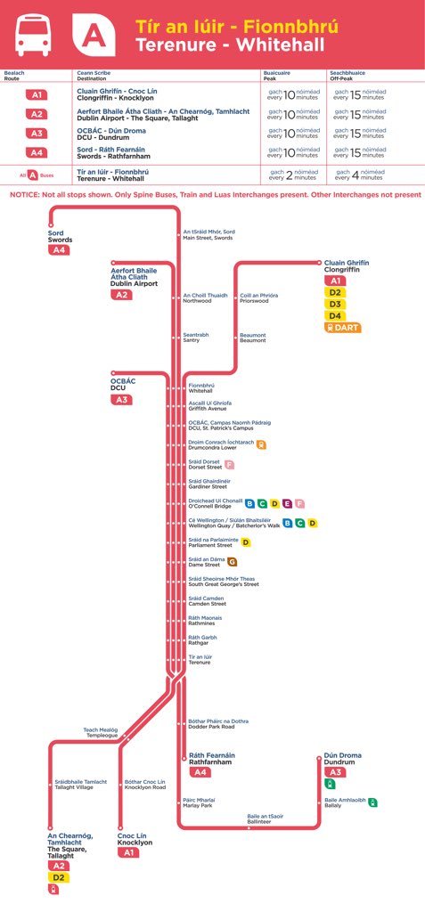

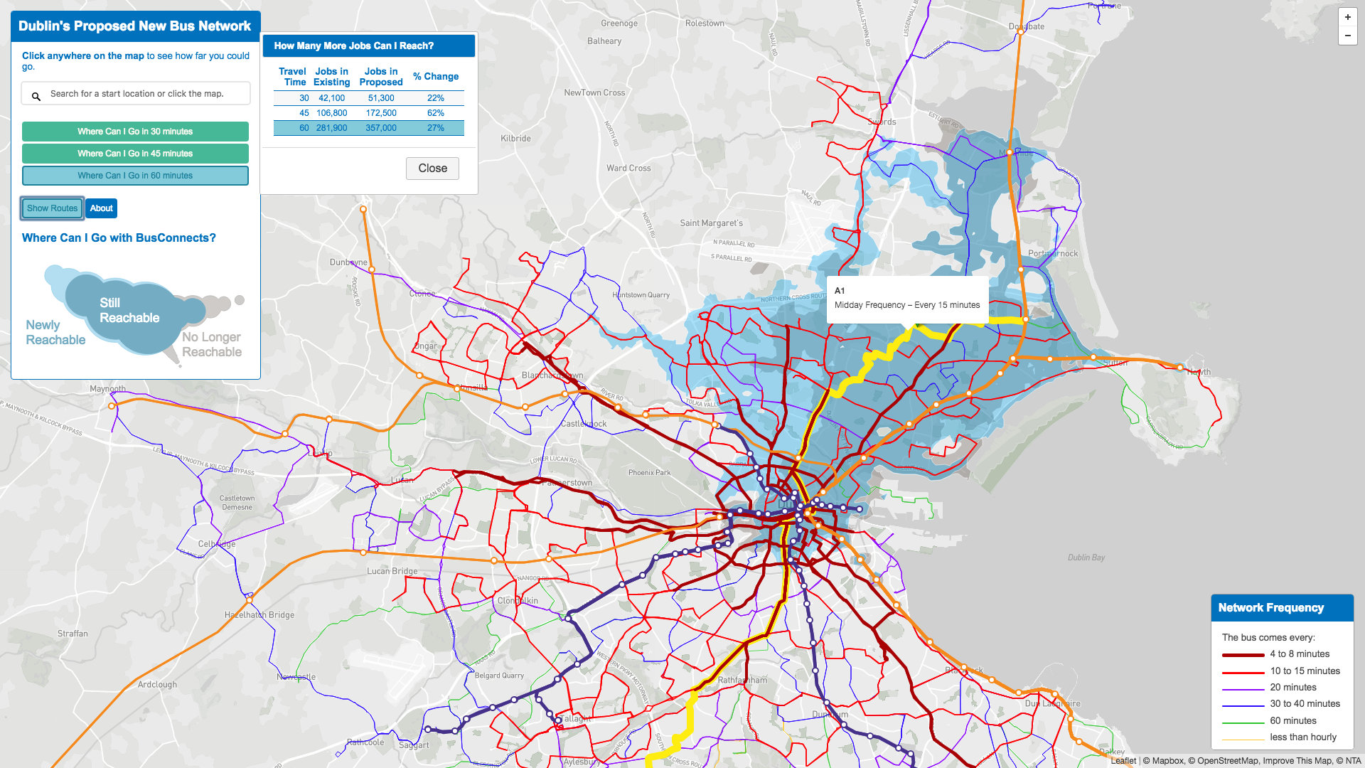

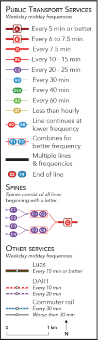 But to understand the maps, you must look at the legend. Our firm’s usual mapping style is dense with information, but therefore contains a couple of things that you need to learn. Most of the early expressions of panic and confusion have been based on misreadings of the map.