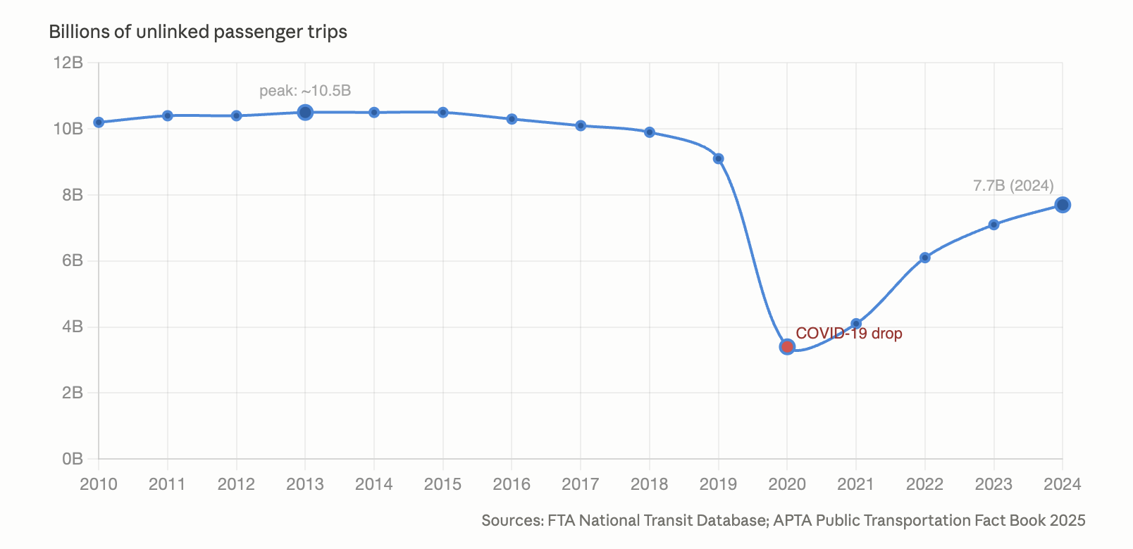
The history of transit ridership in the US is what it is:
But it matters enormously how we talk about it. Many US transit agencies will be facing the voters in the next two years, seeking new funding to plug their structural deficits and forestall destructive service cuts. Many agencies are already involved in fights for more funding in their state legislatures, sometimes winning, as in Illinois, but often losing, as in Pennsylvania and Oregon.
Most of the voters or legislators in these debates are not well informed, so they can be swayed by the rhetoric used. So transit agencies need to be carefully choosing their language. And we should be talking as an industry about what messages are helping and what aren’t.
I found myself provoked this morning by this well-intentioned tweet from the fine folks at the San Francisco Peninsula regional rail agency Caltrain:
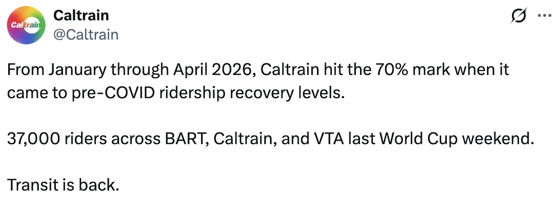
It made me ask: When are we going to stop describing our ridership as a percentage of pre-COVID? Because as long as that’s below 100%, which I expect it to be for a long time, we are playing into a narrative of relative failure, instead of talking about our real success.
In my experience, most reporters and commentators begin with these false assumptions about transit:
- That ridership is the only measure of success.
- That ridership is under the agency’s control.
- That their goal is to get “back” to where they were in 2019.
When journalists interview me, they usually start with these assumptions and I have to say stop, wait:
- Transit has competing definitions of success, so low ridership doesn’t mean failure. The ridership-coverage trade-off is only one example. The boards that govern US transit agencies routinely tell staff to do all kinds of things that are not good for ridership. This is their right, but it means ridership is not the only indicator of success. (Our consulting work is all about making these conversations clearer, so Boards understand the consequences of their choices.)
- Most ridership factors are outside agency control. Work from home caused an overall decline in travel demand, and especially in the kind of concentrated peak demand into major centers that transit can serve easily. Nothing a transit agency can do will change that. It’s clear now that we’re never going back to the office in pre-COVID volumes. The best transit agencies are shifting their service to address other markets where there’s potential to grow ridership, but that means:
- We are attracting new riders, not getting riders “back”. Any new growth in ridership will be in new and different markets. Smart agencies have already made these adjustments (we‘ve often helped) by shifting service to weekends and to more regular all-day patterns, instead of the old intensive peak. (Increasing numbers of agencies are above pre-COVID Saturday ridership as a result.) The great mass of briefcase commuters is gone but there are many others who will use our service if it is useful. So it makes no sense to talk about getting “back” to 2019 performance. Even if that were possible, it’s not a fair description of what we are doing now.
When a transit agency describes their progress in terms of how far “back” to 2019 they are, they concede several things that they shouldn’t be conceding. They imply that 2019, rather than the future, is their north star. The imply that history really can be rolled back. Worst of all, they allow people to fantasize that all this is possible if transit agencies just work harder, from which it’s easy to conclude that if that doesn’t seem to be happening, it means transit agencies are misgoverned and the only way for a voter to object is to vote no on funding them.
Instead, transit agencies need to be much more forthright about explaining:
- what they do and don’t control
- what they’re doing with the control they have
- what is happening in larger travel trends
- why 2019 expectations for transit no longer make sense.
Then, they should tell a data-driven story starting around 2022, when the new world of urban transport demand began to stabilize. Managements turn over frequently in US transit agencies, so you probably can’t judge your current management on what happened more than a few years ago. In any case, the story should be how transit agencies are building for the new world, not how they are bringing back the old one. The first story is about success. The second, no matter how you spin it, will always sound like failure. Nobody can bring back 2019, and nobody who suggests they can is going to look like they’re succeeding.
I just do not see how the “back” narrative leads anywhere good for transit agencies, and would love to hear from those who differ from me.


