When different operating companies all plan their own bus service, the combined network is really complicated!
It’s a time of rapid change for urban bus services in England.[1] Since Margaret Thatcher’s privatization reforms of 1985, these services have been subsidized but not really controlled by government. I wrote here about Thatcher’s vision for privatized public transport, including why it has been teetering for some time and is now being swept away.
Now, all over England, governments at the county or shire level have been looking at whether and how to take control of their public transport, so that they can offer coherent networks and fares, integrate public transport planning with town planning, and ensure accountability to the public. Right now, most of these conversations are happening at a procedural level, but now it’s time to look at maps, and try to figure out what an improved and integrated network would actually look like geographically.
Right now, though, maps are a problem. As we have wandered the transport websites of the UK, we’ve found maps by operating companies, showing only their services, but a shortage of good maps done by governments showing how all the services interact. So we drew one, as an example, and a lot can be learned about England’s challenge by staring at it for a bit.
On my tour of the UK last summer, I spent a day in Cambridge, site of one of the UK’s most elite universities. I was fortunate to be hosted by Andrew Highfield, an assistant director at the Cambridgeshire-Peterborough Combined Authority (CPCA), which manages transport for Cambridgeshire and its cities. If he hadn’t been showing me around, the service would have been incomprehensible. Many operating companies, trained to see each other as competitors, intersect here and cover different parts of the shire. They have their own signs and shelters, each advertising their own services, and each draw maps of just their own services, if they draw maps at all.
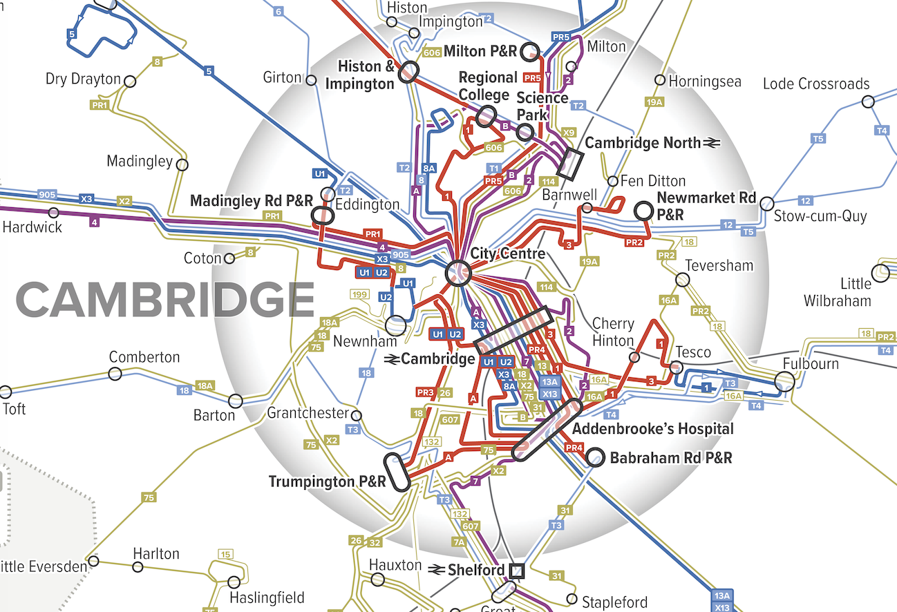
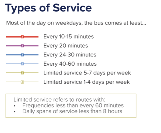
After my visit, the CPCA commissioned us to draft a map for them. Our mapping style focuses on what matters to the customer and not what matters to anyone else. Instead of highlighting operator brands, we highlight frequency, the single most important variable about a service that is not always shown on maps. We use hot colors for high frequencies so that these jump out visually against the background complexity of lower frequency services.
Here is a PDF of our map. As you can see, it’s very complicated, but the complexity of the service, as it’s evolved through the privatization era, is part of the point.
Since I’m now going to make some observations about the network, I should first announce my ignorance. I can’t claim to know Cambridge that well. I’ve spent a day there, and haven’t explored the shire around it at all, though of course I’ve poked around in aerial maps and Street View. So nothing I say here should be taken as a recommendation. Only at the end of long study of the network, and many conversations with local people, would we be in the position to do that.
However, this map should be useful for people in Cambridgeshire to understand what they have, and to think about how well it fits with the demands of the communities that they know well. So the most important point of this article is: Every local authority should have a map like this!
What can we see? First, let’s zoom into a slice of Cambridge itself.
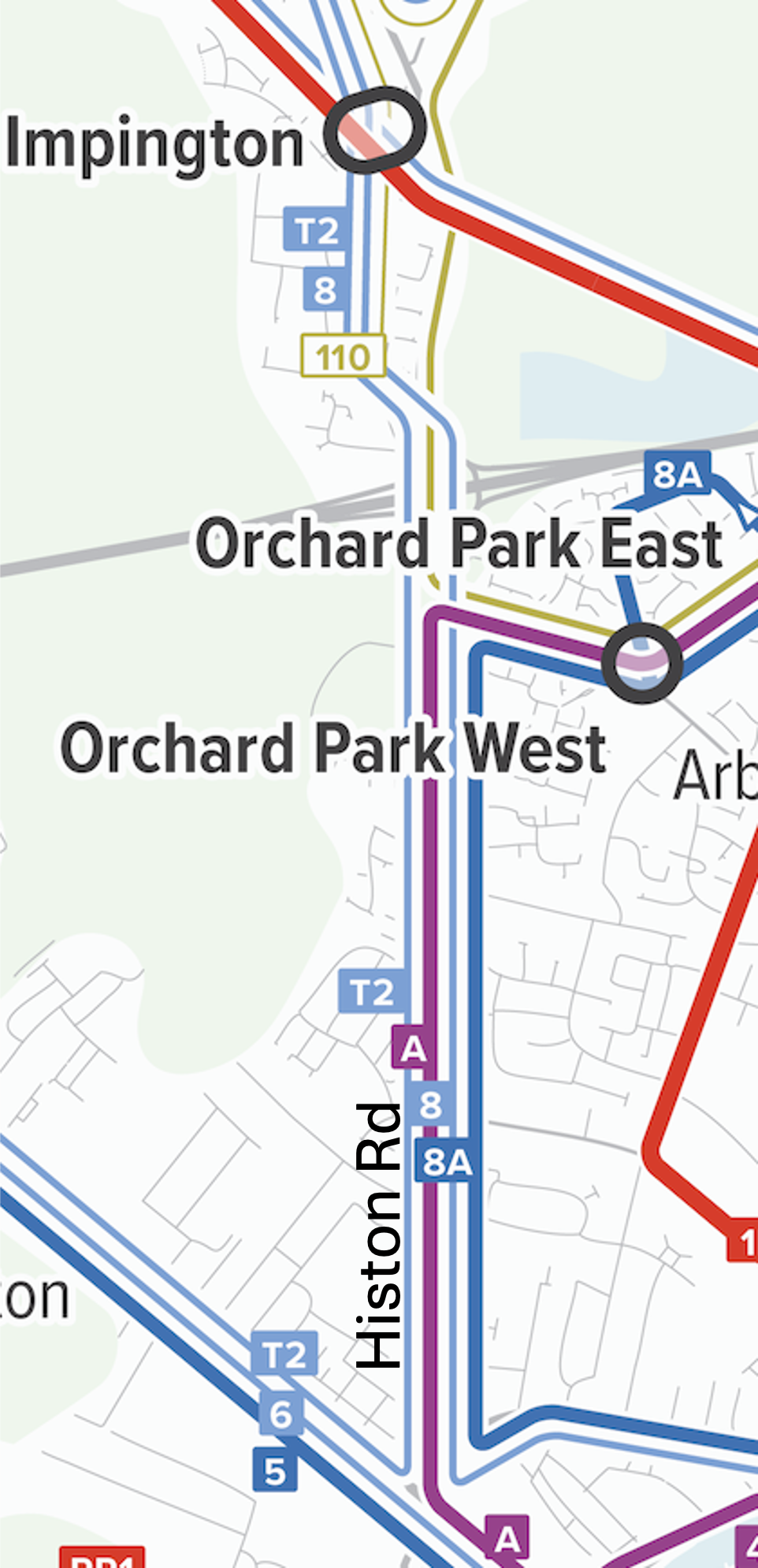
Overlapping services on Histon Rd. in the NW of Cambridge
One of the first things I look for in a network is heavy overlap of low-frequency services, because this means there’s enough service to deliver a higher frequency if the service were organised differently. So looking at our map of Cambridge, my eye immediately went to Histon Road in the northwest part of the city, served by A, 8, 8A, and T2
There’s enough service here to deliver a frequency of every 10 minutes or better, but instead there are four blue or purple lines, indicating less frequent services overlapping. This means long gaps at some times and a pile of buses running together at other times, even when everything is running on time. These routes look like they were drawn separately, by different people at different times with different goals, which is not what you do when you’re trying to build an integrated and efficient network.
Histon Road, by the way, looks like this, mostly the two-story built form typical of urban fabric in much of the British Isles, more than enough to generate demand for service that’s always coming soon.

What these people have now, in return for low frequency and uneven spacing of buses, is direct buses to lots of places. Is that better or worse? In most cases, higher frequency, even requiring connections, delivers better access to opportunity. But an actual network plan would be the chance for the community to consider these tradeoffs and figure out what they want.
Cambridge’s Park-and-Ride structure is also interesting. Because space is limited in the city centre and car parking is expensive there, park-and-rides around the edges are designed to intercept motorists from the surrounding area, giving them a cheap way to get to Cambridge without contributing to its traffic and parking demand. What’s more unusual is that these facilities have their own dedicated direct routes, with numbers starting with “PR” that run frequently all day. Other local routes may duplicate them for a long distance:
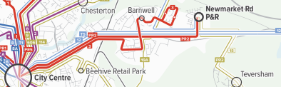
Routes 3 and PR2 can easily be described as being different services with different markets, but we usually get the best public transport for everyone by maximizing the diversity of people on any one vehicle. So it’s more common to serve Park-and-Rides with peak-hour services to provide high capacity where demand is high, but to provide a more basic service at other times, one that serves other markets along the way. (For example, should those intercity buses, 12 and T5, stop at the P&R to contribute to a total frequency product with less duplication? Maybe.) Again, I am not making a recommendation here! That would only come after much more study of demand and some public conversations about goals. But this may be an example of over-specialized service, one whose market is too narrowly targeted to justify being served with these nonstop links.
Now let’s zoom out to the whole map.
It’s rare to see 10-minute frequency on a long intercity link, but there’s one here, formed by A and B from St Ives into Cambridge, running in the Cambridgeshire Guided Busway.
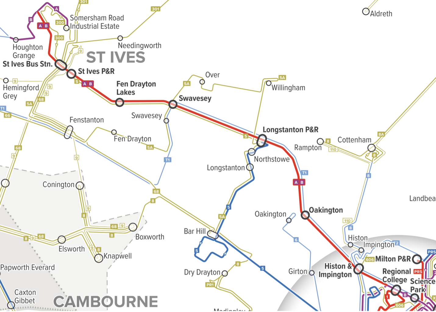
But as it approaches Cambridge in the lower right corner of this map, it splits into two purple (every 20 minutes) branches, which later rejoin in the city centre. So there’s frequent service along the rural link, and to central Cambridge, but not to anywhere in northern Cambridge. This makes some sense from a commute perspective, since there are commute destinations on both branches, but when you’re trying to organise service within a city, the key is to build up simple patterns of high frequency rather than piles of different routes. So it’s awkward to have the frequency go down, because of the branching, right as the line from St Ives reaches the area of highest demand. Maybe this is the right pattern, but it deserves a closer look.
Finally, with our map you can marvel at the incredible complexity of rural services in England:
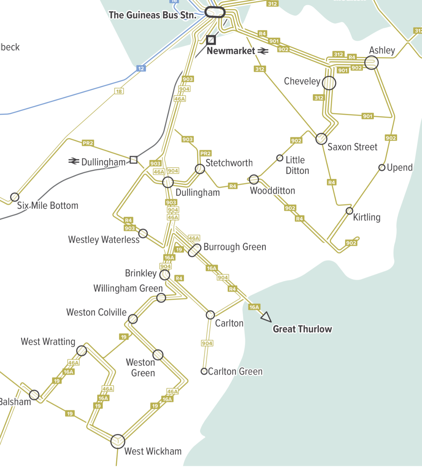
Most of these are one or two trips per day, many scheduled around schools but open to the public. Some are just a few days a week. It is hard to call this a network, because these services are mostly not intended to work together. Instead, each looks micro-designed around a particular constituency. Could this system be much simpler and thus more frequent — running, say, a few times a day instead of just once or twice? Possibly, but again, it would require a full plan engaging the community. My goal here is just to reveal the patterns that suggest possibilities, and to show why our mapping style is key to showing you what you have.
Update: I will be in the UK for most of September 2025, continuing to promote my book! Let me know if you have an event idea or if your organisation would like to sponsor a short training course.
[1] Transport in the UK is a “devolved power,” which means that policy can be different in England, Wales, Scotland, and Northern Ireland, not to mention the various other semi-autonomous islands. This means that Wales, Scotland, and Northern Ireland govern transport through their own parliaments, but the UK government plays the same role for England, since there is no separate English government. (About 83% of the UK population is in England.)
English transport in general is a total mess and the bus companies operate like they want to make the customer experience as miserable as possible. Cambridge Stagecoach and Whippet are especially bad. Single door buses and they somehow have made contactless payment even slower than full cash service (with change).
One of the big questions with Cambridge is how to organise the routes in the centre. The space is very limited and buses currently thread through narrow streets and around sharp bends where they tend to overrun the pavements that are busy with people walking. It’s scary. So one question is how to reroute the buses in a safer and more efficient way, and the other is how to get the bus companies to operate to modern standards so dwell times can be more reasonable. The political aspects of these questions is the most challenging part.
A few years ago a group called Smarter Cambridge Transport attempted to take on these problems and more, but I think people have largely moved on with life now.
I hope the new Mayor’s team makes use of this analysis in planning for bus franchising.
The previous commenter mentioned Smarter Cambridge Transport, of which I was the leader. This was our attempt in 2018 to propose a rationalised public transport network for Cambridge and its surrounds:
https://www.smartertransport.uk/mapping/
The narrative explaining the maps can be found at:
https://www.smartertransport.uk/cambridge-city-bus-hub/
@Jarret, your work was a strong inspiration for ours.
Issues are in a way similar to Malta where there is one company running the system but lots of routes that overlap on key segments but have a 20 / 30 min frequency. Plus the fixation of direct routes, only to get one that operates every 30 minutes.
On a positive note, I really love the way you present transit maps. Would really love to learn more how it’s done.
Cambridge resident and long time route planning enthusiast here. You are absolutely spot on! There is a need for a high-frequency network that facilitates interchanges. Barring a few exeptions (busway/1/PRs), routes in Cambridge mostly have 20-60min headways, which is practically useless for any interchanges. The end result is that the bus routes fail to capture the demand to any destinations outside the city centre (e.g. Cambourne – Mill Road, Bar Hill – Science Park, Cottenham – Addenbrookes etc). This leads to low ridership, low frequency, and a vicious cycle.
One thing that particularly disadvantages buses in Cambridge is its high cycling modal share. This in itself is great, but it also means that the bus routes tend to lose out on passengers making short trips inside the city, which affects the financial viability of buses. I actually think Cambridge should focus more on mid-distance express bus routes outside the cycling sphere, then use mid-distance routes to prop up local services, rather than the other way round.
There is so much untapped demand in towns like Huntingdon (surveys show that 30% residents commute to Cambridge, but almost everyone drives due to poor services), Newmarket (bus doesn’t cover residential areas and runs hourly), and Mildenhall (no service at all).
As for the specific overlapping routes you mentioned, it’s mainly down to historical reasons. Bus 3/8 are old routes that have been around for a long time. When they built the P&Rs and the busway, they added new routes on top of the existing system rather than amalgamating existing routes. This is likely due to opposition from local residents, as routes like 3/8/8A runs deep into residential neighbourhoods, while P&Rs/A/B skids past the periphery. Nowadays, due to the more frequent services on the main road, more and more residents just walk to the main road rather than relying on relic bus routes, so there might be potential for some changes.
I’ve actually drafted out a proposal and a desired bus route network to address some of these issues (in Cambridge, but also for other parts of the UK). Any tips on getting hold of the CPCA? Would really hope to get in touch with more like-minded people but don’t know where to start.
“These routes look like they were drawn separately, by different people at different times with different goals, which is not what you do when you’re trying to build an integrated and efficient network.”
How true.
Every science or business park is trying to organise their own busses in order to reduce demand for parking places.
Cambridgeshire would benefit from a unified transport system using a unified payment system similar to ‘transport for London’.
As someone who lived in Cambridge, the city’s bus service is a *disaster*, Whippet and Stagecoach (two main operators in the city) actively refuse to co-ordinate the services. Thankfully Labour campaigned on cleaning up the local bus services so perhaps the council can clean it up. Ideally there would be a municipal service or some sort of p3 arrangement I think.
Cambridge’s bus network appears to be a lot like Seattle’s.
Buses do a lot of work, a lot of infrequent and peak-only services that form frequent trunks, and an incomprehensible map. Seattle is quite challenging to use. Even when you have a resource like the Seattle Transit Map, done by a rider with an eye toward cartography, the routes still have a lot of turns and there’s no elegant grid like Chicago, L.A. or Vancouver.
Part of Seattle’s problem is the topography makes having a grid challenging at the very least. The northern part of the city is much easier than the southern part. East/West is much harder than North/South. Some suburbs are easier than the inner city.
What is your option of the often-seen argument of “You can’t compare foreign buses to British ones: Britain is different. British people won’t stand for things like having to take a connection rather than a direct bus and the only reason foreigners do is because they’ve had connections imposed on them.”? This forum thread is a good example: https://www.railforums.co.uk/threads/cambridgeshire-bus-franchising.272168/page-7
Yes, I hear this all over the world and it’s never true. Interchange is a key to liberating networks, and when networks are liberating, people use them. Geometry trumps culture. See here: https://humantransit.org/2009/04/why-transferring-is-good-for-you-and-good-for-your-city.html
“Transferring is good” needs to be nuanced. Unnecessary transfers should be minimized. Sometimes a better network design can lead to less transfers, like your redesign in Madison for example.
How to judge whether a transfer necessary or not? All transfers reduce operator’s cost therefore enable higher frequency within same budget.
Well, the simplest example of an unnecessary transfer is when you have one route A-B and another route B-C. In general, having one through-running route that goes A-B-C does not increase operator’s cost (there might be some special cases where a transfer is more effective to the operator, but not in general).
In contrast, a “necessary” transfer is where you have a network formed like a “+”. You have one route that goes A-C-D and another route B-C-E. You need to transfer at “C” if you’re going from A to E for example. In this case, eliminating all transfers would require six routes, thus reducing route frequency to a third. That would be a worse outcome unless you have very high frequencies.
I believe we can say “Transferring is good” when it helps to reduce service overlap. When it has nothing to do with overlapping, transferring seems unnecessary.