Source: Landing page for new system map at website of Via in San Antonio, at https://www.viainfo.net/newmaps/
For a couple of years now, our firm, which is mostly known for transit planning consulting, has also been making network maps for transit agencies. Not “interactive maps,” which invite you to chase flickering, vanishing content around a little screen, but good old physical maps — the kind you can post in a bus shelter, or on your wall. Like most of what we do, there’s an advocacy angle: Even in the age of trip planners, we really believe in static maps. They help people see the structure of the network and how it works with the structure of the city. They invite exploration. And they are especially useful for educating all the decision-makers in the community who do things that affect public transit, like deciding where important destinations will be located.
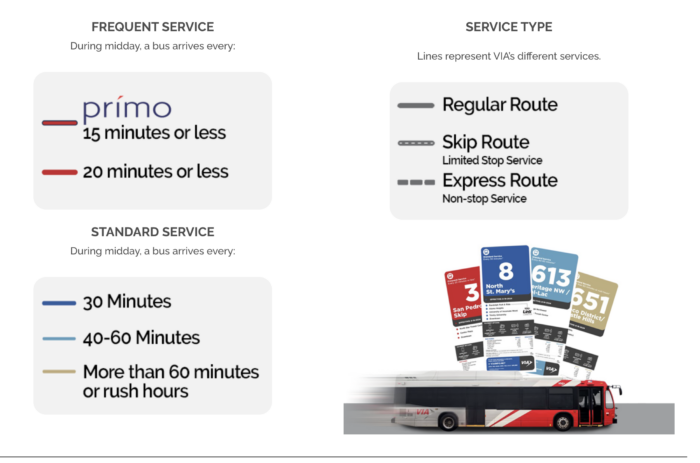
So we’re really excited that our map for San Antonio’s transit agency Via is not just published, but published with a splash, welcoming everyone to “the new colors of the city.” Those colors, of course, are our firm’s usual way of showing frequency clearly. Hot colors for high frequency, because those catch the eye, and cooler colors for lower frequency. A slightly darker red signals the Bus Rapid Transit service, locally called Prímo.
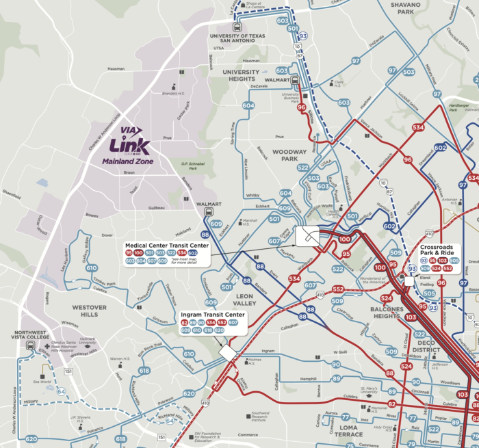
Finally, here’s a bit of the map, but you can download the whole thing here.
Those dark red lines are the frequent network, where service is always coming soon. Want to build something that will need transit? Build it on those red lines! Thinking of relocating and want transit to be good? Locate there! Sending that signal is one of many reasons that transit agencies should still have beautiful static maps, and spread them far and wide.


I suggest using pink for “20 min or less” routes, to better distinguish from the deepest-color one.
I agree with the beautify and important of paper system maps. We did one for the entire Piedmont Triad about 9 years ago it was a big hit. But I was not able to get it printed again. Recently we adapted a Remix public share map for on line use that might replace printed route maps. It works well for our small system. Below is the link. Use an Incognito window if you have a Remix account.
https://platform.remix.com/project/0df34feb?latlng=36.07548,-80.00394,10.936&sp.id=f9266049-34be-4631-b4b4-612229fb4e02
Remix maps are useless, like almost all “interactive maps”. First, it’s too bloated, you can’t run it in your browser if you don’t have a top modern computer. You can only see one route where multiple routes run the same street. You can’t see the route numbers unless you click at the lines. It’s impossible to get an overview of the system. Compare with the new San Antonio map where you can easily see the whole system at once.
Just do a pdf map. It will always be better than everything else.
Thank you, thank you, thank you! The other thing that bugs me on transit websites is how some now have their schedules in an “interactive” form, when a pdf form of the printed schedule would be more useful. Frankly, I can see more use for interactive maps than schedules, especially those maps that can be zoomed in to show where individual stops are. However, a pdf map and pdf schedules should always be offered as well! My 2c worth.
I would agree with that, John. However, I also prefer to have a printed schedule if at all possible, especially if the frequency is more than every 20 minutes.
This map is much better than the previous map. Much clearer, much easier to understand the structure of the system. One thing that could be better though: the map should show where the limited and express lines stop. “Limited stop” is not very helpful if you don’t know where it stops. The Muni map ( https://www.sfmta.com/media/37783/download?inline ) is a great example of how it should be done.
Whats the approach to bus stops?
Can one usually/always transfer/connect where two lines cross?
Amen!
The principle of interactive maps and schedules, as it is for journey planners, assumes the only use case for public transport information is individual people planning their own specific one-off journeys. This ignores the many other use cases for such information, many of which can only be met by network maps and full schedules.
So, yes, transit agencies, provide all the interactivity you want but please please please don’t hide the other stuff (which is likely available behind the scenes anyway)!