Source: Landing page for new system map at website of Via in San Antonio, at https://www.viainfo.net/newmaps/
For a couple of years now, our firm, which is mostly known for transit planning consulting, has also been making network maps for transit agencies. Not “interactive maps,” which invite you to chase flickering, vanishing content around a little screen, but good old physical maps — the kind you can post in a bus shelter, or on your wall. Like most of what we do, there’s an advocacy angle: Even in the age of trip planners, we really believe in static maps. They help people see the structure of the network and how it works with the structure of the city. They invite exploration. And they are especially useful for educating all the decision-makers in the community who do things that affect public transit, like deciding where important destinations will be located.
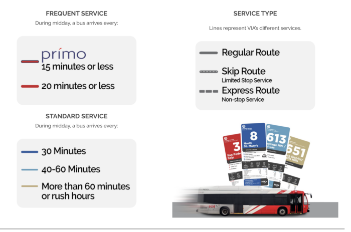
So we’re really excited that our map for San Antonio’s transit agency Via is not just published, but published with a splash, welcoming everyone to “the new colors of the city.” Those colors, of course, are our firm’s usual way of showing frequency clearly. Hot colors for high frequency, because those catch the eye, and cooler colors for lower frequency. A slightly darker red signals the Bus Rapid Transit service, locally called Prímo.
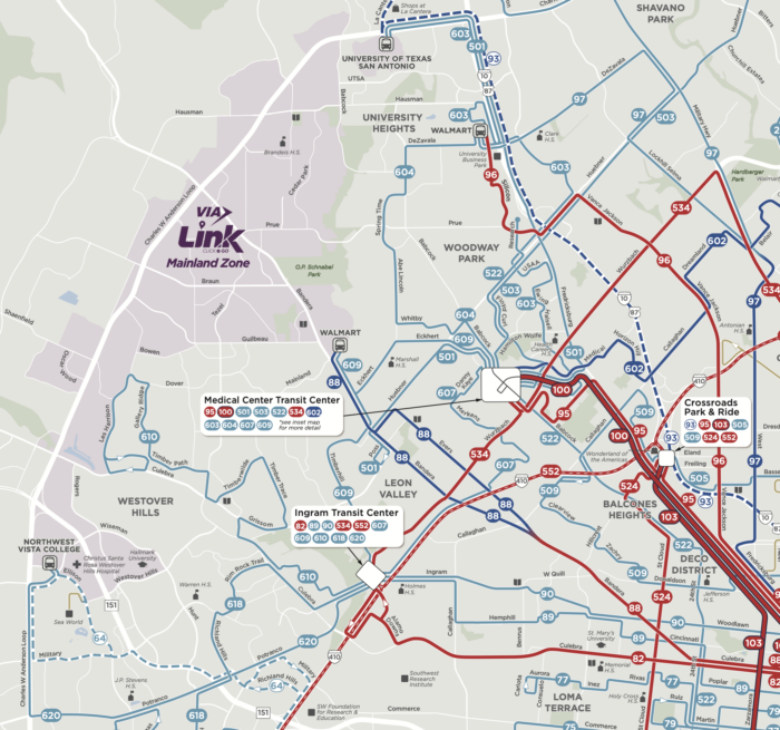
Finally, here’s a bit of the map, but you can download the whole thing here.
Those dark red lines are the frequent network, where service is always coming soon. Want to build something that will need transit? Build it on those red lines! Thinking of relocating and want transit to be good? Locate there! Sending that signal is one of many reasons that transit agencies should still have beautiful static maps, and spread them far and wide.

