Atlanta

Atlanta: Welcome to Your New Transit Network

The Atlanta area transit agency MARTA finally implemented its bus network redesign, called NextGen, on April 18, 2026.  We led the network design and analysis tasks for the consulting team, and although it was a long and difficult journey, we’re proud of the results.  Now that the new service is running, I want to give a quick overview of what the redesign did, and the new opportunities it creates.  If you want to go deep into geographical detail, and understand why we made each routing choice, you can find our Final Report online here.

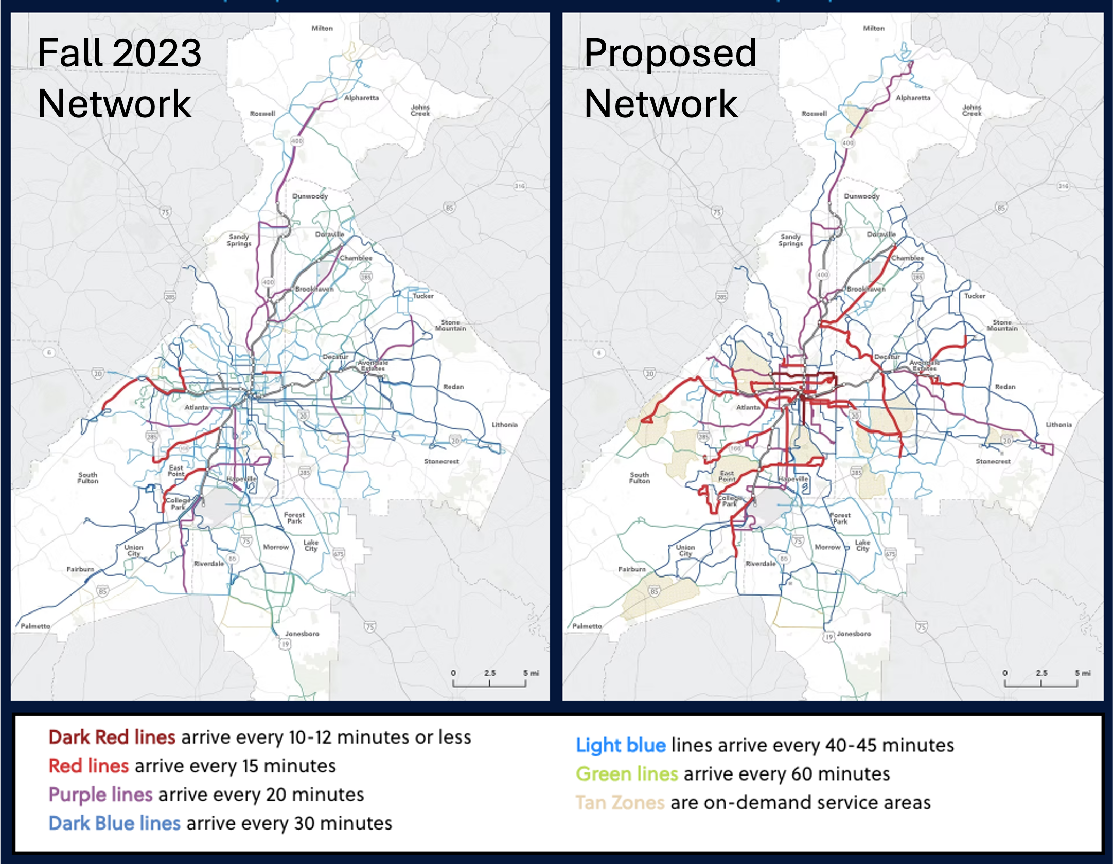
Here’s the big picture.  Old network on the left, new network on the right.  Note the legend: Colors indicate all-day frequency.  The wide grey lines on the basemap indicate the rail rapid transit network, which is all frequent most of the time.  Our more detailed map of the new network is here.)

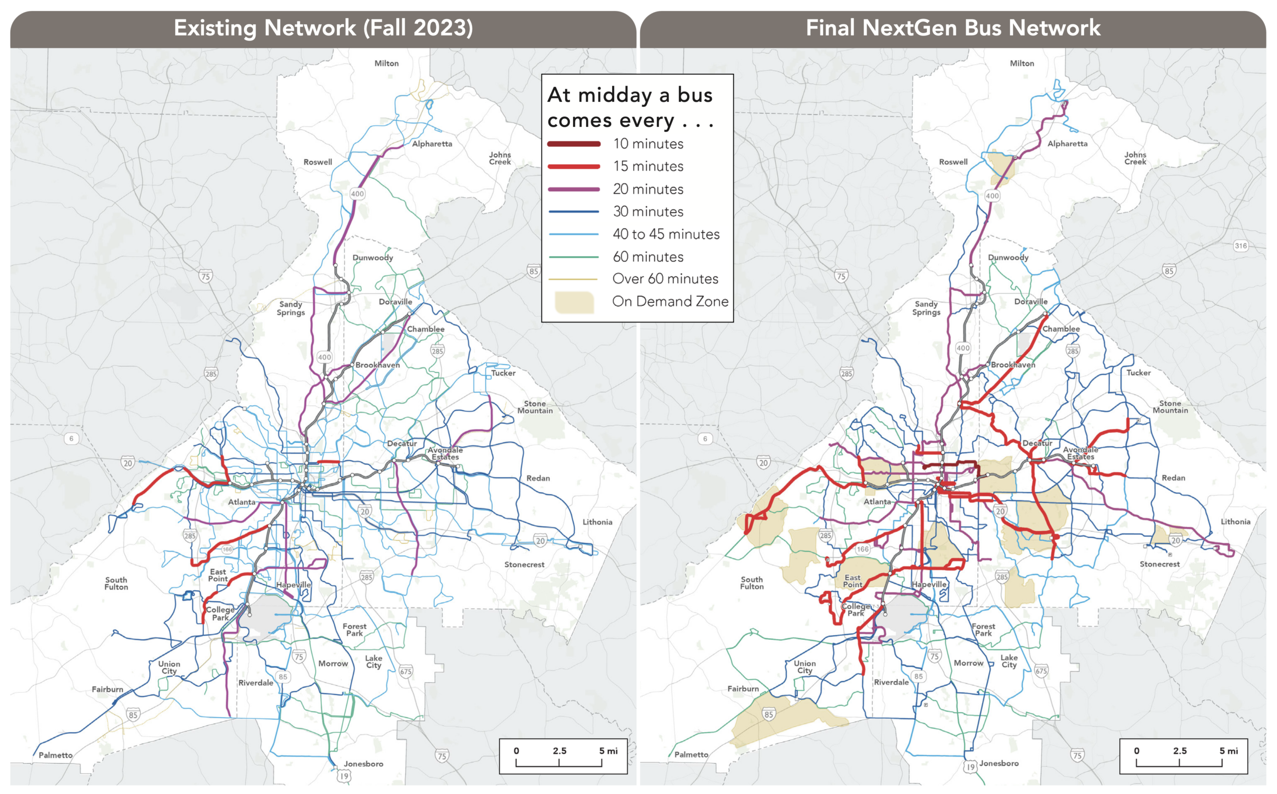
The overall quantity of service we had to work with is slightly higher than in 2023 but lower than what existed in 2019.  This reflected the available resources and key policy decisions about priorities.  For example, the City of Atlanta has its own transit funding source, More MARTA Atlanta, but during the study process they chose to devote these funds entirely to future transit projects rather than short-term transit service.  That’s why there isn’t more service within the city.  As network design consultants, we work with the service budget that the agency has.  When I have been asked how much service Atlanta needs, or how much would attract good ridership, I say “much more than this.”  But that is not the question we were asked in this project.

Within those budget limits, we were able to increase by 22% the number of useful destinations the average person can reach in 60 minutes.  (For more about these access measures, and why they matter, see here.  For more on how we measured this in Atlanta, see the Final Report.)  This is the easiest way to describe why the network is better: more people will find it useful for more trips.

The old network had three major problems that we tried to address:

  • Low Frequency.  For a city of Atlanta’s size and density, there was remarkably little high-frequency service, which we define as service coming every 15 minutes or better all day.  The new network has much more frequent service, shown in red on the maps above.  Purple lines in the new network, running every 20 minutes, all deserve to be every 15 but our resources just didn’t go that far.
  • Poor Connectivity.  While the old frequent bus lines all connected to rail, they did not connect much with each other.  Most connections outside the rail system required multiple transfers at low frequency, without any particular timing of connections.  This made for long delays even on fairly short trips.  In addition to increasing frequencies and increasing the number of places where frequent lines meet each other for fast connections, we also introduced new timed connections at several suburban locations, enabling fast connections between routes even when the frequencies are low.
  • Buses Exclusively Feeding Rail.  The bus network had not been substantially rethought since the rail network was created decades ago, and its basic assumption was that buses exist to feed the rail network.  Virtually all routes in the old network ended at a rail station.  This is very unusual, and for good reason.  Many local trips in dense areas are traveling across the rail line, and this approach made the rail line a barrier for all those trips.  We questioned this as much as possible, though in many cases, infrastructure limitations forced us to continue the practice.

We’re especially proud of what we achieved in Downtown and Midtown, the densest place in the region.  Three lines now run continuously east-west across the city center — including the very frequent route 2 as well as the 11 and 51.  (Old network above, new one below).  (All these detailed maps can be fiound in the final report.)

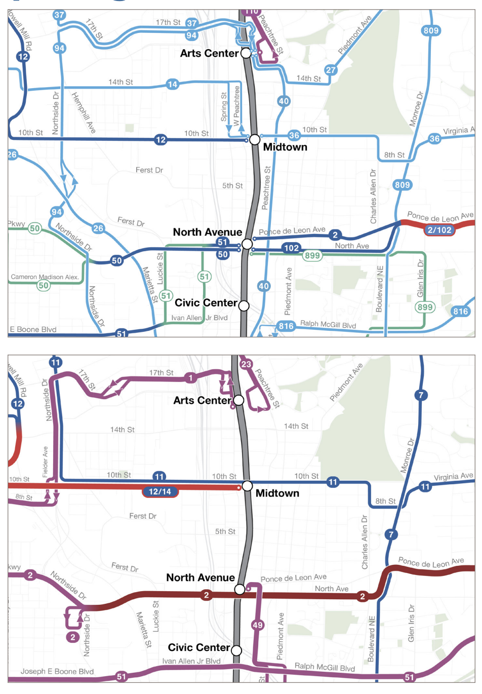
Old network (above) and new network (below) in midtown Atlanta. Colors represent frequencies, using the same legend as in the first image above.

Of course downtown Atlanta would support a full grid of frequent lines, as comparable downtowns such as Denver and Los Angeles have, but with so few resources devoted to bus service, that wasn’t possible here.   Still, the new continuous routes across downtown will vastly improve access into and across the city.

One route with great potential was actually removed: the old north-south route 40 along Peachtree Street, the highest-density spine of downtown Atlanta.  This route ran right alongside the rail line but made more stops between the stations.  We observed that this route, if running frequently, would have very high ridership.  Comparable streets in similar cities certainly do, even with rail running beneath them, because the demand for local trips is so high and the time to access the station often isn’t worthwhile for short trips within downtown.

But with the budget we had to work with, and the need to divide service among the various parts of the region, we couldn’t afford the level of service that Peachtree Street would need, which would be every 10 minutes or better.  So we decided not to serve it at all.  The 45 minute frequency being offered was simply not relevant to the kind of market that Peachtree Street is.  Plenty of people are moving up and down the street and would benefit from the service, but most are doing so spontaneously, not on predictable schedules, so they will only use the service if it’s coming when they need it.  Without extremely high frequency, there wasn’t much point.

Thinking about the needs of disadvantaged communities was hard in this project.  In the Atlanta area, the greatest concentrations of low-income and minority populations are in the south and southwest, but southside Atlanta in particular has a very difficult street network.  There are north-south streets, but none of the east-west streets is entirely continuous across the area.  Freight rail lines, which made some crossings inoperable due to the disruptions long trains would cause, further complicate the picture.  That’s why we weren’t able to create as much of a frequent grid pattern on the south side as we would have liked.

The Atlanta area is also a world leader at building low-income apartment developments in places where efficient transit can’t get to them, often because they are on long cul-de-sacs or in locations that would require an awkward deviation.  This is where you’ll find many of the new on-demand or “microtransit” zones, which are the only way to get any service to some of these locations.   We also used one of these zones in the far west to cover part of the unwalkable Fulton Industrial Area, bringing people to a central point where they could connect to several fixed routes.  As always, these zones were designed to maximize coverage, not ridership.  Their purpose is to provide lifeline access to as many people as possible in the places where the geography is especially difficult.  They are not meant to be superior to fixed routes.  They are just a way of arranging service to get some coverage to areas where the design has made efficient fixed routes impossible.

If you live in the MARTA service area, I hope you’ll explore how the network has changed, and how it might be useful to you now.


Atlanta: A Draft Redesign of the Bus Network

After much hard work, intense discussions, extensive public outreach, and a pandemic, we’re finally ready for public comment on the draft MARTA “NextGen” bus network redesign, whjch covers Atlanta and the neighboring cities in Fulton and DeKalb Counties.  (Clayton County is also part of MARTA but being addressed by a different process.)

The project website has all kinds of maps and useful information.  But if you’re curious, I hope you will delve into our readable full report (download high resolution pdf, or view low resolution pdf).  There you’ll find a complete explanation of the thinking that led to the proposal as it stands.

This is the first complete rethinking of the bus network since the MARTA rail system opened 45 years ago.  Back then, the core idea of the network was that the purposes of buses was to feed the rail system, producing a network overwhelmingly suited to bringing people into downtown Atlanta.  But since then, much has changed about the region and it transit demand:

  • Many suburban employment and activity centers have developed, some of which are well suited to transit service.
  • The rise of working from home after Covid-19 has reduced the downtown rush hour commute market.
  • The need is greater than ever for all-day, all-week, all-direction trips that matter to lower income people.  Many of these trips are not going downtown, but to activity and job destinations all over the region.

We have done our best to redesign the network reflecting these changes.   Big ideas include:

  • More lines that run frequently (every 15 minutes or better) all day and on weekends.  These are in red on our maps below.
  • More lines that continue past rail stations instead of ending at them, to connect more destinations with fewer transfers.

Is this all of the service that the service area needs?  No, it is what MARTA can afford, given its other commitments and the decisions that have been made about priorities.   MARTA directed us to plan for a total service budget that is slightly lower than 2019 though higher than 2023.  I wish we could have proposed far more service than this.

Still, within these constraints, the plan achieves some dramatic improvements.  Here is the Fall 2023 network on the left, which we used as a baseline, and the proposed “NextGen” network on the right. (These are just diagrams.  Much more detailed maps are on the project website and in our report.)


Some key facts:

  • The average number of jobs reachable in an hour goes up by 21% for all residents, 23% for racial minority residents, and 23% for low income residents.  (Why does this matter?)
  • The number of residents within 1/4 mile of service goes up by 2%.
  • The number of residents within 1/4 mile of frequent service (every 15 minutes or better all day, shown in red above) goes up by 245%.

I hope you’ll take the time to peruse our friendly report, which talks through the whole thought process and explains how we got to this recommendation.  Then, if you live or travel in the MARTA service area, please comment!  MARTA is taking comments through February.


Atlanta: You Have Choices for Your Transit Future

Source: “Atlantacitizen” at English language Wikipedia

For over a year now we have been working with the metro Atlanta transit agency MARTA on a study to potentially redesign their bus network.

A bus network plan isn’t just about bus service! It’s also about how public transit contributes to all kinds of goals that residents care about, including equity, prosperity, managing congestion, and reducing emissions. Bus service is relevant to redevelopment, too, because this study will help determine where it is viable to live without a car.

We’ve analyzed the existing system and patterns of demand.  Now, we really need everyone in the region to tell us what their priorities are.  If you live in Fulton, Clayton, or DeKalb Counties, your opinion matters and we need you to speak up.  The future design of the bus system will depend on what you tell us now!

There’s no money to add service above 2019 levels, so we have to make some hard choices.  To illustrate these choices, we’ve sketched two contrasting alternatives for what the network might look like.  We need you to have a look at these and tell us what you think.

To see the alternatives, and take the survey, just click here.

Please share this with everyone you know in the region!


How do I find a hotel near good transit?

Map_of_hotels_near_washington_dc_metroHere's news you can use, or at least news I can use as an absurdly frequent flyer.  

All of the standard travel shopping sites make it very hard to assess the transit options from a hotel's location.  At most they have distances and sometimes car travel times.  So I often spend too long doing research, and pay too much for a hotel close to my destination when I might easily have stayed further away more cheaply if I knew good transit was there.

This, therefore, is a really good tool.  In the case of Washington DC, it helps you see all the hotels that are close (objectively close, not hotel-marketing-close) to a subway station.  It's the work of Jeff Howard, and he's also done one for Atlanta's MARTA subway.

You can get hints of similar output from Google, very crudely, by pointing Google Maps at a city and then specifying, say, "hotels near a DC Metro station," but Google is easily confused by excessively clear requests, and to Google, "near" means car-near, not transit-near.  Someday, maybe Google will understand "hotel within 400m of a frequent transit stop," or even "hotel within 30 min frequent transit travel time from ___".  But that's clearly a way off, and Google often seems more interested in interpreting vague search requests than replying to clearly stated ones.

In any case, even a competent search engine wouldn't produce Jeff Howard's very useful feedback about hotels.  Click on a station and there's a writeup about each station area, including a map showing the hotel's exact relationship to the station, and links to the hotels themselves, including a reservation widget.  Nice work, Jeff!


Walkscore.com and the Lure of the Single “Score”

[Note: This post is from 2010 and has not been updated to reflect more recent developments, including the acquisition of WalkScore by Redfin.]

The Conservative Planner [blog site no longer active] has a thoughtful attack on WalkScore.com‘s methodology for calculating a simple “walkability score” for any neighborhood in America.  He’s found several examples where WalkScore has given a high score to a place that’s clearly hostile to pedestrians when viewed on the ground.  Continue Reading →

Rail Rapid Transit Maps, to Scale

Nyc4bf

Neil Freeman recently posted a great collection of rail rapid transit maps, all drawn to scale, and all at the same scale.  The image at right, of course, is New York City,

He calls them subway maps, but of course that term suggests that the service is all underground, which few “subway” systems are.  What matters is that they’re rapid transit.  In this case, they’re specifically rail rapid transit, which is why Staten Island’s rail line in the lower left appears disconnected from the rest.  In reality, it’s just connected by rapid transit of a different mode: the Staten Island Ferry.

(By “rapid transit” this blog always means transit services that run frequently all day in an exclusive right of way with widely spaced stations — linking centers to each other, for example, rather than providing coverage to every point on the line as local-stop services do.)

Continue Reading →