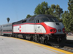
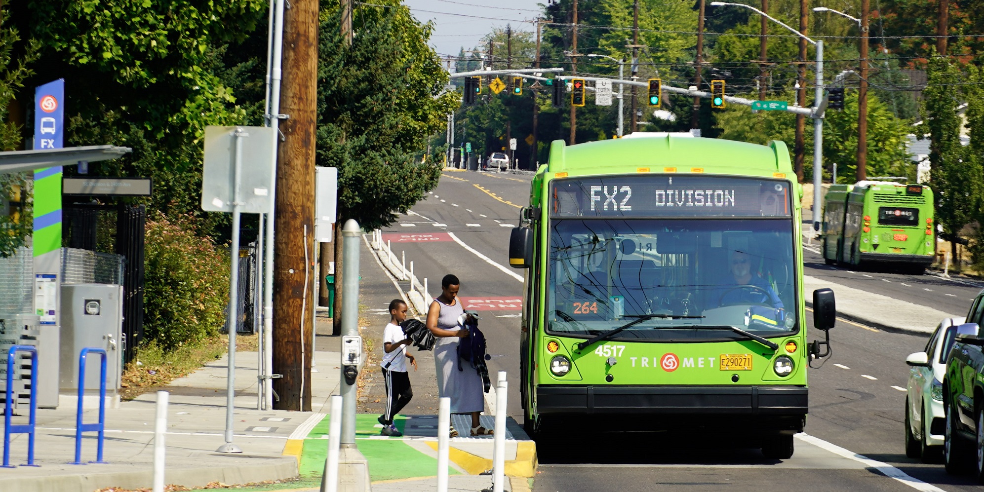
Frequent Networks

Portland: Good Outcomes from “BRT-Lite”

Photo: TriMet

Portland’s transit agency TriMet has some good news to report from its “light Bus Rapid Transit” project on Division St.  It’s especially good news because lots of North American cities have streets that look like Division, namely:

  • A segment of a few miles through the inner part of the city where the street is too narrow for bus lanes, but where redevelopment is driving up densities and thus travel demand.  This part of Division is increasingly lined with four story buildings — residential over retail — with historic small-lot single family homes behind them.
  • An outer segment in “inner ring suburbia” where the street is wide enough for bus lanes, and where the critical issue is the unsafe environment for pedestrians.

The Division FX project consisted of the following changes, probably in roughly declining order of importance.

  • Wider spacing of stops (up to 1/2 mile in some places) with no underlying local-stop service alongside it.
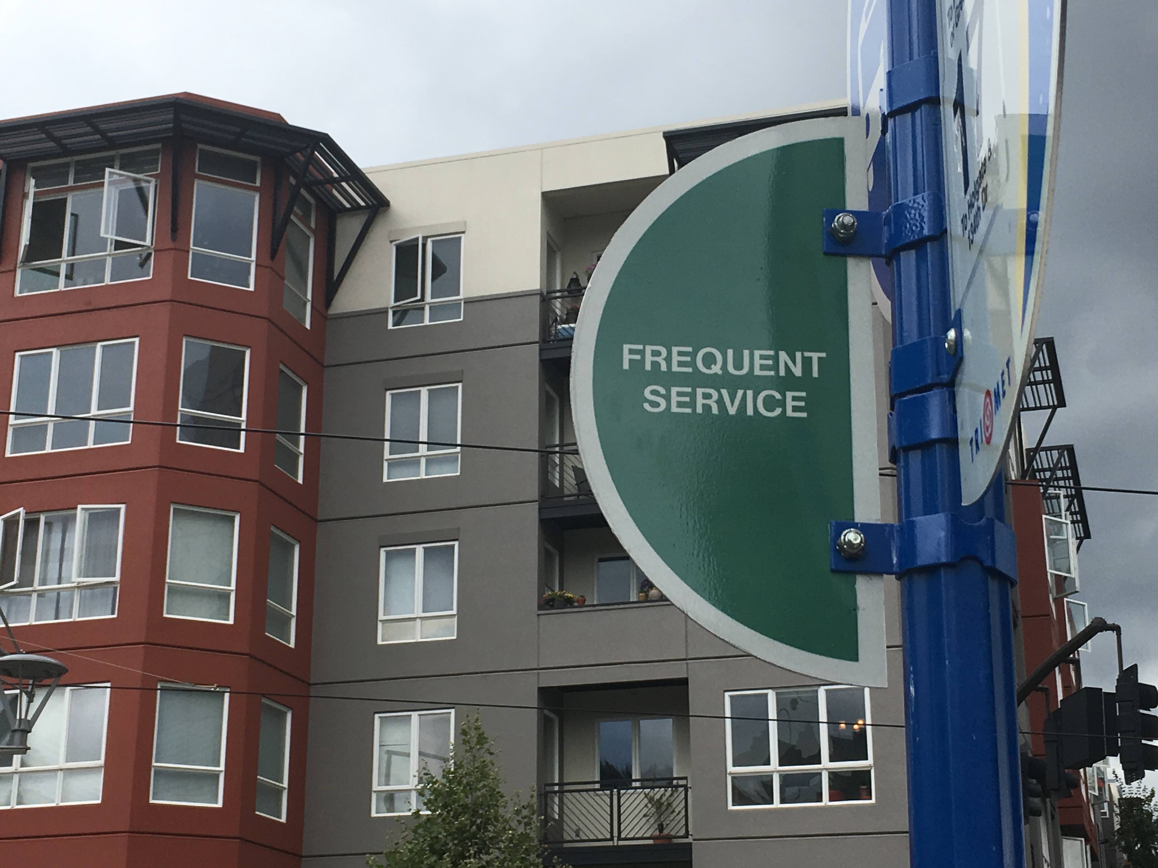
  • A 12-minute frequency, instead of the usual 15 for Frequent Service Network lines.
  • Signal priority at signals along the line.
  • Improvements to sidewalks and pedestrian crossings in the outer segment.
  • A short stretch of bus lane in the area that had room for one.
  • Articulated buses (60 feet long, with a hinge).
  • Nicer shelters with signage identifying the location and a realtime information display.
  • A special green paint scheme.

But it’s still in mixed traffic on the narrow and congested inner segment.  There was a lot of reason to doubt how much improvement could be achieved in that situation.

So I’m pretty impressed with the results:  Overall travel times are up to 20% shorter.  That’s 20% more access to opportunity for people traveling along the line.  And of course, this line is part of a frequent grid, which spreads these benefits over this whole side of the city.

Ridership is up dramatically as a result, almost 40% for the first year of operation (September 2022 – August 2023) compared to the year before.  Total transit system ridership grew about 8% over that time, so some of this is background growth due to ongoing pandemic recovery.  But still, even if the effect of these changes were only a 30% increase, that would be spectacular.

There are many, many streets like Division where this quality of service is needed and possible.  I hope we can aspire to a time when all frequent bus lines have at least this level of quality.


One Less Barrier to Expanding US Urban Rail Transit


Caltrain between San Francisco and San Jose is one of many urban “commuter rail” lines that really need to be high frequency rapid transit lines. Now that’s a little more likely. Photo: Lucius Kwok.

Here’s some good news for people who want more rapid transit service in US cities, and soon.

In the US, all passenger rail services that could potentially mix with freight are governed by the regulations of the Federal Railroad Administration (FRA). This applies not just to Amtrak but also, critically, to “commuter” rail lines, crucial rail transit services that run on freight railways.

If cities wanted to rapidly upgrade their rail transit systems, the cheapest way is often using upgraded commuter rail rather than building new lines.  Many major cities have large networks of radial commuter rail lines [typically originally freight lines] which, if upgraded to run every 15 minutes or better all day, would effectively become metro lines, on the cheap.  You’ll find this level of service in many major metro areas overseas. Toronto’s Smart Track plan is exactly this idea.

The problem, as always, is frequency, which in turn is a problem of operating cost.  Most US commuter rail systems are far too infrequent to be useful for anything but 9-5 commuting, even though many of them run through dense urban fabric where the demand is there for all-day frequent service.

The Obama FRA, responding to several freight rail disasters, had proposed a rule mandating two-person crews, and had quietly inserted language extending this to passenger rail, even though passenger and freight rail present very different safety issues.   Those requirements would have made commuter rail service too expensive to run frequently enough for it to be useful, and would have persisted regardless of whether technological developments improved the safety outcomes of one-person crews.

The Federal Railroad Administration has just announced that it will stop requiring two-person crews and preempt state requirements to do so.  If this were a genuine safety issues, I’d be alarmed, but it really isn’t. The new FRA position liberates transit agencies and other local governments to negotiate the right solution with their unions in the context of what’s technologically possible.

Yes, removing this requirement is a “conservative” idea that would be unlikely to come from a Democratic administration.  But it removes a significant barrier to providing more useful urban public transit, which leads to all kinds of benefits for equity, prosperity, and the environment.

A US Density Revolution?

These two things are connected!

In major cities and some states across the US, the tide seems to suddenly be turning in favor of density.  James Brasuell at Planetizen has a thorough survey of these efforts.  Read the whole thing.

An inescapable trend emerged in recent years and months: a large and growing number of communities are now engaged in comprehensive plans and zoning code revisions, and they’re doing that planning work in the hopes of creating a future that is fundamentally distinct from the 20th century model of planning.

But the revolution Brasuell describes is about much more than planning documents.  The story is political:  In response to the housing crisis, both city and state politicians are producing legislation that makes it easier to build densely by:

  • reducing off-street parking requirements, which makes denser development pencil out and can also make units more affordable
  • streamlining transit-oriented development, including around frequent bus corridors and
  • most controversially, allowing more density in neighborhoods that have long been legally protected as exclusively for single family homes.

All this is great news, not because everybody wants to live at high density but because more people want it than can currently afford it.  The extreme cost of living in dense and walkable cities is the sound of the market screaming at us to build more of them, and finally that’s becoming possible.

From a transit perspective, I have one note of caution when it comes to upzoning absolutely everywhere.  Most cities have places that are hard for transit to get to, and where a few more people will create transit demand that is very expensive to serve.  Sometimes they are physically hard to reach: long cul-de-sacs, squiggly streets, etc.  But sometimes too they are so sparsely populated that they are poor transit markets and adding a few more people isn’t enough to make them better.

Gentle upzoning of single-family areas — allowing second and third units on formerly single-family parcels — is mostly helpful, but not always in these tough spots.  In any case, serious density must be organized around the frequent transit network — bus and rail — so that more people end up in places where transit can be really useful to them.   Don’t know where yours is?  There should be a map of it somewhere, reflecting a policy adopted by both your transit agency and your city government!  It should be on the wall in both the transit agency and the city’s planning and traffic offices.  (See Chapter 16 of my book, Human Transit, for more on this tool.)

Transit is expensive.  It succeeds when it can run in straight lines through dense and walkable places, so that it has enough ridership over a short enough distance that it can afford high frequency.  A policy frequent network, agreed upon by the transit agency and the city government(s) and manifested in both zoning and traffic planning, was critical to jumpstarting the growth of transit in Seattle, which is now one of the US’s great success stories.  It could make a difference for your city too.

Toronto: A new King Street for Transit

By Christopher Yuen

For the past few decades, Toronto’s King Street, a frequent transit corridor through the densest and fastest-growing parts of the city, has been increasingly choked by car traffic. Built before the age of the automobile, and running in mixed traffic as was typical with legacy streetcar systems, the 504 King streetcar’s speed has deteriorated to just about walking speed on most days during rush hour. That was until three weeks ago, when the City of Toronto launched a one-year pilot project to restrict car traffic and give transit the space it needs to move. The Globe and Mail has a great piece on the significance of this project here. Details on the project and its design are available at the City of Toronto website here.

King Street Pilot Plan Diagram excerpt

The King Street pilot project prioritizes transit.

The new design of 4-lane King street was particularly thoughtful, given some of the constraints the corridor faces. While transit malls in some cities completely ban non-transit vehicles, existing high-rise parking garages that front onto King Street and businesses throughout the bustling entertainment district without back lane for loading and deliveries meant that vehicular access had to be maintained. Under the new design, left turns and through-travel are prohibited for cars and trucks at all major intersections- requiring drivers to turn right and use alternate streets.

At the approach to intersections, vehicles waiting to turn right form a queue in the right lane, out of the way of transit. At some intersections, cars receive an advance turn signal ahead of pedestrians to ensure the tail of the turning queue does not impede the streetcars.

Taken on a weekday at 4:00pm, this scene would have been much more chaotic with through-traffic blocking transit before the project. Now, cars are channeled to turn right at every intersection. (Photo: Alex Gaio)

Taken on a weekday at 4:00pm, this scene would have been much more chaotic with through-traffic blocking transit before the project. Now, cars are channeled to turn right at every intersection. (Photo: Alex Gaio)

Without through-traffic, having two lanes at the start of each block is no longer necessary, allowing for an important feature for efficient transit operations- far-side stops. Streetcar tracks in Toronto, and in many legacy systems, operate in the middle of the road. To board and alight, passengers must step into the roadway, protected only by a rule prohibiting motorists from passing open streetcar doors. As a result, stops have always been located on the near-side to reduce the risk of drivers making a right turn onto a transit corridor and immediately conflicting with passengers getting on or off a streetcar. Under the new design, streetcars stop on the far side of most intersections, beside barriers that effectively extends the curb to the second lane at the start of each intersection.

New far-side stops with a temporary curb-extension mean passengers no longer have to walk through a traffic lane to get on and off the streetcar. (Photo: Alex Gaio)

New far-side stops with a temporary curb-extension mean passengers no longer have to walk through a traffic lane to get on and off the streetcar. (Photo: Alex Gaio)

In addition to the obvious safety benefits of the new design, the far-side stops also allow transit vehicles to travel faster. Traffic signals along Toronto’s King Street already feature transit signal priority- they detect an approaching transit vehicle to hold a green light, or shorten a red light. With near-side stops, the unpredictable dwell times at stops would sometimes cause the traffic-signal to time-out, leaving the transit vehicle with a red light just as it closes its doors and is ready to get moving. Far side stops allow signals to be held for a streetcar to get through an intersection before stopping for passengers.

The new design also re-allocates curb space as loading zones, taxi stands and for new seating and patio space mid-block- all valuable features for a dense, mixed-use central business district which would not have been possible when all four lanes have been dedicated to the throughput of cars.

New public spaces like this will become especially valuable when patio season begins.

New public spaces like this will become especially valuable when patio season begins. (Photo: Alex Gaio)

Since its launch, public support has been for the most part, positive. The all-at-once approach to implementing this pilot across the corridor has ensured that the new inconvenience to some drivers has also been matched with a drastic, noticeable, and immediate improvement for everyone else. Across the twittersphere, Torontonians are reporting anecdotes of more consistent departures and trips taking half as they did previously.

Even among some taxi drivers, subject to the same turn restrictions throughout the day, initial skepticism appears to have eased.

Preliminary analysis of GPS data shows that the project is working, significantly reducing both the average and the spread of travel times.  However, it remains to be seen if enough drivers will comply with the new restrictions once the initial enforcement blitz is over. If New York or San Francisco‘s bus lanes offer any guidance, Toronto should introduce automatic camera enforcement along the corridor. Over the course of this one-year pilot project, municipal staff and the transit agency will be sure to monitor the situation closely and make adjustments based on actual results.

Cities, faced with growing populations and spatial constraints, must defend the right for transit to move if they wish to limit the negative impacts of traffic congestion. Toronto’s King Street offers a story of how that can be done quickly and effectively.


Christopher Yuen is an associate at Jarrett Walker+Associates and will be regularly contributing to this blog.

Auckland: South Auckland Redesign Rolls Out

Back in 2012, I worked with Auckland Transport to design a completely new design for the city’s transit system.  (Auckland has a single city government covering the whole urban region, so you could also call this a regional plan.)

The old design — if it could be a design at all — had been the result of private operating companies designing their own routes to their own advantage, which led to enormous numbers of express buses into the Auckland city centre (where they created major bus congestion) but poor services for getting around locally or crosstown.  It was also just impossibly complicated …

Old network in southern Auckland. Can you see how to get anywhere?

Old network in southern Auckland, almost all infrequent. Can you see how to get anywhere?

The new network emphasizes all-day high-frequency services, connecting to each other in grid patterns and to newly frequent rail lines.  Read about that big picture, and its payoffs, here.

A small piece of the network, in the Green Bay area, was implemented last year, and achieved a 20% ridership increase (on no increase in service quantity) in the first year.  Now, the first really big piece has been rolled out across southern Auckland.  This area, formerly the City of Manukau, is relatively low-income, ethnically diverse, and features fragmentary, shredded street patterns that are a huge challenge to network designers.

A fragment of the old network is above.  Virtually none of it, including the train line, was frequent.  The overlapping lines with uncountable 3-digit-route numbers show local routes tangled up in express routes going all the way into the CBD far to the north, competing with the rail line.

Here’s the same slice of the new network (beautiful full map here):

New South Auckland network. Wide lines (31, 32, 33) are the Frequent Network

New southern Auckland network.  Wide lines (31, 32, 33) are the Frequent Network

Why the huge reduction in complexity?  Virtually all express buses to the CBD were replaced by buses connecting to the main rail line, which is now frequent.  Local lines were organized so that they form a logical network feeding into local hubs as well as to major rail stations.  Note that not all rail stations are bus hubs; the network concentrates only on certain rail stations so that buses connect with each other as well as with the trains, and so that consolidated station facilities can be built at these locations.  The biggest new hub, Otahuhu at the north end of South Auckland, has a huge number of buses feeding it, and got a shiny new bus-rail station for the new network’s opening day.

As always, there will be hiccups in the implementation process, as people adjust. But it’s great to see this plan, first sketched four years ago, on the street at last.

Portland: New Transit Map Underscores Frequent Network

By Evan Landman

Evan Landman is an associate at my firm, Jarrett Walker & Associates, and serves as a research assistant and ghostwriter on this blog. He tweets on transit and other Portland topics at @evanlandman

For years on this blog and in our projects, we've stressed the importance of highlighting and emphasizing transit agencies' Frequent Networks on customer information of all kinds.  Portland's agency TriMet has traditionally been a best practice example here, given their extensive Frequent Network branding down to the individual stop level, but curiously, their system map has not embraced this idea so wholeheartedly. Today, TriMet's new system map changes that, introducing a cleaner, more readable map, which does a much better job of highlighting the agency's premier bus services. 

Let's compare the two, starting with the old map that has just been retired:

Screen Shot 2015-09-30 at 3.57.57 PM

Portland Central Eastside, TriMet map (early 2015)

This Southeast Portland shows the core of the city's Frequent Network. The Frequent Network is symbolized with a thicker line weight, but every line still has its own individual color, presumably to make it easier to trace each individual line across the network. However, the effect of this choice distracts from the important information contained in the line weight property, because the wide diversity of bright colors climbs to the top of the visual hierarchy, though the colors communicate nothing about the nature of the service on each line. 

The legibility of the map is not aided by the large number of points of interest shown, with both text and symbols frequent overlapping the most important features (the transit routes). TriMet's old map was certainly not a bad transit map by any means, and deserves enormous credit for being one of the first to explicitly show frequency at all, but in the years since, many of TriMet's peer agencies around the country have focused even more heavily on frequency to produce truly useful and innovative maps.

Now compare the image above with the same area of the new map:

Screen Shot 2015-09-30 at 3.57.38 PM

Portland Central Eastside, TriMet map (late 2015)
 
This is a map that truly focuses on communicating the usefulness of the transit routes. The most important factor for usefulness is frequency, which is obscured when every line on the map is the same color, or a different color, or colored by a less important attribute, like which corner of the city it serves. 
 
Here, weight and color are both deployed to differentiate the Frequent Network (heavy, dark blue) from other less frequent routes, but without the riot of color of the older map. When we compare the legends of each, the difference is subtle, but the when deployed on the map, the difference is dramatic.
TriMet Map ComparisonThis new map makes one thing very apparent: anywhere near a thick, dark blue line, a bus is always coming soon.
 
It is also a clearer, more traceable map! Where the old version employed the common convention of using color to distinguish routes and make it easy to tell where they travel across the city, the new map uses line displacement and simplification in a much more sophisticated manner to accomplish the same task.
 
For example, examine the path of the 10-Harold: on the old map, its line appears to end at Hawthorne and 12th, where it joins the 14-Hawthorne to head into downtown (it's actually beneath the 14's line, if you look closely). With the new map, it is much clearer that this route overlaps with the 14 in this segment, just by the way in which the two lines have been separated from one another. Now that color is now longer necessary to distinguish each route, it can be used for a more important purpose: showing frequency.
 
Apart from the increased focus on frequency, this map also succeeds by reducing the amount of non-transit information, with fewer points of interest labeled. Those that are present have symbols and labels drawn with a brown color much closer to that of the map's background, reducing the effect of collisions with transit features, and diminishing the level of visual "noise" competing with the transit network structure for the reader's attention.
 
It's fantastic to see an agency like TriMet continuing to work to improve its customer information. Even in the age of real-time data and mobile trip planning, a transit agency's map is often the only place where the entire system is documented in a way that an average person can understand. City transit networks are complex, and the best maps, like TriMet's, are designed to reduce that complexity, focusing on the most important aspects of the service for the people who ride it. 
 

Houston METRO’s Transit System Reimagining Plan approved

Over the past two years, our firm has worked as a member of a diversely skilled team to help Houston METRO comprehensively redesign the city's transit system (look back to this post for the backstory). Houston is a dynamic, fast-growing city, where despite a reputation as a place where one must own a car to live, many areas have developed land-use characteristics indicating a large, untapped market for quality transit. This project has sought to design a transit network which can deliver the type of mobility outcomes current growth patterns demand, through a extensive Frequent Network grid. 

Today, we are proud to share the news of the unanimous passage of the final plan by METRO's Board of Directors, with implementation on track for August 2015. In the history of transit in North America, top-to-bottom transit network redesigns are very rare, particularly for a city of the Houston's size and national importance. This is a great day for Houston, and will be a fascinating case study for transit in North America.

The final approved map (click here for the detailed pdf):

Reimagined Network Plan Feb Revision

perth: a frequent network map

For over four years now, this blog has been encouraging transit agencies to map their high-frequency networks, and encouraging citizens to map them themselves if the transit agency doesn't.  We've featured many over the years, including a rapidly rising number of maps by actual transit agencies.  Just enter "frequent network maps" in our handy new searchbar.  —>

Here's a new citizen entry, from Perth, Western Australia, by a Mr. OC Benz on the Bus Australia discussion board.

Perth frequent network

And zooming in a bit:

Rsz_perth_high_frequency_map_inner_city

Although the definition does not include weekends, when Perth service levels drop sharply, the map is remarkable nonetheless.  Greater Perth is a young and mostly car-oriented area with a population of around 2 million, but it has a lot of frequent bus service — more than Brisbane, its closest peer in both geography and economics, and far more than almost any US city of similar size.  

The bus service is also intended for more than going downtown, indeed, you can also see disciplined efforts to construct a high-frequency grid against overwhelming geographical obstacles: downtown is at the convergence of two squiggly rivers that make it difficult.  (Again, a dramatic contrast to Brisbane, the only big Aussie city with no orbital frequent transit service at all.)

Edmonton: what a great transit debate looks like

The Edmonton Journal's Elise Stolte has been doing an excellent series on the city's debate about the future of transit.  Unlike many transit debates, this one is about a real issue that affects the entire city: how to balance the ridership goals of transit with the competing coverage goals, where "coverage" means "respond to every neighborhood's social-service needs and/or sense of entitlement to transit even if the result is predictably low-ridership service."   This is the great inner conflict in transit planning: Do we respond to demand (ridership) or to needs and expectations (coverage)?

When I briefed the Edmonton City Council last year, as part of their Transit System Review, I encouraged the council to formulate a policy about how they would divide their transit budget between ridership goals vs. coverage goals.  This solves a fundamental problem in transit analysis today: too often, transit services are being criticized based on their failure to achieve a goal that is not the actual goal of the service.  

For example, almost all arguments about how unproductive North American bus service is are based on the false assumption that all bus services are trying to be productive.  Based on all the agencies I've worked with, only around 60-70% of bus services have ridership as a primary purpose.  (My test: "Is this service where it would be if ridership were the only goal of the agency?")

I may have invented this rigorous way of talking about transit's conflicting mandate.   I began developing it in a Spokane (Washington) project around 1997 and in projects in Bellingham and Reno a few years later.  My peer-reviewed paper on the methodology us here and the case for it is also in Chapter 10 of my book Human Transit.  Helping transit agencies think about this question has been a central part of most transit studies I've done since, including major projects in Houston, Columbus, Indianapolis, Salem (OR) etc. 

Nothing makes me happier than to hear elected officials debating an actual question whose answer, once they give it, will actually affect reality.  This is what's happening in Edmonton now.  So far,  articles in Elise Stolte's series have included

Soon, I'm sure, she'll cover some of the passionate arguments in favor of coverage services, which we heard from several City Councilors when I last briefed them on the issue.  

Throughout, the Journal's Elise Stolte has taken a tone of genuine curiousity ("So, will you help me think this through?") in an argument where there are no right or wrong positions, only different priorities and visions to be balanced.  Is your city having this conversation clearly?


indianapolis: upcoming meetings on your transit system!

Last spring, Jarrett Walker + Associates was contracted by IndyGo, the transit agency serving Indianapolis and Marion County, to lead an update of their last Comprehensive Operation Assessment. This project involves consideration of the design, performance and mobility outcomes of IndyGo's existing network, followed by an extensive public engagement and redesign process. Next week, we will be on the ground in Indianapolis for a series of meetings, asking stakeholders and members of the public to share their views on the future of the network, including one very fundamental question: to what degree should IndyGo pursue each of the competing goals of high ridership and high coverage?

As always, one of our first steps was to draw a map showing IndyGo's midday route frequencies. To the agency's credit, it already incorporates frequency into its general purpose map (along with a lot of other useful information).

Frequency - Midday - Existing '14-08-25

 Next week, IndyGo and JWA will be hosting three meetings to discuss the future of the network at The Hall, 202 N. Alabama Street:

  • Thursday, Sept. 18: 11:30 a.m. – 1:30 p.m. 
  • Friday, Sept. 19: 9 – 11 a.m. 
  • Friday, Sept. 19: 4-6 p.m. 

We'll be discussing immediate changes to the network responding to the 2015 opening of the new Downtown Transit Center, as well as long term priorities and plans for future rapid transit lines. For more information, and to take a survey on these questions, head on over to IndyGo's site for the events: http://www.indygo.net/news-initiatives/indygoforward.