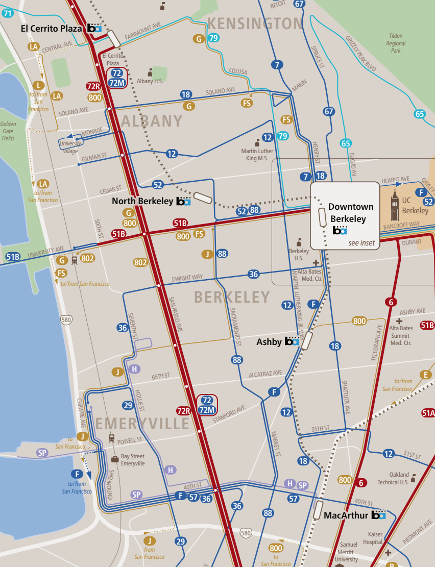
A slice of our system map for AC Transit.
As transit information tools have gotten better, some transit agencies have stopped offering a system map to the public. Often, a website offers me trip planning software and route by route timetables, but not a map. If it’s there, it’s often difficult to find.
We think system maps are essential. They’re not just for everyday navigation. They’re for exploration and understanding. Some people prefer narrative directions, but many people are spatial navigators, and they need maps. They’ll understand details only if they can see the big picture.
Another way to think about system maps is that they show you where they could go, and how. They give you a sense of possibility. (It’s the informational dimension of access to opportunity.) Maps also show visually how different services work together. Finally, good system maps help people make better decisions about where to locate, or even where to build things.
One of our most fun projects this year was a new system map for AC Transit in greater Oakland, California. You can see the whole thing, including its legend, here. (To be fair, we’re not the only people who do these. Our friends at CHK America do them, and I also love the work of the European designer Jug Cerovic.)
The style of this map is very similar to that of the maps that we’ve always used in our planning studies. The key is the visual hierarchy that makes frequent lines more prominent than other lines, and makes all-day lines more prominent than peak-only lines. (In older standard mapping styles in this region, peak-only express lines were often the brightest red, even though they don’t exist the vast majority of the time. It was very confusing.)
As transit planners, we use this style for all of the maps that appear in our studies. In fact, red=frequent in absolutely everything we do, whether it’s a map, a chart, a planning game toy, or a pen used to draw routes inside a course or workshop.
We take pride in having been among the first to bang this drum. I was making the case back the 2000s (really, in the 90s) and there’s a chapter on it in my book.
We’re excited to be in the business of public-facing system maps. They don’t have to be this precise; they can be done at various levels of design at various costs.
But if a system map doesn’t exist, people can’t understand all that your transit system can do.
Pretty good system map! Knocking back commute lines is super-helpful, plus the color-coding for frequency. It definitely shows the possibility of exploring by transit; though not so good for exploring by foot (we’ve got phones…I guess).
Throughout the ’80s, AC Transit’s old pamphlet map by Reineck and Reineck with system superimposed on a white street grid was good enough to navigate the ever-shifting grid, between bus routes, to your actual destination. Reineck and Reineck’s sparse style meant that every time you came to an intersection, shown as “+” or “T” you had to figure out which way the rabbit went by searching for the bus number…again. (Routes passing through intersections have been a long time coming; much appreciated on your maps). The long, skinny service area required a wonderfully offset foldout format.
For fine scale there were my mentor Kris Bergstrom/Cartographic’s four detailed street maps of the 2010s – a marvelous pocket companion for local knowlege (the East Bay’s first “SF MUNI” style map) but no longer a system map. The quirky bus number icons symbolizing hours of operation (AKA evening service cuts) were not easily read! And such big maps were impractical to reprint for every service change. They survive as the basis of some of the local posted maps.
The one flaw that jumps out on this sample view is that downtown Berkeley is a white box (AKA a black box). Once the system redesigns settle down, agencies should show the continuity of the major routes, and even a distillation of the minor routes, rather than require the reader to rely solely on yonder detailed inset to chase their rabbits (or switch rabbits). Distill it, ghost what’s inside the box, hint at what’s inside. It’s a big version of a dumb “+” or “T” leading inevitably to “@&*!#N!!@!!??”.
That said, a great map for frequencies, including changes within a route (51 at Amtrak/Marina) and the warp and woof of South Berkeley/Emeryville routes that has been shfting as long as I can remember. Loops! Snakes! Grids! This iteraation makes some sense.
There is, of course, one frequent all-day transit option in the AC Transit service area that is not only not showing on the map as a thick bright red line but is portrayed through faint black dashes as though it’s one of those transit lines that only operates 1 trip on Tuesday and 1 trip on Thursday.
Thank you so much for this.
Your first few paragraphs sum what I have been trying to get across rather poorly (like banging my head on a wall) to some agencies here in the UK.
Just because other tools are now available we don’t need to throw away older tools that still work and what people who do that seem to miss is that people have different information needs as well as different learning styles – we don’t always know when, where and how we want to travel.
Your point about decisions on where to live is important – you simply can’t do this with a journey planner.
Sweet map! Much better than the old AC transit map. One of the biggest issues in the bay area is the integration. There is not only AC transit, but BART, Union City Transit, Emeryville transit, Amtrak and BEAR transit in the same area.
I made an interactive map that tries to address this issue, check it out! https://tmaps.org
This one hits home very personally for me; the transit systems shown here are what I grew up with to get around as a teenager. Navigating one system alone was often easy enough. For me, I came to know BART like the back of my hand, I knew almost every stop on every line and what was around there, knew more or less what lines were frequent when or which were worth checking a schedule for, knew all the possible transfers which are painless and super easy on BART. AC Transit was always a totally different beast. In theory it integrated well with BART, but it was never that way in practice for me being generally unfamiliar with the system. One of my best friends rode AC then transferred to BART every single day to get to school and back. He knew both systems easily. But I remember feeling very lost trying to figure out even how to get to his house, let alone most other destinations I could reach with AC Transit, or pricing and payment, or scheduling. This was the era before Clipper cards were adopted in the region and before Google Maps had useful transit navigation that could actually model transfers between different systems and so on.
Happy Holidays, everyone.
I’ll be doing a presentation about the design of transit system maps at TransitCon 2022: https://transitcon.org/
Love the colour coded line frequencies, but why was the BART line made almost invisible? Surely a considerable number of locals and commuters use BART daily, so why hide it as a dotted line? Is it to abstract fares and rides to AC Transit?
“Another way to think about system maps is that they show you where they could go”
Having lived my whole life in a city where public transport is omnipresent, I never thought of it this way. The most I ask someone is branch and frequency because I know there is at least one combination that would take me there in a decent time
Fede. What city do you live in?
I think you are taking the words too literally. Perhaps a better way to think of it, is that a transit map gives you an idea of where you could go quickly, or where it would be a bit of a pain. It gives you the lay of the land, so to speak, from a transportation standpoint.
If I see a couple stops on the same subway line, I figure it won’t take long to get from one place to another. If, on the other hand, it shows relatively infrequent buses involving a transfer or two, then I figure it will take a lot longer.
The same is true of a road map. If you are a driver new to an area, you don’t look at a map and think “I can go anywhere”. You look at it and think “Those places are much easier to get to than those”. A ten mile trip might take 10 minutes, or 45 minutes. It is quite common for road maps to show freeways and highways in different colors or with different lines to designate that the speed limits are higher. That is the same idea with the transit maps, like the one shown (except with an emphasis on frequency instead of speed).
“I think you are taking the words too literally. Perhaps a better way to think of it, is that a transit map gives you an idea of where you could go quickly, or where it would be a bit of a pain. It gives you the lay of the land, so to speak, from a transportation standpoint.
If I see a couple stops on the same subway line, I figure it won’t take long to get from one place to another. If, on the other hand, it shows relatively infrequent buses involving a transfer or two, then I figure it will take a lot longer”
You aren’t taking Fede literally enough. In many cities in Europe, every route is frequent. You don’t need frequency mapping because every bus route is turn up and go. Fede is saying that this mapping style is new because, where they are from, you don’t need to map frequency.