In the San Francisco Bay Area, the regional transportation planning body, the Metropolitan Transportation Commission (MTC), has launched a major effort to improve the coordination between the region’s 27 transit agencies. One element of this, just unveiled, is a regional standard for transit network maps. The goal is to have all of the region’s maps evolve toward the same style, so that it’s easier to explore the entire region’s network.
MTC has now released the first sketches of the design standard, which you can find starting on the 20th slide of this document. I’m generally delighted. The recommendations look very much like what I’ve been promoting for years: reds to denote high frequency (15 minutes or better) and less prominent colors for lesser frequencies. They 0bserve that three major transit agencies in the region already do this.
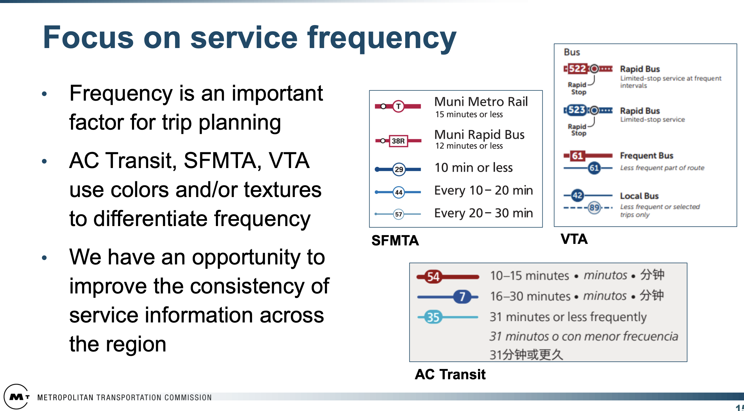
We’re flattered! We drew AC Transit’s map, and probably influenced the other two, as we helped San Francisco MTA (SFMTA) with service branding and also led the redesign of the VTA network, both in the mid 2010s. Our study mapping for our VTA network redesign was all in this style.
Here are the proposed colors of the regional standard:
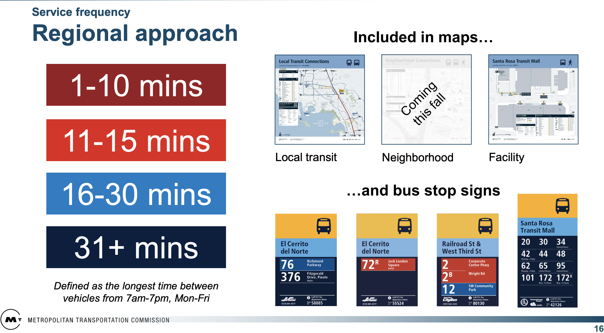
In our maps we use those reds with those meanings, but I’m puzzled by the two blues. To me, that darker blue is more prominent and eye catching than the light blue, so shouldn’t it represent the higher frequency? In all of our firm’s maps, we use pale blue to represent a lower frequency than dark blue, but I’m curious if others disagree. Here is our public-facing map of San Antonio, for example.
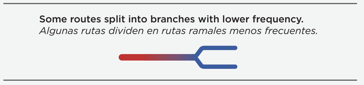
Finally, whenever you use color to show frequency, you have the problem of what happens when the frequency changes along a line, often because of branching. The draft MTC standard shows this example for where a red line, representing the combined frequency from two overlapping routes, separates into two blue lines:
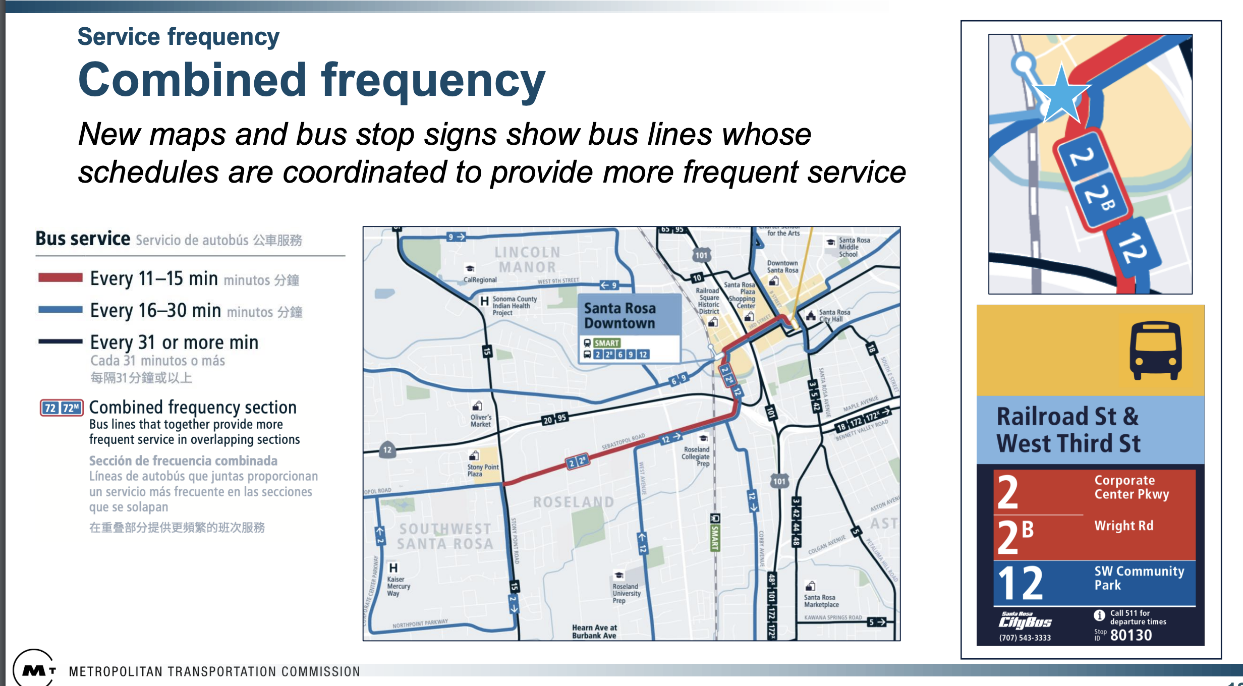
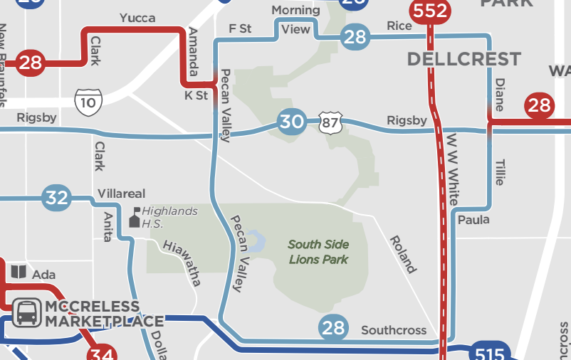
We’ve learned from long experience that most people need more help understanding that the route continues even as the color changes, mostly because people have seen many other maps where colors distinguish the routes from each other. So we always show a fade from one color to the other, as in this San Antonio example where Route 28 separates and rejoins:
We also make sure there’s a legend item clarifying this:
So anyway, that’s what we know about transit mapping. We hope MTC thinks further about these details before imposing a regional standard.
So if you’re in the Bay Area, and you want to share your own comments with MTC, this page has an email address to write to. Click “Public Engagement and Staff Contact” partway down the page. But this is a great initiative!
Regarding the choice of dark blue versus light blue: I think the idea is that a redder color suggests more frequent (i.e., “hotter”) service. Since people associate red with hot and blue with cold, it makes sense that if “very red” means intense service, “very blue” means the opposite. I feel it’s pretty intuitive on a map legend, even if it doesn’t stand out as well on a map.
I agree that dark blue shall be a higher frequency than light blue, and that there should be a fade from one color to the other when a route changes color. But there’s one thing that is even more important: Non-stopping sections should be shown on the map. In the Santa Rosa example, there are some routes on the highway, where there of course couldn’t be any stops, but there’s nothing in the map that tells this.
I actually prefer the color scheme the agency is taking. The shade of blue they chose is different than the one shown in the San Antonio map. It seems to be more prominent than the shade on the San Antonio map, and more prominent than the navy blue. Hard to tell without a background. I assume the less frequent line (navy blue) is also the thinnest. Thus they may have chosen a dark color just so that people could see it. Another way to think of it: red is hot, blue is cold. Dark red is really hot; dark blue is really cold. Now think of “hot” as “frequent”. It works. (Of course it might have been better with purple.)
I do like the fading idea. I’ve seen people just use width to represent that. For example I really like this map: https://seattletransitmap.com/app/. Green is frequent, blue is not. But blue routes that combine for frequent service don’t change colors. They just get thicker. I prefer the change in colors. It takes a little while to get used to, but then it is a great way to get a view of overall frequency.
In my mapmaking career (many years ago) we were taught that if you are mapping data that is a gradient (such as transit lines with different frequencies), you stay on one side of the spectrum (such as all-blue) and go from dark to light, with the darkest being the most important. People will intuitively interpret the darker as more important (frequent), and the lighter shades as less important (less frequent).
If you are mapping something that is not a gradient (like languages in Europe), you can wander all over the color palette. If you use colors on different parts of the spectrum to represent frequencies, people have to constantly refer back to the legend to understand the data and it is not intuitive.
From a Customer Experience perspective I think Duncan Watry is on point. Keep it to shades of a single color to make it as intuitive as possible.
1. There are colour-blind people. Or red-green-blind people. (I’m not.)
2a. A couple of years ago my city / transit authority used colours to explain the network structure. The historical city centre (Luebeck,SH) on a peninsula shaped by 2 rivers, now an island shaped by 2 rivers and 1 canal had almost all bus lines run through it. St.Lorenz is Northwest of centre and Trave river, St.Gertrud is East of Centre and South of Trave river and East of Wakenitz river, St.Juergen is South of Centre and East of Trave and West of Wakenitz river.
Red lines (now only line 4) run/ran from Juergen via Centre to Gertrud and back, without touching Central Railway Station (Hbf). Green lines connected Juergen to Lorenz via Centre and Hbf. Blue lines connected Lorenz to Gertrud via Hbf and Centre. … So did orange lines but partly serving a different part of Centre. … And most frequent and straight lilac line 5 touched all four historic subdivisions starting or ending at populous but far-from-centre Moisling running through Lorenz, Hbf, Centre, Juergen’s Nothernmost peninsula, Gertrud and ending at populous but far-from-centre Eichholz (being the only bus line on Wahmstrasse, probably the narrowest street having that frequent bus service, busses tell each other to wait for to pass by at the narrowest section.)
2b. Later colours changed on maps and made them less intuitive (my own opinion) than before. Now each of quite many lines got its own colour.
3. Just recently municipal politics, no, administration planning, released a plan on how to improve bus service. This was communicated by local paper press without reference, and local online press with links, but the news scroll themselves out of sight when new news arrive. Here’s one of the now invisible links:
https://www.luebeck.de/de/rathaus/politik/pil/bi/vo020.asp?VOLFDNR=1015360
The map there’s quite interesting to me who knows the geography of my surrounding. But it’s really annoying to figure out that the 60-minute-frequent dark blue is better to see than the 30-minute-frequent light green, almost invisible and only to grasp usefulness knowing the map this map this was based on already.
The fine print, that the map only shows service frequency between 7 AM and 7 PM Monday-Friday, seems to suggest that riding a bus outside of those times is an irrelevant edge case. There needs to be a way to illustrate frequency at difference hours of the day, rather than only weekday daytime hours.
AC tried this once, but the result was too complicated. We recommend having small diagram maps showing the network at different periods — not showing all the detail but just enough for you to recognize each route — along with a detailed man map representing weekday midday.
Tangentially related… One alternative method I enjoy is the way Auckland goes about it, where all lines have a different colour with frequency distinguished by line thickness.
https://at.govt.nz/media/05yhi0v2/auckland-network-map-showing-all-bus-train-and-ferry-routes-as-of-november-2023.pdf
This has the benefit of making it much easier to follow a route along a map for most people, and it also helps out a lot on the branching problem since a line can split into thinner branches while keeping the same differentiating colour.
One downside is that the designer needs to work much harder to prevent colour conflicts from happening, but which seems possible with enough colour license. The main problem though is that the map only effectively gives you two tiers of routes (frequent/everything-else). It means less clarity between 10 and 15, or 30 and 30+. There was an attempt to have three tiers of line thickness for 15/30/30+, but it was less obvious as compared to just having thick/thin.
A draft map from nearly 10 years ago with three tiers of line thickness: https://at.govt.nz/media/309600/4-Final-New-Network-Map-for-Implementation-2015-changes-explained-.pdf
The AC Transit maps Jarrett is referring to tried to show (recently curtailed) hours of service via a dozen different icons around the bus route numbers – shape and color (round, square, a crown, a speech bubble, and one shaped like a house). Commute, early evening (6 pm!), evening, late evening, night late night, 24 hour… also weekday only variants (outlined icon). The LED route signage above the bus windshield corresponded with the colors on the maps. No real color progression, not intuitive. On the plus side, the 4 maps from Richmond to Fremont (by Kris Bergstrom/Cartographics) were the first excellent AC Transit maps, showing routes and fine details (every street named, a full index on the back). Segments of these maps doubled as local signage. (I remember coming across a south-facing bus shelter where the sun had caused the coating on the plastic substrate to peel in little strips like birch bark, so there were hundreds of snippets at the floor of the map case…but the map was still 80-90% readable). The new SF/Oakland/regional map style generally works well. My partner didn’t notice the change in SF for about a year, but one evening she looked out at the bus shelter map, and got the red, frequent routes right away (didn’t know there were so many).
I’ve often wondered about the use of color codes to represent bus transit routes, especially if it could come across instinctively without needing to look at the key. One agency used 3 colors, where Red = Express, Blue = Local and Green = Limited Stop.
There’s then colors used in other transit systems, most notably the New York Subway system. I too wonder if that could have a meaning that’s picked up by intuition.
It does get confusing, however, when wanting to make sense of transit apps. Some colors are used within popular apps like Google Maps, then an agency has its own bus tracking app with its own color scheme. Meanwhile, neither of these electronic apps coloring coincides with the one on the physical paper system app. I wish these could be coordinated for a given region.
The one color code system I’ve thought about wanting to see reused in transit especially as more people become tech savvy is Resistor Color Code. It also appears as Rainbow Ribbon Cable Color Code. It’s consistent from system to system when you open up electronics and see all the components and interconnects. You know that Brown is 1, Red is 2, etc. to White = 9 and Black = 0. It applies to any verbal language. I’ve thought maybe route numbers ending in 1 would be Brown, those ending in 2 would be Red, etc. (I haven’t figured out what to do with letter routes, yet.)
I wish there was some kind of International Transit Color Code similar to others like national electrical wiring codes. Maybe one day someone will invent a universal standard that in retrospect will appear so obvious.
I meant to say “physical paper system map.”