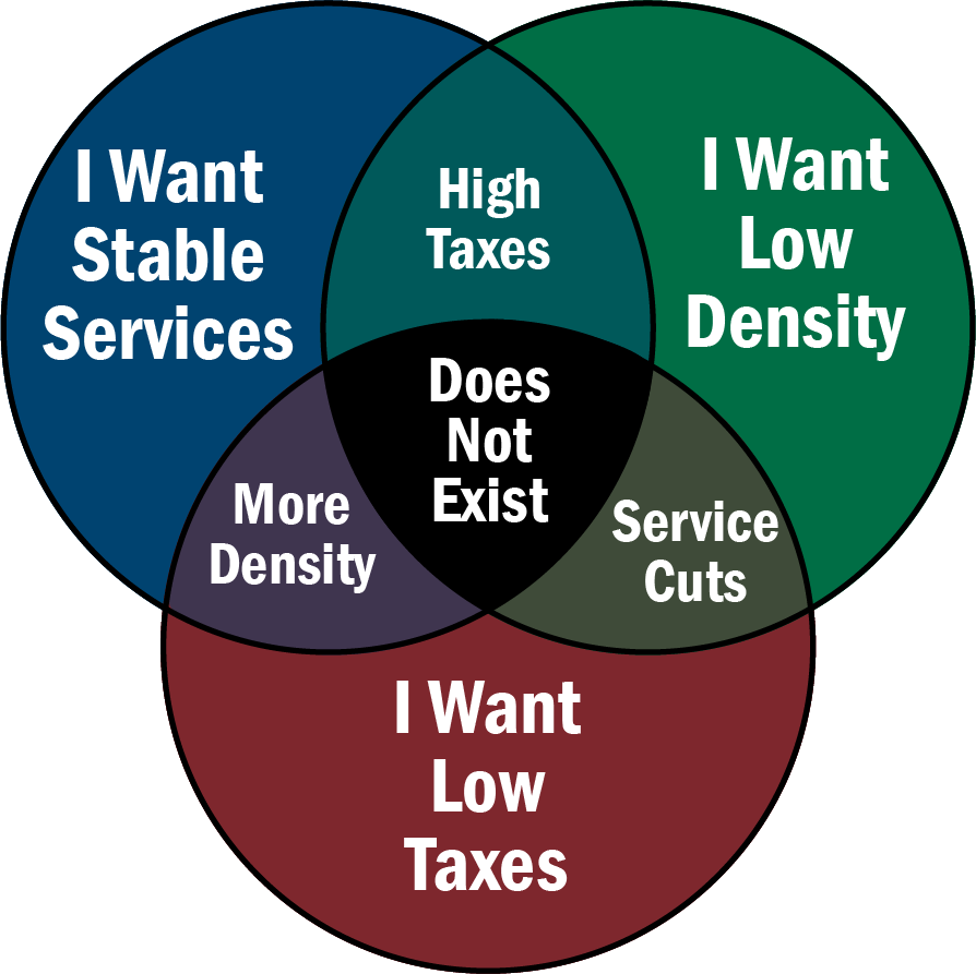
Urban planning guru Brent Toderian likes to share this graphic, which has just been redrawn more clearly by Willem Klumpenhouwer and Kathryn Mathias.
I should clarify, though, that this is an image about local urban development policy. It captures the fact that when talking about local infrastructure and service costs, high density uses public resources more efficiently even though it has requirements, such as public transit, that are also expensive. Its real purpose is to challenge the suburban NIMBY perspective that imagines the central point of the diagram is possible. Anyone who embraces all three of the outer-circle slogans is contradicting themselves.
A few other cautions:
- Taxes can be high or low for many other reasons. Much tax revenue goes into things that aren’t related to urban density.
- It’s also the case that high density, while more efficient in consuming urban services, can understandably correlate with progressive politics that demand greater public investment in solving social problems, in part because those problems are often more visible and troubling in high density places. That, in turn, can also be a reason for higher taxes given higher density.
- Finally, in the US, the structural dominance of suburban and rural voters over voters in walkable urban areas — especially in the Senate and Electoral College — can lead to policies by which urban voters subsidize suburban and rural needs through their taxes more than the reverse. Similar effects operate in some other countries.

High-density areas usually have more transit per capita than low-density areas. So taxes should be higher in high-density areas.
Rural and suburban areas are actually a net drain on the public coffers, while high density urban residents net contribute to subsidize your wasteful and unsustainable lifestyle, so rural and suburban voters should be the ones paying higher taxes. Also tax the billionaires.
There are three problems with this graphic.
First, the side opposite “Service Cuts” should be “High Service Level” not “Stable Services” (just as high/low taxes and low/more density are opposites. The area labelled “does not exist” absolutely exists – there are millions of people all over the country living in low density/low tax communities where the services are stable; stable in the sense that roads are repaved, the fire department exists from year to year, there local parks, etc. These services may not be as high a standard as other places or as some people may want (i.e. low or no public transit, no public pools, etc.) but they are stable.
Second, the chart assumes that infrastructure is a major component of public spending and that being more efficient in infrastructure via density (your town has 50km of road to pave instead of 250km) will meaningfully lower taxes. However, in fact, the vast majority of budgets is not spent on infrastructure but on things unrelated to density. Social security, welfare, schools, etc. are all things that scale with population, and making the population more dense will not reduce how much you spend on them. What’s more, even some infrastructure cost does not necessarily scale down with density. Running a 10km bus line costs half of running a 20 km one, but running a 5km subway because your community is dense enough costs more than either, for instance. Alon Levy at Pedestrian Observations just had a post on this.
Third, the empirical evidence is exactly opposite to this graph: the states and communities with the highest taxes are among the densest (such as New York, New Jersey, Connecticut) while those with the lowest tend to be low density (such as Wyoming and South Dakota). Jarret points out that this may be unrelated to density per se but a result of more left wing politics leading to higher taxes and spending, but it still invalidates the graphic.