It’s been a long struggle, but Toronto’s Eglinton rail line is finally open. Now, the rapid transit network consists of the wide lines on this map, numbered 1-6.
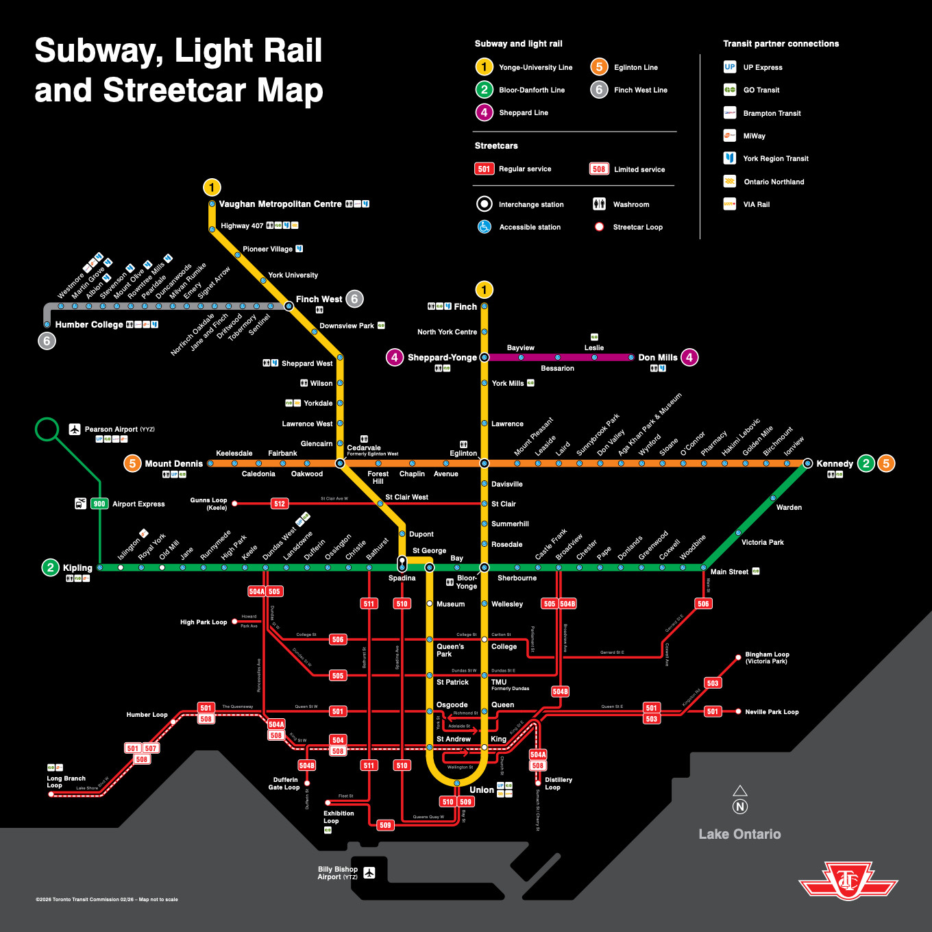
New rail map published by the Toronto Transit Commission, showing the new Eglinton line as Line 5. Please ignore the narrow lines numbered in the 500s. They are streetcars, and many of them are stuck in traffic and slower than buses.
The internet is full of reviews and recriminations about how long Eglinton took and the pros and cons of its design, but I want to make a different point: Eglinton shows a city slowly awakening to its true nature as a grid. This awakening is ultimately more important for the mobility and freedom of people in Toronto than details of what’s on rails and what’s on tires.
Toronto, like Chicago, is a grid city with a very uneven distribution of density. The city has a large grid of arterials that are more or less c0ntinuous across the city, but density is historically concentrated downtown and to some degree along the oldest rail transit corridors, especially Yonge (the east leg of Line 1).
So for a long time it wasn’t crazy for Toronto, like Chicago, to have a radial rail network (designed mostly for trips downtown) fed by buses that followed the arterial grid.
But it’s crazy now. Working from home has reduced the rush of commuters into the downtown towers. Meanwhile, many more towers are being built in the suburbs, often just over the line outside Toronto. And as in every city, the preponderance of travel demand is now much more all-day, all-week and all-direction than it used to be. Finally, lower-income people have always been less likely to be going downtown, and more likely to be accessing lower-wage jobs that are scattered all over the city. So if we care about them, we have to stop building and planning as though downtown is all that really matters.
So Toronto needs a network that people can use to go anywhere at any time.
The downtown-oriented network is not good at this, because by feeding toward downtown in a hierarchical pattern, it makes it hard to travel in non-downtown directions. In short, Toronto needs a grid transit network to match its grid geography, so that people can go from anywhere to anywhere in a simple L-shaped trip, usually with a single transfer.
Eglinton is the first major investment that shows a stirring of that consciousness. It lies well north of downtown, and runs east-west most of the way across the city. For the first time, it’s possible to travel a long distance east-west without transferring and without going downtown, which means that trips to many other places become possible with one transfer instead of two or three.
But the old consciousness is still on display further north on the map above, where the recent Finch West line (Line 6) has opened. It’s very much the old model of a hierarchical feeder, running from the west edge of the city only to the first subway connection. It’s now a mirror image of the equally problematic Line 4, which serves only a fragment of Sheppard on the east side. Both of these lines are largely useless for the kinds of trips that will increasingly prevail in a multi-dimensional city, because they interrupt the logic of the grid instead of working with it. My advice to Toronto years ago was not to build Finch West until they were ready to continue it all the way east at least to Yonge, the east leg of Line 1, so that it could also be used to travel to points on Yonge including northward into the dense suburbs. It will be interesting to see how useful the newly opened fragment turns out to be.
The buses, too, still display the old consciousness. Almost without exception, long east-west lines terminate at Yonge, requiring the passenger to transfer to continue in the same direction on the same street. Again, this means they will often transfer twice to complete an L-shaped trip to an actual non-downtown destination:
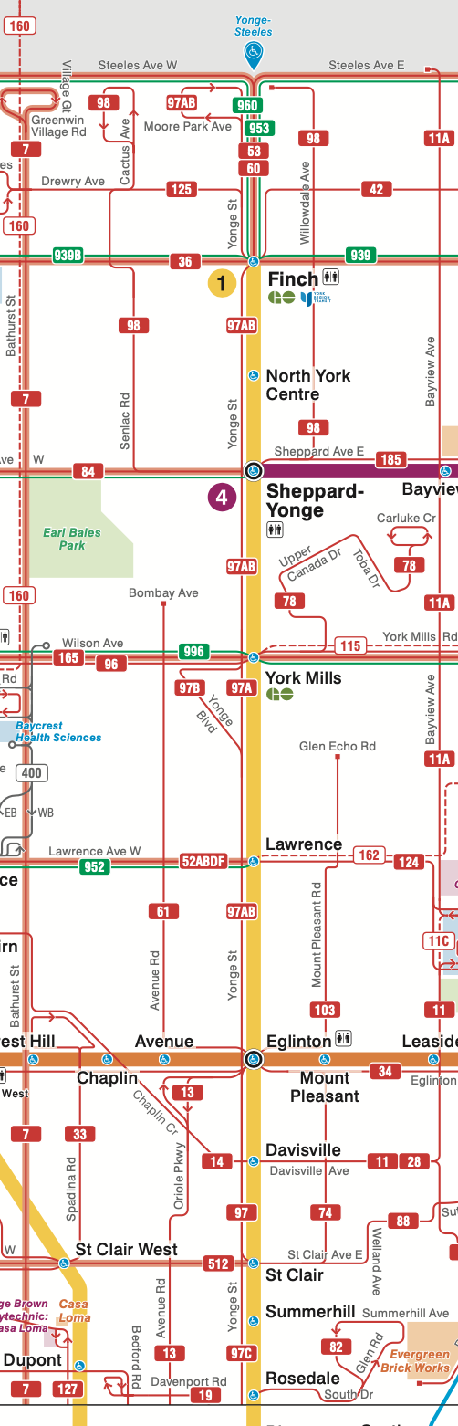
A segment of the Toronto bus map along Yonge Avenue from the north edge of downtown to the north edge of the city. Note that every east-west line is interrupted here. Eglinton rail (orange) is the only exception.
The situation is even more remarkable along the Bloor-Danforth subway Line 2, where again many bus routes are interrupted. Toronto is about twice as big east-west as north-south, so these corridors are shorter, which means there’s even less reason to interrupt them:
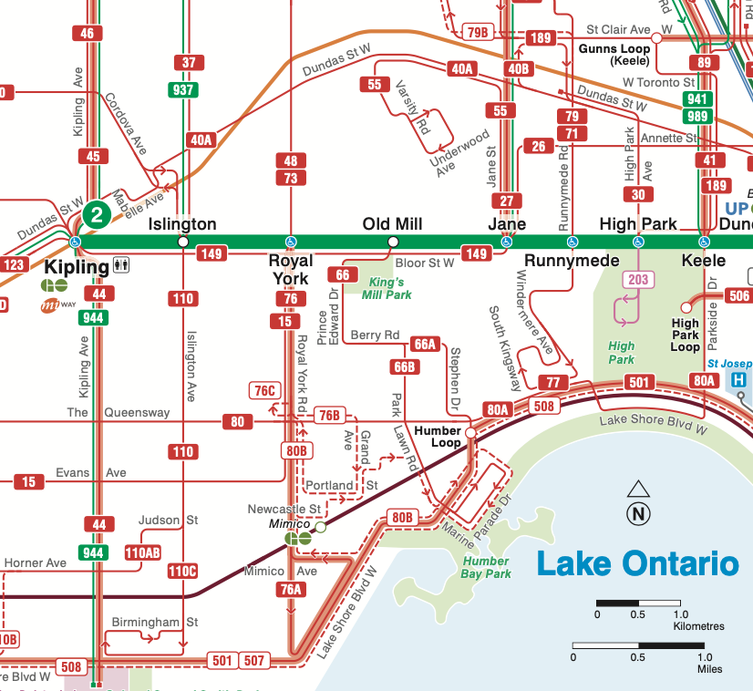
The west end of Line 2. Note that every north-south bus line is interrupted as it crosses the rail line, adding many unnecessary transfers to L-shaped trips that do not use the rail.
These designs reflect an obsolete notion of hierarchy in which rail is king and buses are servants, existing only to “feed” the rail. In an era when downtown commuters mattered more than anyone, that made a bit of sense, but only a bit. There were always people trying to go everywhere and struggling against these patterns. Now, buses need to be rethought to make sense on their own terms, as parts of complete grid networks. (Our firm brought the same awareness to the upcoming redesign of Atlanta’s MARTA bus network, where for the first time, many bus routes will continue past rail stations instead of ending there)
So amid all the other debates about Toronto, let’s celebrate the most important thing about Eglinton: For almost the first time, the city has made a major investment that recognizes that in a big, dense city, surrounded by dense suburbs, people need to go all directions, all the time.