As the public consultation on the Dublin bus network redesign ramps up, we’ve been working hard to get information out in as many ways as possible.
Today, at busconnects.ie, you’ll find an interactive map that shows you two things:
- Where Can I Go? Click a location, and the tool shows you how the plan changes were you can get to, in 30, 45, or 60 minutes midday, including the average waiting time at the start of your trip. It also shows you the change in the number of jobs or school enrolments that you can get to in that time.
- Show Routes. This gives you an interactive layer showing all the proposed new routes, with the most frequent routes shown most prominently. This is a good tool for exploring the new network, and seeing how you could make various trips within it.
Where Could I Go?
Click “Get Started” and then click any point on the map. Let’s select Priorswood in Dublin’s north east. Then, in the upper left, you can choose whether you want to see what’s reachable in 30 minutes, 45 minutes, or 60 minutes. Let’s choose 60 min.
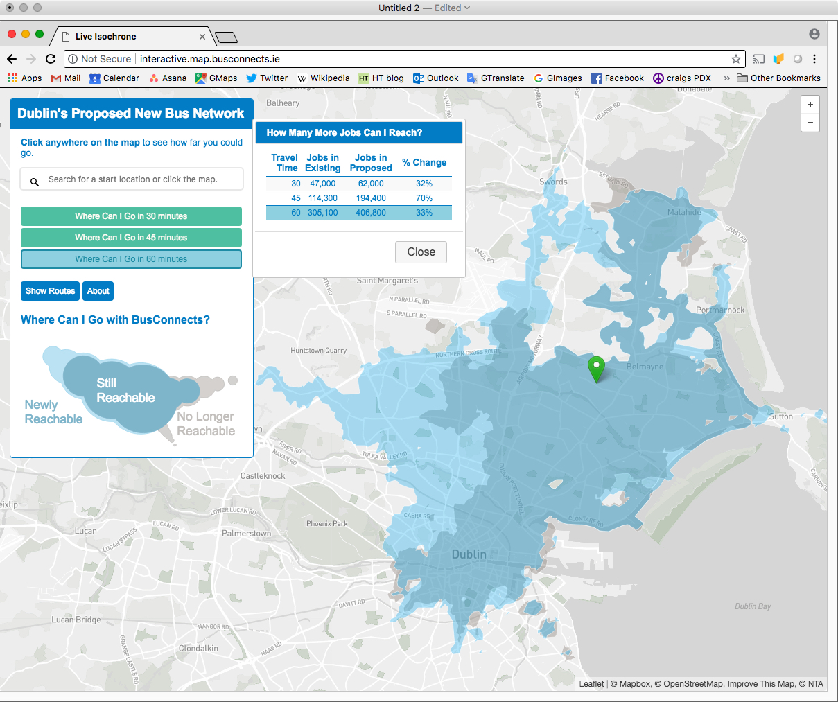
See the legend at left.
- Dark blue is the area that you can still reach in that time. (You can reach it now, and in the new network you still can.)
- Dark grey is the area that you can no longer reach in that time. You can see a little of this on the east edge of the city centre, and around Malahide in the north. (Yes, I know this looks too much like the light grey of the parks and bay, but if you look close you’ll notice the difference. There are good but boring technical reasons[1] why we didn’t have a free hand in choosing colours.)
- Light blue is the area that you can newly reach under the new network. You can’t get to these places in 60 minutes now, but under the proposed network, you can.
- The box “How Many Jobs Can I Reach?” shows you that the light blue area, minus the dark grey area, amounts to an increase in 1/3 in the number of jobs (and student enrolments) that you can get to in an hour. We show these because there’s good data on where they are, but obviously this gives you a sense of your ability to get to all kinds of useful things: shopping, social opportunities, etc etc.
Want to dig deeper into these calculations? See Chapter 8 of our full report.
Across all of Dublin, the average person can go 20% farther (i.e. to 20% more jobs and student enrolments, and thus other useful places) in 30 minutes. But this tool shows you what that result is for any location, and where.
Many people have asked us for “travel time maps”. That’s what this tool is. Compare the 30, 45, and 60 minute results, and you’ll get a good sense of how long it will take to get somewhere, and whether that changes.
And yes, this is the midday outcome, which is usually also the outcome for the early evening and weekend. Doing this calculation for the peak rush hour raises several difficulties [2]. The outcome will usually be the same in direction (positive or negative in the jobs reachable), though sometimes not as dramatic in the degree of change. For outer suburban areas, peak express services may be proposed that give better outcomes than shown.
“Show Routes”
How would you get to those places? The “Show Routes” tool shows you the proposed network with the high-frequency network highlighted in red, because it’s especially likely that a logical trip will go via those routes. Note the frequency legend that appears in the lower right.
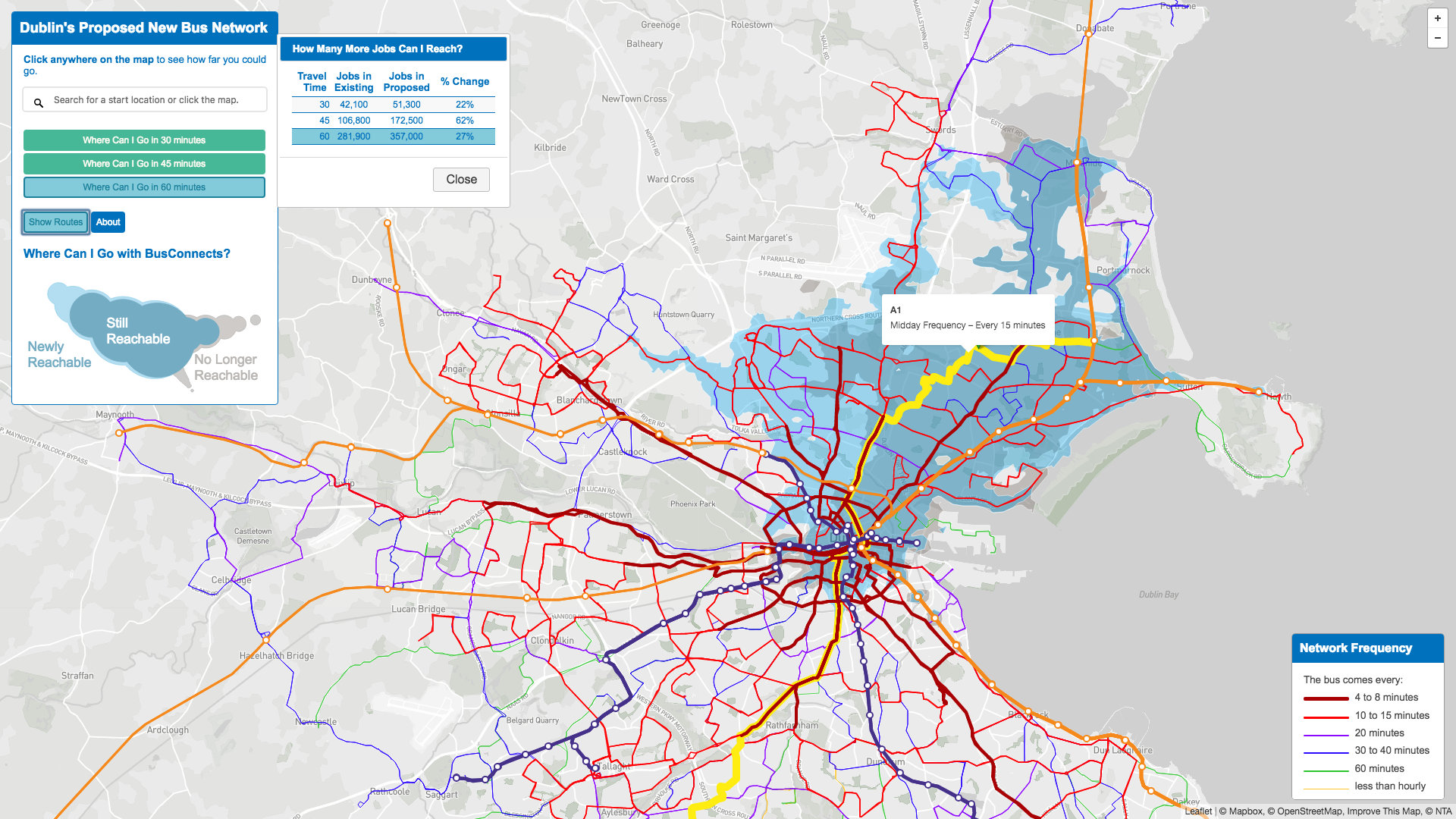
Roll over any route (like we did for the route serving Priorswood here). It tells you that this is Route A1 and the yellow highlight shows you everywhere that A1 goes. Now, it’s not hard to see how you’d go to another part of the city, because you can see where A1 crosses other routes going in your desired direction, and you can roll over them to see what they do.
Many people have asked us for a before-and-after trip planner, giving exactly how a trip would go before and after the change. We are sorry we can’t provide that, but you can get most of that information from exploring this tool. First, the “Where Can I Go?” tool will show you, pretty closely, what a travel time will be from any point to any other, and then the “Show Routes” tool will show you the network. Follow the brightest lines (the most frequent services) that seem to go where you’re going. That’s usually the fastest path.
Footnotes:
[1] Our tool required us to choose colours such that the “no longer reachable” and “newly reachable” colours add up to the “still reachable” colour, while still providing adequate contrast. This turns out to be harder than it sounds.
[2] In short, the midday service pattern (which is also the pattern of much of the evening and weekend) remains the same for several hours, so we can coherently talk about a typical condition. The peak service pattern, by contrast, is changing every minute, so the facts about how long a trip takes are also changing continuously. The result of a peak analysis would therefore be hard to present as a general outcome that would describe most people’s experience. (A peak analysis would also require making many more assumptions that would make the outcome less reliable.) In general, peak results will be similar to midday results in direction (positive or negative) but may be less dramatic in the degree of change.
This interactive map is an excellent idea. This could suit people who are not really into reading big full pdf reports from busconnects.ie. This map of Dublin here in my mind should provide a much simpler option for people if they want to get the information in a quick amount of time as they possibly can. When I began using it; the information looks really easy to read & provide informative information about the new bus network in regard to going to work & education centres. Thanks Jarrett & to your team for providing this helpful data.
Excellent map, it will be very useful. I have a query though, what is the maximum walking time you allow to a stop? I’ve picked up a couple of anomalies when the map is centred on my house, wondering if it is because it is deep inside an estate so you don’t expect me to consider a 25min walk to a stop reasonable. If I move the start point a 5min walk closer to the main road, then the 30min isochrone reaches areas that the 45min isochrone at my house doesn’t.
Also I noticed that my local cinema is shown as not reachable in the 30min isochrone. It usually takes me 25mins to walk there.
I’m a bit of a map nerd so apologies for this nit picking.
I believe the tool assumes that you’ll walk however far you need to for the fastest total trip time. Of course, the tool uses air distances (walks along the street network are way more computationally intensive).
Actually, two corrections:
1. The tool uses street distance, not air distance.
2. The tool limits the total walk distance on the journey to something like 1500m. This includes both the walk to the bus stop at origin, the walk in the interchange, and the walk from the final bus stop. This is to avoid creating situations where the tool is telling you that you could reach somewhere, but in fact that requires walking distances most people wouldn’t tolerate. This does create some minor distortions, as there are cases where you could walk, say, 100m further and it would be fine. We toyed around with the threshold, though, and think we landed at the most realistic output in most cases.
Thank you Daniel, that makes sense. I think my house is just about 1.5km from a stop on the N8 orbital, probably just outside the threshold. Explains the anomalies.
I agree that 1.5km sounds reasonable, just means an even better service than advertise can be available if you are willing to walk that bit further.
Good stuff providing that interactive map.. while I did review the pdf in full previously as well, this will certainly help people with visualisation.
One problem though – it doesn’t accurately represent the things are they are currently. From Clonee I can easily reach Bachelor’s walk and beyond within 45 minutes currently and easily within 60 in peak hours but the map appears to suggest that I can only reach as far as the beginning of Phoenix park and I’ll now be able to go as far as the entrance of the Quays in 60 minutes! Technically that’s reducing the amount of ground our buses cover currently in the same (actually lower) amount of time. There has to be something else wrong with the data or the map.
Remember, we add waiting time at the beginning of each trip (1/2 of the scheduled time between buses) to make these figures comparable to car or bike figures.
Since the presentation of this tool is explicitly for comparing two bus networks, I think making a compromise so the figures are comparable to car or biking is the wrong approach.
It’s almost tautologically true that a new network will score highly on the metrics it has been designed to maximize. But tools to assess the network on other metrics should be provided since different things will matter to different stakeholders. The crude attempt to do this without the proper skills-set is (probably) why we end up with a situation of ‘counting bus routes’, for example. One tool that could be offered is to compare the two networks on the basis of being prepared to plan around the bus – I.e. neglecting the wait time, or putting in a fixed wait time, for the first bus boarded.
The “planning around the bus” approach only works if you have a single-seat ride. If you have to transfer, you can’t avoid an average wait time of half the headway because you have no control when you’ll arrive. It also assumes that you never get caught up in a conversation leaving the office, and never had to run back home on the way to the bus stop because you forgot something.
Pragya,
Are you counting the average wait time at the start of your trip? Our tool assumes that you’ll wait an average of 1/2 the frequency of any bus you take. Currently, the in-vehicle travel time to get from Clonee to Bachelor’s walk is just about 39 minutes, but that trip is only available once an hour, so unless you happen to have an appointment in the city centre at at a time that matches the bus schedule, you’ll end up arriving early and having to wait at your destination. For the return journey, unless you’re lucky with schedules, you’d have to wait in the city centre.
Absolute disgrace. Celbridge to town takes an hour as it is and now they want to send the buses through leixlip which is already being serviced by 3 different bus routes. Half of celbridge isn’t serviced by a bus outside of peak times. Your adding more time on to an already long commute as it is for those who work in the city centre
Claire. Yes, you can object to routing Celbridge-city buses through Leixlip, but your comment that “half of Celbridge isn’t serviced by a bus outside of peak times” is false. Here is the Celbridge area map: https://www.busconnects.ie/media/1298/map-5-proposed-network-dublin-west-outer.pdf All of the routes on this map run all day (and there is much more service during the peak.)
I love the idea of an interactive map. Is the tool built from off-the-shelf software, or did Dublin pay a group of software engineers to design a tool specifically for this restructure, that will get thrown away in a few weeks?
Ideally, every agency planning a restructure would be able to present an interactive map with by plugging their data into existing software, rather than paying people to re-invent everything from scratch (which smaller agencies won’t have the budget to do).
Another nice benefit of off-the-shelf software is that, once the software is written, agencies can get a lot of cool advanced features for free – for example, mobility maps at a user-specified time and day of week, not just noon on weekdays, automated trip planner support, and the number of minutes saved in your commute by the new network, compared to the old network.
On top all this, cheap (or free), easy-to-use software allows armchair transit planners to make their own restructure proposals for their city’s transit network, and send it to all their friends on social media to build support. I can easily imagine a little bit of citizen activism, combined with software to make it easy, generate momentum to get a city to modernize their transit network, whose leaders otherwise would not have bothered.
asdf … Our firm builds these, using very secret sauces, but the basis is Open Trip Planner.
We’ve been developing similar tools. They are more difficult to get right than they seem on the surface, for sure. Another purpose we have for tools of this type is ADA paratransit compliance. That is, did ADA trips take the same amount of time or less than the corresponding fixed route trips. It’s a good measure of contractor performance that isn’t often used, but is a big determinant of customer satisfaction.
To be honest I am more interested in the ‘peak time duration rather than midday times for journeys. How can frequency of 4 minutes during midday be bettered? I know this particular aspect has been addressed above but it doesn’t reassure me.
That information re ‘ how many jobs can I reach’ is useless – and does nothing to help me plan my route.
I find that rolling over a particular route isuddenly morphs into another one..route E morphs into route F somewhere near St. Mary’s Place?
I wonder how many focus groups trialled this map and what was the demographic make-up?
so far the campaign is not inspiring nor does it instill confidence in the outcome.
This “plan” is politically dead as the local politicians fall over themselves to object to this silly “it looks good on paper” plan. Really its hard to believe these people would come up with instead of increased services a removal of direct routes to the city from Rush for example and replace it with a bus to Swords. It just proves that “experts” have not an ounce of common sense. The “experts” are busy explaining and as they say when you are explaining you are losing.
I will be at the Ballycullen end of the A1 route, the proposed times is every 15 minutes from the terminus, where as at present there is a frequency of every 10mins during rush hour. Will there be an increased frequency from 6.30-9.30am, and also at the end of the day?
I ask because this morning I got onto a packed, standing-room-only bus at 7.30 this morning, only 4 stops from the start of the route. There are at least 4 more stops on Knocklyon Road before we join another bus route and the bus was so full that it could not stop for the passengers waiting at those final 3 stops. Dublin Bus knows the problem and has been providing two buses within minutes of each other at peak times to increase capacity.
In addition the number 49 will not be running to town (it will be replaced by the S6/7 serving Firhouse estates , those passengers will have to try to transfer onto the A1 at the bottom of Knocklyon Road which will be impossible. These interchanges will be especially unpleasant in the rainy and cold winter months as passengers jostle to get on the bus, never mind a seat.
Those of us in the more distant suburbs are at a distinct disadvantage to those who can afford to live more centrally in the city. If the plans are enacted as at present, I forecast chaos within days