by Evan Landman, the lead data analyst at Jarrett Walker & Associates
For years, we’ve talked about the utility of isochrone maps as a method of visualizing the mobility impacts of different transit choices. The idea is to communicate in a simple, direct way, all of the places a person can get to from a point under different transit network scenarios. Much of our firm’s work involves leading cities and transit agencies through public processes where the outcomes produces by transit networks based on different choices are explicitly compared. We’ve come to rely on isochrone maps more and more as the technology to generate them has become more widespread and accessible. This has led to a proliferation of images like these:
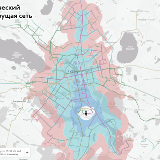
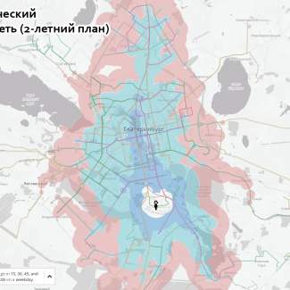
These static images generated with Remix show isochrones from the center of Yekaterinburg, Russia, under an existing network (left) and a proposed network (right). The location, one of a series of 10, was selected because it was judged to be a well-known place relevant to many people’s travel patterns, and thus a place where the isochrone difference would be easy to understand.
Of course, no set of possible isochrone locations will accurately represent the places of interest of all people who would be impacted by a plan. Better still would be to offer a tool that would allow people to create their own isochrones from any location, and compare the direct impact of a proposed change on the places most important to their own lives and travel behavior.
With that background in mind, we’re excited to share a new tool designed by Michael Baker International, our partners working on a transit network redesign project in Richmond, Virginia. Using GTFS files generated for three conceptual network options, this web map generates travel time isochrones for three different network scenarios. You can check out the live version here. The point is to let people explore, for themselves, how the different options would affect where they could go, and hence the opportunities in their lives.
 As more and more of the work of outreach and documentation of transit planning projects moves online, new opportunities have emerged to communicate the true impacts of these plans. Techniques first deployed by open-source software developers, stimulated by the ever-growing capability and adaptability of web mapping software and abundance of GTFS data, are now well-documented, established practices. We are constantly adapting these tools as part of our efforts to clearly explain the outcomes of such projects to the people who will be directly impacted by them.
As Scudder Wagg of Michael Baker International, who directed the tool’s development, put it:
We’re always excited to work on innovative tools and new ways of visualizing the value of transit. We enjoy taking on new challenges and finding ways to help residents understand and explore how different transit concepts can change their lives. The technical hurdles to implementing this tool were not all that great. The biggest challenge was getting the right people talking to each other in a way they could understand so that our transit planners, GIS professionals and web developers could all understand the desired outcome and figure out how to get there.
These maps are also very useful for choosing an office location for any business. My current employer needs to move within the next year, and about half the employees take transit. Upper management which will choose the location, but they consists of all drivers, and no transit riders.
Does anyone know where I could get isochrone maps for various locations in Vancouver?
Transport for London have an interesting tool that shows journey times. I’m not a transport professional but my company will be moving offices soon and I’ve been using it to assess different possible locations.
https://tfl.gov.uk/info-for/urban-planning-and-construction/planning-with-webcat
Use postcode SW1A 1AA to see what the Queen’s journey times would be if she ever actually took public transport.
The TfL tool mentioned in Mike Robinson’s e-mail above, also allows users to view the population and jobs within each isochrone displayed on the map. In this way a commercial site could see how many customers could potentially reach their site. Or a residential location could view how many jobs are reachable in say 45 minutes.
The site also includes future transport networks so you could see what impact say Cross rail has on the catchment statistics for a specific location – how many more customers could reach my site?