(This series of posts on ridership-increasing bus network redesigns starts here, and its wrap-up is here.)
We’re proud of the ridership growth from all of the network redesigns we do, but our recent project in Monterey County, California had results that were off the charts: 45% ridership growth in two years, for a growth in productivity (ridership / quantity of service) of 25%, far above the 15% growth that occurred nationwide in similar systems. The enormous improvements in ridership and productivity contributed to MST winning the 2025 APTA Outstanding Public Transportation System award for systems in its category.
Why? There was one other factor: a simplified fare system that made transfers free. But the much-improved travel times from our redesign, especially in lower-income areas, definitely mattered too.
Located just south of the Bay Area, Monterey County resembles all of California in miniature. There are scenic and touristed wealthy communities along the coast (Monterey, Carmel-by-the-Sea, Pacific Grove), and a huge interior valley with an agricultural economy and a large city of its own (Salinas). There’s also a vast rural area, half mountainous (including Big Sur) and half agricultural. And if you think of Monterey as a little San Francisco, then the adjacent town of Seaside would be its Oakland: more affordable, less touristed, more diverse, with lots of people commuting to jobs in Monterey and Carmel.
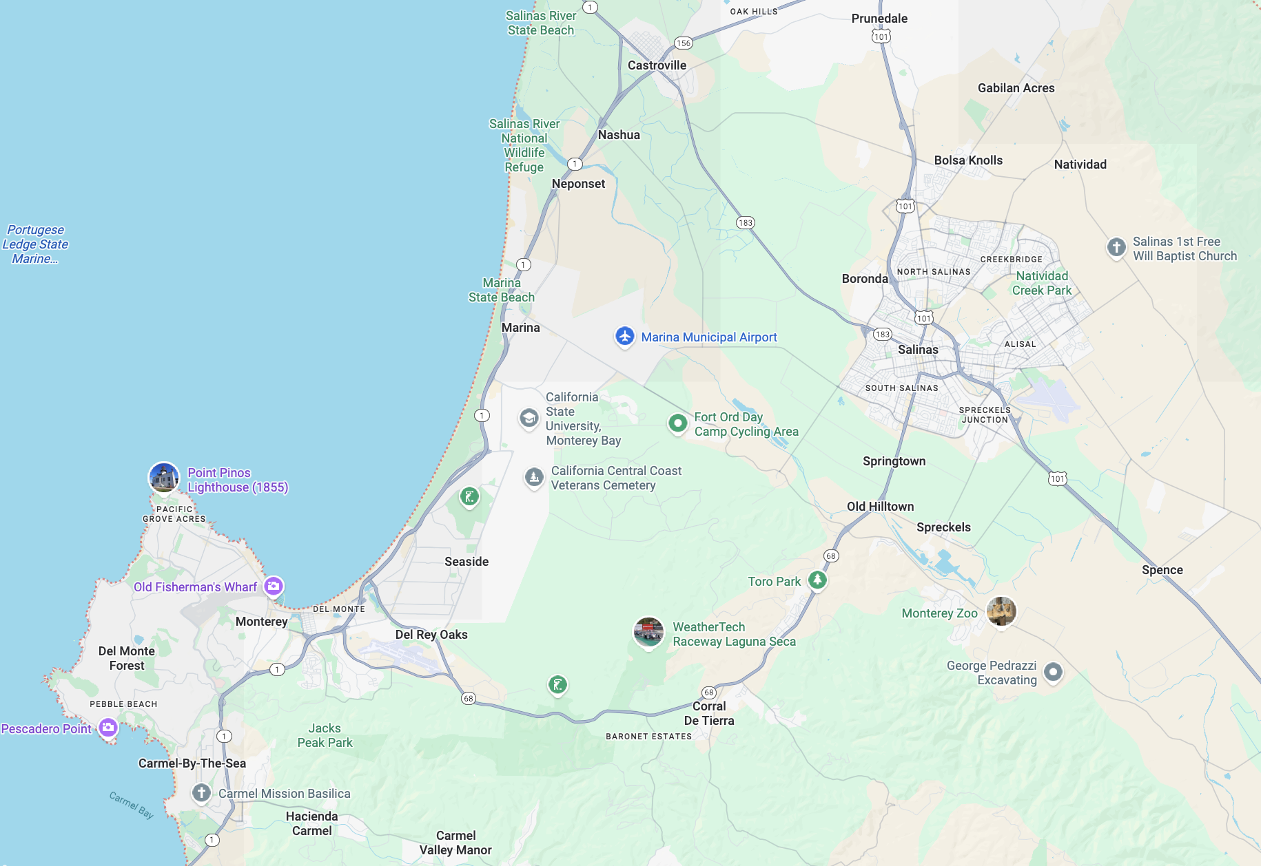
Urbanized areas of Monterey County. Big Sur is in the county, much further south along the coast. Along Highway 101, the county also extends further south in a long agricultural valley. Google Maps.
In 2021, Daniel Costantino led our work to complete a Comprehensive Operations Analysis for MST, which led to a redesigned bus network that the agency implemented in November 2022. A major finding in our early analysis of the MST network was the mismatch between service and activity and need. In the old network
- The greater Monterey-Seaside-Marina-Carmel area had just over 40% of the urban population but had nearly 60% of MST urban service.
- The Salinas area had nearly 60% of the urban population, but only 40% of MST’s urban service.
So a major element of the redesigned network was reapportioning service and bringing more service to Salinas. This required interesting discussions with the Board, which is constructed on a one-city one-vote basis and therefore underrepresents the residents of the county’s largest cities.
In the Monterey area, we encountered many other interesting design challenges. Here is this part of the network as it was before the redesign. See the caption for the meanings of the colors.
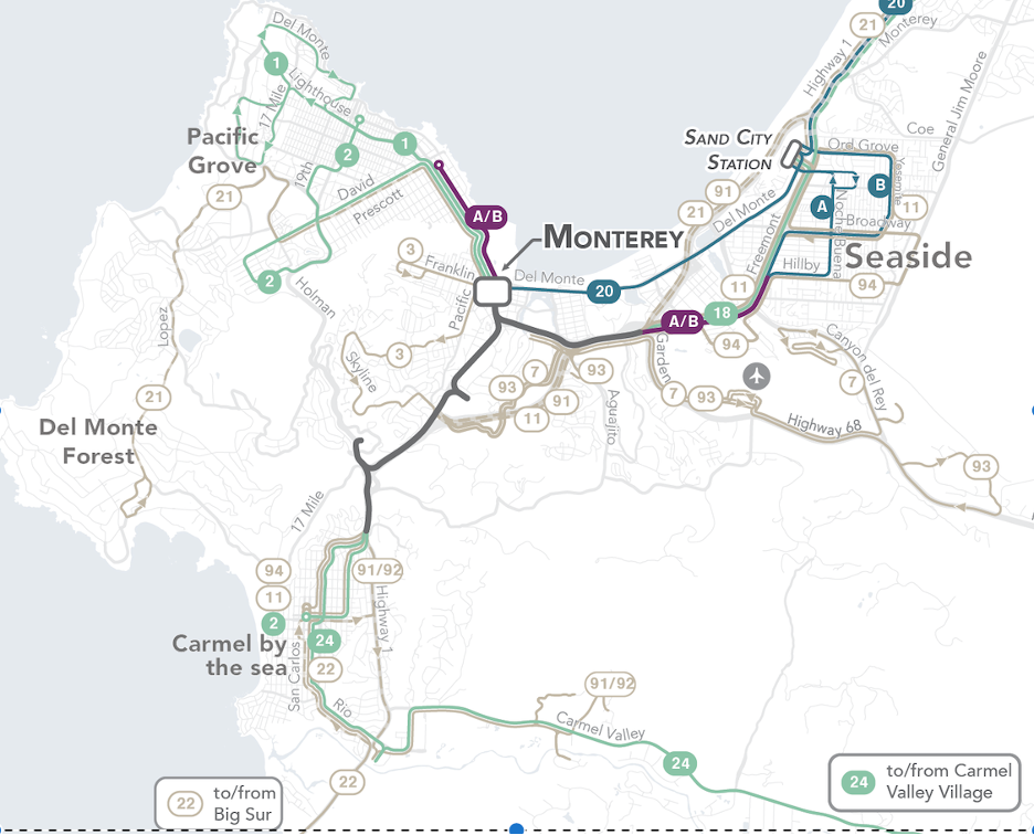
Old Monterey Peninsula network. Colors mean all-day frequency. Purple means every 20 min, blue means every 30 min, pale green means every 60 min, and pale beige means worse than every 60 min.
Note the complex tangle of very infrequent routes (worse than hourly) on the south side of Monterey. These had arisen from years of trying to respond to demands for service to some important destinations that had been built in very transit-hostile ways and therefore couldn’t be served efficiently, including, unfortunately, the courthouse. Meanwhile, the network’s busiest route, the combined A/B service between Monterey and Seaside, was only every 20 minutes, just below the 15 minute threshold where ridership tends to take off.
We were able to increase frequencies on the most important links, bring the A/B spine up to every 15 minutes and the Monterey-Carmel link to every 30 minutes. To do the latter, though, we had to give up stopping at the Community Hospital of the Monterey Peninsula, a hilltop fortress whose slow and complicated access path consumes too much running time. We served that with an hourly frequent route instead. Obviously, a major hospital should have a more frequency, but it also needs to take responsibility for the high costs imposed by its location and layout.
The new design looks like this (from the new MST map that we designed):
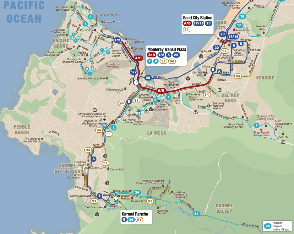
Redesigned Monterey Peninsula network. Map by Jarrett Walker + Associates. See legend below.
The new design also improved timed connections between routes at the two densest hubs in the county: downtown Monterrey and downtown Salinas. This is an important part of how we achieved faster travel times. The line linking these two biggest hubs, Line 20, is obviously especially important to keep on time, because timed connections at both ends rely on it. While this line is exposed to some traffic congestion, a new Bus Rapid Transit project, called Surf, will create a five mile bus-only roadway to help protect this line’s running time. In fact, the case for the busway is stronger now, because the new network design is helping more passengers along that path.
For this project, we did not conduct the same kind of job access analysis that we did in Akron, but the travel time matrix clearly showed how much better this new network would be for most people in most of the county. This helped sell the value of the redesign to the agency board and the community overall:
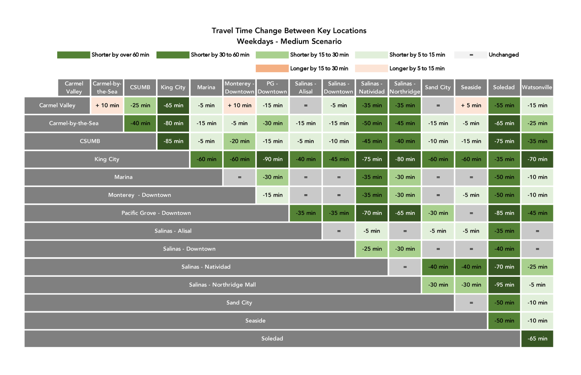
Carmel Valley, the only area with travel time losses, is a rural and mostly affluent area. The vast majority of the region saw huge travel time savings, especially in the lower-income valley communities of Salinas, Soledad, and King City.
I’ve focused on just one part of the network, but we made many other changes. South of Salinas, we were able to increase the frequency of the route that connects a long series of towns extending south through the agricultural valley; this is one of the higher-ridership rural corridors we’ve encountered. Salinas saw an expansion in simpler and more frequent service. Perhaps the hardest place to serve was the California State University Monterey Bay. Scattered across an abandoned military base, it’s remote from other major destinations and not on the way between them, so we were only able to get two hourly routes to it. We hope that MST will be able to support better service as the empty spaces fill in.
We really enjoyed working in this complex and very scenic county. Congratulations to everyone at Monterey-Salinas Transit for their award, and for all the great work that led to it.
For some reason I find myself very curious about the color scheme of the MST map. It looks surprisingly familiar.
It looks like routes 91 and 94 are duplicating route 5. Would you consider shortening them and making route 5 more frequent?
Jarrett, you have previously written about the need to refer to “connections” (a word that implies access and agency) instead of “transfers” (a word that implies effort and cargo instead of people). Yet your recent series of posts have all referred to “timed transfers” instead of “timed connections” or “clock face connections”. Why?
Onux, the context is pretty clear. Connections and transfers refer to the same thing: the need to change buses. Distinctions without a difference.