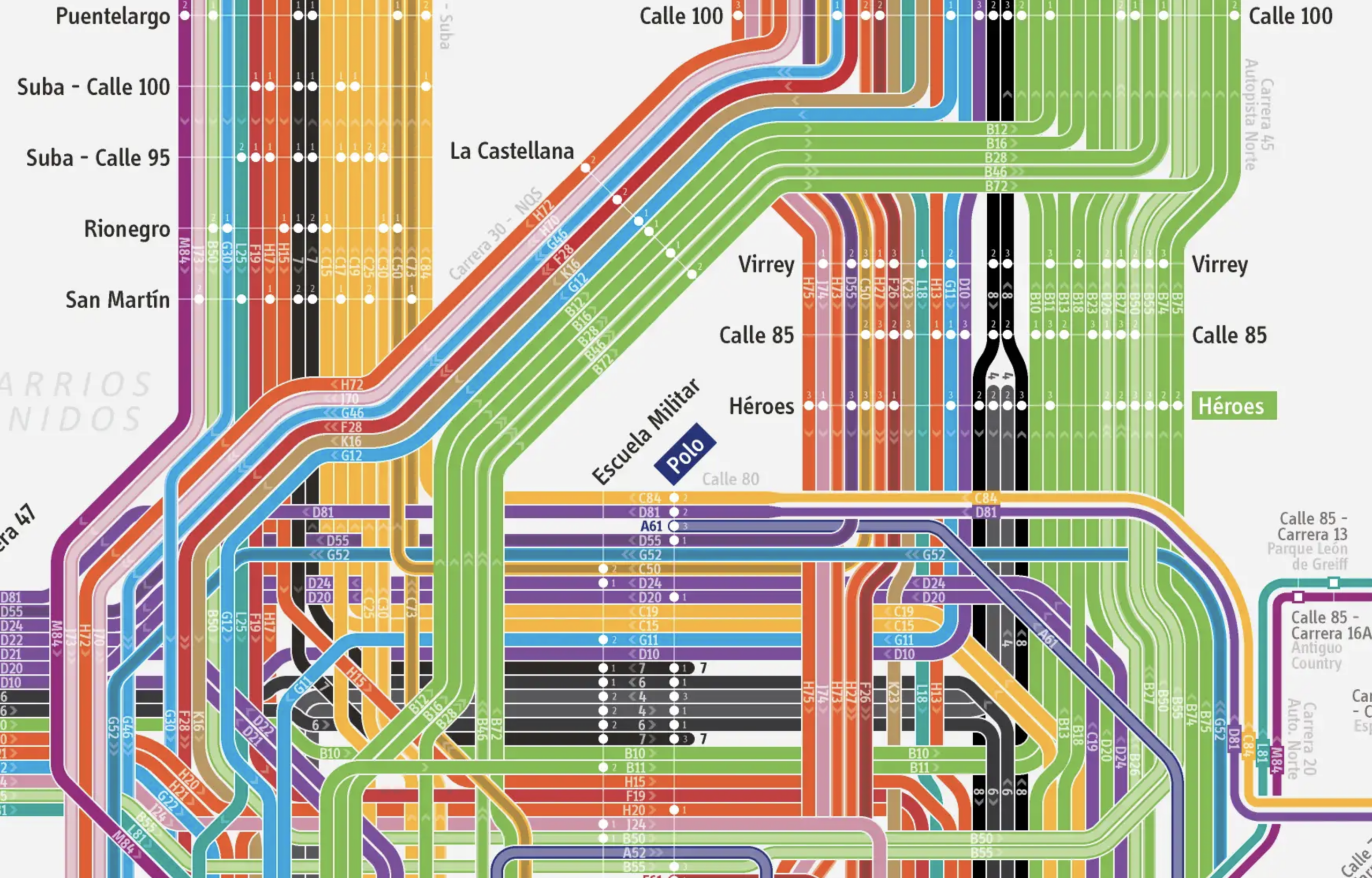
My recent writing on Bogotá’s Bus Rapid Transit system, TransMilenio, ended with an article on the extreme complexity of the service patterns, and the role this complexity plays in the many problems that people complain about. It turns out that there is a lovingly detailed diagram of all of TransMilenio’s service patterns. (It’s by someone calling themselves the Clarion Project, but I’m guessing this is not the US-based foundation of the same name.) Brace yourself:
The whole map in all its glory is here.
It’s overwhelming, but it’s still really useful, at least to map people like me. I wish I had had this when I was in Bogotá earlier this year. In fact, I wish TransMilenio published it, just for those who find this kind of representation useful.
But even if you’re not a map person, we need this images to illustrate the problem. By carefully identifying every routing pattern and every stop, the map honestly represents how complicated TransMilenio truly is, and it’s not possible to fix a problem if you don’t have a good picture of it.
Why is TransMilenio so complicated? What problems could be solved by making it simpler? My piece on that is here.
The map makes the system look much more complicated than it is, since it uses two lines for each route, one for each direction. For example, B10 and D10 are the same route going in different directions. The letter stand for direction, the number is the actual route. They should remove the letters and have one line for both directions, and use arrows only for the exceptions. That would halve the size of the map.
I think they did it that way to show that certain lines all end up at the same place. That would otherwise be less apparent if you combined the coming and going of it.