The Dallas area’s new bus network goes live on January 24, 2022! It’s the result of our three-year collaboration with the transit agency DART and its member cities. The project relied on extensive input from the community, and the Board, about what kind of transit system they want to see. But it’s still a no-growth network, which means that DART couldn’t add new operating budget. As a result, it’s full of difficult tradeoffs and not everyone will like it.
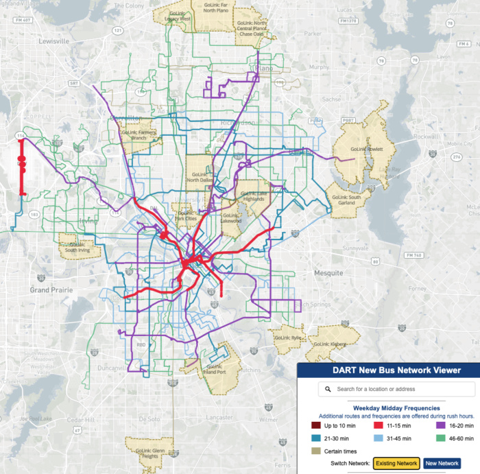
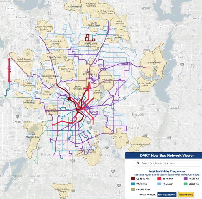
You can compare the old and new networks at this cool data viewer that we developed. Here is the existing network followed by the new network. Note the frequencies in the legend, without which these maps make no sense.
In general, it’s fewer routes, longer walks in some cases, but higher frequencies. We’ve also:
- established more regular timed-transfer patterns among infrequent routes, especially at South Garland and Addison Transit Centers.
- set feeder routes to 20 or 40 minute frequencies so that they match the 20 minute rail frequency. This is the main reason that you see relatively little expansion of the 15-minute frequencies (red) but a big expansion of the 20-minute frequencies (purples).
- substantially expanded the GoLink demand-response program to provide more coverage. This is a relatively low-cost service for DART, as microtransit goes, because some of the service is provided using ordinary Uber rides under contract with DART.
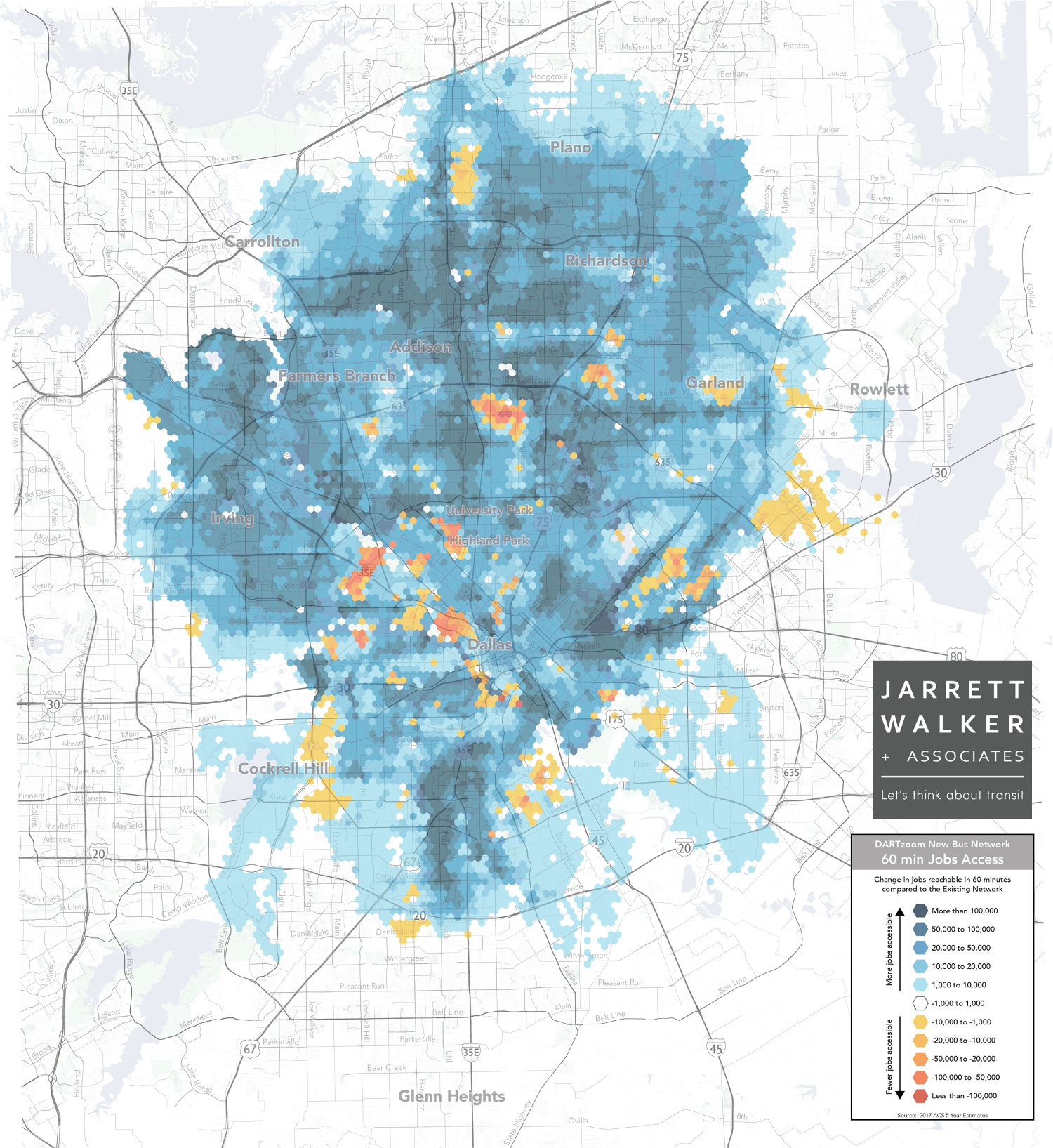
The result is usually faster access to more destinations. The average area resident will be able to get to 1/3 more jobs in 60 minutes, which means more access to all kinds of opportunity for all kinds of people. This benefit happens almost everywhere (blue in this image) (click to enlarge).
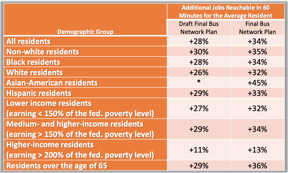
… and the benefit is similar for all races, ages and incomes.
The plan was based on the Board’s decision (not mine) to shift the focus of the service slightly toward a ridership goal and away from a coverage goal. That would have meant service to fewer places, or further away from a few people’s homes, in order to run higher frequencies that produced expanded access to opportunity for most people. Because the sad mathematical fact is: Ridership arises from how useful service is to many people, not how useful it is to absolutely everyone. When we seek to serve absolutely everyone, we’re planning for coverage, not ridership.
But in fact, even though the priorities shifted away from coverage, the final network hardly cuts coverage at all.
None of this means that everyone will be happy. Network changes are always disruptive to some people’s lives. We make sure every decision-maker to know that before they decide to proceed.
Finally, this is not our plan. It’s DART’s plan based on their conversation with the public, and the decision of their Board. We facilitated the design conversations and did the analysis, but we didn’t set the policy that led to the network looking as it does. That’s not an evasion of responsibility. It’s the key to our whole approach to these projects, which is to defer entirely to the community on questions of priorities, and to never make those decisions ourselves.
We hope your new network takes you to good places. Meanwhile, we’ll soon be starting work on a happier project to envision an expanded bus network, a little bit closer to what the community actually needs. So if you’re in the Dallas area, stay involved!


This is great to see. I live in San Francisco, but grew up in Dallas. In spite of the high investment in the light rail, I found the Dallas bus and rail network to be pretty unusable for most purposes unless you happened to be very close to a light rail station at both ends. Dallas is no San Francisco, but this looks like a huge improvement to the usability of the network.
The hexagon shapes of the access levels is interesting. Were they used to calculate the time distance, or did you have sidewalk data?
I like the network viewer tool to compare the old and the new, I just wish it was better able to convey service frequency at all times of day and days of week, rather than focusing only on the weekday midday period. (Weekend service information is available by clicking each individual route, but doesn’t affect the color codes; evening service is missing from the website completely).
In many ways, the network viewer web design seems to suggest, whether intentionally or not, that nearly all riders are profoundly interested in weekday daytime service (or rush hour service), a few riders are interested in weekend daytime service, and the number of people that care about evening service is so small, it’s not even worth mentioning. In many ways, this seems to undersell the network.
In many ways, this design seems to undersell the network. If you look closely and click through each individual route, nearly all routes actually do run just as often on the weekend as they do during the weekday midday. This is good and costs money to run, and the network comparison tool should promote this. Similarly, if buses are running later into the evening under the new network than the old (not sure if this is the case), this should also be trumpeted.
One simple way to do this could be to add buttons to toggle between different times of day (midday/weekend/evening), just like the toggle buttons between the old and new network. But, the key is to not undersell the network. If DART is going to spend the money to actually run the buses on evenings and weekends, the incremental cost of showing this in the network comparison tool is a drop in the bucket. For people that travel primarily during evenings and weekends (this includes anybody with a 9-5 work-from-home job, which has become much more common during the pandemic), a map that focuses on weekday daytime service doesn’t help much. People need to know how the new network affects the trips they make, at the times they make them, regardless of when they travel.
I’ve been waiting for this. I tried out some of the routes near my home today, and even came across your podcast with Strong Towns on my way home today. What a coincidence! I’m pretty happy with how things turned out in terms of where I live.