Jacob Lynn is currently a data scientist at Booking.com, and was previously Chief Information Officer at public transit start-up Via Analytics.
Bus network redesigns have been making waves in the transit world over the past few years. The new Houston bus network represented a massive redeployment of resources, and early returns suggest that bus ridership is increasingly roughly as expected, though ridership is also subject to broader economic forces. Portland’s 1982 grid restructuring was critical to the early success of the new light rail system. But Barcelona’s recently redesigned bus network, the Nova Xarxa, has [despite this Human Transit post] received less attention outside Europe than it probably deserves. New research indicates that the network started inducing new demand as soon as it was deployed. Even though it is only partially complete, the Nova Xarxa is demonstrating the potential of transfer-oriented high-frequency bus networks for providing an anywhere-to-anywhere mobility solution for a city.
Prior to the redesign, Barcelona had a spaghetti-like tangle of routes with many stops, low speeds, and generally low frequencies. In other words, like most bus systems, it was biased towards coverage over ridership. Of course, in conjunction with the Metro network and the suburban Rodalies commuter rail, transit has a very high mode share in Barcelona overall. But city officials felt like they were not making the best use of their bus system. Could something be done?
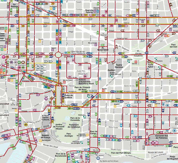
A central section of the local bus network in Barcelona.
Enter the Nova Xarxa. (NB: Nova Xarxa means “new network” in Catalan, and Xarxa is pronounced “sharsha.”) Carlos Daganzo developed a simple mathematical framework to model a “hybrid” transit network, which combines features of grid and radial networks. The model could be optimized to minimize a combination of transit agency and user costs, including travel and wait time. This abstract model was then applied to the specific situation in Barcelona to determine the target spacing between routes in the grid, spacing between stops on a route, service frequency, and other parameters of the network. It turned out that a grid-like network with very frequent service, stop spacing of about 400 meters, and about 20 lines would serve the city well.
Once these basic organizing principles had been determined, Transports Metropolitans de Barcelona (TMB), the city’s transit agency, got to work developing the actual routes. The resulting network has been remarkably faithful to the original grid vision. (The Nova Xarxa was previously discussed on Human Transit in 2010 and again in 2016.)
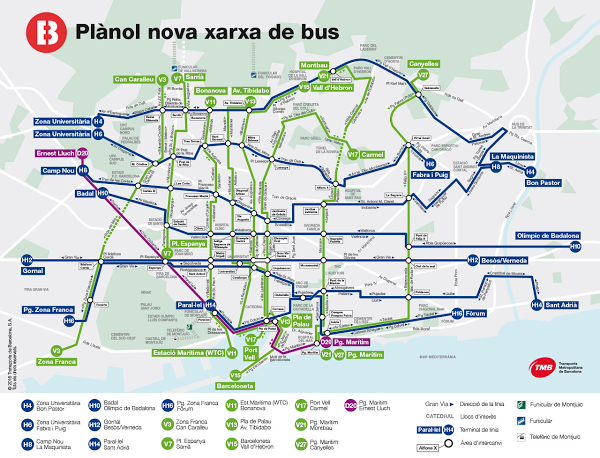
The current Nova Xarxa, which is about 60% complete.
By design, a grid network depends critically on transfers between routes to enable anywhere-to-anywhere urban travel. Transfers between bus routes have a bad reputation among the public, to the point where there is a large academic literature quantifying exactly how awful it is to have to wait for the bus, particularly when connecting between routes. But in big urban metro rail networks, transfers between lines are commonplace and often only a mild inconvenience. The key difference is the amount of time you have to wait for your connection. Many metro lines run at intervals of 4 to 8 minutes, making the wait for the next train much more palatable. So, if the buses come sufficiently frequently, the thinking goes, the “transfer penalty” may disappear, and the system will function as a well-connected network rather than as a collection of individual lines. (Of course, the transfer experience differs between a metro system and a bus network due to other environmental factors, but generally speaking, if the wait time is short, those other factors will matter less too.)
The Nova Xarxa is designed with this principle in mind, with scheduled headways between 3 and 8 minutes for the entire system. The currently deployed Nova Xarxa routes all have scheduled headways of 6 to 8 minutes, and most current NX routes are intended to have shorter headways once the full network is deployed. Shorter headways are enabled by several factors. Increased spacing between stops, as well as dedicated bus lanes where space permits, have provided key speed increases. Some intersections have traffic signals which prioritize buses. New articulated buses were purchased that increased capacity and in some instances (e.g. line H12) enabled faster multi-door boarding. Removal of overlapping routes allowed redeployment of existing resources. But the network redesign was not intended to be cost-neutral, and some of the frequency increases have come from simply running more buses.
The Nova Xarxa has been deployed in four phases. In each phase, pre-existing routes that had been superseded by the new routes were removed or redesigned to focus on local service. Five routes were initially deployed in October 2012, five new routes were added in November 2013, and three more were added in September 2014. Three more were deployed in February 2016, but data from that period was not included in this report’s analysis. The full deployment of the Nova Xarxa will consist of 28 lines, and it is currently more than half complete. The detailed routes for the 12 final lines were recently proposed by TMB, and should be deployed during 2017 and 2018.
A group of researchers, including Hugo Badia of the Universitat Politècnica de Catalunya and Juan Argote and Carlos Daganzo from UC Berkeley, presented an analysis of ridership on the Nova Xarxa at the recent Transportation Research Board meeting in D.C. (As noted above, Daganzo worked with the city of Barcelona on the initial high-level network concept in 2010, but was not thereafter involved in the detailed design or deployment of the Nova Xarxa.) The research is publicly available as a working paper and is currently under review at TRB Part A. TMB provided the researchers with their key dataset: total bus boardings, broken down on a per-route, per-month basis, over the entire period of the new network. The dataset did not include detailed records of individual boardings, so the proportion of transfers could not be determined directly. But the phased deployment of the network allowed the researchers to use a clever technique.
Boardings on the Phase 1 routes generally reached a fairly stable level within a few months, but then jumped up sharply when Phase 2 was deployed, and then again when Phase 3 was rolled out. The authors infer that the increase in boardings on the Phase 1 routes was caused by riders who were transferring to and from the new routes. When the new routes opened, the old routes immediately became more useful, because they now provided access to more destinations with a short transfer. The researchers formalized this intuition into a simple statistical model, which allowed them to decompose each route’s ridership into two components: baseline demand for the route itself, and transfer demand for connecting routes.
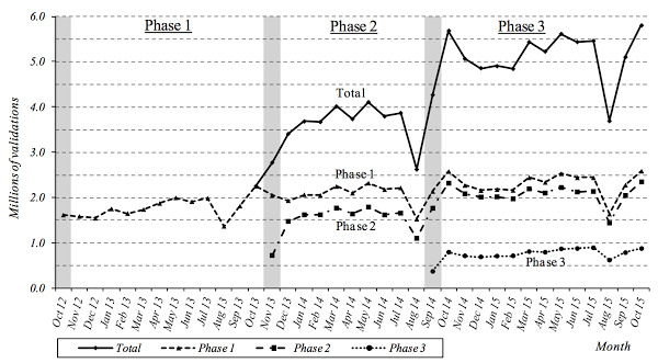
Monthly validations on the NX, with routes grouped by their phase of deployment. As new phases were deployed, boardings on routes from previous phases jumped up, almost certainly due to transfers to and from the new routes.
So how much do transfers matter? The authors estimate that 26% of boardings on the current Nova Xarxa comes from transferring passengers — and once the entire network is deployed, they project that bus-to-bus transfers will represent 44% of boardings. This will be much higher than other major bus networks that overlay rail transit networks, such as Melbourne (16%), Boston (1.5%), London (13%), and New York (3%). (Note that this indicator is not always made public by transit agencies, and different agencies measure it in different ways.) Furthermore, comparing ridership on old routes to their new replacements suggests that corridor ridership has increased by 6% to 24%, due to a combination of increased connectivity, ease of use, and improved level of service. This figure should also increase as the rest of the network is rolled out.
Other factors have contributed to the success of the new network. In the early modern period, Barcelona, as the key city of Catalonia, was repressed by the centralized Spanish monarchy, fortified against revolt, and penned in behind its medieval city walls. Once these walls were removed in the mid-1800s, the city of Barcelona expanded dramatically beyond its medieval core under a strongly gridded street plan, known as L’Eixample. Thus, the idea of the “grid” has a strong resonance with the shape of the city for its citizens. Barcelona city officials have indicated that they believe that the disruptive Nova Xarxa plan faced less political resistance thanks to this intuitive preference for grids.
Beyond any speculative psychological considerations, Barcelona is a city of relatively spatially uniform population and job density. Within the city, there is no strong central business district generating demand for highly radial transit. Furthermore, the city is geographically constrained by mountains to the northwest, the Mediterranean to the southeast, and the Llobregat and Besòs rivers on the other two sides. Thus the overall urban density is quite high. Demand for space-efficient modes in Barcelona is intrinsically high and isotropic, making the Nova Xarxa a natural fit.
These results should not be too surprising. But it is rare that the real world provides us with such a clear-cut opportunity to test the principles of network design. Barcelona’s experience strongly suggests that a dense network with sufficient frequency for painless transfers can unlock anywhere-to-anywhere travel.
The authors of the original analysis, Hugo Badia, Juan Argote, and Carlos Daganzo, provided very useful feedback on early drafts of this article.


 Our tiny firm is delighted to announce that we’ve hired our first East Coast senior planner and project manager.