The best of intentions lay behind the recent analysis of the availability of high frequency service, described by Jake Anbinder at TransitCenter. And as one of the original proponents of Frequent Network branding, I’m delighted to see organizations starting to care about whether transit is useful, rather than just whether it exists.
But when we transit professionals design Frequent Networks and their standards, we think really carefully about what counts as frequent service. I insist that it always means every 15 minutes or better on both peaks and throughout the midday, but we have to have a sensitive local conversation about how late it extends into the evening, and how long on weekends. It’s easy to say that you want 15 minute service 24 hours a day, but when you look at your fixed resources, you’ll find that if you insist on that, your Frequent Network won’t cover enough of your city to be either useful or politically feasible.
That’s exactly the problem that makes the analysis misleading. Here’s the chart making the rounds from the their work:

The problem is that this analysis defines frequent transit as 672 trips each direction per week on a route segment. Why 672? It’s 4 x 24 x 7, that is:
- 4 trips per hour (so every 15 minutes)
- 24 hours per day
- 7 days per week.
For service to count as frequent, by this analysis, it has to be frequent even at 3:00 AM.
I can’t think of a bus route anywhere in North America that runs every 15 minutes in the middle of the night. Maybe there are a few in Manhattan, but this calculation is an unrealistic basis for defining Frequent service anywhere in North America, except for the densest, biggest cities.. (Obviously, the other way to meet this target is to be very, very frequent during the day to compensate for not being frequent at night.)
Why quibble about this? Because this chart caused some needless angst in the media. Among its worst outcomes would be to signal that frequent service is such a rarefied thing that most cities couldn’t realistically hope for it. It certainly obscures all the great work that’s actually being done to build realistic but useful frequent networks in many cities.
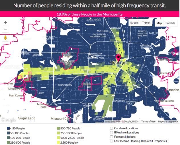
For example, it triggered this Houston Press article implying that there’s some racial disparity in the distribution of frequent service, based on the bizarre notion that Houston’s frequent service consists only of the areas highlighted in yellow:
The Press’s Megan Flynn writes:
In Houston, according to TransitCenter’s analysis, while nearly 80 percent of people have access to transit at least a half mile away from their doorstep, only 18 percent of them have access to what the map’s algorithm considers the highly reliable, “high-frequency” service.
By the AllTransit definition of high-frequency—service running at least every 15 minutes on average, 672 times a week—only one bus route, the Westheimer route, meets that standard, along with all three of Houston Metro’s light-rail lines.
As TransitCenter noted in its analysis: “Notably, in cities with fewer high-frequency transit lines there tends to be a greater demographic skew among people who live near quality transit.”
And it considered Houston to be one of the two “most notable” examples of that demographic skew.
Even though black and white people in Houston each have equal walking-distance access to public transportation in general—each making up 24 percent of the pie—36 percent of white people can access high-frequency service while only 19 percent of the black population can. Latinos make up 45 percent of people with walking-distance access, yet only 34 percent access high-frequency routes. (See The New York Times‘s map of the racial makeup of Houston’s neighborhoods here to compare with the above map.)
Ouch! Great basis for rage. But it’s not about what matters! When we designed the Houston network, our standard for frequent service was not 672 buses/week, and the map above illustrates why. If it had been, we’d have brought frequent service to too small a part of the city, and we could have fairly been accused of racial disparity. That’s why we didn’t!
As it is, the Houston Frequent network (the red lines on this map) is abundant and citywide. It may not fit some abstract big-city standard, but it’s the fair and equitable way to cover most of Houston with frequent service given the transit agency’s resources, and it’s sculpted to hit inflection points on the frequency spectrum where ridership begins to take off. The same is true of many of the cities that “fail” the 672 buses/week test.
TransitCenter is an excellent organization, by the way, and this showed in how open they were to this critique when I shared it in draft. In our correspondence they asked me what a good benchmark would be. I suggested “15-15-7”: 15 minute frequency, 15 hours a day, 7 days a week, plus 30 minute service for an additional 5 hours a day. That gives you a total service day of 20 hours, e.g. 5:00 AM – 1:00 AM. That’s only 490 bus trips/week, so their estimate of 672 is high by over a third. The chart would be totally different, and more useful at motivating change in cities that aren’t as dense as New York or San Francisco, if a standard around there had been used.


 When Jane Jacobs died 10 years ago, I wrote this