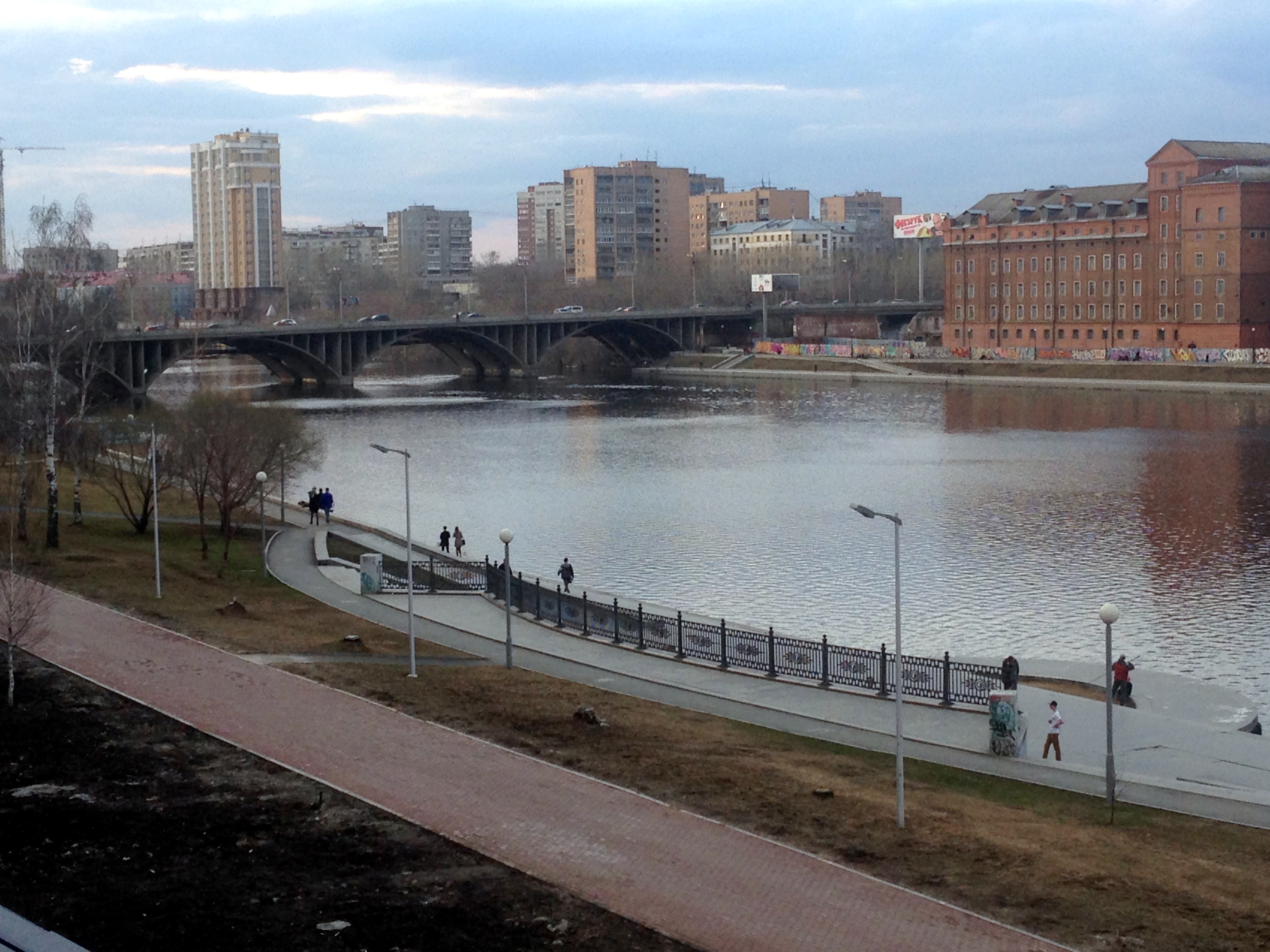
For the last 10 days, I’ve been in Yekaterinburg, Sverdlovsk Oblast, Russia.
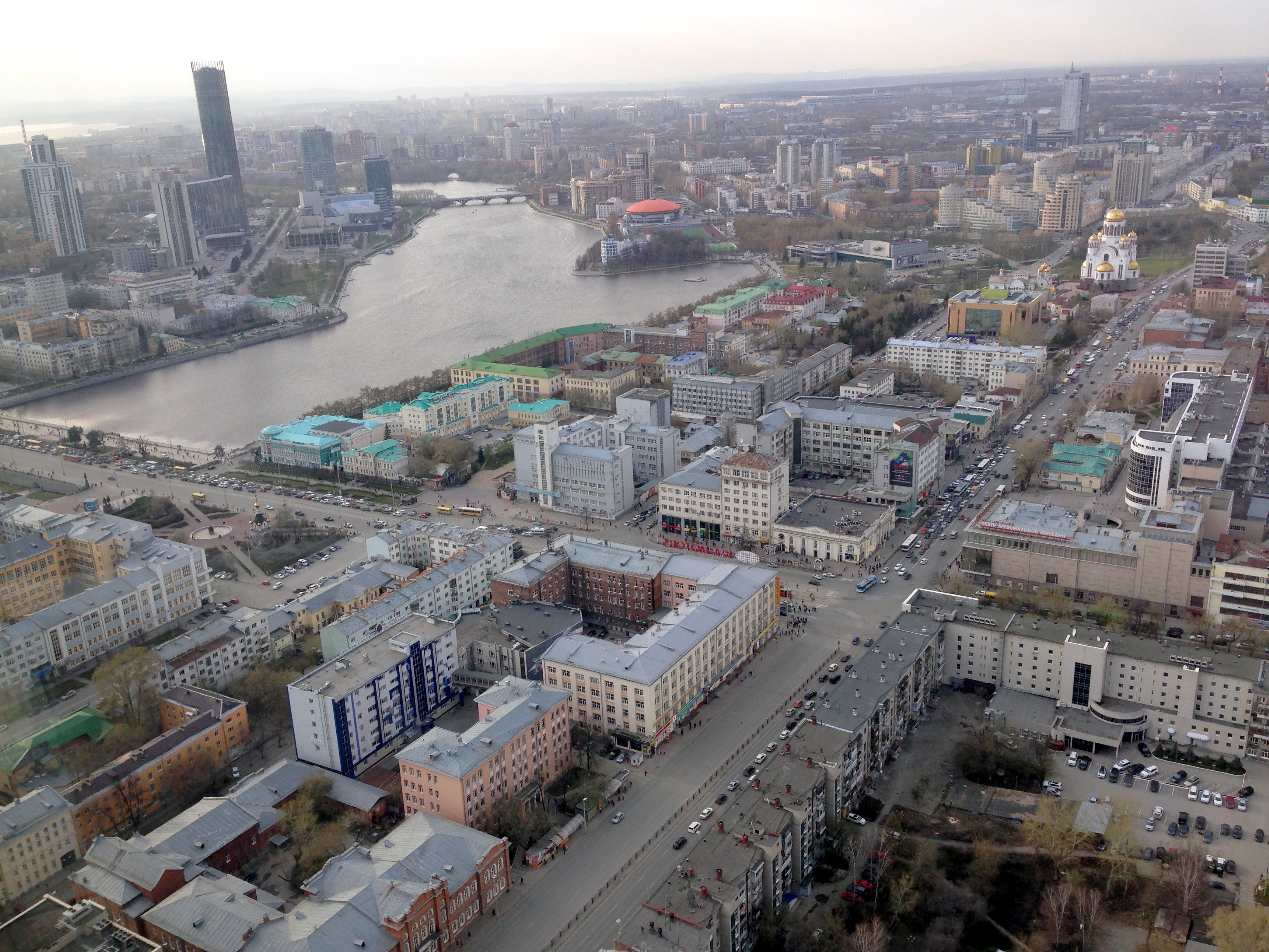
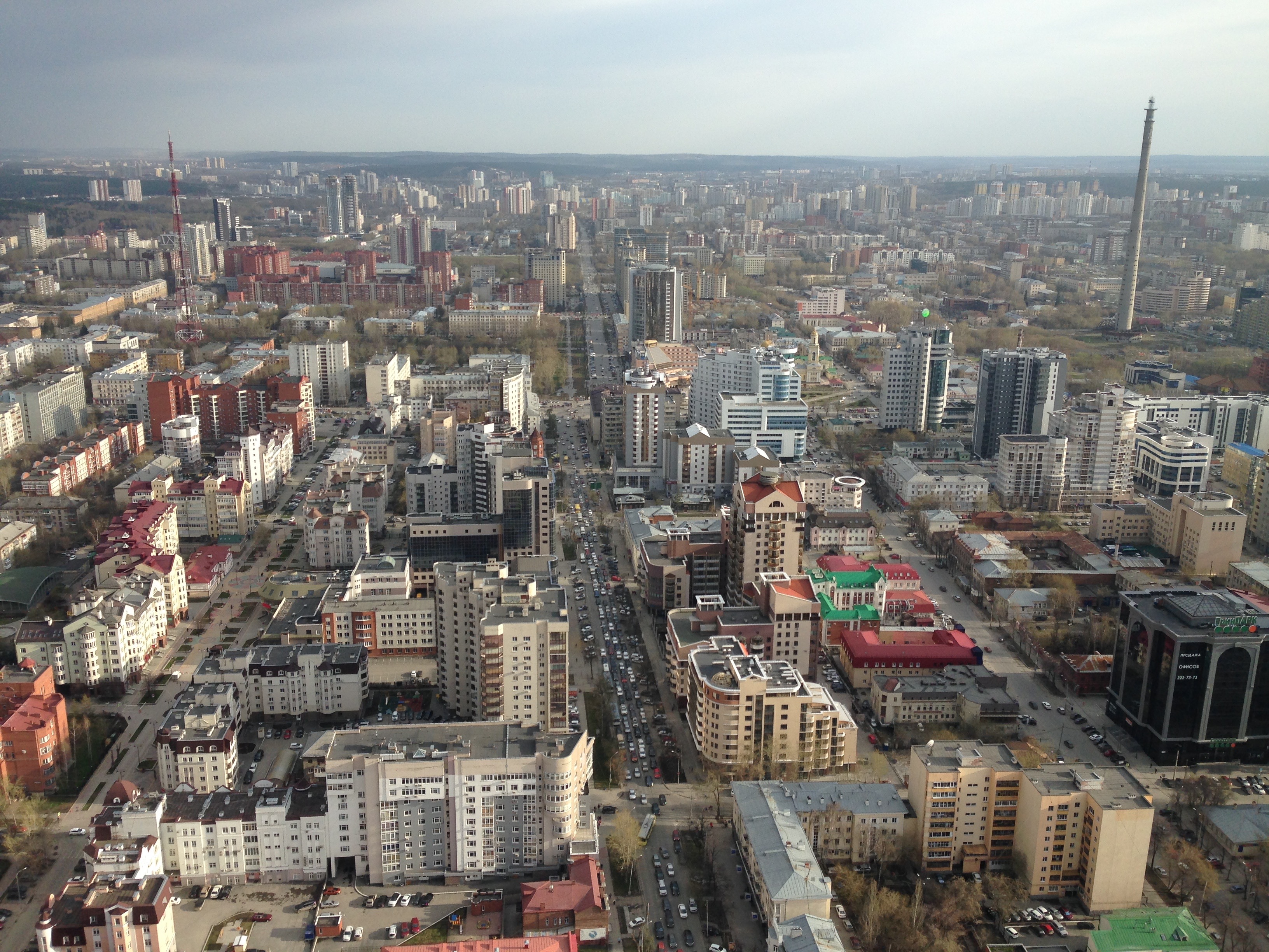

 It’s over a million people in a remarkably compact city at a dam on a river, in the midst of taiga forest (spruce, birch, larch, pine). In fact, it’s by far the most dense and compact Russian city of its size, which means they need to get used to being a national leader in public transit development.
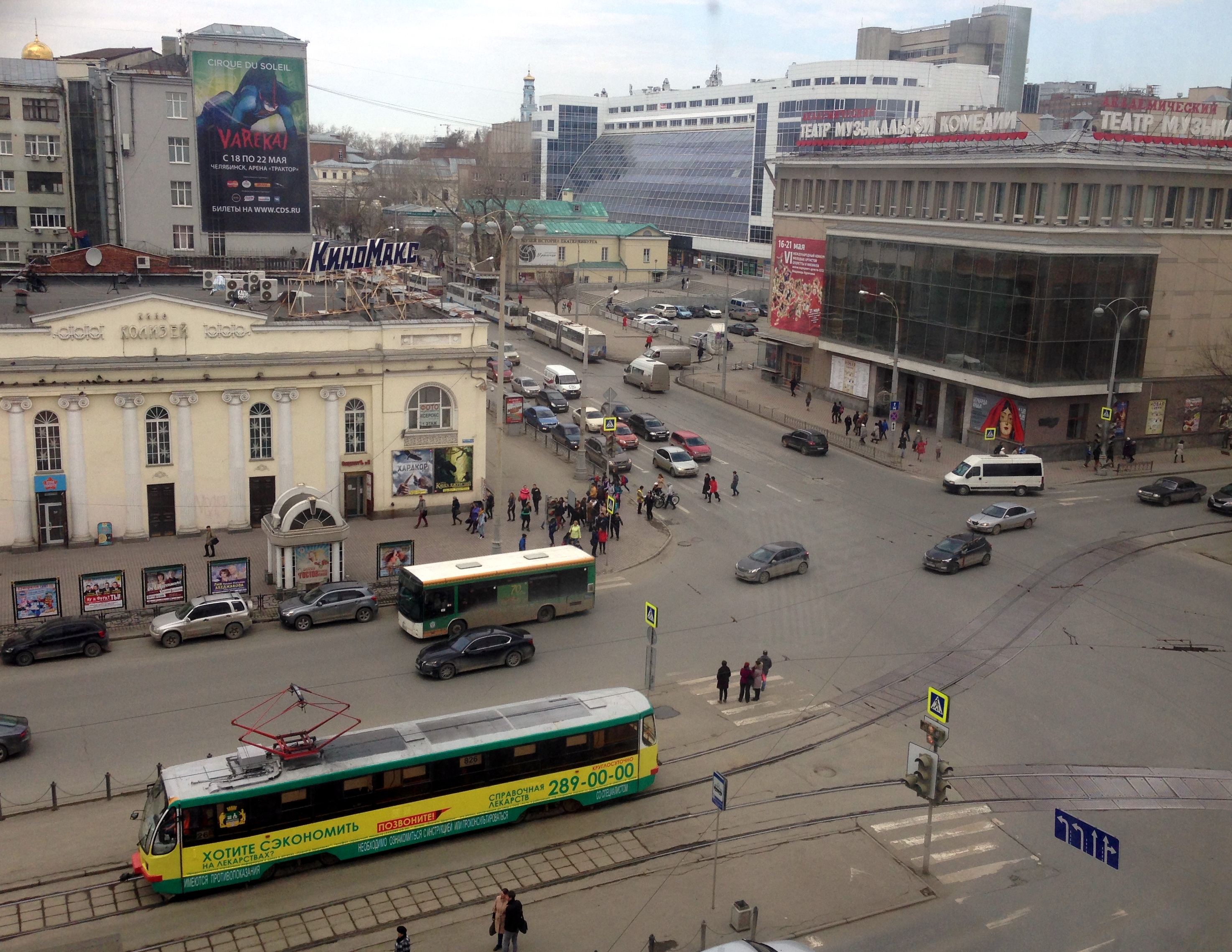
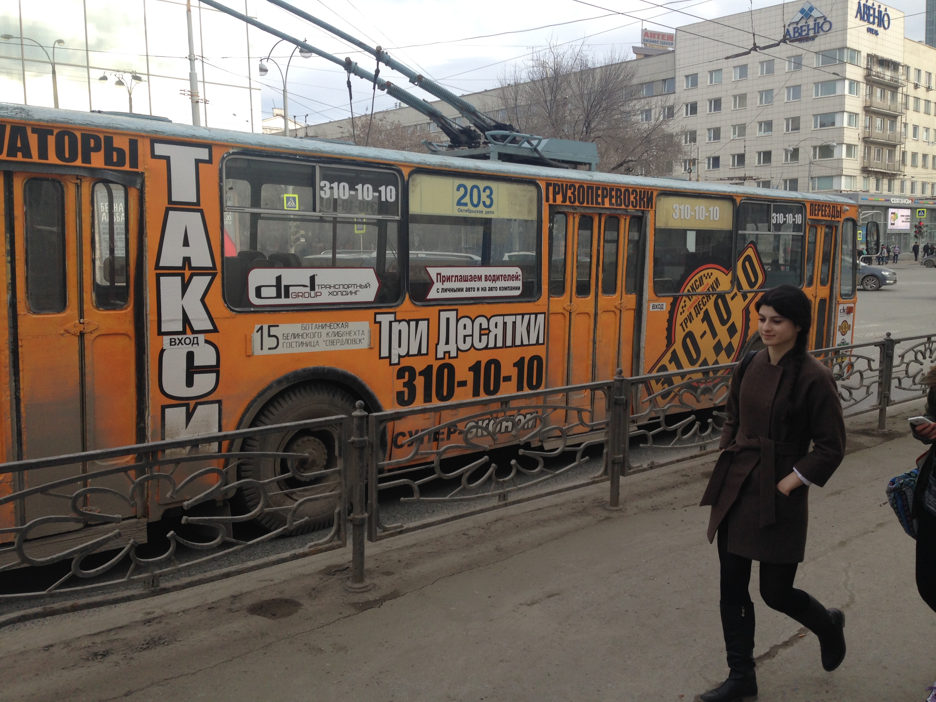
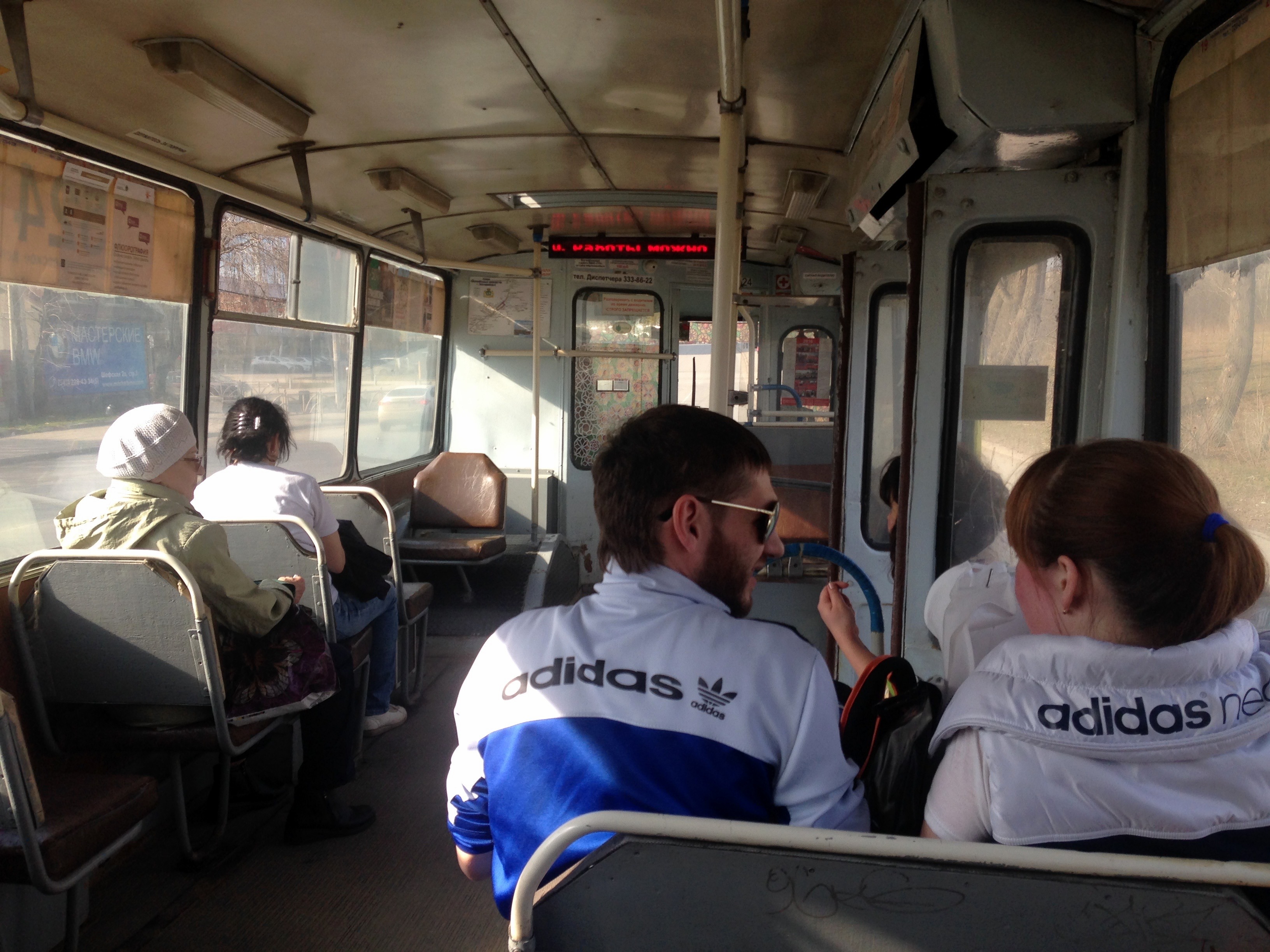
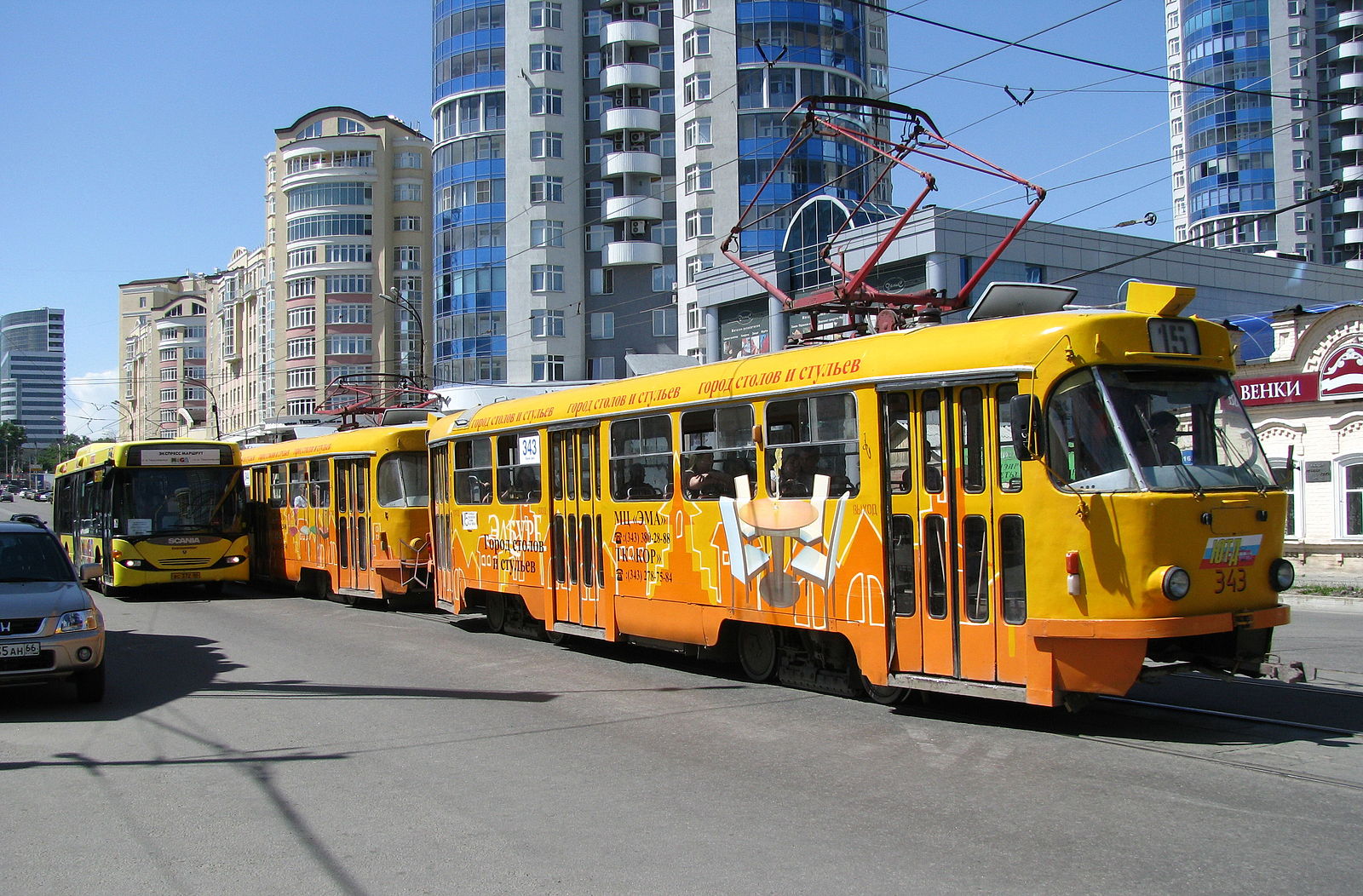
And yes, it already has a lot of transit. In this first picture, note the trams, full-size motorbuses, and, at the crowded stop in the distance, trolleybuses and tiny van-like buses. There’s also a metro.

Still, it’s OK if you haven’t heard of Yekaterinburg. A year ago I’d barely heard of it either.
But last year, an energetic local NGO called Gorod.pro, which is dedicated to improving the city’s transport and urban environment, called me, and I do my best to say yes to these things.
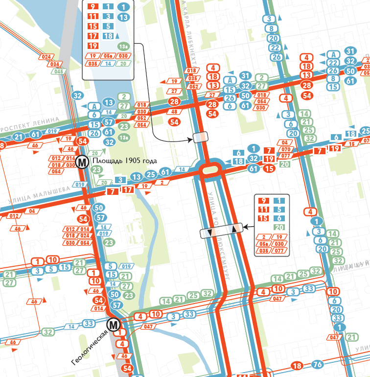
Yekaterinburg presents a series of transit situations common in middle-wealth places, but that I’ve also struggled with in Australia and New Zealand and the UK. As I outlined in more detail here, the city has evolved several overlapping transit systems that compete as much as they cooperate, and as a result you can’t get to as many places as quickly as you could if they were all working together. The trams, trolleybuses, and motorbuses overlap each other and also overlap the single metro line. And there are about 1000 smaller buses, down to the size of vans, that do all kinds of unpredictable things, including driving rather dangerously in order to get ahead of big buses and grab their passengers.
So I was asked to work with local leaders and transit managers to hammer out a vision — including a specific map — of what that would look like.
I’m always happy to slip quietly into a city, but that certainly didn’t happen here. The client wanted a splash, so all week I was doing public lectures, radio interviews, and high profile meetings with the City Manager, his key deputy for transportation, and even the mayor, Yevgeny Roizman — all with lots of reporters.
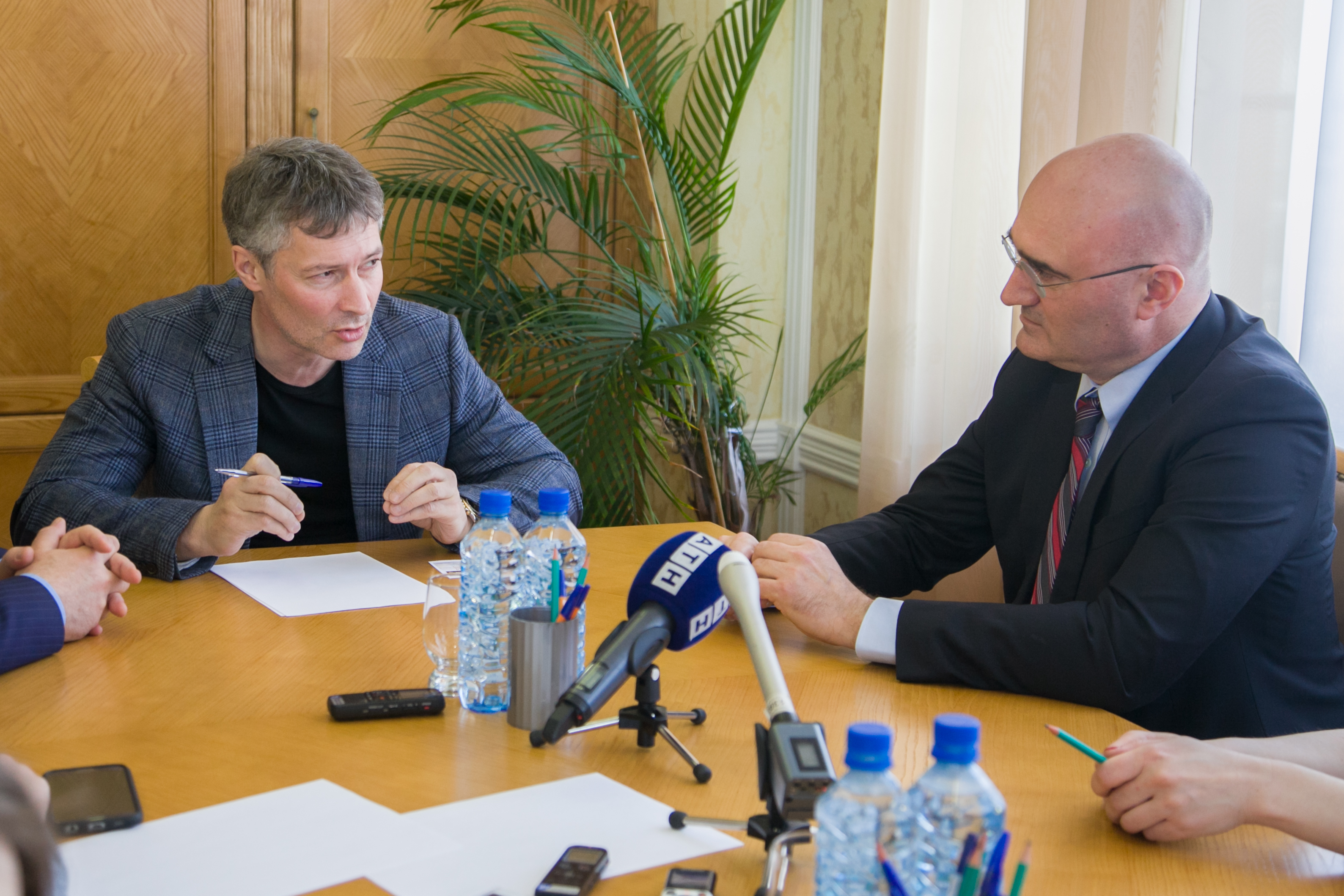
Mayor Roizman was especially generous with his time and interest. In addition to our formal meeting in his office he also gave me a tour of a museum of icon painting that he founded. He also joined us for a few hours of touring the city, often interrupted by eager citizens wanting a photo with him. He even dropped into our working sessions, with chocolate.
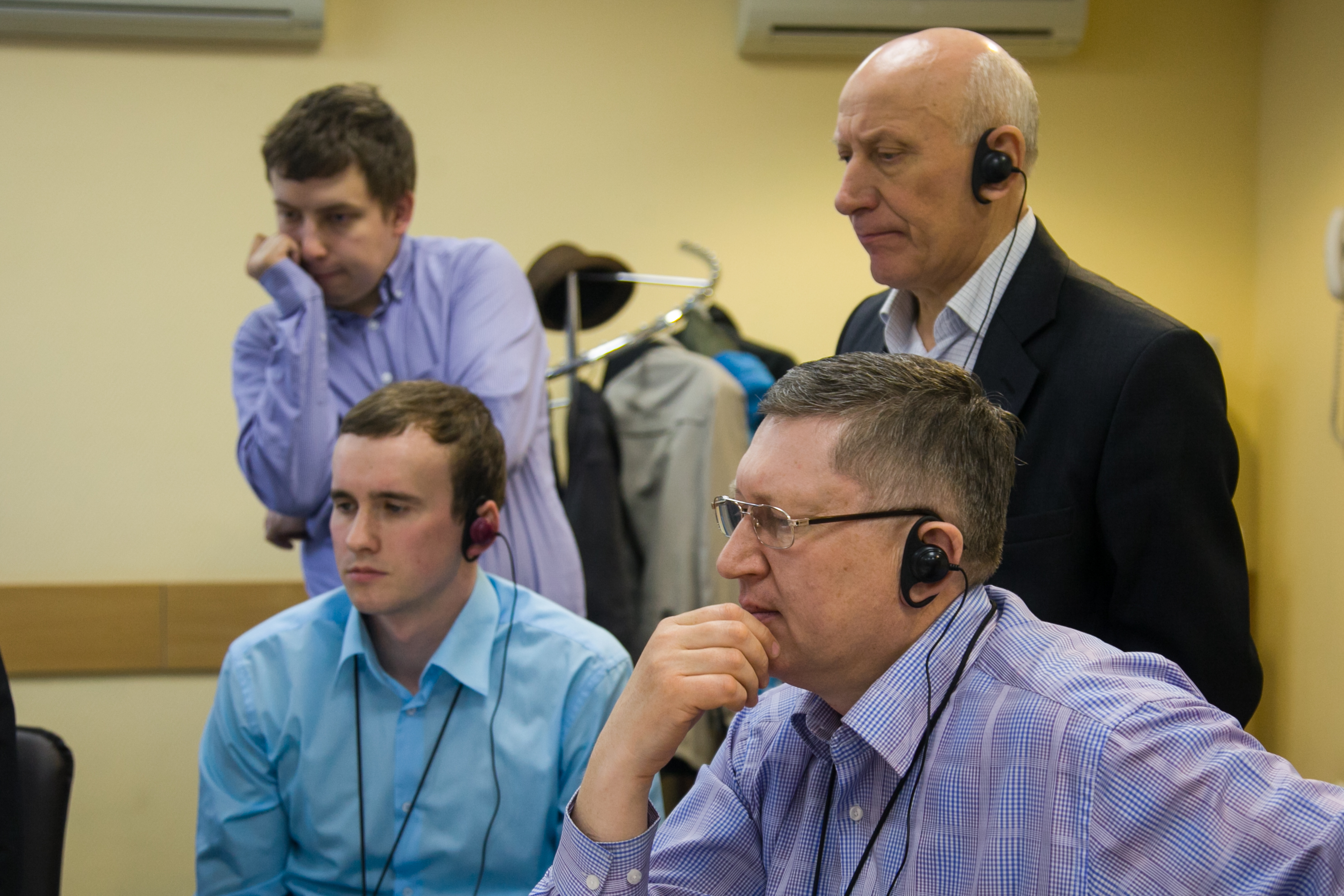
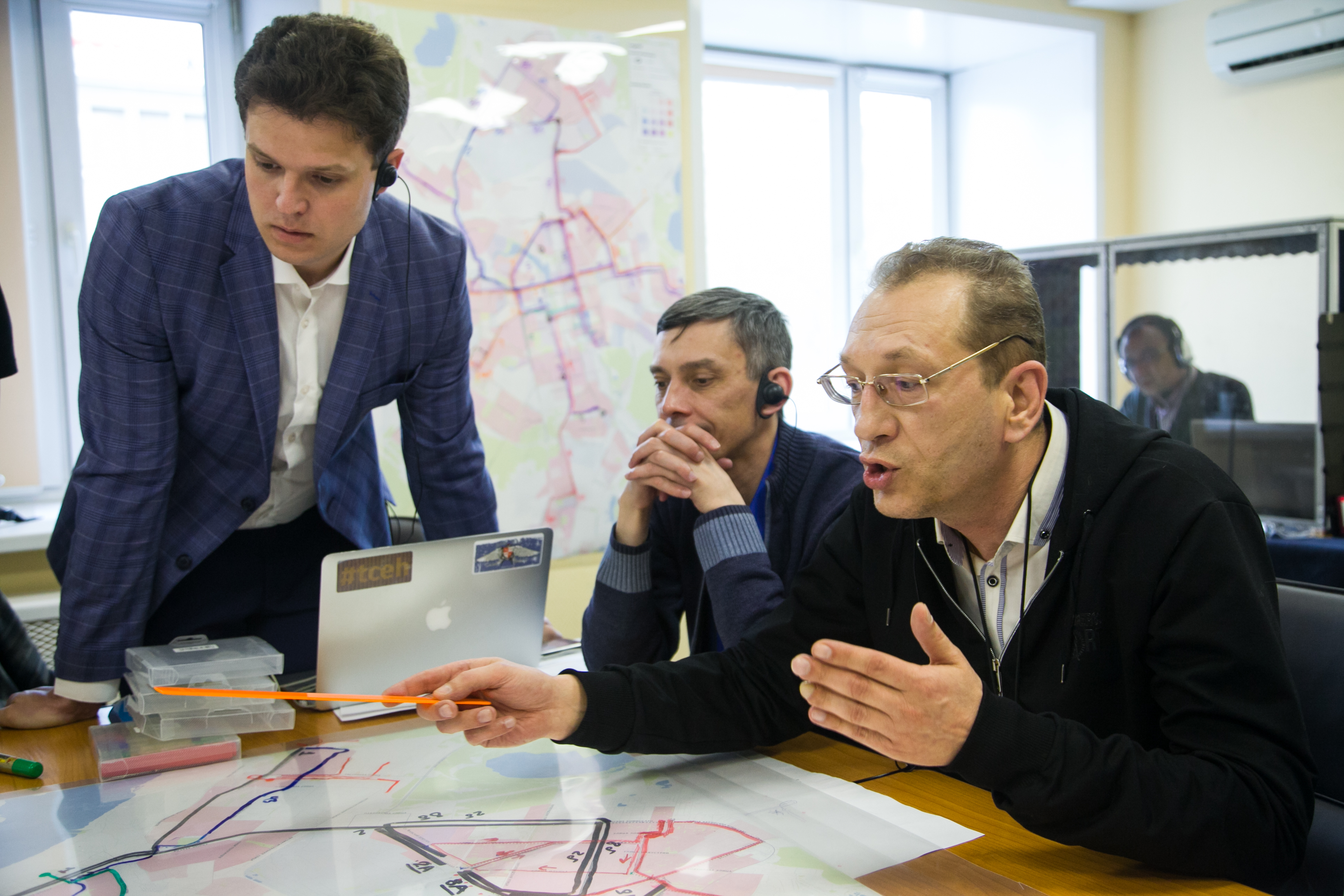
For much of the week, I was sequestered with a group of key staff leaders, including senior managers from the various transit operating companies and city transport and planning staff. As I insist on doing in most of my planning projects, we locked ourselves away for 8 hours a day to hammer out a shared vision of how the city’s transit might be better if it were planned as a single network. An excellent set of photos by Gorod.pro gives a sense of the intensity.
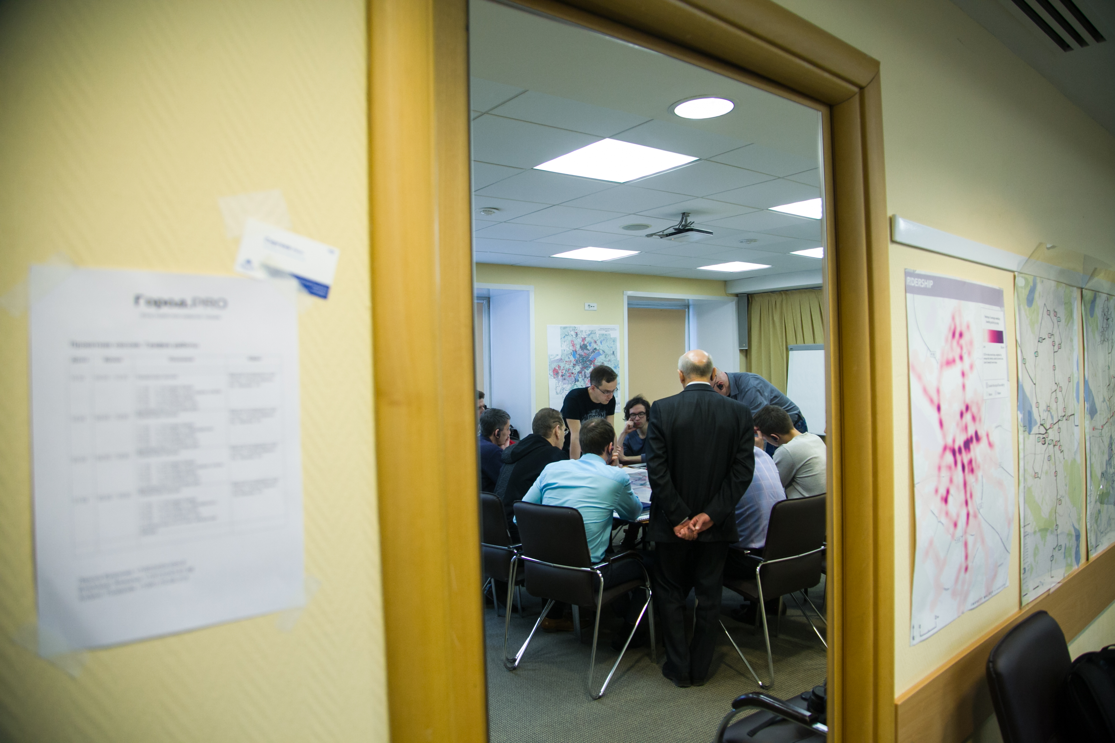
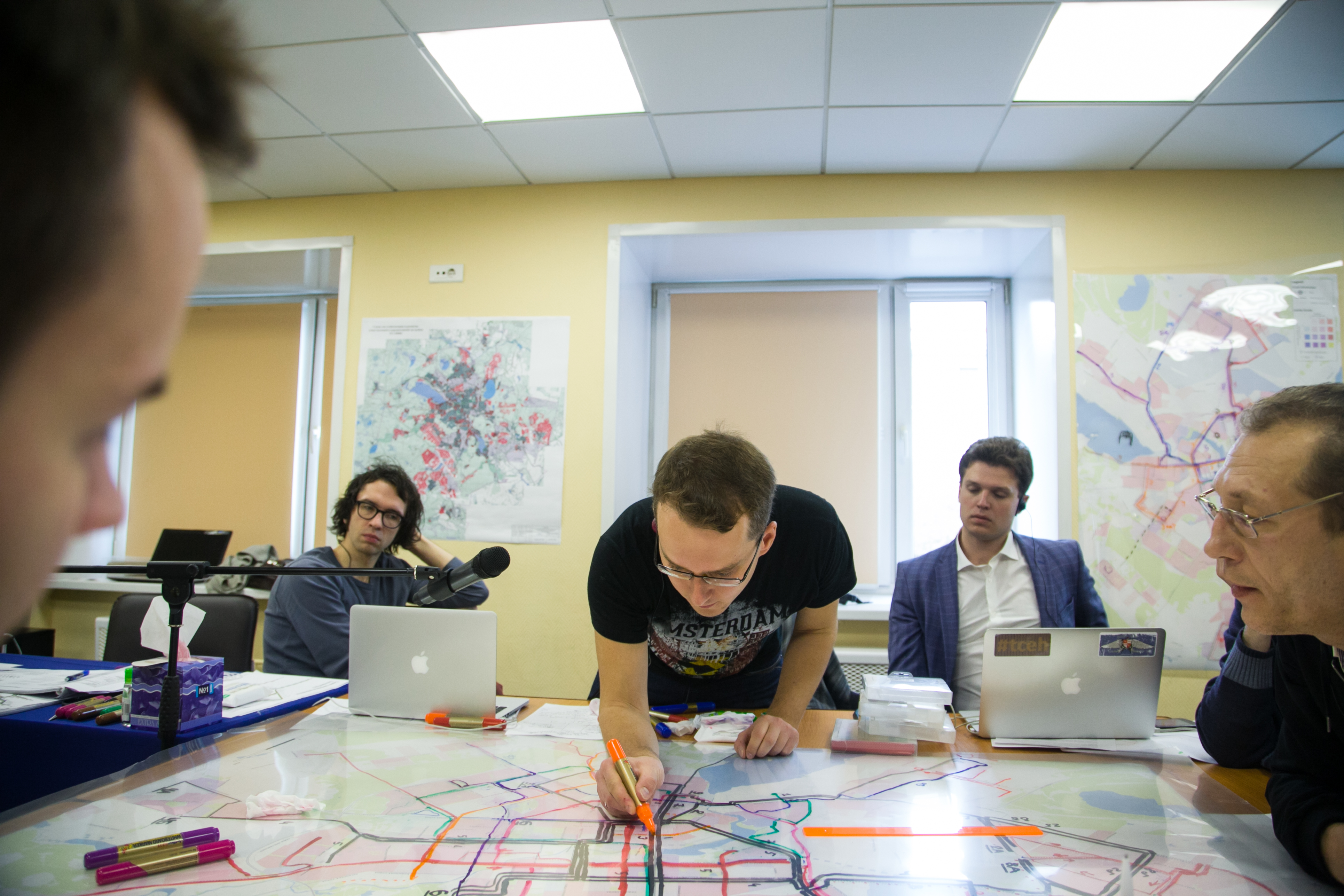
(The guy drawing is Vladimir Zlokazov of Gorod.pro. He was my main contact, advisor, negotiator and translator throughout the project.)
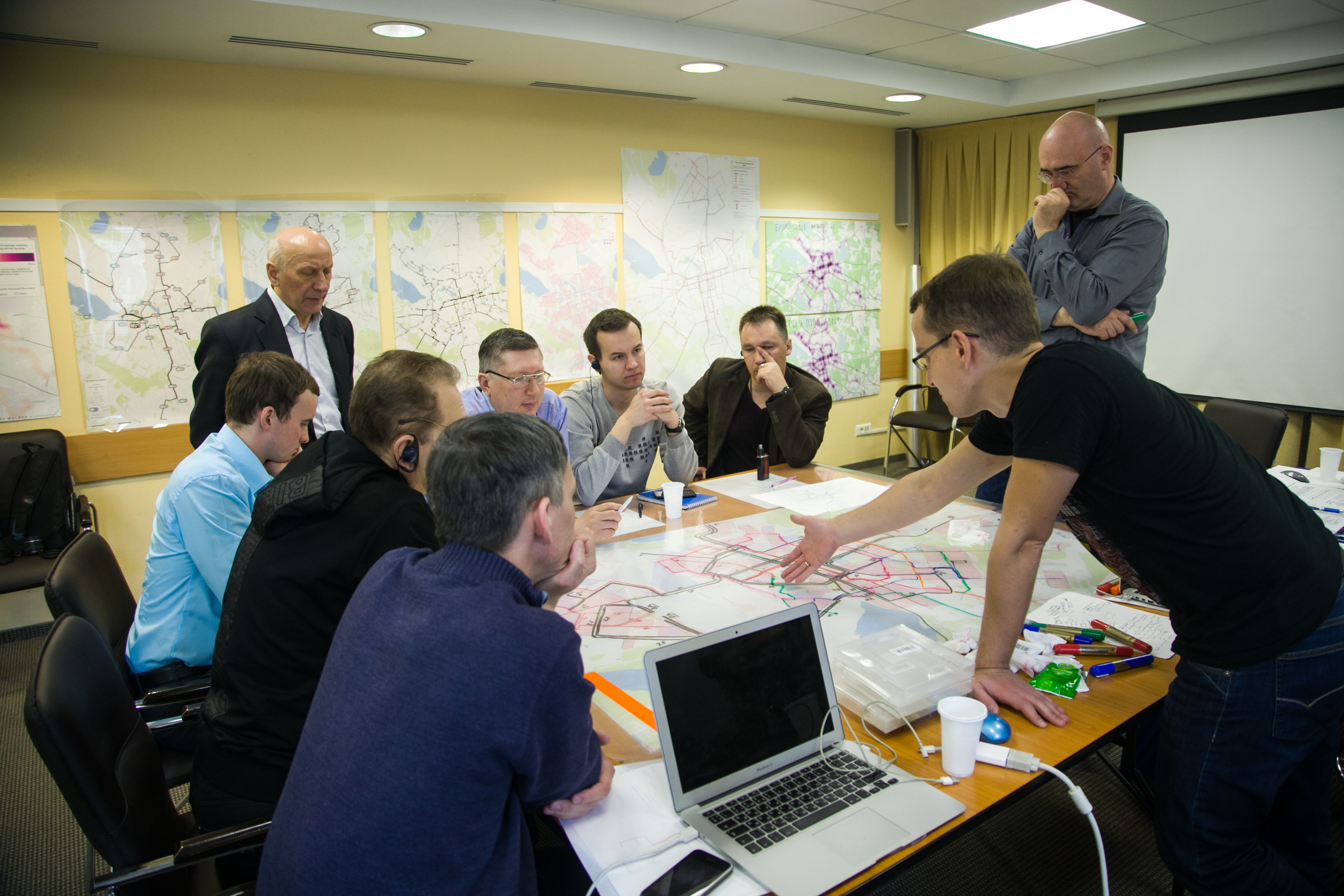
At the end of the week, we had a sketch of how the network could look if everything worked together. We had tram, trolleybus, and frequent motor bus lines drawn specifically, and a general set of principles for how the enormous fleet of smaller buses would supplement this network.
We also identified some of the biggest challenges for moving forward:
- Fixing the fare system. The current fare structure charges people for changing vehicles, which undermines the whole point of a highly efficient network.
- Reorganizing operating contracts, so that the only revenue total that matters is that from the entire network. This is essential to eliminate competitive behavior between subsidized services, so that the result is the maximum possible access to the city for everyone.
- Maintaining separability from other issues. There are 1000 other things to be done to improve transit, notably in the area of infrastructure. But almost none of it has to be done to get the new network on the road. We worked carefully to make sure we had a plan that didn’t require building anything more than bus stops, and that had a first phase that didn’t even require that. This is the key to ensuring that a network plan doesn’t get stuck waiting for something to be built.
A report on this network, its benefits, and the challenges it will present, will be out soon, and I’ll do a post on it here.
(Workshop photos: Gorod.pro)
