The Atlanta area transit agency MARTA finally implemented its bus network redesign, called NextGen, on April 18, 2026. We led the network design and analysis tasks for the consulting team, and although it was a long and difficult journey, we’re proud of the results. Now that the new service is running, I want to give a quick overview of what the redesign did, and the new opportunities it creates. If you want to go deep into geographical detail, and understand why we made each routing choice, you can find our Final Report online here.
Here’s the big picture. Old network on the left, new network on the right. Note the legend: Colors indicate all-day frequency. The wide grey lines on the basemap indicate the rail rapid transit network, which is all frequent most of the time. Our more detailed map of the new network is here.)
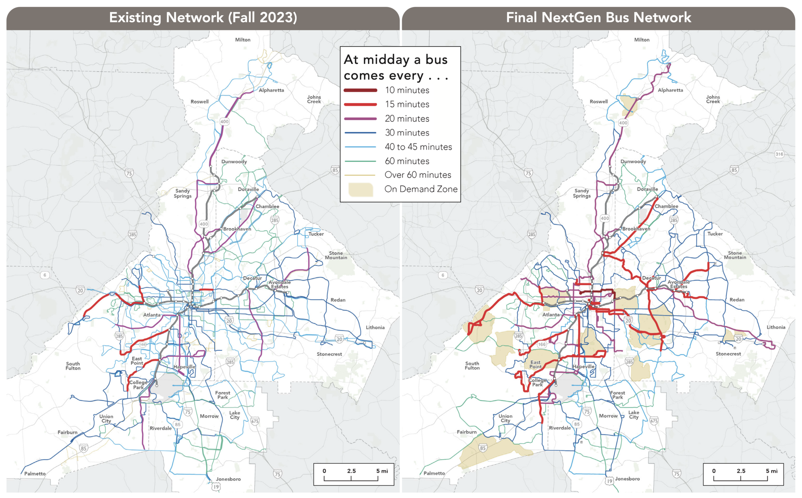
The overall quantity of service we had to work with is slightly higher than in 2023 but lower than what existed in 2019. This reflected the available resources and key policy decisions about priorities. For example, the City of Atlanta has its own transit funding source, More MARTA Atlanta, but during the study process they chose to devote these funds entirely to future transit projects rather than short-term transit service. That’s why there isn’t more service within the city. As network design consultants, we work with the service budget that the agency has. When I have been asked how much service Atlanta needs, or how much would attract good ridership, I say “much more than this.” But that is not the question we were asked in this project.
Within those budget limits, we were able to increase by 22% the number of useful destinations the average person can reach in 60 minutes. (For more about these access measures, and why they matter, see here. For more on how we measured this in Atlanta, see the Final Report.) This is the easiest way to describe why the network is better: more people will find it useful for more trips.
The old network had three major problems that we tried to address:
- Low Frequency. For a city of Atlanta’s size and density, there was remarkably little high-frequency service, which we define as service coming every 15 minutes or better all day. The new network has much more frequent service, shown in red on the maps above. Purple lines in the new network, running every 20 minutes, all deserve to be every 15 but our resources just didn’t go that far.
- Poor Connectivity. While the old frequent bus lines all connected to rail, they did not connect much with each other. Most connections outside the rail system required multiple transfers at low frequency, without any particular timing of connections. This made for long delays even on fairly short trips. In addition to increasing frequencies and increasing the number of places where frequent lines meet each other for fast connections, we also introduced new timed connections at several suburban locations, enabling fast connections between routes even when the frequencies are low.
- Buses Exclusively Feeding Rail. The bus network had not been substantially rethought since the rail network was created decades ago, and its basic assumption was that buses exist to feed the rail network. Virtually all routes in the old network ended at a rail station. This is very unusual, and for good reason. Many local trips in dense areas are traveling across the rail line, and this approach made the rail line a barrier for all those trips. We questioned this as much as possible, though in many cases, infrastructure limitations forced us to continue the practice.
We’re especially proud of what we achieved in Downtown and Midtown, the densest place in the region. Three lines now run continuously east-west across the city center — including the very frequent route 2 as well as the 11 and 51. (Old network above, new one below). (All these detailed maps can be fiound in the final report.)
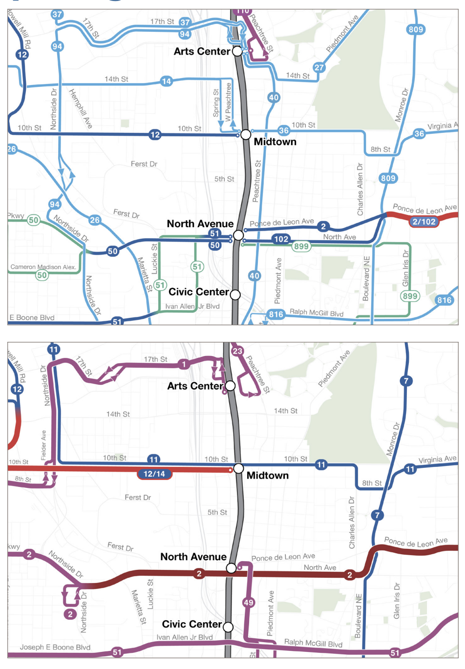
Old network (above) and new network (below) in midtown Atlanta. Colors represent frequencies, using the same legend as in the first image above.
Of course downtown Atlanta would support a full grid of frequent lines, as comparable downtowns such as Denver and Los Angeles have, but with so few resources devoted to bus service, that wasn’t possible here. Still, the new continuous routes across downtown will vastly improve access into and across the city.
One route with great potential was actually removed: the old north-south route 40 along Peachtree Street, the highest-density spine of downtown Atlanta. This route ran right alongside the rail line but made more stops between the stations. We observed that this route, if running frequently, would have very high ridership. Comparable streets in similar cities certainly do, even with rail running beneath them, because the demand for local trips is so high and the time to access the station often isn’t worthwhile for short trips within downtown.
But with the budget we had to work with, and the need to divide service among the various parts of the region, we couldn’t afford the level of service that Peachtree Street would need, which would be every 10 minutes or better. So we decided not to serve it at all. The 45 minute frequency being offered was simply not relevant to the kind of market that Peachtree Street is. Plenty of people are moving up and down the street and would benefit from the service, but most are doing so spontaneously, not on predictable schedules, so they will only use the service if it’s coming when they need it. Without extremely high frequency, there wasn’t much point.
Thinking about the needs of disadvantaged communities was hard in this project. In the Atlanta area, the greatest concentrations of low-income and minority populations are in the south and southwest, but southside Atlanta in particular has a very difficult street network. There are north-south streets, but none of the east-west streets is entirely continuous across the area. Freight rail lines, which made some crossings inoperable due to the disruptions long trains would cause, further complicate the picture. That’s why we weren’t able to create as much of a frequent grid pattern on the south side as we would have liked.
The Atlanta area is also a world leader at building low-income apartment developments in places where efficient transit can’t get to them, often because they are on long cul-de-sacs or in locations that would require an awkward deviation. This is where you’ll find many of the new on-demand or “microtransit” zones, which are the only way to get any service to some of these locations. We also used one of these zones in the far west to cover part of the unwalkable Fulton Industrial Area, bringing people to a central point where they could connect to several fixed routes. As always, these zones were designed to maximize coverage, not ridership. Their purpose is to provide lifeline access to as many people as possible in the places where the geography is especially difficult. They are not meant to be superior to fixed routes. They are just a way of arranging service to get some coverage to areas where the design has made efficient fixed routes impossible.
If you live in the MARTA service area, I hope you’ll explore how the network has changed, and how it might be useful to you now.
NextGen sucks for people who actually use the bus. You have destroyed many of our commutes, especially in northern DeKalb County. Let’s address the three areas this claimed to “fix”.
1) Low frequency. Improving bus frequency is not an improvement if the tradeoff is that a connection is added (see #2) to our trip. It takes LONGER to get to where we need to go, even when anything is running on time.
2) Poor connectivity. This makes absolutely no sense. If you are reducing the number of bus lines, there are more connections needed, not fewer. Plus, the notion of “timed connections”, with the number of cancelled buses and Atlanta traffic, is laughable and definitely not working out in actuality. The bus outside my place is almost always running way behind schedule during rush hour (20-30 minutes late); I saw one that was 78 minutes late the other day.
3) Buses Exclusively Feeding Rail: Why is this a problem? Maybe this could make sense in specific areas, but you’ve done this to lines outside of the “hip” areas too. I want my old bus back that went to my nearest train station, rather than a convoluted route through the neighborhoods of Atlanta. And who are you to tell us what a key destination is? Newsflash, most of us care about getting to work quickly, which often involves a rail connection.
What has happened to my commute? It was pretty consistently 1 hour each way is on average longer, has been up to 1 hour and 45 minutes. I have had to run after buses to avoid missing a connection. I have to walk down a street without a sidewalk. I have had to sit on curb in an abandoned lot with glass around me b/c my back is aching from standing, due to no bench at the connection bus stop. I wish you and MARTA would be honest about the fact that outside of selected areas, many, many people have worse or no service.
“If you are reducing the number of bus lines, there are more connections needed, not fewer”
Wrong. If you have one bus line from A to B, and another bus line from B to C, then you need fewer connections if you combine them into one line A-B-C. This is exactly what was done in Atlanta. B in this case is the rail station.
This is exactly why “Buses Exclusively Feeding Rail” was a problem. Previously you had one line A-B and one line B-C, now you have one single line A-B-C.
Wrong. Previously, I took one bus to a rail station, then took the train. Now, I take one bus, then have to transfer to another bus (which I’ve had to wait up to 40 minutes for, despite this being a supposedly “timed” connection) to get to the rail station, then take the train. I went from 1 to 2 connections.
Sounds like your starting point is along a lower ridership, less frequent bus route. Coverage was maintained with NextGen, but unfortunately, your single-seat ride to rail was lost. The network ultimately favored ridership over single-seat riders. That’s a valid trade-off in growing ridership, while still serving existing riders.
Interesting to understand the design and some of the constraints involved. I’m curious if the redesign included planning for ongoing headway management during high traffic conditions especially on consolidated routes with increased frequency. In my experience riding the new 2 route bunching during rush hour has resulted in much higher than advertised wait times. Obviously, I get that this is a major redesign probably meant to last for many years so can’t be conditioned on fluctuating traffic patterns.
The project’s remit was just the network design. We have no influence over operations, which I trust MARTA is working on.
Do you ever factor into your designs that the transit system shouldn’t be trusted to work on improving operations? That they won’t do anything about adjusting routes and just throw their hands up and do nothing if the connections turn out to be totally unreliable. MARTA has a reputation for poor operations for many years.
I’ll be very curious to see a follow up on this expansion to see if there have been any major ridership changes!
It’s very disappointing that you feel the need to censor my previous about how shitty the MARTA NextGen roll out has been and why your plan did not address the problems you claimed it would. It seems from your other comments that you don’t listen to others who have tried to tell you that many of your ideals (e.g., connections not being a bad thing) just don’t hold in reality. A real transit planner should listen to people who have lived experience with the actual systems, not just your hypothetical ideals.
Your comment was not censored. I just don’t check comments every day.
You don’t have to check comments *every* day but honestly the commenting doesn’t work if it takes multiple weeks for comments from new emails to appear and this is not the first time. You should have someone else checking comments if you don’t have the time.
Then how come you approved a comment that was posted AFTER mine weeks ago? That was why I am assumed you were not approving mine.