If you look for a map of Bogotá’s TransMilenio network, you’ll find something like this:
Diagram of TransMilenio from the City of Bogotá website, published by Jose Luis Martinez.
Note that north is to the left on most standard Bogotá maps.
This is not, of course, a map of the whole network. It barely even begins to explain what the buses do. In fact, what the buses do — even the biggest buses providing high-capacity transit — is so complicated that it may impossible to map clearly. (Update: But someone has tried!)
This map invokes a familiar stylistic language from metro maps worldwide: A solid line of a certain color means direct service between all the dots on that line. Where two lines cross at the same station dot, that means you can connect between those services there. The style is so pervasive and effective that some cities without much rail service draw their bus services this way. (Here’s the bus map in Wellington, New Zealand, for example). Just down the hill from Bogotá, the Medellín Metro system uses this familiar style to show how their rail, bus rapid transit, and gondolas all interact.
![]()
But Bogotá’s map doesn’t work that way. No logical metro network would have lines like B, A, and H as they appear on this map, meeting end to end. In the usual metro map language this would mean you have to transfer twice to keep going in the same direction, which would be silly. But that’s not what it means here.
This is a map of branded corridors of buses, a concept that takes some explaining. The green line B on the map means that along this corridor, a bunch of buses whose line numbers start with B all operate. But those buses are coming from points all across the network, bearing their B number.
Here’s the explanatory sign of a single station, Virrey on the B segment. (Click any photo to enlarge and sharpen.)

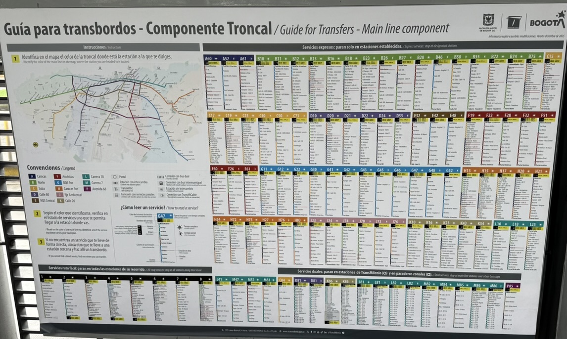
This sign lists every bus route that stops at this station, with a list of the other stations that each route serves. The colors match the map. We’re on the green “B” segment so sure enough, there a lot of green B bus routes. But those buses are nowhere near the majority of all the buses that stop here. In fact, if you’re traveling between two B stations, the next bus that does that may not be a B bus at all. What’s more, the next B bus may not take you to the B station you want, because of their complicated skip-stop patterns. So you really have to check that the bus you get on is stopping exactly where you want to stop.
Why so many different patterns? This is the compounded effect of two kinds of complexity:
- They are trying to run direct service from this corridor to every other corridor in the network, so people don’t have to transfer.
- Not all buses stop at all stations, so stopping patterns generate separate routes even among buses that are all following the same path.
Notice that both of these effects are multiplicative rather than additive. If you wanted direct service between any two or the 12 corridors, that in itself would generate 72 possible routes (12 squared is 144 one-way pairings, which is 72 two-way routes). Then when you start varying stopping patterns you continue to multiply routes. Remember, more routes always means less frequency on each one. It means more time standing in a crowded station before you can start moving toward your destination.
In the lower left of the sign above, there are also six bus routes numbered 1-8, with headings in black. These were added later. These buses are distinctive because they stop at every station, so they provide a simpler service pattern. (It would have been nice to have a map of at least these eight routes, which are clearly simple enough that such a map would be legible.) But these routes are a small part of the network. Most of the great masses of red buses that you see in the TransMilenio corridors are doing one of the more complicated patterns.
Most of these patterns run with a frequency of 5-10 minutes, but of course there are disruptions, especially in routes that run partly outside the infrastructure, so I often waited longer. Ten minutes is a reasonable wait in the transit-starved United States, but on TransMilenio, with many buses per minute flowing past each station, and given the discomfort of most of the stations, it feels like a very long time, especially if the complexity is also heightening your anxiety.
So let’s review all the ways that this complexity affects the rider and the experience of TransMilenio as a whole:
- It requires longer waits. In simpler systems, there are fewer service patterns but they run more frequently, so people are more likely to get on the next bus that comes and make progress sooner on their journey, even if that bus doesn’t take them all the way to their destination.
- This means that stations are more crowded, as more people wait for a particular bus instead of getting on the next one.
- It makes buses more crowded because they are more unevenly loaded, for the same reason. This is likely the cause of the difference between TransMilenio’s “theoretical maximum” capacity (56,000 people per peak hour per direction) and the highest actually observed volume (43,000).
- It makes the station wayfinding challenge very difficult, because people have to be navigated to a particular platform within the station, and the huge number of routes means that the user must wade through a lot of information (see sign above).
- Most importantly, it trains people to either (a) rely on an app to navigate them or (b) use only services that they know. Both options also tend to steer people away from other services that might be more useful to them for the trip they’re making.
The complexity is staggering enough if you travel within the TransMilenio busways, but once you’re outside of them, it’s truly overwhelming. Here’s a bus stop sign in a very dense inner city neighborhood.
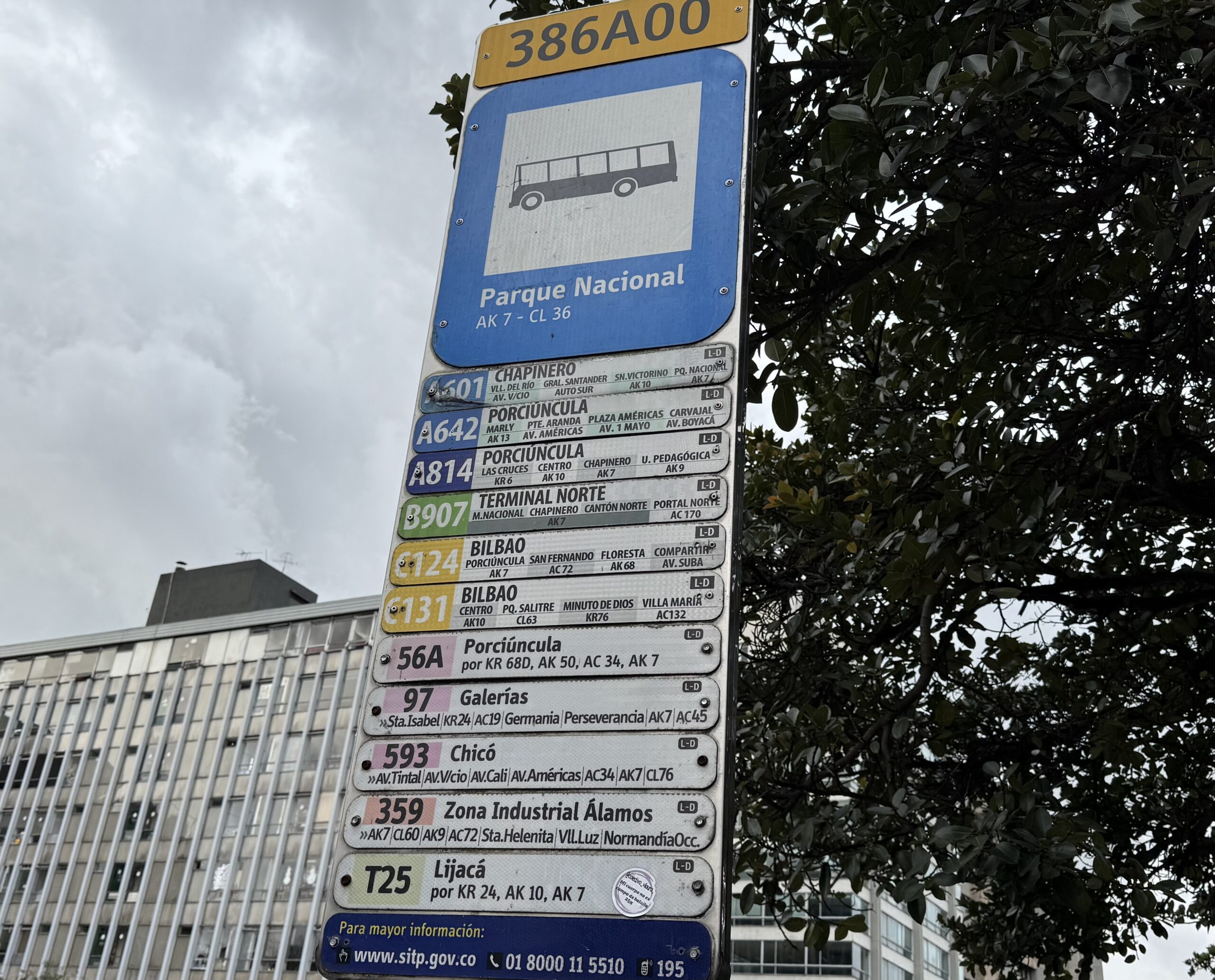
That’s a lot of flavors of buses, all going down the same street in the same general direction. You already know that route numbers beginning with A, B, and C mean that those buses will eventually end up running on those corridors of the busway, though it’s anyone’s guess whether that segment is in the future or the past relative to this sign. And there are so many other routes on top of each other. This is what the network looks like at street level, stripped of the relative clarity of the big busway stations. There is information here — Bogotá’s numbered grid system means that a practiced rider can decode much of it — but the cognitive load is immense, and for a newcomer it is simply a wall of text.
To TransMilenio’s credit, they’ve done all they can on a static sign to explain these bus routes with text. Bogotá is blessed with a grid system of numbered streets, called carreras when they run north-south and calles when they run east west. This allows routes to be described very briefly, because locals learn the code: K for carrera and C for calle. (A for Avenida just means that the calle or carrera is a major street.) So there is a great deal of information here, which I quickly learned to make the most of. But it’s still a lot of complexity.
Later, I attempted a trip from K11 & C92 to K69 & C24. The journey required a transfer, which was fine with me, but Google told me to transfer at a point where there was only one bus route continuing to my destination. As I waited 20 minute for that bus, countless other buses flowed past me, each one maybe taking me partway to my destination, and to a place where there might be more buses to where I was going. But there was no way to make sense of this information.
As I understand, the local app TransMiApp will give you directions based on where the buses actually are, so that for example if my direct bus were late it would serve up a faster alternative involving a transfer. But the right answer would continue to change by the minute during my journey as various buses ran on time or not. This would have helped, but not nearly as much as having a simpler system of fewer routes, all running much more frequently. There are enough buses in Bogotá so that on almost every street, the next bus could always be coming within a minute or two, ready to take people on the first stage of their journey. But that would require a different approach to design, one that is less fearful of transfers.
Let’s acknowledge that Bogotá can be critiqued on this score only because:
- They have unified planning control of the whole network, so they theoretically have the power to make things simpler.
- They have at least attempted to explain the service, which makes it possible to see what’s wrong.
In many middle-wealth countries, and certainly in poorer ones, you won’t see any effort to make the service legible, so the complexity is overwhelming that it’s hard to even talk about. In many countries, too, private operating companies still control service planning and do not feel motivated to participate in creating a logical total network. If I seem to be picking on Bogotá here, it’s only because unlike so many of its peers, its public transport authority is at least trying to present a network, and it has enough planning authority that it can be held responsible for that network’s design.
Still, if I had been working on this network, I would have questioned how much of this complexity was truly necessary. I would especially have asked:
- How much of this complexity is needed only in the peak? One of the most common mistakes in transit planning is to design the all-day network around the rush-hour pattern of demand. Instead, the all-day network should always be designed around the all-day pattern of demand, with rush-hour patterns added on top only as demand warrants. That can help you create a more legible all-the-time network — maybe even one simple enough to draw a diagram of — even if rush hour service is adding a lot of complexity. In our firm‘s maps, we draw rush hour services very faintly, if at all, so that they don’t distract from the simplicity of the all-the-time pattern.
- Where in the network is the infrastructure for changing buses so good that there is no reason to insist on providing a single-seat ride? There are already several convenient interchange stations in the network. Asking people to change buses is always the key to a simpler and more frequent network.
- Can we make simplifying assumptions about stopping patterns to reduce the number of service patterns? This massively complex system has millions of details that can be fine-tuned to demand, but what is the cost/benefit ratio of keeping track of all those details. Would a simpler system that’s easier to understand produce benefits that outweigh that?
There’s one easy response to these questions: “People hate to transfer!” In Bogotá the decision to avoid transfers is based on surveys in which people are asked if they want to transfer. But these surveys asked a hypothetical question without explaining consequences. It’s always important to ask: “Which matters more to you? Avoiding a transfer or getting to your destination sooner?” Because that is often the real choice.
“This means that stations are more crowded, as more people wait for a particular bus instead of getting on the next one”
More transfers would also make stations more crowded. Also, as the transfers would likely be concentrated to a few major transfer points, the crowding would be even worse.
“It makes buses more crowded because they are more unevenly loaded”
Fewer routes would most likely lead to more uneven loading. Because with fewer routes, each route would have to be very frequent, like every two minutes or so. With so high frequencies, bunching is inevitable. Instead of one bus every two minutes, you get three buses every six minutes. That would make buses even more unevenly loaded.
“Which matters more to you? Avoiding a transfer or getting to your destination sooner?”
Well if the buses already comes every 5 to 10 minutes, further increasing frequencies would not shorten the waiting times very much. So I guess most people would prefer avoiding the transfer.
“More transfers would also make stations more crowded”
Only at stations where transfers take place – and if a simpler service means higher frequencies, then the lower wait times will reduce crowding.
This sounds like a forbidden napkin needs to be drawn and burned.
Of course people don’t like transfers. But transfers are inevitable and if you try really hard to avoid them you end up with a network where the transfers are terrible. You aren’t really sure what bus to take or where to transfer. Or you have to go way out of your way because you designed the system for the most common one-seat ride.
“In Bogotá the decision to avoid transfers is based on surveys”
Surveys tend to lead to flawed networks. The average person doesn’t know any better. I know that sounds rude and elitist but would you have medical care based on surveys? Or legal advice? Typically the surveys aren’t even scientific. People assume a transit system will work a certain way and they respond accordingly. If you think the transfer is going to require a lot of waiting you don’t want it. Meanwhile, a lot of people just don’t have the time to answer the survey. Then there is the context.
We stumbled into this problem in Seattle. The 522 is a bus run by Sound Transit, the regional agency that also runs the metro. Riders in the suburbs north of Lake Washington were asked whether they wanted a bus to the closest station or one that continued down the main corridor. They choose the closest connection, even though the other route could have connected them to more destinations (like the University of Washington). They had no context. Unfortunately, this blew a hole in the bus network and it will be very difficult to fix. The focus should be on the network — surveys be damned.
Surveys are not perfect, but they are better than just guessing what people want. Of course, you need to ask relevant questions. Just asking “do you want to transfer or not” is meaningless, instead you should ask “how much extra time are you willing to wait to not have to transfer”. You’d be surprised how many people are willing to wait five or even ten minutes extra just to avoid a transfer. “Transit experts” like you and me tend to care very little about minimizing transfers, but most transit users are not like us.
“Transfers are inevitable” is a mindset to avoid. Some transfers are inevitable, but that doesn’t mean you shouldn’t try to minimize transfers where possible. Of course, you should still try to make transfers as convenient as possible where transfers are required.
It’s always possible to minimize transfers, but at what cost? There’s always a tradeoff.
The complexity of Bogota’s TransMilenio network seems to be the perfect example to “pick on”. It carries a ton of people each day, but could possibly carry more people with a simpler network. Conversely there are simpler networks that don’t even attempt to relate buses going in a similar direction, which in turn makes the network less useful.
My local example is in Dallas where the overall network deprioritizes overlapping routes but there are natural corridors and transfer points where buses converge. Theoretically it should be easy to get from one side of Downtown Dallas to the other, or to other spaces where buses converge like the Medical District. In practice its tough to conceptualize even for a regular rider. Like Bogota, making transfers more intuitive and comfortable would make the network better for riders.
I don’t know what specific transit system attributes would maximise ridership in Bogota. Would there be any specific local factors, including cultural, social,economic/financial or rider preferences that support direct bus routes in Bogota that outsiders mightn’t appreciate?
More generally, even if it’s difficult to quantify and analyse transfer penalties, it might be helpful to identify and consider the many factors that would disuade people from making transit trips involving transfers in different urban and regional contexts. “Seamless” transfers impose zero (or near zero) burdens on travellers. Car and bike riders get seamless door to door travel. Car riders additionally get shelter from the weather, AC, entertainment, privacy, personal comfort and security – together with their single-seat journey.
Over the world, it’s the most desperate in society who have no choice but to undertake gruelling multi-leg, multiple-transfer trips across metro areas and regions day and night, in all weather conditions. Transfers involving lone travellers standing on anonymous street corners at night can be both unsafe and undignifying. As transit planners push more “frequent interchange networks”, they also need to take ownership and responsibility for the transfer experience that travellers must suffer as part of transit journeys.
Years ago when attending a conference in Bogota I used public transit several times. My biggest adventure was when I boarded a small bus close to my hotel to go to the historical center called Candelaria. The bus said Candelaria N. on the front sign so I boarded. At one point I noticed it turned into the wrong direction, more and more people left and the area became more and more strange. I decided to stay on board till the last stop and then go back so not risking to wait in a dangerous area.
Finally the bus moved up the hills and I noticed I was precisely in that area where I was warned never to set a foot into. On the top of the hill the bus turned into a small backyard. Two people cleaned it, mumbled words in Spanish, a sentence with „cojones“ and finally it started the trip back. In fact I was in Candelaria La Nueva, a really poor neighborhood and even beyond in the south, where no one should go as they had warned. It had nothing to do with the historic old center in downtown.
The operational complexity of TransMileni; particularly its mix of local, express, and semi-express services; is not accidental. It is the result of a system that has been evolving for 25 years, with its service patterns and passenger information systems redesigned more than once during that period.
This complexity is also a direct response to TransMilenio’s role as a high-capacity BRT system serving long-distance trips across the city. In corridors with very high demand, there is an inherent trade-off between service simplicity and travel time efficiency. Express services reduce in-vehicle travel times, improve vehicle productivity, and help increase effective corridor capacity by limiting dwell times at stations.
For many regular users, who often travel long distances within the system, the time savings from an express service can outweigh the additional waiting time associated with more specialized service patterns.
That said, this model does create a real cognitive burden, especially for occasional users, visitors, or tourists. Therefore, the issue is not only the structure of the service itself, but how the system is communicated and experienced by different user groups.
Rather than assuming that simplification is always the best answer, Bogotá may need a more layered approach: preserving operational efficiency for regular users while improving wayfinding, signage, and passenger information for those less familiar with the system.
Gonzalo. I agree that there should probably be express stopping patterns. It is the attempt to avoid transfers, by running direct service from every axis to every other, that makes the system maddening.
I would argue that the direct services between axes are not only an attempt to avoid transfers. They also help maximize the benefits of express stopping patterns in a system where many trips are long.
A forced transfer does not only add walking and interchange time; it can also add significant waiting time, especially in a network with differentiated service patterns. In many cases, that extra generalized cost may offset much of the travel time benefit produced by express services.
There is also a station capacity issue. Many TransMilenio stations were not designed to handle very high transfer volumes, precisely because the operating model assumes a large share of direct trips. Some stations that already function as transfer points experience serious platform congestion today.
So the current structure is not simply an attempt to avoid transfers at any cost. It reflects a trade-off between travel time savings, corridor capacity, station constraints, and long urban trip patterns. The real challenge may be improving legibility and wayfinding without losing those operational benefits.
Thank you, Jarrett. I honestly couldn’t get my head around the network when I was there.
Also, the differently color buses added another layer of complexity.
Thank you for this article.
One thing I did see is that people were packed into those triple-articulated buses like sardines at almost any point during the day and evening. The locals I spoke with were looking forward to some rail being constructed in a few years.