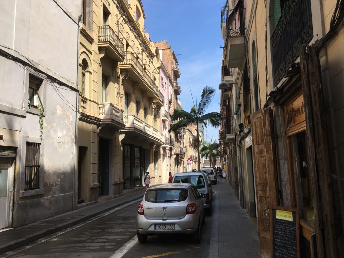
For just two days, over a weekend, I’ve visited Barcelona for the first time.
It has the sort of public transit system that will impress a North American at first: a large metro, pleasant buses with numerous stretches of exclusive lane, two practical funiculars, commuter trains, and two tram networks …
That’s the usual way most people summarize a transit system, isn’t it? A list of technologies in use, which says nothing about how easy it is to get around the city. Did you notice how, when I said “two tram networks,” it sounded at first like that’s better than one tram network? The opposite is true, of course, and indeed they’re working on making it just one.
In the end, what matters is not the diversity of technologies, but how easy it is to get places, and this requires a different kind of transit tourism. Instead of going to a city to marvel at the technologies – picking trams over buses regardless of where they go, and riding every funicular, gondola, and odd little ferry – I prefer access tourism: I try to actually go places, and experience how easy or hard that is. (I still experience serendipity of course, but it’s in sharper relief when seen against the bright background of intention.)
Only traveling with intention made me notice the oddness of the Barcelona metro. The transit agency’s full map is here, and a slice is coming up below. You may also enjoy Jug Cerovic‘s more austere version here. The network is complicated partly because it shows metro lines (L), tram lines (T) and regional commuter rail lines (R) but for this purpose I’ll focus on the Metro lines (L).
Some simple math: In an optimal grid network, lines keep going more or less straight, and intersect each other more or less perpendicularly. You change direction in this network by making a connection. The perpendicularity maximizes the area of the city that each connection could take you to.
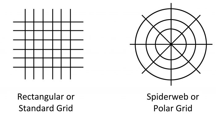
Transit grids can be standard or polar, but are almost always some subtle fusion of the two. The polar grid arises when there’s a huge center on which the network logically converges, because desirable destinations are packed most tightly there.
Once you recognize these patterns, you notice how coherent most metro networks are. Even those that are kludges to a degree have usually been patched as much as possible to create some appropriate fusion of radial and standard grid effects.
But among the metros I’ve encountered Barcelona’s metro network seems unusually chaotic in its network structure, often seeming to meander without intention.
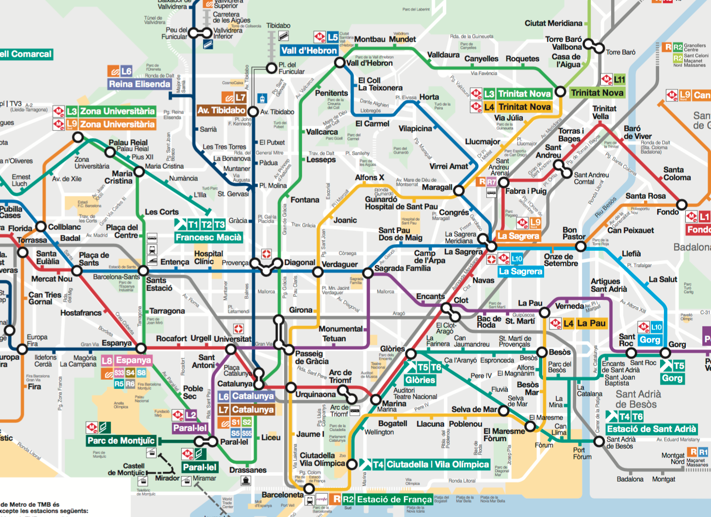
On the map above, for example, look at the medium blue line that enters the map area on the left at Pubilla Cases station. This is Line 5. It heads resolutely across the map from left to right, but two-thirds of the way across the city, at La Sagrera, it seems to get distracted, suddenly turning 120 degrees and heading for the hills at the top of the map.
The network is also full of lines meeting tangentially instead of crossing. For example, here’s a diagram of just Lines 5 and 2 (dark blue and purple, respectively) touching tangentially at (unmarked) Sagrada Família station:
There are numerous cases like this. In each case, you would have a more coherent network — more likely to connect more people to more destinations with fewer transfers — if the lines traded paths at this point, crossing over each other rather than touching tangentially.
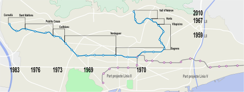
Again, most metros are kludges to some degree. It’s unlikely that anybody alive in Barcelona today deserves blame for the odd patterns of the metro’s flow. There are always historical reasons for why things have ended up as they are. If you want to follow that history, here’s a fun video.
But meanwhile: Does your head contain some received wisdom along the lines of: “European metros are so fantastic that why would anyone take buses?” I can remember when many Europeans used to believe this, but today, bus network improvement is one of the most important of European trends. The need for a rational bus network may be even more urgent if your metro is staggering around drunkenly, unable to follow a straight line.
What’s great about the new Barcelona’s bus network then, is not just that it’s a grid, but that it really wants you to know that it’s a grid, and how straight its constituent lines are:

The new lines have numbers preceded by “H” or “V” for “horizontal” or “vertical”. (Vertical is quite literal: not just up-down on standard maps like this one, but also up to the hills or down to the sea.) These frequent lines are also numbered in logical sequence across the city, so that as you get to know the network, a number reminds you of roughly where in the grid each line sits, and thus what it’s likely to be useful for.
The idea is that people should be able to keep a sense of the whole grid network in their heads. If you just remember what H and V mean, and the sequence in which they’re numbered, you have an enormous amount of information the whole system. When you see any bus numbered this way, you have a general sense of which way it’s going, or at least along which axis. And when you hear a bus route number, you can easily form a general sense of where it is.
There’s liberty in this kind of legibility. You could measure it in terms of the number of useful places you can get to divided by the bytes of information you need to remember to have a workable map of how to get there. Anyone who’s navigated Manhattan knows the difference between the regular grid across most of the island (high usefulness/byte) vs the patternless warren of streets at the south end (low usefulness/byte). European cities tend to be especially challenged in this regard.
I talk about Barcelona’s bus network a lot because it’s one of the best examples of the marketing of network-scale legibility, an idea that’s almost unheard of in other parts of the world. (Perhaps related, it also has a Wikipedia article that describes it with the same respect you’d expect in discussing a metro network. Someone should translate it into English.)
Barcelona may have come upon its grid bus network, in part, because proudly legible grids were already its most celebrated urban planning idea. Most European street patterns are largely gridless and irregular. But in a systematizing vision rivaling that of Haussmann in Paris, 19th century Barcelona embraced a single grid pattern for its fast expansion around the medieval core.
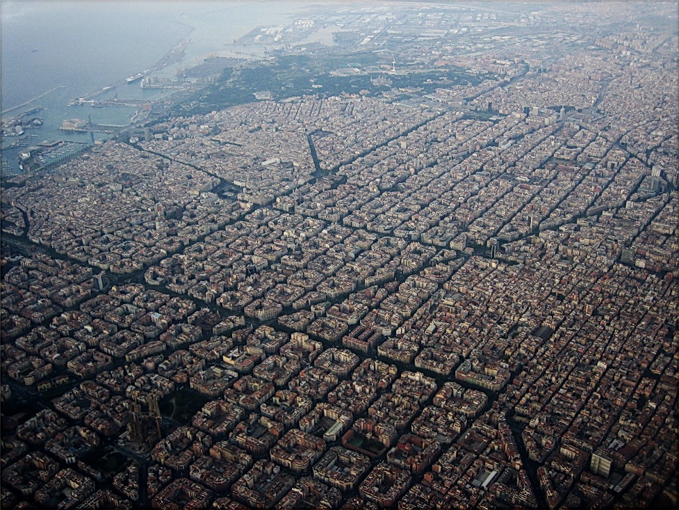
Photo by Alhzeiia via Wikipedia
This plan is usually described as the Eixample district, but it’s really a principle rather than a place. (The Catalan word eixample means “extension” or wider area”.) The new grid flows across the city over a distance of about 7km (4.5mi). It therefore covers many neighborhoods, uniting them not just with a perfectly regular street pattern but also with the grid’s most distnctive detail: the “cut off” corners that create little square spaces at each major intersection.
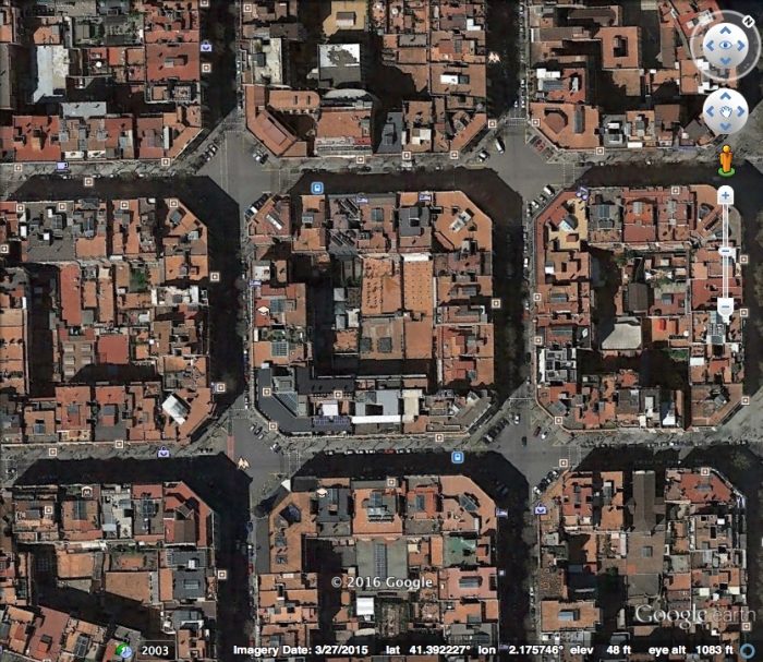
Now that Barcelona is beginning to close many of these streets to fast car traffic, these little diamonds will be the next great public spaces in a city already rich with them. And a great bus network, whose citywide grid pattern you can remember, and that stops just down the street, will take you there.
Thanks to my Barcelona friend Andreu Orte for background, including the Line 5/2 diagram.


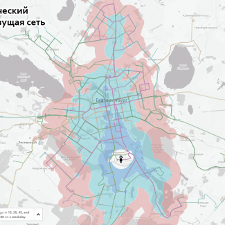
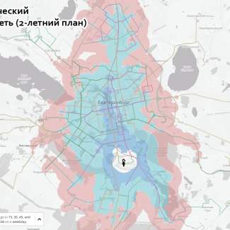
 As more and more of the work of outreach and documentation of transit planning projects moves online, new opportunities have emerged to communicate the true impacts of these plans. Techniques first deployed by open-source software developers, stimulated by the ever-growing capability and adaptability of web mapping software and abundance of GTFS data, are now well-documented, established practices. We are constantly adapting these tools as part of our efforts to clearly explain the outcomes of such projects to the people who will be directly impacted by them.