Author Archive | Chris Yuen

Why Does Ridership Rise or Fall? Lessons from Canada

by Christopher Yuen

With only a handful of exceptions, transit ridership has stagnated or been falling throughout the US in 2017.  The causes of this slump have been unclear but some theories suggest low fuel prices, a growing economy fueling increased car ownership, and the increasing prevalence of ride-hailing services are the cause.

A few North American agencies have bucked the trend, including Seattle, Phoenix, Houston, and Montreal.  By far the biggest growth was at Vancouver, BC’s Translink, which saw a ridership growth of 5.7 percent in 2017.

But notice the big picture:  In a year when urban transit ridership fell overall in the US, it rose in Canada.

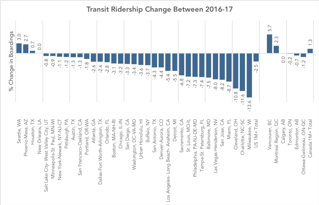
Transit ridership urban areas with populations of over 1M are included in this chart. Ridership of major agencies that serve the same region are added together. (Source: National Transit Database; APTA 2017 Q4 Ridership Report)

There are three interesting stories to note here.

1.  If You Run More Service, You Get More Riders

Canadian ridership among metro areas with populations beyond one million is up about 1.3% while regions of the same size in the US saw an overall ridership decrease of about 2.5% in 2017 despite the broad similarity of the countries and their urban forms.  Why?  Canadian cities just have more service per capita than the most comparable US cities.  This results in transit networks that remain more broadly useful in the face of competition from other modes.  Note, too, that Canadian transit isn’t cuter, sexier, or more “demand responsive” than transit in the US.  There is simply more of it, so more people ride, so transit is more deeply imbedded in the culture and politics.

2.  Vancouver Shows the Effect of Network Growth, Higher Gas Prices, Great Land Use Policy, and No Uber/Lyft

Vancouver’s transit ridership has historically been higher than many comparable regions as a result of decades of transit-friendly land-use and transportation policies, including an early regional goal to foster density only around the frequent network.  (The Winter Olympics also had a remarkable impact: ridership exploded in 2010, the year of the Olympic games, but then didn’t fall back after the games were over; apparently, many people’s temporary lifestyle changes became permanent.)  By North American standards, Vancouver is remarkable in the degree to which development is massed around transit stations.

But Translink attributes its 2017 ridership growth to continued increases in service, high fuel prices, and economic growth.  The 11km (7mi) Millennium-line Evergreen Extension just opened prior to 2017, directly adding over 24,000 boardings a day.  Fuel prices in Vancouver have also reached an all-time high, at $1.5 CAD / litre (4.4 USD/ gal), an anomaly in North America, although still lower than in Asia and Europe.  Economic growth has also been consistent, with the region adding 75000 jobs in years 2016 and 17.  Notably, ride-hailing services like Uber and Lyft are not available in Vancouver due to provincial legislation.

3.  There is Conflicting Evidence on the Impacts of Economic Growth on Ridership

Many commentators suggest economic growth to be a factor of the 2017 trends in transit ridership but there seems to be two conflicting theories, with economic growth cited as both a cause ridership growth and a cause of ridership decline. The positive link is obvious- economic growth leads to more overall travel, some of which will be made by transit.  Contrastingly, the negative link is based on the theory that increasing incomes allow for more people to afford cars.  Both theories seem plausible, but for both to be true, the relative strength of each must differ between cities.

Most likely, economic growth in transit-oriented cities is good for ridership, and growth in car-oriented cities, which encourages greater car dependence and car-oriented development, is bad.  This would explain the roaring success of Seattle, Vancouver, and Montreal, though it doesn’t explain why Houston and Phoenix are doing so well.

As North American cities work to reverse last year’s losses in ridership, they may best learn from Canada, and a select few American cities, to leverage economic growth for ridership growth.

Postscript by JW

For Americans, Canada is the world’s least foreign country.  There are plenty of differences, but much of Canada looks a lot like much of the US, in terms of economic types, city sizes and ages, development patterns, and so on.

So why is Canada so far ahead on transit?   All Americans should be asking this.  Ask: Which Canadian city is most like my city, and why are its outcomes so different?  We’ll have more on this soon.

Basics: The Ridership – Coverage Tradeoff

Is your transit agency succeeding?  It depends on what it’s trying to do, and most transit agencies haven’t been given clear direction about what they should be trying to do.

This post revisits a basic topic at the core of transit planning decisions that everyone engaged in conversation about transit should understand.

In the fictional town below, the little dots indicate dwellings, jobs, and other destinations. The lines indicate roads. Most of the activity in the town is concentrated around a few roads, as in most towns.

Imagine you are the transit planner for this fictional town. The dots scattered around the map are people and jobs. The 18 buses are the resources the town has to run transit. Before you can plan transit routes you must first decide: What is the purpose of your transit system?

Designing for Ridership

A transit agency pursuing only a ridership goal would focus service on the streets where there are large numbers of people, where walking to transit stops is easy, and where the straight routes feel direct and fast to customers. Because service is concentrated into fewer routes, frequency is high and a bus is always coming soon.

This would result in a network like the one below.

All 18 buses are focused on the busiest areas. Waits for service are short but walks to service are longer for people in less populated areas. Frequency and ridership are high, but some places have no service.

Why is this the maximum ridership alternative?  It has to do with the non-linear payoff of both high density and high frequency, as we explain more fully here.

Designing for Coverage

A network designed for ridership would not go to many parts of the city.  In the map above, someone who lived in the southeast part of town would not like this network at all.  That person is likely to want a network designed for coverage, not ridership.

In a network designed for coverage, the transit agency would spread out services so that there would be a bus stop near everyone. Spreading it out sounds great, but it also means spreading it thin.  The resources would be divided among so many routes that it wouldn’t be possible to offer much service on any of them.  As a result, all routes would be infrequent, even those on the main roads.  Infrequent service isn’t very useful, so not many people would ride.

The 18 buses are spread around so that there is a route on every street. Everyone lives near a stop, but every route is infrequent, so waits for service are long. Only a few people can bear to wait so long, so ridership is low.

In these two scenarios, the town is using the same number of buses. These two networks cost the same amount to operate, but they deliver very different outcomes.

Both Goals are Important

Ridership-oriented networks serve several popular goals for transit, including:

  • Reducing environmental impact through lower Vehicle Miles Travelled.
  • Achieving low public subsidy per rider, through serving the more riders with the same resources, and through fares collected from more passengers.
  • Allowing continued urban development, even at higher densities, without being constrained by traffic congestion.
  • Reducing the cost of for cities to build and maintain road and bridges by replacing automobile trips with transit trips, and by enabling car-free living for some people living near dense, walkable transit corridors

On the other hand, coverage-oriented networks serve a different set of goals, including:

  • Ensuring that everyone has access to some transit service, no matter where they live.
  • Providing lifeline access to critical services for those who cannot drive.
  • Providing access for people with severe needs.
  • Providing a sense of political equity, by providing service to every municipality or electoral district.

Ridership and coverage goals are both laudable, but they lead us in opposite directions. Within a fixed budget, if a transit agency wants to do more of one, it must do less of the other.

Because of that, cities and transit agencies that lack adequate resources need to make a clear choice regarding the Ridership-Coverage tradeoff.   In fact, we encourage cities to develop consensus on a Service Allocation Policy, which takes the form of a percentage split of resources between the different goals.  For example, an agency might decide to allocate 60 percent of its service towards the Ridership Goal and 40 percent towards the Coverage Goal.  Our firm has helped many transit agencies think through this question.

What about your city?  How do you think your city should balance the goals of ridership and coverage?   There is no technical answer.  Your answer will depend on your values.

Further Reading

Jarrett Walker’s Journal of Transport Geography Paper, which first introduced this concept, is here.


MobilityScore: an Improvement over TransitScore?

By Christopher Yuen

For cities aiming to increase transit ridership, expanding transit to reach more people is only half the task.  The other half is to encourage people who value transit to locate where high-quality transit is possible.

To that end, tools that help quantify the usefulness of transit at any given location can be extremely valuable, whether for a person finding a place to live, or for a business looking to locate in a place most accessible by its employees and customers.

Since 2010, the tool that has gained the most attention has been Transit Score. With it, you type in an address and are returned a two-digit score that is supposed to approximate the usefulness of transit at that location. While simple and easy to use, Transit Score’s methodology has a few flaws, as discussed in our last post about it. Two issues particularly stand out:

  1. Transit Score assumes that the sexiness of transit technologies compensates for their objective uselessness. For example, Transit Score assumes that you’d rather wait 20 minutes for a streetcar instead of 10 minutes for a bus, even if the two will have the same speed and reliability.
  2. Transit Score describes the transit around a site without evaluating where it goes. Frequent transit that drove around in circles inside your neighborhood would score exactly the same as frequent transit that went straight across your city and formed a connected network, accessing countless jobs and opportunities.

Recently, the beta version of a new tool, MobilityScore, was released.  It offers a similarly simple two-digit score, but with a broader scope than TransitScore. Created by TransitScreen, a company specializing in real-time transit information displays, MobilityScore is described as an “easy-to-understand measure of your transportation access.”

MobilityScore takes into account all your options, from public transit to carsharing, bikesharing, and hailed ridesharing services, to give you a number from 0-100 that will tell you how easy it is to get around. – transitscreen.com

MobilityScore works by scoring the typical time it takes to access each transportation mode based on past availability and response time data from bike share, car share, and ride-hailing services. For its transit component, it generates a score based on the frequency of scheduled trips near the address being queried. It then aggregates the scores of each component to generate a total “Mobility Score”.  The tool does not directly indicate the score of each component, although it does indicate the fraction of overall mobility that comes from each mode as percentages.

The “Mobility Score” from a location in Portland, Oregon

In some ways, MobilitysScore appears to be an improvement over TransitScore. For example, TransitScore weighs results based on vehicle type, rewarding rail and penalizing buses, regardless of whether they differ in speed and reliability, but MobilityScore’s transit component is only based on frequency, without bias based on vehicle type.

However, a true measure of mobility must also look at the speed of travel on the relevant transit routes. Taking this a step further, a fair measure of the usefulness of transit must consider the access that the service provides– the number of jobs and opportunities that can be reached from the starting point within a reasonable travel time.  Like TransitScore, MobilityScore only tells you where you can easily access transportation services to begin your trip, which says nothing about what destinations you can reach in a given time.

One could consider MobilityScore’s expanded scope (including ride-hailing, car-share, and bike-share) to be an improvement over TransitScore, given that transit riders are likely to also occasionally use those other modes. However, the resulting combined mobility score should be interpreted with some caution. For a data-driven approach meant to be objective, the combination of ride-hailing, car-sharing, bike sharing and transit scores into one single measure introduces a new layer of value judgement that is difficult to generalize. While a well-paid executive may place a high value on the ride-hailing services for everyday use, a person with a limited income may not find the availability of ride-hailing to be relevant, since it is not affordable to them. Similarly, car-sharing services may not be useful to a person without a driver’s license.

The mere availability of a ride-hailing option, including taxis, uber, or lyft, seems to result in a minimum score of 40. This optimism means that many sites, without any transit service, and a significant drive from urbanized areas are said to have – “Fair Mobility” despite being completely impractical for the average person.

MobilityScore thinks this farm, nowhere near transit has “fair mobility” because it is within the service area of ride-hailing

The location of that farm

It’s not easy to build a measure of transportation access that is both objective and simple to use so despite my criticism of some aspects of MobilityScore, I think it is great to see the development of more products like this. Hopefully, when MobilityScore evolves beyond its beta version, it will address some of its current deficiencies and become a serious contender for inclusion in real-estate listings.  As we suggested before, the real two-digit score that matters may be a percentage:  What percentage of your city’s jobs and opportunities can you reach from this point, in a given amount of time?


Christopher Yuen is an associate at Jarrett Walker+Associates and is a regular contributor to this blog.

Toronto: A new King Street for Transit

By Christopher Yuen

For the past few decades, Toronto’s King Street, a frequent transit corridor through the densest and fastest-growing parts of the city, has been increasingly choked by car traffic. Built before the age of the automobile, and running in mixed traffic as was typical with legacy streetcar systems, the 504 King streetcar’s speed has deteriorated to just about walking speed on most days during rush hour. That was until three weeks ago, when the City of Toronto launched a one-year pilot project to restrict car traffic and give transit the space it needs to move. The Globe and Mail has a great piece on the significance of this project here. Details on the project and its design are available at the City of Toronto website here.

King Street Pilot Plan Diagram excerpt

The King Street pilot project prioritizes transit.

The new design of 4-lane King street was particularly thoughtful, given some of the constraints the corridor faces. While transit malls in some cities completely ban non-transit vehicles, existing high-rise parking garages that front onto King Street and businesses throughout the bustling entertainment district without back lane for loading and deliveries meant that vehicular access had to be maintained. Under the new design, left turns and through-travel are prohibited for cars and trucks at all major intersections- requiring drivers to turn right and use alternate streets.

At the approach to intersections, vehicles waiting to turn right form a queue in the right lane, out of the way of transit. At some intersections, cars receive an advance turn signal ahead of pedestrians to ensure the tail of the turning queue does not impede the streetcars.

Taken on a weekday at 4:00pm, this scene would have been much more chaotic with through-traffic blocking transit before the project. Now, cars are channeled to turn right at every intersection. (Photo: Alex Gaio)

Taken on a weekday at 4:00pm, this scene would have been much more chaotic with through-traffic blocking transit before the project. Now, cars are channeled to turn right at every intersection. (Photo: Alex Gaio)

Without through-traffic, having two lanes at the start of each block is no longer necessary, allowing for an important feature for efficient transit operations- far-side stops. Streetcar tracks in Toronto, and in many legacy systems, operate in the middle of the road. To board and alight, passengers must step into the roadway, protected only by a rule prohibiting motorists from passing open streetcar doors. As a result, stops have always been located on the near-side to reduce the risk of drivers making a right turn onto a transit corridor and immediately conflicting with passengers getting on or off a streetcar. Under the new design, streetcars stop on the far side of most intersections, beside barriers that effectively extends the curb to the second lane at the start of each intersection.

New far-side stops with a temporary curb-extension mean passengers no longer have to walk through a traffic lane to get on and off the streetcar. (Photo: Alex Gaio)

New far-side stops with a temporary curb-extension mean passengers no longer have to walk through a traffic lane to get on and off the streetcar. (Photo: Alex Gaio)

In addition to the obvious safety benefits of the new design, the far-side stops also allow transit vehicles to travel faster. Traffic signals along Toronto’s King Street already feature transit signal priority- they detect an approaching transit vehicle to hold a green light, or shorten a red light. With near-side stops, the unpredictable dwell times at stops would sometimes cause the traffic-signal to time-out, leaving the transit vehicle with a red light just as it closes its doors and is ready to get moving. Far side stops allow signals to be held for a streetcar to get through an intersection before stopping for passengers.

The new design also re-allocates curb space as loading zones, taxi stands and for new seating and patio space mid-block- all valuable features for a dense, mixed-use central business district which would not have been possible when all four lanes have been dedicated to the throughput of cars.

New public spaces like this will become especially valuable when patio season begins.

New public spaces like this will become especially valuable when patio season begins. (Photo: Alex Gaio)

Since its launch, public support has been for the most part, positive. The all-at-once approach to implementing this pilot across the corridor has ensured that the new inconvenience to some drivers has also been matched with a drastic, noticeable, and immediate improvement for everyone else. Across the twittersphere, Torontonians are reporting anecdotes of more consistent departures and trips taking half as they did previously.

Even among some taxi drivers, subject to the same turn restrictions throughout the day, initial skepticism appears to have eased.

Preliminary analysis of GPS data shows that the project is working, significantly reducing both the average and the spread of travel times.  However, it remains to be seen if enough drivers will comply with the new restrictions once the initial enforcement blitz is over. If New York or San Francisco‘s bus lanes offer any guidance, Toronto should introduce automatic camera enforcement along the corridor. Over the course of this one-year pilot project, municipal staff and the transit agency will be sure to monitor the situation closely and make adjustments based on actual results.

Cities, faced with growing populations and spatial constraints, must defend the right for transit to move if they wish to limit the negative impacts of traffic congestion. Toronto’s King Street offers a story of how that can be done quickly and effectively.


Christopher Yuen is an associate at Jarrett Walker+Associates and will be regularly contributing to this blog.