Over on the personal blog, I took a walk in Lineville, Iowa, and sold some real estate there for $200 (US).
Over on the personal blog, I took a walk in Lineville, Iowa, and sold some real estate there for $200 (US).
Two crucial bits of news about Elon Musk:
Aaron Gordon at Jalopnik lays on the irony so I can stay above the fray:
Yes, for those keeping score, in a mere two years we’ve gone from a futuristic vision of electric skates zooming around a variety of vehicles in a network of underground tunnels to—and I cannot stress this enough—a very small, paved tunnel that can fit one (1) car.
The video’s marketing conceit is that the car in the tunnel beats a car trying to go the same distance on roads. You’ll never believe this, but the car that has a dedicated right of way wins. Congratulations to The Boring Company for proving dedicated rights of way are important for speedy transportation, something transportation planners figured out roughly two centuries ago. I’m afraid for how many tunnels they’ll have to dig before they likewise acknowledge the validity of induced demand.
In other words, as I wrote three years ago, Musk may be brilliant at physics but he often doesn’t seem to understand geometry, or at least not without doing expensive experiments to rediscover it.
Why even write about Elon Musk again? When Elon Musk insulted me on Twitter over a year ago, I had a brief rush of media fame, including interviews on the BBC and Fox Business. Maybe I’m just addicted to that. Evidence against this theory: I’ve written little about Musk for over a year since that brief moment of fame. One of my worst nightmares is that I die before doing anything else that gets that much attention, so that Elon Musk’s insult dominates my obituaries.
No, the real utility of Elon Musk is that he presents himself as an extreme example of elite projection. I defined that term, here, as “the belief, among relatively fortunate and influential people, that what those people find convenient or attractive is good for the society as a whole.”
When he was first promoting his mysteriously cheap tunnels, he talked about how much he hated traffic personally. So he invented a tunnel that might get him and a few other billionaires out of traffic, but whose capacity was so low that it couldn’t possibly be relevant to the volume of travel in a big city. As always inefficiency is inequality. Only an efficient solution (in terms of both space and money) can be made available to everyone.
So don’t confuse elite projection with elitism. The problem with elite projection isn’t that it’s an elite point of view. The problem is that it doesn’t work.
Why have I devoted my career to fixed public transit, rail and bus? Because unlike Musk’s tunnels, or streetcars that are slower than walking, or “Ubering your transit system,” or fantasies of universal microtransit, fixed transit scales. When it’s allowed to succeed, it’s a supremely efficient use of both money and space. Bus service, especially, is cheap enough that you can have a lot of it, everywhere, if you decide you care about liberating lots of people to move around your city. And if you want a city that’s equitable and sustainable remember: if it doesn’t scale, it doesn’t matter.
So no, I’m not interested in Elon Musk for his own sake. But ideas are more exciting when we put faces and stories to them. So if Elon Musk wants to be the face of elite projection, I’m grateful for his rhetorical help. Should we call the phenomenon Muskism. Muskismo?
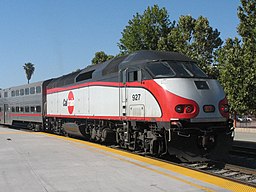
Caltrain between San Francisco and San Jose is one of many urban “commuter rail” lines that really need to be high frequency rapid transit lines. Now that’s a little more likely. Photo: Lucius Kwok.
Here’s some good news for people who want more rapid transit service in US cities, and soon.
In the US, all passenger rail services that could potentially mix with freight are governed by the regulations of the Federal Railroad Administration (FRA). This applies not just to Amtrak but also, critically, to “commuter” rail lines, crucial rail transit services that run on freight railways.
If cities wanted to rapidly upgrade their rail transit systems, the cheapest way is often using upgraded commuter rail rather than building new lines. Many major cities have large networks of radial commuter rail lines [typically originally freight lines] which, if upgraded to run every 15 minutes or better all day, would effectively become metro lines, on the cheap. You’ll find this level of service in many major metro areas overseas. Toronto’s Smart Track plan is exactly this idea.
The problem, as always, is frequency, which in turn is a problem of operating cost. Most US commuter rail systems are far too infrequent to be useful for anything but 9-5 commuting, even though many of them run through dense urban fabric where the demand is there for all-day frequent service.
The Obama FRA, responding to several freight rail disasters, had proposed a rule mandating two-person crews, and had quietly inserted language extending this to passenger rail, even though passenger and freight rail present very different safety issues. Those requirements would have made commuter rail service too expensive to run frequently enough for it to be useful, and would have persisted regardless of whether technological developments improved the safety outcomes of one-person crews.
The Federal Railroad Administration has just announced that it will stop requiring two-person crews and preempt state requirements to do so. If this were a genuine safety issues, I’d be alarmed, but it really isn’t. The new FRA position liberates transit agencies and other local governments to negotiate the right solution with their unions in the context of what’s technologically possible.
Yes, removing this requirement is a “conservative” idea that would be unlikely to come from a Democratic administration. But it removes a significant barrier to providing more useful urban public transit, which leads to all kinds of benefits for equity, prosperity, and the environment.
 Oregon poet Dale Favier published a short poem about my work today. It’s one of the best birthday presents I’ve every received. Hope you enjoy.

My mother, the artist Mirra (Louella) Meyer, passed away on Friday, April 16. The story of her life, with images of her work, are here.
Uber and Lyft — especially Lyft — want you to think that they are partners of public transit, eager to help more people get to rapid transit stations. Lyft and Uber have both created partnerships with transit agencies to provide “last mile” service. When people talk about the “last mile” problem of access to transit (a problem that exists mostly in suburban areas or late at night) Lyft and Uber are eager to seem part of the solution.
I would like to believe this. Here are two reasons I don’t.
First, no Uber or Lyft driver really wants to offer a “last mile” because a mile is too short a trip to make sense to them. The hassles of each trip are constant regardless of the trip’s length, so long trips are always preferred. In the old days of taxis, whenever I booked a taxi ride to a transit station, the driver always pitched me to give me a ride all the way to my destination. And if I approached a long taxi queue at a suburban rail station and told the driver I wanted to go a mile, he’d be unhappy to say the least, because he spent a lot of time waiting for my fare.
That’s why the partnerships between Uber/Lyft and transit agencies for “last mile” service inevitably involve public subsidy, which means that they compete with other kinds of transit service for those funds. (This can be OK if transit agencies have really decided that this is the best use of funds given all of their other needs.)
Uber and Lyft drivers mostly use mapping software that can’t find many transit station entrances. If connecting with transit were a critical part of their business, this would have been fixed by now.
The nearest rapid transit station to my home in Portland (Bybee Blvd) looks like this:
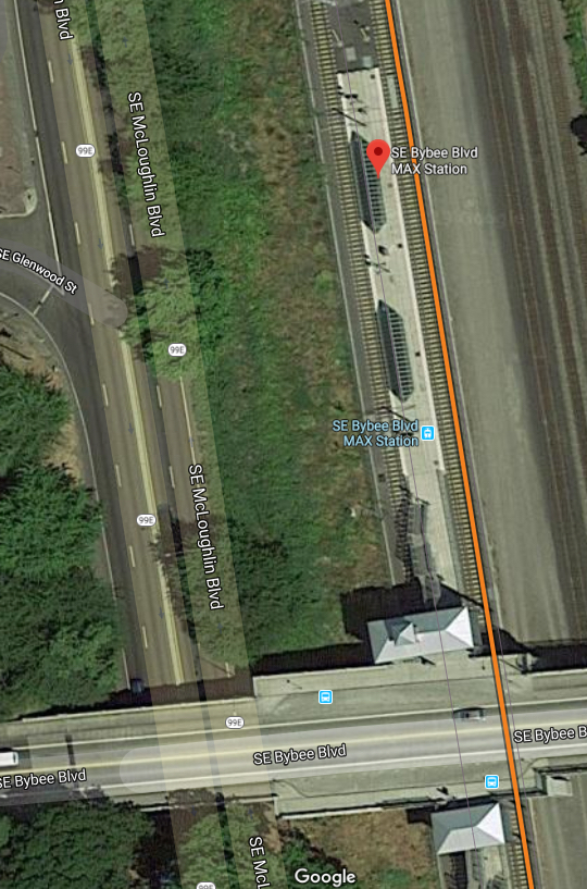
This is a typical suburban arrangement (although this is not really suburbia). The station is alongside a highway (labeled McLoughlin Blvd.). The pedestrian access to the station is from the overpass. The little roofs are the elevators and stairs.
But the mapping apps think that the station entrance is on the highway.
So it is impossible to call Uber or Lyft to this station, because the software tells the driver to go down the highway, where all they’ll find is a fence. I can text them to correct it, but not all drivers pay attention to texts (nor should they, while driving.) And even if I correct it, I’ll then wait an extra 10 minutes as they get themselves turned around and navigated to the right spot.
This is the example I deal with all the time, but I’ve found many suburban rail stations in many cities where drivers don’t have clear directions about station locations. For example, call Lyft or Uber to Van Dorn Metro Station in Alexandria, Virginia, and you can expect the driver to wander all over the adjacent interchange.
Some people clearly need to go to work accurately coding the location of every entrance to every transit station, but it’s clearly not being done. Why not? It must not be that important to these companies.
So Do Uber and Lyft Want to Go to Transit?
It makes sense that Uber and Lyft would want to do long trips to rapid transit, more than a few miles. For example, in San Francisco, Uber and Lyft do a good business to regional rapid transit stations (BART and Caltrain) but since each system has only one line in the city, these can be trips of several miles (often competing with the abundant local bus and light rail system).
And Uber and Lyft certainly want to be subsidized to do more “last mile” work, via partnerships with transit agencies.
But the drivers’ inability to find transit station entrances — and the fact that this problem has been tolerated for years — is what really decides it for me. Companies that really want to connect with transit would have made sure that they can navigate a driver to any entrance of any rapid transit station. But they don’t.
Lyft has completed its Initial Public Offering, and at this writing the price has since fallen 35%. Uber’s IPO is expected soon. Both will now be publicly traded companies, reliant on many people’s judgments about whether they can be good investments. Uber loses billions of US dollars every year, while Lyft, which is smaller but growing faster, is getting close to losing $1 billon/year for the first time.
Why invest in these companies?
Anyone who says “Amazon lost money too at first” is just not thinking about transportation. Amazon can grow more profitable as they grow larger, because they can do things more efficiently at the larger scale.
Uber and Lyft are not like this, because their dominant cost, the driver’s time, is entirely unrelated to the company’s size. For every customer hour there must be a driver hour. Prior to automation, this means that no matter how big these companies get, there is no reason to expect improvement on their bottom line. Any Uber or Lyft driver will tell you that these companies have cut compensation to the bone, and that they already require drivers to pay costs that most other companies would pay themselves, like fuel and maintenance.
If Uber and Lyft could rapidly grow their shared ride products, where your driver picks up other customers while driving you where you’re going, that could change the math. But shared ride services don’t seem to be taking off. My Lyft app rarely offers me the option, even when I’m at a huge destination like an airport, and when they do it isn’t much of a savings, which suggests that it’s not really scaling for them.
Of course Uber and Lyft could also go into another business, such as bike and scooter rental, but in doing that they’re entering an already crowded market with no particular advantage apart from capital. The single-customer ride-hailing is the essence of why these companies exist, and there’s no point in investing in them unless you think that product can succeed.
Please correct me if I’m wrong, but it seems to me the possible universe of reasons someone would invest in these companies is the following:
So I must be missing something. What am I missing?
![]() Harry Campbell, who calls himself “The Rideshare Guy,” runs a blog and podcast specifically for Uber and Lyft drivers. In a new podcast, he interviews me a broad range of topics, not just Uber and Lyft. He gets me going on how transit works, and how I got into the business, in addition to the effects of rideshare.
Harry Campbell, who calls himself “The Rideshare Guy,” runs a blog and podcast specifically for Uber and Lyft drivers. In a new podcast, he interviews me a broad range of topics, not just Uber and Lyft. He gets me going on how transit works, and how I got into the business, in addition to the effects of rideshare.
You can listen right here. We get going at 3:20.
It’s hard to capture what good news this is. Through a bipartisan bill, Congress is seriously considering a plan to give more weight to how proposed transit investments improve access to jobs and opportunity. The bureaucratic word for this is accessibility, but I like to call it physical freedom, because the presence of meaningful choices in your life lies in whether you can get to them in a reasonable time, which is exactly what this measures. From the Transportation For America website:
The incredibly blunt metrics that most planners or communities have used since the 1960s, like overall traffic congestion and on-time performance for transit, paint a grossly two-dimensional picture of the challenges people face while trying to reach jobs and services. They don’t provide sufficient information for agencies to make accurate decisions about what to build in order to best connect people to the places they need to go. These 1960s metrics lead to singular and expensive solutions (like highway expansions), while often failing to solve the problem or even creating new ones.
Today, precise new tools allow communities to accurately calculate accessibility to employment opportunities, daily errands, public services, and much more. These tools allow states and MPOs to better understand where people are traveling and to design transportation networks to maximize the ability of people to travel. It also allows states and MPOs to optimize their transportation networks to utilize all modes of transportation and even to understand how their investments interact with land use policies.
We use these tools all the time in our bus network redesigns, though we are limited, by available data, to studying access to jobs. It is great to see people working on better data layers to capture errands, shopping, and so on. I am not sure how much of this granularity is necessary, but it doesn’t hurt.
Implicit in this news is the idea that ridership prediction could decline in importance, which would be great news. We are much too deferential to predictive algorithms for things that may not be predictable, such as human preferences and attitudes 20 or 30 years from now.
There’s one other caution. When planning fixed infrastructure investment, hard thinking has to go into what facts from today are assumed to be permanent. For example, when we talk about access to public services, will we just analyze outcomes based on the often terrible locations of these services, thereby enabling continued terrible location decisions? If we dare to predict better urban form in response to public investments, on what basis will we predict that?
The conversation about access therefore needs to reflect on what aspects of urban form and location are likely to last for decades, like the larger scale urban form and the likely trip generation it implies. (We may build more dense urban fabric, but we are unlikely to tear it down.) This is another reason why too much granularity could distract us; it leads us back into obsessive descriptions of the present, some aspects of which could be different next year.
So this is difficult philosophical stuff. I’m trying to grapple with it in the next book. Feel free to nag me about how it’s going!
![]() The Orlando Economic Partnership‘s Alliance for Regional Transportation has invited me to speak at a lunch event this Thursday, March 14. Admission is $40, but they apparently feed you. Details and registration here.
The Orlando Economic Partnership‘s Alliance for Regional Transportation has invited me to speak at a lunch event this Thursday, March 14. Admission is $40, but they apparently feed you. Details and registration here.