We’re delighted to announce the release of our analysis of the bus network of Miami-Dade County, the Better Bus Project Choices Report. The report reviews existing services, identifies possible paths for improvement, and also points to difficult choices that policymakers need to think about. Here’s the Miami Herald‘s coverage.
We’ve worked on a lot of bus network redesigns, but the Miami-Dade Better Bus Project is unusual in a number of interesting ways.
Most remarkably, the project is led not by the transit agency, but by a well-resourced and well-respected advocacy group, the Transit Alliance. These folks brokered a deal where they would manage a study on behalf of both Miami-Dade Transit and several of the key cities. They are handling all of the public outreach and government relations, leaving us to just do the planning behind the scenes.
The role of the cities is also unusual. Many cities in the county run their own “trolley” services, which offer small buses, free fares, but often routes that duplicate what the countywide Miami-Dade Transit network does. This happens in other metro areas, but in this project we some of the key cities at the table, trying to come up with the best solution for the city andthe region.
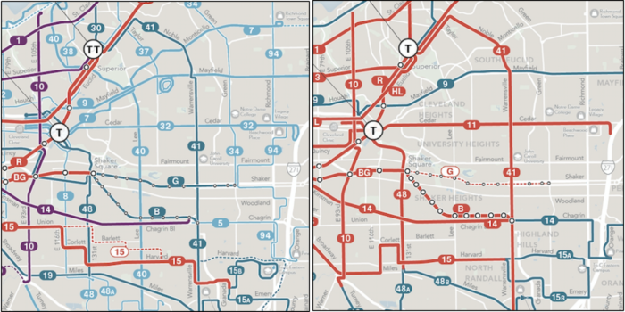
Less unusual, sadly, is now thinly the service is spread. Here’s a bit of the network map for the dense core of the region.
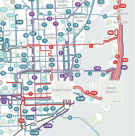
And the legend:

Most effective transit systems have some kind of frequent grid, where many intersecting lines run at least every 15 minutes all day. Houston’s, which we helped design, looks roughly like this:
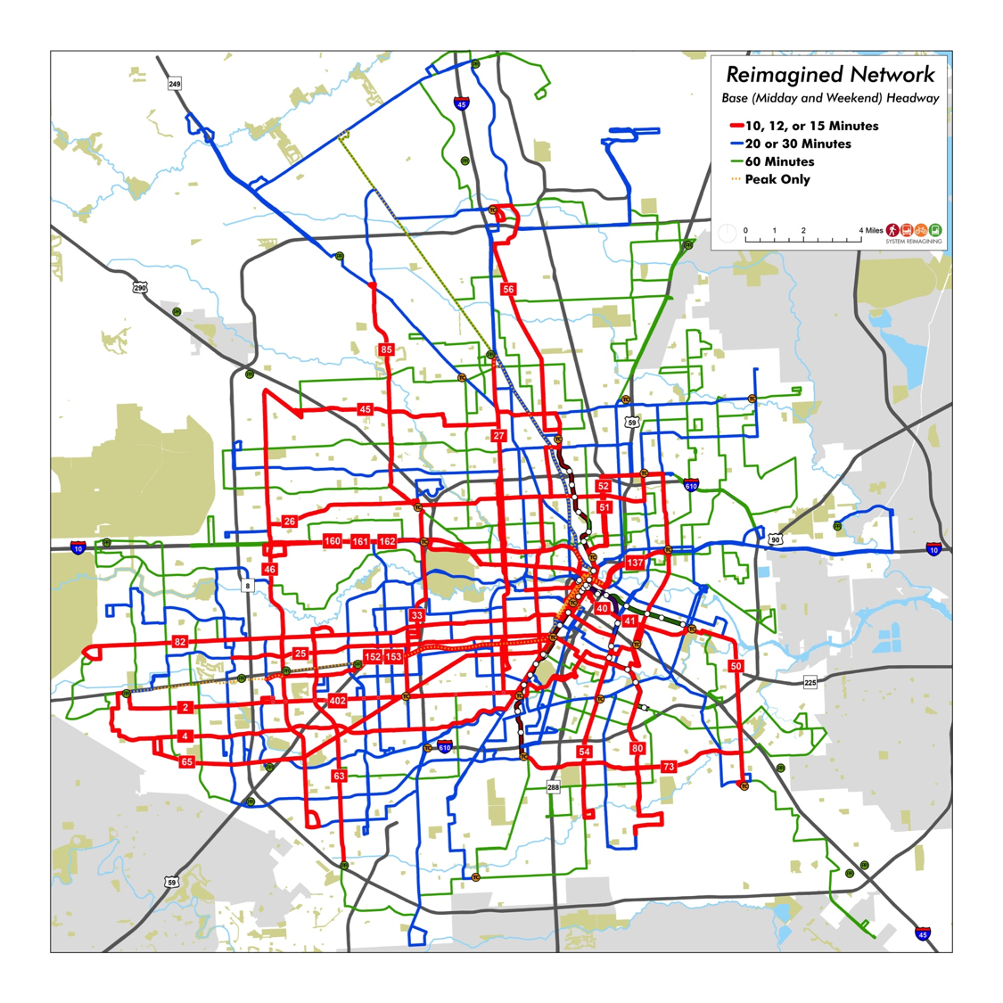
The key idea of a frequent grid is that wherever red lines cross it’s easy to change buses to go a different direction, and that’s the key to being able to get to lots of places in a reasonable amount of time.
You’ll find extensive frequent grids in a number of gridded cities, including not just big cities like Los Angeles and Chicago but also in Houston, Portland, Phoenix and even Tucson.
But Miami-Dade, which is equally dense and equally gridded, has essentially no frequent grid. There are grid lines, but most run every 20-30 minutes, not enough for connections to be easy. Only in Miami Beach will you find the intensive frequent service that means transit is there whenever you need it.
So that’s one issue we’ll be looking at. Others raised by the choices report include:
- What’s the ideal division of labor between county transit and municipal services?
- Is there too much peak service and not enough all-day service? Overall, productivity (ridership / service quantity) is lower during peak hours than midday, which suggests that might be the case.
- And biggest of all, how should the region balance the competing goals of ridership and coverage?
In the next round of the project, we’ll present illustrations of how the network might look if the region gave a higher priority to ridership, or if it gave a higher priority toward coverage. As always, the first will have fewer and more frequent lines, but less service to some low-demand places, while the coverage network will go everywhere that people expect service, at the expense of lower frequencies. As always, we’ll encourage a public conversation about this unavoidable question.
So if you know anyone in Miami-Dade County, send them to the project website to explore and express their views. Encourage them to peruse the Choices Report. And if you’re interested in reforming bus networks in general, this one will be an interesting example.