The endless debate about how fully automated cars would change our cities often starts with the assumption that we will have fully automated cars soon. We imagine that we’ll all be riding around in totally automated taxis, whose lack of a driver will make them cheap.
This is the essence of the “driverless cars will replace transit” fantasy. I’ve argued many times that this idea is geometrically incoherent in dense cities, because regardless of automation there isn’t enough room to move people from big transit vehicles into small ones.
But it’s also important to ask: How soon is this truly driverless vehicle really coming?
Levels of Automation
Here is the standard 1-5 scale, by SAE International, that everybody uses to talk about this. Level 1 technology is available now, but the kind of automation that totally eliminates a driver, thus transforming the economics of all hired transportation, comes only at Level 5.
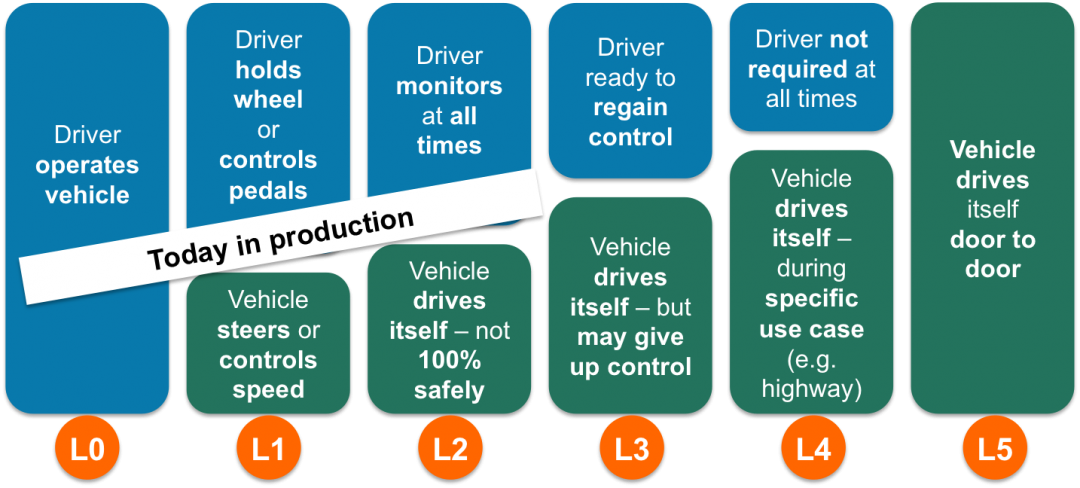
Six levels of automation. Videantis. http://www.videantis.com/what-are-all-these-automotive-cameras-doing.html
Most experts seem to agree we will soon have Level 2, enhanced driver-assistance that shifts the driver to more of a monitoring role, but that the journey to Level 5, actually eliminating the driver, is a long one that has only begun.
Steven E Shladover, from the PATH program at UC Berkeley, has been thinking about vehicle technology for decades. In his excellent (and tragically paywalled) piece for Scientific American this June, he noted some of the reasons why full automation is so hard, and requires solving problems that are not just technological.
A fully automated vehicle needs to be able to do the right thing any situation, and handle its own equipment failures. In big airplanes, this is achieved only through multiple redundant systems that make the product massively expensive. Nobody knows how to scale an airliner’s level of redundancy to an affordable mass-market vehicle.
Crossing the Ravine of Distraction at Level 3
The biggest barrier to full Level 5 automation may also be a reason to leap to it prematurely. It’s human reaction time at the intermediate levels of automation. Shladover:
The prospects for level three automation are clouded, too, because of the very real problem of recapturing the attention, in an emergency, of a driver who has zoned out while watching the scenery go by or, worse, who has fallen asleep. I have heard representatives from some automakers say that this is such a hard problem that they simply will not attempt level three. Outside of traffic jam assistants that take over in stop and go traffic, where speeds are so low that a worst case collision would be a fender bender, it is conceivable that level three automation will never happen. [Emphasis added.]
Anyone examining their own experience will see that this is a big problem, and that it’s not a technological problem.
To make this more vivid, let’s stop and think what the opposite of automation is. It’s an old mid-century car, maybe my parents’ 1962 International Scout, a tough precursor to today’s SUVs. The primitive suspension pounded your body with the textures of the road. Your hand on the stick-shift felt the movement of the gears. When something shoved back against your attempt to turn, the steering wheel sent the shove right up your arms. To stop fast, you had to pound the brakes with your weight. Nothing pretended to protect you from the weather. With all this vivid input flowing into you, demanding constant decisions, you would never fall asleep at the wheel, or be tempted to look at the newspaper on your seat. Driving was hard, but often ecstatic. When power steering and automatic transmissions came along, my elders agreed that by reducing the level of effort and stimulation, these inventions made driving harder to focus on.
The journey from here to Level 3 looks just like the journey from the Scout to here. It’s the same straight-line path from vividness toward tedium, from control to passivity. It ends at a faintly ridiculous extreme: you sit there, unstimulated and with nothing to do, but you must still pay attention. We could reach a point where the only safe “drivers” are people with years of meditation training, since nothing else prepares you for that situation. And all that training would be expensive, pushing drivers’ wages up!
At Level 3, Forward or Back?
If the Level 3 problem is as hard as it looks, how will we respond? Tech-optimists will see this as a reason to rush even faster to Level 5, maybe prematurely. But many people who get a taste of Level 3 will be keen to stop at Level 2, where they still feel like they’re in control. Level 3 accidents, caused by human inattention but easily blamed on the technology, would inflame both sides in this debate.
At that point, will the reason to go forward be safety? We don’t know, because we don’t know what the impact of Level 2 will be on fatality rates. Maybe they will have improved so drastically that Level 5 doesn’t offer that much more, or at least not enough more to make the public ready to accept the loss of control at that level.
So the other issue will be the liberation of labor, especially professional drivers. All the dreams of driverless taxis, for example, require getting all the way to Level 5. Maybe it will happen, starting with fleets, but the question of whether you can jump over the ravine of distraction at Level 3, and land all the way at Level 5, is an open one.
Are we sure driverless vehicles will be cheap and abundant soon? I have no idea, and nobody else does either, but the path does not look easy.
Automated Transit Is Easier!
So what does this all mean for transit? You read it here first: Full automation of transit is much easier than automation of cars. (If it’s impossible, that’s only because driverless cars turn out to be impossible.) Shladover:
And yet we will see highly automated cars [vehicles?] soon, probably within the coming decade. Nearly every big automaker and many information technology companies are devoting serious resources to level four automation: fully automated driving, restricted to specific environments, that does not rely on a fallible human for backup. When you limit the situations in which automated vehicle systems must operate, you greatly increase their feasibility. [Emphasis added.]
High-ridership fixed route transit vehicles are perfect examples of this possibility. They run on pre-set paths in a narrow range of situations. In fact, the busier they are, the more money we should spend to make these situations narrower: exclusive lanes, automated stopping and fare collection, weather protection technologies, and potentially limits on lateral motion, up to and including rail. Unlike vehicles that could go anywhere, automated transit vehicles don’t need a map of absolutely everywhere. All of these things make transit automation easier. In effect, transit is a case where you can get full automation with Level 4 technology.
I am not making light of the considerable challenge of managing the impact of the transformation of the workforce wrought by automation. I am very concerned about those impacts. But the effect of automation on work is an issue in many fields, and when it becomes critical we will find a collective solution. Smart people are thinking about it.
Takeaways:
- Full automation of any kind, going anywhere, the goal that replaces most human labor, is quite a ways off and requires overcoming several obstacles that nobody has cracked yet. It may not be possible.
- Driving a partially automated vehicle may be harder than driving a vehicle today, because the distraction problem gets worse. This may increase the skill level of the labor required, and thus the labor cost.
- But the distraction problem with partial automation may also cause a premature rush to full automation, plus a strong movement to stop at Level 2.
- Technologically and spatially, high-ridership fixed-route transit is much more easily automated than any other vehicle under discussion today, because it operates in such limited situations. Fully automated rail transit, in regular service, is over 30 years old. Driverless buses are under development and present especially promising options especially in fixed rights of way.
- If driverless transit were ever achieved, the explosive growth in transit abundance would be extraordinary, because labor cost is the main limiting factor today. This vast increase transit would mean cities could grow denser with less traffic, putting more opportunities within a shorter travel time for everyone.
- But again, full automation may not be possible. We don’t know.
I am not sure what we will do about this, apart from telling the “we-should-neglect-transit-because-driverless-cars” people to take a cold shower. But that’s the terrain ahead, and to me, it looks like transit has a very promising future.

