Randal O’Toole has made quite a career of being America’s leading anti-planning planning expert, and especially its leading anti-transit transit expert. His biases are obvious but his he knows his topic and can make good points, so he’s sometimes worth reading a little closer. If nothing else, transit advocates need to hear more arguments from outside their own media bubble, just as everyone else does.
Today he has a blog post asking if we are approaching “peak transit.” It’s a concise and readable display of his insights, techniques, and biases. So if you’ve never read O’Toole before, let me take you on a quick guided tour:
“Billions spent, but fewer people are using public transportation,” declares the Los Angeles Times. The headline might have been more accurate if it read, “Billions spent, so thereforefewer are using public transit,” as the billions were spent on the wrong things.
The L.A. Times article focuses on Los Angeles’ Metropolitan Transportation Authority (Metro), though the same story could be written for many other cities. In Los Angeles, ridership peaked in 1985, fell to 1995, then grew again, and now is falling again.
O’Toole nicely summarizes the two fallacies that drove the sadly-too-influential LA Times piece. The first is that Los Angeles ridership is on a clear downward trend based on 2015 data, which is an illusion created by the Times reporters’ selective citation of data. [JW update: The trend is clearer in 2017, which doesn’t change the fact that 2015 data didn’t support it.] The second, more basic fallacy is that short term ridership is the proper metric for judging long term investments. That’s like saying that because the corn you planted wasn’t ready for harvest a week later, it was dumb to have planted corn.
Sometimes O’Toole is Right
But just as you’re ready to dismiss O’Toole, there’s this:
Unmentioned in the story, 1985 is just before Los Angeles transit shifted emphasis from providing low-cost bus service to building expensive rail lines, while 1995 is just before an NAACP lawsuit led to a court order to restore bus service lost since 1985 for ten years.
This is true, especially if you’re careful, as O’Toole is here, not to assert that the lawsuit caused the change. (There are several explanations for why Los Angeles transit leaders started focusing on bus improvements in the late 90s, and rehashing them is not helpful to consensus-building today.) Let’s look again at that chart from the LA Times article.
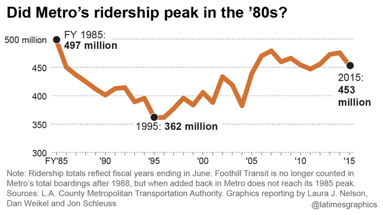
Los Angeles ridership fell when bus service was being cut early in the rail program, then rose when bus service was being rapidly improved. Since 2005, when the balance of attention on rail vs bus has been closer to equilibrium, ridership has been basically flat, going up and down in a small range that is trivial compared to the great swings of the 1985-2005 period. The little downtick at the end of the chart, on which the Times reporters hang their narrative, is obviously not enough to be significant yet, at least when viewed at this scale.
But this does not mean, of course, that “billions have been spent on the wrong things.” This would require that we share O’Toole’s belief that short-term ridership was the purpose of the rail investments, which it was not. Declaring transit to be failing at goals it is not pursuing is extremely common in anti-transit commentary. Another common example of this is here.
The (Real) Ridership-Counting Problem
Then O’Toole makes another almost-good point:
The situation is actually worse than the numbers shown in the article, which are “unlinked trips.” If you take a bus, then transfer to another bus or train, you’ve taken two unlinked trips. Before building rail, more people could get to their destinations in one bus trip; after building rail, many bus lines were rerouted to funnel people to the rail lines. …
Higher transfer rates are not strictly a result of rail; they can arise from good bus network designs as well. But the “unlinked trips” issue is real. It’s one of those things that makes sense to the transit industry internally but not to the public to whom we have to explain our work.
The problem dates back to a time when completed journeys (“linked trips” in the comically opaque jargon of technocrats) were just impossible to count without expensive manual surveying. This is still the case in many agencies. People flash monthly passes or day passes at the driver, for example, and even if the driver counts this as a pass, there’s no record of whether the rider was beginning their journey or making a connection. As automated ticketing comes in, it is getting easier to count completed journeys. But the transit data world is very concerned with comparability — this is the whole point of the US National Transit Database — and this creates a motivation to use only data that all transit agencies can easily report, even the lowest-tech ones. This is a real issue.
Of course, a rising transfer rate isn’t evidence of failure. But it does distort the real outcomes if a count of boardings (“unlinked trips”) are reported as though they were a count of human beings reaching their destinations. They are not.
Judge by Real Investments, and Real Goals
Transit ridership is very sensitive to transit vehicle revenue miles. Metro’s predecessor, the Southern California Rapid Transit District, ran buses for 92.6 million revenue miles in 1985. By 1995, to help pay for rail cost overruns, this had fallen to 78.9 million. Thanks to the court order in the NAACP case, this climbed back up to 92.9 million in 2006. But after the court order lapsed, it declined to 75.7 million in 2014. The riders gained on the multi-billion-dollar rail lines don’t come close to making up for this loss in bus service.
This is right, too (except for the debatable causal claim of “thanks to,” which I won’t touch). Yes, you have to evaluate ridership in the context of service quantity, and what matters is not what is built but what is operated.
Contradictory Accusations
But then, we get an old O’Toole favorite, that transit agency “officials” are incompetent:
The transit agency offers all kinds of excuses for its problems. Just wait until it finishes a “complete buildout” of the rail system, says general manager Phil Washington, a process (the Times observes) that could take decades. In other words, don’t criticize us until we have spent many more billions of your dollars. Besides, agency officials say wistfully, just wait until traffic congestion worsens, gas prices rise, everyone is living in transit-oriented developments, and transit vehicles are hauled by sparkly unicorns.
Imagine if we had built the Interstate Highway System with this attitude. Oops, we just spent billions on a freeway to newly developing suburbs, but not many people are driving on it yet because the suburbs are still under construction. Surely the O’Toole of the day would have said that those highway planners are fools!
There’s another contradiction here, which pervades all of O’Toole’s work I’ve read. O’Toole can’t decide if (a) transit is a bad idea or (b) transit is just badly planned and operated. If transit is run by idiots, as he often implies, then logically its performance says nothing about transit’s actual potential. On the other hand, if transit is a dumb idea, it would fail even if it were run by geniuses, which he advises it’s not. He can never seem to decide if he’s against transit or against the people making decisions in transit agencies. Logically, these two claims undermine each other.
The Heart of the Matter
We’ve arrived at what’s really at stake here in this obsession with short-term outcomes. O’Toole begins from a deep hostility to the very notion of long-range planning, at least when done at the level of the city or community, and I hear this more and more from “conservative” voices in local conversations. (I put “conservative” in scare quotes because the more I hear the word, the less it seems to mean.) Sometimes I want to get some of these folks (especially older ones) into a room and just ask this: “Close your eyes and visualize your grandchildren, or whatever children are in your family. Are there any sacrifices you’d be willing to make so that they would have better lives, more opportunities, and generally a better world, even after you’re gone, even after you are no longer there to enjoy their gratitude?”
Most writers who self-describe as “conservative” these days, including O’Toole, seem to be starting from a clear no on this question, and presuming the same in their readers. If it doesn’t pay off now, it doesn’t matter. If you think about it, is the world view of the average thrill-seeking teenager, something most of us hope to grow out of as adults.
Transit investments will make no sense to anyone who thinks this way, so the best answer, I think, is to ask my question about grandchildren. If the answer is no, there’s no point arguing.
O’Toole would probably respond that he’s only opposed to government long-range planning, not private-sector or personal long-range planning, but the real horror for him is that as the world is becoming more interconnected, prosperity depends more and more on collective outcomes. Nowhere is this more obvious than in the rising economic importance of cities, the popularity of urban life as expressed in urban real estate values, and the impossibility of managing a prosperous and inclusive city without effective government.
One of the most crticial things governments do, by the way, is involve affected people in decisionmaking. Some folks may look back fondly at times when the private sector did most city planning and city building — as in the 1865-1929 period in the US. Much of the developing world is like this today, and if anyone wants to argue that “great libertarian city” is not an oxymoron, that’s where they’ll have to look for case studies. But these were and are oppressive places for vast majorities who are not connected to the power structure, and the developing-world cities that are trying hardest to improve themselves are doing so through strengthening the government’s role and competence. The notion that a happy dense city can be generated solely from private profit-seeking has been tried, and I suggest you consult your favorite urban novel from the 1865-1929 period for reminders of what that was like. Almost anything by Dickens will do, and so will Upton Sinclair.
Next up, another paragraph with which I can partly sympathize:
A more realistic assessment is provided by Brian Taylor, the director of UCLA’s Institute of Transportation Studies, who is quoted by the L.A. Times saying, “Lots of resources are being put into a few high-profile lines that often carry a smaller number of riders compared to bus routes.”
This is half right. There are lots of great rail projects, but that list does not include projects that can only be promoted by categorically denigrating buses and their passengers, such as many of the new slow streetcars. O’Toole is making a good argument against projects based on technology-fixations, but that’s not an argument against high-capacity projects like the Wilshire subway in Los Angeles, whose purpose is not just to improve transit there but to make many more people want to live and work there. It’s certainly not an argument against Manhattan’s Second Avenue Subway or Vancouver’s Broadway Subway, where the necessary crowds already exist.
The Arbitrary Starting Year, and Other Statistical Absurdities
That, I’m afraid, was the best part. From there on, O’Toole’s post goes downhill. First, we get a pile of misleading but ominous statistics.
Los Angeles ridership trends are not unusual: transit agencies building expensive rail infrastructure often can’t afford to keep running the buses that carry the bulk of their riders, so ridership declines.
Ridership in Houston peaked at 102.5 million trips in 2006, falling to 85.9 million in 2014 thanks to cuts in bus service necessitated by the high cost of light rail;
Despite huge job growth, Washington ridership peaked at 494.2 million in 2009 and has since fallen to 470.4 million due at least in part to Metro’s inability to maintain the rail lines;
Atlanta ridership peaked at 170.0 million trips in 2000 and has since fallen nearly 20 percent to 137.5 million and per capita ridership has fallen by two thirds since 1985;
San Francisco Bay Area ridership reached 490.9 million in 1982, but was only 457.0 million in 2014 as BART expansions forced cutbacks in bus service, a one-third decline in per capita ridership;
Pittsburgh transit regularly carried more than 85 million riders per year in the 1980s but is now down to some 65 million;
Austin transit carried 38 million riders in 2000, but after opening a rail line in 2010, ridership is now down to 34 million.
Give O’Toole credit: When he tells us that ridership “peaked,” he’s confessing that he’s playing the “arbitrary starting year” game. To get the biggest possible failure story, he compares current ridership to a past year that he selected because ridership was especially high then. This is a standard way of exploiting the natural volatility of ridership to create exaggerated trends. Again, the Los Angeles Times article that got O’Toole going made a big deal out of how ridership is down since 1985 and 2006, without mentioning that ridership is up since 1989 and up since 2004 and 2011. Whether ridership is up or down depends on which past year you choose, which is to say, it’s about what story the writer wants to tell.
Then we get a real gem of absurdity:
Even where ridership is increasing, it’s decreasing. After building two light-rail lines, transit ridership in the Twin Cities has grown by 50 percent since 1990. However, bus ridership is declining and driving has grown faster than transit.
Well, of course bus ridership declines when you open high-ridership rail lines. That’s because the rail lines, if they’re well designed, grow out of very high ridership bus lines. Rail replaces those bus lines, shifting a large number of riders from bus to rail. Maybe there is a larger story here about neglect of buses in the Twin Cities, but O’Toole doesn’t make that argument.
Ignore National Statistics
Anti-transit arguments can always take comfort in national statistics about transit, which count all of the rural and exurban population as part of the case for transit’s failure:
Whatever the service levels, transit just isn’t that relevant anymore to anyone. As I’ve pointed out before, more than 95 percent of American workers live in a household with at least one car, and of the 4.5 percent who don’t, less than half take transit to work, suggesting that transit isn’t even relevant to most people who don’t have cars.
Again: National statistics about transit are meaningless, because transit works or doesn’t for entirely local reasons. Most Americans don’t live in places where transit works really well — dense cities, mainly — so of course not many Americans use transit. This says nothing about transit’s popularity in the places to which it’s suited.
Did You Know that You Don’t Exist?
You should also be offended whenever a minority of any kind, including the minority who use transit, is described as not counting as “anyone,” as O’Toole does in the first sentence in that last quotation. Because most Americans don’t ride transit, O’Toole says, transit isn’t relevant to anyone. In case you weren’t offended already, O’Toole hammers it in.
“It’s not the dream of every bus rider to arrive in a bus that was on time, air conditioned and clean, where a seat was available,” the L.A. Times quotes USC civil engineering professor James Moore as saying. “It’s the dream of every bus rider to own a car. And as soon as they can afford one, that’s the first purchase they’ll make.”
Not the dream of most bus riders, but the dream of every single one. Again, if that doesn’t describe you, you aren’t just invisible or unimportant: You actually don’t exist. These are the moments, increasingly common in arguments in our polarized age, when O’Toole reveals that he has no desire to convince anyone who is not already in his cultural camp.
The Nod to Driverless Cars
Finally, there’s the inevitable coda about driverless cars:
Cities that invest in expensive transit infrastructure are ignoring the reality that, long before that infrastructure is worn out, self-driving cars will replace most transit. The short-run issue is that transit agencies that spend billions on rail transit or bus-rapid transit with dedicated lanes are doing a disservice to their customers. The most important thing they should focus on instead is increasing bus revenue miles in corridors where they will do the most good.
I am a big champion of bus investments, but this is the worst possible argument for them, and it’s an especially self-ridiculing argument against rail. High capacity transit lines — including most the rail lines that O’Toole decries — are the kind of transit that is least threatened by driverless cars, because they succeed in dense cities where there simply isn’t room for everyone to be in a separate car, driverless or not. (This is also true of many high-ridership bus services, but not for low-ridership bus services.)
Summing Up
What can we say at the end of such a reading? O’Toole understands transit well enough that he can make substantiated points when he wants to, though he’s also willing to distort statistics with simple tricks like the arbitrary starting year. His suspicion of rail is overly general but overlaps with some valid questions that have been raised by urban progressives like Matthew Yglesias, especially about slow and unreliable rail projects whose usefulness is no greater than that of buses. His defense of bus services, when it’s separated from generalized hostility toward transit or blanket dismissal of anything on rails, echoes the view of many minority and low income groups and also of many transit professionals, including me. Making bus services more useful, after all, is much of what I do as a consultant.
But O’Toole sends constant signals that he does not want to be taken seriously by anyone who lives in, works in, or cares about big, dense cities. He ascribes to government stupidity anything that smacks of the kind of long-range planning that functional and civilized cities have always required, and he also has little time for the public consultation and consensus-building that governments spend so much time on, and which are a key reason they move so much more slowly than the private sector.
In the end, O’Toole sounds like almost everyone who lives inside of echo chambers today, anywhere on the many political spectra, saying this: I, and the people choose to I listen to, all share the same tastes and experience and goals, so the fact that we’re right is just obvious! So, when government disagrees with us it must be stupid and incompetent. The only other explanation would be that there are actual citizens who disagree with us, because they have a different experience or goals, and that these people are asserting their democratic right to influence the government too. No, it can’t be! People who don’t fit my story aren’t “anyone.” They simply do not exist!
 he dense Capitol Hill neighborhood, opens today. And if you vaguely associate Seattle with vast