Whenever I present a bus network redesign plan, I’m always accused of ignoring important things. How can I design a bus network, people say, without also planning for bus lanes, or bicycle parking, or road pricing, or parking policy, or urban structure? These things are all connected, they say!
Yes, they are all connected. But despite being connected, many planning tasks are separable:
- Two projects are connected if they affect each other’s outcomes. For example, a network redesign and a bus lane project will certainly improve each other’s benefits over what either could do alone. A rail line and a bus line parallel to it are competitors that will undermine each other’s outcomes, so they are connected too. (Deep ecologists would say that almost everything is connected in this sense.)
- Two projects are separable if one can be done before the others, and will achieve some benefits by itself, even while waiting for the other connected parts to happen.
I know why people get anxious about this, because we all see situations where things were separated that really were inseparable. A rail line and a freeway are built side by side, without noting how each will reduce the demand for the other. Maybe bus routes are designed without thought to connections between them, or worse, great infrastructure for bus connections gets built in a place where it’s not actually useful to the bus service. A public transit service ends at a political boundary even though the demand doesn’t end there. These are all examples of projects being separated when they were not really separable.
On the other hand, no human brain can focus on everything at once. If we tried to do bus network redesign, fleet modernization, bus lanes, bike parking, road pricing, and parking policy as part of one project, it would never get off the ground. Just co-ordinating the hundreds of experts needed to deal with all dimensions of such a project would consume most of our effort.
More important, in any project, everything moves at the speed of the slowest element, which is why it so often takes forever to get things done.
So separating projects is the only way for anything to happen soon. We are not denying that everything is connected. We are saying we have to start somewhere, and make some progress, even as other pieces of the puzzle are in the works.
Like any plan, a good network redesign effort requires clear thinking about separability. A redesign is mainly a revision of the patterns in which buses run, but this process always identifies infrastructure and policy changes that are also needed. Sometimes these are truly inseperable: The specified number of buses can’t meet at point A unless the facility there is enlarged to have room for them. If the plan requires people to change buses at an intersection, we need to make sure there’s shelter and safe street crossings, and so on. If the fare structure is penalizing changing buses, that needs to be fixed if our plan wants to encourage that.
But we fight to make the list of inseparable things as short as possible, because every time we decide that something is inseperable from the plan, that becomes one more thing that could stop the whole plan if it hits some kind of snag. We ask: Would the redesign still be possible, and worth doing, if some infrastructure or policy element doesn’t get done? Sometimes this leads to good tactical thinking: Can we do this necessary interchange quickly on-street, even while waiting for the funding and consensus to do the permanent facility that’s really needed? Can we make some patches to the fare system while the ultimate system is still being worked out?
Another test is: Does doing Project A without Project B actually make things worse? If not, this is another signal that the projects are probably separable. The answer, for bus network redesigns, is almost always no. By itself, redesign will achieve significant improvement even as it leaves a lot of other frustrating problems in place. But getting it done may make other improvements politically easier if the result is that public transit is more visible, more used, and thus more widely valued.
So when people respond to a network redesign proposal by being angry that it doesn’t talk about bike lanes, electric buses, or road pricing, they’re confusing connectedness with inseparability. Our network redesign study isn’t ignorant of those things just because we’re not talking about them. We’re just talking about something different, something that’s also important and needs some attention. A good network redesign, if allowed to succeed, will make all those other things easier. And in any case, the redesign itself is important enough, and hard enough to explain, that it deserves the public’s full attention for a few weeks.
Everything is connected, but many things are still separable. That’s a good thing, because if they weren’t, nothing would get done.

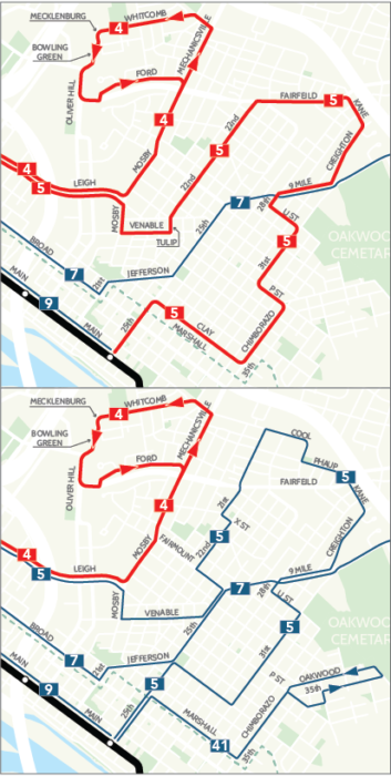
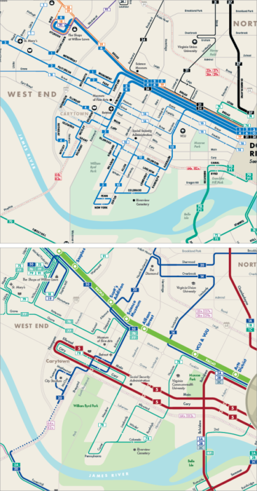
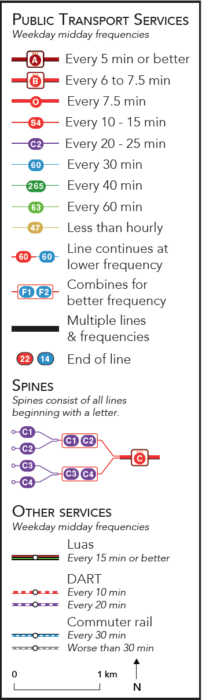 But to understand the maps, you must look at the legend. Our firm’s usual mapping style is dense with information, but therefore contains a couple of things that you need to learn. Most of the early expressions of panic and confusion have been based on misreadings of the map.