Connections, Transfers

los angeles: deleting some lines can be fair

The New York Times today bewails the loss of Los Angeles bus line 305, which soon will stop running diagonally across the city's grid, from Watts to Beverly Hills and Westwood. 

4bus-map-popup

NYT reporter Jennifer Medina assumes this is purely a victimization-of-the-poor story, starting with this observation:

The 305 was one of several lines created under the consent decree, and it is the only direct route from the city’s impoverished southern neighborhoods to its affluent West Side, where legions of janitors, nannies and maids work each day.

Sounds sad, and it's easy to fill an article with interviews with 305 riders who will experience the deletion as a hardship.  But as that paragraph should warn us, 305 was a symbolic service.  It cannot have been relevant to very many people, not even to many people in the targeted demographic ("janitors, nannies, maids" according to the NYT).  Why?  If you explore the route and schedule [ Download PDF ] and look at how the route fits into the larger network ("System map overview" here), you'll notice:

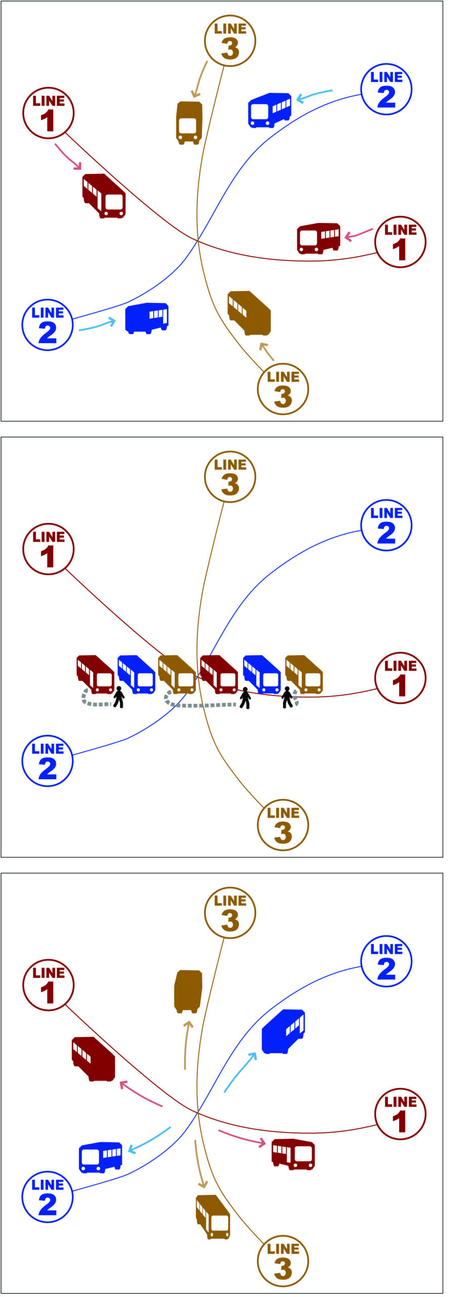
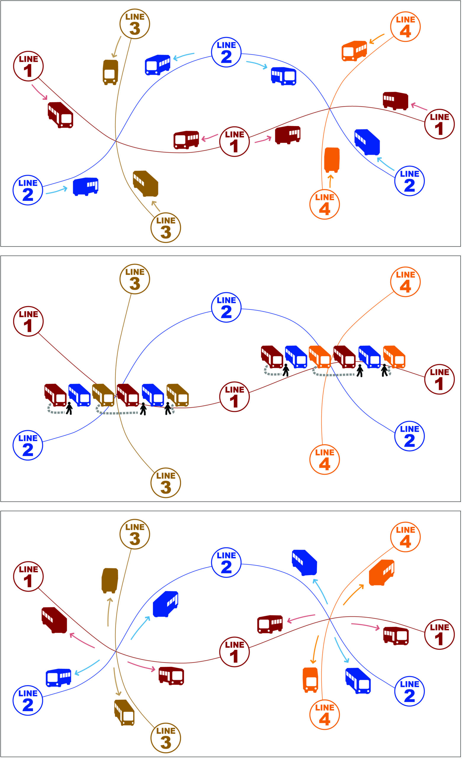
  • Line 305 is a diagonal shortcut across a high-frequency grid, where trips between anywhere and anywhere can usually be made on lines running every 15 minutes or better with some are far more frequent than that.  Meanwhile, the Line 305 frequency is every 40-60 minutes.  [PDF]  That means that the 305 is the fastest path between two points on the line only if it happens to be coming soon.  If you just miss one, there's another way to get there faster, via the much more frequent lines that flow north-south and east-west across this entire area. 
     
  • The 305's low frequency exposes its riders to the risks of waiting for a single bus: you're basically making an appointment with one driver who may not show up for a variety of reasons.  Routing the same trips via the high-frequency grid means much higher reliability, because the abundance of buses along a line means you are less dependent on any one of them.
     
  • Most important, the alleged target demographic — trips from the "poor south" to the "affluent west" for domestic workers — was mostly not served by the 305.  Both the "poor south" and the "affluent west" are enormous areas.  So no one bus line was ever going to connect all or even most of the "poor south" with all or even most of the "affluent west." 

These points, but especially the last, identify a public transit service as symbolic.  Symbolically, the 305 links the "poor south" and the "affluent west," and thus helps everyone feel good about having served domestic workers.  In fact, the 305 runs through a small part of the vast "poor south" and a small part of the vast "affluent west," but it's still useless for most of the people making that kind of trip, because both areas are so large that no one bus line, or even five, could link all of the likely origin-destination pairs between them.

(You could take other buses in each area and transfer to the 305, but the low frequency of the 305 makes this very risky.  Once you've accepted the need to connect, you might as well ride along the main grid and connect with a high-frequency line to take you where you're going.)

This problem is why frequency and connections were invented.  The governing principle of transit in these core parts of Los Angeles is the high-frequency grid, which allows everywhere-to-everywhere travel at high frequencies with at most one connection.  Yes, it may be sad that some domestic workers who are used to zero-transfer trips are now going to have a one-transfer trip, but that only means that 305 riders will have the same level of transit mobility that everyone else has, including most domestic workers.  It also means that Los Angeles transit will be treating all of this demographic equally, rather than arbitrarily preferring people whose path happens to lie along Line 305.

The other moral of this story is even simpler: If your mission is to serve a whole city or region, designing transit routes around any self-identified group of people is almost always a bad idea.  Most successful and attractive transit seeks maximum versatility, by serving the most diverse possible range of demographics, trip purposes, and origin-destination pairs.  You can make exceptions where a single demographic group produces sufficiently massive ridership, as in some commute markets.  But in general, the way people self-organize and self-identify politically is a bad guide to how to meet their transit needs efficiently.  Everyone can draw the perfect transit line just for their interest group, but such proposals tell you nothing about what a good transit system would look like.

Nobody should be happy about the severe cuts being imposed on many US transit agencies that urgently need to move in the opposite direction.  But as in San Francisco in 2009, cuts are sometimes an opportunity to delete services that have passionate, well-connected defenders, but that simply don't make sense if your goal is a complete network that people can use to go wherever they're going.

connection-activated civic squares

A few days back I asked for examples of connection-activated civic squares, public squares that serve as both a symbolic and functional heart of the community, but where people connecting between transit lines form part of the square's activity.  I was looking for a real-world example of something like this, which is a design for a (non-existent) square in Surrey, an outer suburb of Vancouver:

  Surrey Central Plaza-1

The idea arises from the desire to have bus-rail connections happen in an interesting urban setting, rather than a typical suburban bus interchange that features an area where only bus passengers would be. 

First, I should answer this comment

Isn't the idea to reduce transfer penalties, not to deliberately increase them for other ends? Getting off the train on a cold, stormy night, I think I would resent being made to animate an otherwise deserted public square – running 200m for my bus, with my umbrella blown inside out, dodging puddles. Even worse if it was on the way to work in the morning!

Indeed it is.  I always want connection walking distances to be as short as possible.  The square above is 100m wide, so maximum walks would be no more than that, and that's not out of line compared to what you'll do in tunnels in many of the great subway systems of the world.  But I'm not sure that walking across a square is more onerous than walking along corridors or tunnels, so long as there's some reasonable alternative in bad weather.  And of course the urban designers are always telling us that visual interest makes walks feel shorter.  When walking along a typical subway tunnel lined with shops, I feel reduced to the status of consumer.  I would much rather walk across a square on a nice day.

One reason that these arrangements are unusual, and that I should have noted, is that they require buses to be organized in an inverted couplet.  In a country that drives on the right, you would expect that a westbound one-way street would be north of its eastbound partner.  That's the way two-way streets normally divide.  In this Surrey proposal, we set up the car traffic to do that but the buses to do the opposite in contraflow lanes.  That's how we got the bus stops to be on the square rather than across the street from it.  This is a great trick in situations where you already have one-way couplets of streets.  It gets buses out of traffic and puts them with their doors facing each other so that they can stop at opposite sides of a square (or even just at opposite ends of a pedestrian street or lane). 

(Portland's transit mall is a famous example of an inverted couplet — the northbound street is west of the southbound street — and if the Pioneer Courthouse Square were one block further east, it would be a spectacular example of a connection-activated square.  The mall couplet does help create an effective square at PSU Urban Center Plaza, where the mall and the streetcar intersect.)

It was quickly clear from the reader suggestions that really large connection-activated squares have to be in pretty big cities.  Even there, size can be a problem.  Note how Lyon's Place Bellecour, below, is reduced in width by a bit of landscaping.  The whole block is 250m x 170m, but the trees reduce the purely open space to about 100m wide.  At that, it's still the largest clear square in Europe, says Wikipedia.  There's room for two soccer fields in the remaining open space, three if that guy on the horse would get out of the way.

Place bellecour lyon

Place Bellecour does have a bus stop facing onto the square on the east side, but the main east-west bus movement is east on the south side, west on the north side, which in France puts the stops across the street from the square.

Many readers pointed to Berlin's Alexanderplatz, a vast and intense area that includes Berlin's iconic tower, the Fernsehturm.  Alexanderplatz is technically the northeast part of this image, but it's all intimately connected.

Alexplatz

The interaction here is between rapid transit ("U") at the center of the image and tram and bus lines.  One of the tram lines extends northeast and northwest from just south of the rapid transit station.  As I recall some of these trams turn to stop alongside the station (so are not activating the plaza) but others do not, so some people do walk across parts of the plaza.  Also relevant are buses on both the far northeast corner of the image and on Spandauerstrasse, which is the street cutting across the southwest corner.  Greater Alexanderplatz is a series of spaces where the interaction of transit and urban life is quite intricate.

A clearer big-city example is Syntagma Square, Athens.  It's about 110m on a side, and seems to work well, though Google is a little fuzzy there:

Syntagma

Syntagma has an underground metro station on the east side of the image, including entrances right into the square.  Buses are organized as a couplet, and in this case, it appears to be an inverted couplet so that the buses open into the square, but I can't quite be sure.  The Athens Tram also terminates there.  The position next to the Greek parliament building ensures that the square is a symbolic center of the city and nation.

Several readers suggested Piccadilly Gardens, Manchester, UK.  I had in mind hardscaped plazas, but this one is interesting as an example of how much transit work a grassy park with a fountain can do.  It's about 120m x 90m at its widest points.

Piccadilly gardens manchester"

This is clearly a major tram+bus terminal, with lots of space taken up by end-of-line storage as opposed to just stops.  That's part of why the transit operations seem to dominate the space to a degree that urbanists are likely to find objectionable.  Note that the main pedestrian links between connecting services are paved paths across the gardens.  The landscaping is a nice way of saying "this is a park, not just a transit interchange," even as the paths serve the interchange volume.

Last among big-city examples, I'm intrigued by Insurgentes station plaza in Mexico City, which is in a roundabout roughly 120m in diameter. 

Plaza insurgentes mex

Note that the red buses appear to cycle the circle in a contraflow lane, i.e. clockwise where all other traffic is counter-clockwise, so that they open onto the central plaza.  (UPDATEI am now advised that they are operating with-flow, counter-clockwise, but in their own lanes, and have doors on the left that enable them to open onto the plaza.  The two silver-roofed structures are their main stops).  Obviously, this is a massive bus-rail connection point.  The red buses are from the city's Bus Rapid Transit system.  This is certainly enough pedestrian volume to activate a space, and indeed it looks as though some kind of merchant activity is going on.  But of course a roundabout is inevitably more of an island than a heart, as you'll need to go underground, through the subway station, to cross safely to any part of the surrounding district.

But when we step down to smaller cities, or to outer locations that aren't major transit hubs, the successful squares are quite a bit smaller.  Several readers praised Mont Royal station plaza in Montréal.  The subway station is on the west side, with bus stops on the east and north sides.  This looks like a case where terminating buses are actually looping around the square. 

  Mont royal, montreal

But it's only about 50m wide.  Many readers suggested connection-activated squares on this scale, often in secondary nodes of big cities or in suburban areas, especially in Europe.  Many such squares were mentioned, but Stockholm's Odenplen is typical.  And even in North America, small open spaces, usually  less than 50m on a side, are common at some subway stations; Vermont/Santa Monica station in Los Angeles and the two Mission BART stations in San Francisco come to mind.  Another example, at a simiar edge-of-downtown scale, is the PSU Urban Center plaza in Portland, which handles interactions between an inverted couplet of north-south buses and an east-west streetcar.  The open space there, too, is less than 50m on a side.

So to sum up:

  • An obvious larger design point is that civic squares have to be scaled to their catchment area.  The bigger the city and the more central their role in it, the bigger they can be.  For squares that aim to serve a smaller suburban or neighborhood node, the squares are smaller, usually less than 50m on a side.  The plaza we sketched for Surrey (at the beginning of this entry) was probably too big.  Place Bellecour in Lyon a totally open space of 200x100m with only a statue as furniture, probably is too big.
  • At all scales, these squares can work as multiple-purpose plazas while also serving transit connections, and there seem to be many examples of these two functions supporting each other.
  • Inverted couplets are rare but work well with public squares.  The inverted couplet is a key unappreciated feature of the Portland transit mall. 

Thanks to everyone for contributing to this adventure!  I'm sure there are many other great examples I haven't mentioned. 

This work is important to me because many designs for great highrise urban nodes at rail stations collide with the needs of connecting and terminating buses, and it's often tempting to push the buses away.  These examples, at a range of scales, capture how transit connections and urban life can happen in the same place, and indeed support each other.  Links to other great examples are welcome!

    basics: branching (or how transit is like a river)

    A short draft chapter from the book, overlapping the content of this recent post but with an extended BART example that I hope readers will enjoy and have comments on.

    In 2011, cartographer Daniel Huffman thought it would be interesting to draw river systems as though they were subways.  Figure 1 shows part of his sketch of the Lower Mississippi.[i] Continue Reading →

    london’s northern headache

    London underground_map crop Commenter David M on what rivers teach about transit:

    It's interesting to note that in London the newest Underground lines have no branches (Victoria, Jubilee). In fact, when Jubilee was originally opened it took over one of the Bakerloo Lines branches, reducing the Bakerloo to a branchless line also.

    For real complications, look at Camden Town [top center] on the Northern Line [black on this classic map] in London, England. Just south of this station is a complex deep underground junction that lets trains from any two of the branches south of Camden to simultaneously run on any two of the branches to the north. It is a marvel of engineering, but it is also an operational nightmare with trains run from any branch to any branch – one train runs late and it can cause problems on all of the branches.

    London has wanted to simplify the operations by spliting the line into two and requiring an interchange at Camden Town. There are four platforms at Camden Town but the interchange passages are insufficient to handle the expected interchange traffic – so for now, it is cheaper to suck it up and deal with the operational issues.

    There is an interesting effect of this interchange. Going south, both branches serve Euston Station before heading off to cross London on two different lines serving different areas of the core. You can get on one train at Camden, stop at Mornington Crescent and at Euston. You could get on the following train at Camden and arrive at Euston without passing through Mornington Crescent. The reason is that Mornington Crescent is on only one of the two branches, the other just bypasses the station. It makes for fun time when trying to get to Mornington Crescent.

    The other night a Sydney rail expert was telling me that when the North West line is built, creating a four-way junction at Epping similar to the one at Camden Town, they will spend a number extra millions on the tunnelling to create the ability to route trains from any segment to any other.  A similar decision has already been made about a similar junction at Glenfield in Sydney's southwest.  I wonder how much could be saved if we let lines cross without connecting track, and required connections, where that pattern makes sense as part of a larger grid.  It's not the right answer everywhere, certainly, but it sounds like London transit experts aren't very appreciative of all the flexibility that their great-grandparents gave them with the design of the Northern Line.

    online “map movies”: useful?

    Can animation help people understand their transit options?  The Rotherham Metro Borough Council in the UK has done some simple "map movies" that highlight the paths followed by buses and trains.  Here's a still:

    Rotherham map movie still

    Watch the actual animation here.

    As they stand, they're limited in usefulness, as the icons move along the routes with no indication of frequency.  They certainly do advertise complexity, which is accurate; this looks like a very complicated network.

    But it's easy to imagine taking this to the next step, showing by animation the scheduled paths of all the services in a transit system.  This would be especially helpful in helping citizens understand pulse systems, where the integrated scheduling pattern is an essential part of how the network gets you where your going.  Now that I think of it, I'm pretty sure this has been done, but I've never seen it on a public information website, which is the obvious next step.

    the connection-count test

    As I look at the new metros being built in the developing world, I'm noticing some striking connection-count problems.  Consider Delhi, a city I know a bit:

    Delhi metro frag

    The full Delhi Metro network map is here, but this slice is the only part of the system where lines connect with one another. 

    What's wrong with this picture?  Well, suppose you want to go from Shivaji Park, on the green line in the upper left of the image, to Khan Market, in the lower right.  That's right: three connections.

    Developing a new metro in a crowded city is always an exercise in compromise, but I'm struck by how often one of the first compromises is network integrity, easily measured in the reasonableness of the number of connections required. 

    In an idealised grid network, the maximum number of connections for almost any trip is one.  Plenty of real-world networks require two connections for a range of trips between secondary stations.  But requiring three is pretty remarkable. 

    Basics: Some Tools for Small Cities

    Early in my career, I did a number of network designs for free-standing small cities in the American West.  These cities, say populations of 30,000-100,000, tend to have a similar set of problems and opportunities, and could probably benefit from a little more theoretical focus.  The same issues arise in most of these cities across North America, Australia, and New Zealand, including: Continue Reading →

    Email of the Week: Dept. of Blindingly Obvious Ideas

    From a frequent commenter:

    I was thinking about transit websites, and I had a thought that struck me with how blindingly obvious it is, and I’m surprised for some reason I don’t think I’ve seen any transit agency do this before. On the main timetable page, they will generally have a menu to let you pick a route, and give you the timetable and map for that route. But those are leaf pages, they don’t link to anything other than back to the menu. My thought is, the web is all about links, so why not make the structure of the timetable pages reflect that of the route network, and for any route to which there’s a transfer, provide a link to that route’s timetable right there on the page? With fancy web design, I’m sure even more elaborate things can be made, like letting you see what transfers you can make for a particular run of a route.  But in general, this seems like one of those things that can greatly enhance the public’s understanding of how the transit network works, and I’m surprised that I don’t recall seeing this anywhere before.

    If you know of a transit agency that does this, please comment with a link to a sample timetable page!

    Basics: Finding Your Pulse

    When transit services are running every 30 minutes or worse, you can’t assume they connect with each other just because they cross on the map.  Schedules need to be coordinated to make connections at low frequencies possible.  The only technique that does this comprehensively is called a pulse or timed transfer.  

    A pulse is a regularly scheduled event, usually happening at the same time each hour, in which transit vehicles from a range of routes — usually running every 30 or 60 minutes — are scheduled to all meet together.  A group of hourly local routes, for example, might all come to the pulse point between :22 and :25 after the hour and leave at :30. That way, nobody has to wait more than 8 minutes for a connection even though the services in question are hourly.

    The sequence of events at a pulse. Buses arrive, sit together briefly, and then depart. Drawing: Alfred Twu

    Often, pulses are organized around a main transit line, such as a trunk bus or rail line that takes you to a nearby larger city.  In these cases, the main line vehicle usually doesn’t dwell as the local buses do, since it’s the most crowded service and hence the most speed-sensitive.   Instead, the locals arrive a few minutes before the trunk passes through, and leave a couple of minutes after.

    Pulses are the only way to provide connection wait times that are much, much better than the frequency of the services involved.  A pure pulse is also equally convenient for connections between any pair of lines, and thus for travel in any direction.

    For this reason they are used almost universally, in North America, in small-city networks where frequencies are low and often also in suburban areas of large cities.  If you’re in a North American suburb or small city and see a large number of buses hanging out together on a street corner, you’re probably watching a pulse.

    I was introduced to pulse scheduling in Portland at a tender age.  I was a teenage transit geek then an undergraduate working part time at TriMet, the transit agency.  This happened to be the period (1979-85) when the lattice of suburban pulse networks was being constructed.

    We spent a lot of time thinking about how the pulses interact with each other.  For example, if you have a pulse of buses at Beaverton Transit Center at :05 and :35 past the hour, and one route goes from Beaverton to Sunset Transit Center in 12-14 minutes, how do you schedule the Sunset Transit Center pulse?  Do you set it at :20 and :40, so that this connecting route can serve both pulses but with just a few minutes to spare?  When this route is late, a lot of connections will be missed and a lot of people stranded.  Or do we just set the Sunset pulse at :05 and :35, so that the bus linking the two transit centers has lots of spare time but now has too much time to kill and will tend to arrive inconveniently early for one pulse or the other.  Or do we just accept that this line isn’t going to hit one or the other of the pulses precisely?

    In lattices of multiple pulses, the travel times between the pulse points become critical. In this example, if Lines 1 and 2 have different travel times between the two pulse points, the timing may not work well for both of them. Good network design thinks about this problem as routes are being designed.

    To do pulse scheduling, we have to plan the pulse schedule as we’re designing the network.  In the two-pulse problem I outlined above, we will think hard about the line connecting the two pulses and ask if we can either make it a little shorter (so that it will get there more reliably in 15 minutes) or a little longer (so that it will get there in 30 minutes without so much time to spare).  I have designed some large networks with multiple pulse points, all designed to work harmoniously.  To do that, I’ve always designed lines between pulse points with the specific goal of making them a certain length.

    Pulse scheduling requires an intimate two-way conversation between the planning and scheduling tasks, but not all public transit authorities are not set up to have this conversation.  Sometimes, planning and scheduling are too far apart organizationally and become structurally incapable of noticing and exploiting pulse opportunities.  In other cases, pulses may simply not be the prevailing habit; there may be nobody around who is in the position to suggest them.

    The organizational challenge presented by pulsing is, to me, a positive feature of the concept.  Better integration of planning, scheduling, and operations management has many benefits, and if the pulse challenge helps motivate an agency to get there, so much the better.

    But pulse scheduling does have some practical limitations.  In particular, it struggles in any environment where the running times are prone to vary a great deal.

    Pulses are about managing a low-frequency network, so they aren’t generally needed in inner cities where frequencies are every 15 minutes or better.  Pulses are almost universal in small-city design in North America, because most such cities have little traffic congestion and can therefore run a pulse reliably.  The best big-city agencies also do some kind of pulse late at night, when their services are very infrequent.

    But in the suburban areas of big cities, running times vary due to traffic congestion and pulse operations struggle.  I suspect that the difficulty of guaranteeing pulses in these settings is the main reason that big suburban agencies are reluctant to advertise their pulsing too much.  Small-city agencies, which don’t deal with such severe congestion, are more likely to emphasise that at the heart of their network, they have a pulse.

    A lattice of interconnected pulse points, all beating as planned in unison or alternation in a pattern that repeats each hour, is a thing of beauty if you can visualize it, especially because if the motion of pulsing suggests the movement of blood through the heart.  It’s like watching the inner life of a large multi-hearted organism.  This can be a nice metaphor for other kinds of thinking about your city.


    1 Ross R. Maxwell, “Converting a Large Region to a Pulsed-Hub Public Transport Network.”  Transportation Research Record, paper 03-4020, p 128.  Original paper here.  

    Connections vs Complexity

    In my first “basics” post on connections, I explained why a network that requires connections (or as North Americans call them, “transfers”) can actually get people where they’re going faster than a network that tries to avoid them.

    But there’s another important reason to plan for connections rather than direct service, one that should be important to anyone who wants transit to be broadly relevant to urban life: Unless you welcome and encourage connections, your network will become very, very complex. Continue Reading →