Like many fashionable tech folks, Elon Musk wants to replace city buses with little vehicles that protect you from having to share space with strangers.
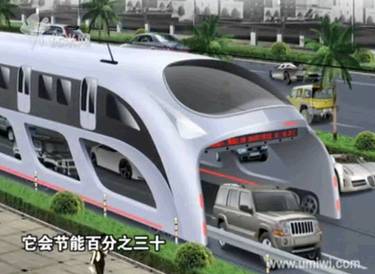
With the advent of autonomy, it will probably make sense to shrink the size of buses and transition the role of bus driver to that of fleet manager. … [This technology] would also take people all the way to their destination. … (Emphasis added)
Musk assumes that transit is an engineering problem, about vehicle design and technology. In fact, providing cost-effective and liberating transportation in cities requires solving a geometry problem. This confusion is very common in transport technology circles.
In dense cities, where big transit vehicles (including buses) are carrying significant ridership, any “small vehicles replacing big vehicles” solution increases the total number of vehicles on the road at any time. The technical measure of this is Vehicle Miles (or Km) Travelled (VMT).
Today, increasing VMT would mean increased emissions and increased road carnage, but let’s say technology has solved those problems, with electric vehicles and automation. Those are engineering problems. Inventors can work on those.
But there is still, and aways, the problem of space. Increasing VMT means that you are taking more space to move the same number of people. This may be fine in low-density and rural areas, where there’s lots of space per person. But a city, by definition, has little space per person, so the efficient use of space is the core problem of urban transportation.
When we are talking about space, we are talking about geometry, not engineering, and technology never changes geometry. You must solve a problem spatially before you have really solved it.
—
The reigning fantasy of Musk’s argument is that we must always “take people all the way to their destination.” To do this we must abolish the need to ever change vehicles — from a train to a bus, from a car to a train, from a bus to a bike — and of course we also abolish walking. This implies a vision in which buses are shrunk into something like taxis, because a vehicle going directly from your exact origin to your exact destination at your chosen time won’t be useful to many people other than you.
So a bus with 4o people on it today is blown apart into, what, little driverless vans with an average of two each, a 20-fold increase in the number of vehicles? It doesn’t matter if they’re electric or driverless. Where will they all fit in the urban street? And when they take over, what room will be left for wider sidewalks, bike lanes, pocket parks, or indeed anything but a vast river of vehicles?
—
There are audiences for which Musk’s vision makes perfect sense, people for whom useful high-ridership transit isn’t an option anyway. There are two big categories of these people:
- People who live in outer-suburban and rural areas, where space is abundant and high-ridership transit isn’t viable.
- The wealthiest 20% or so of urban residents, who can afford to use relatively expensive services that would never scale to the entire population of the city.
If you are in one of these categories, your most urgent task is to remember that most people aren’t like you, and that cities are impossible if everyone lives according to your personal tastes. As Edward Glaser said, “one’s own tastes are rarely a sound basis for public policy.”
That issue, right there, is the great disconnect between tech marketing and genuine urban problem-solving.
Tech marketing is all about appealing to elite personal tastes. It runs on the assumption that whatever we sell to the wealthy today we can sell to the masses tomorrow. But some things stop working when everybody buys them. Cars in dense cities, for example, are not a problem when only the top 20% are using them; it’s mass adoption of cars that makes them ruinous to a dense city and to the liberty of its citizens. Ask anyone in a fast-growing developing world city about that.
—
Here is the harm that this all this elite chatter about abolishing the bus is doing: It’s introducing fatal confusion into the discussion of urban development.
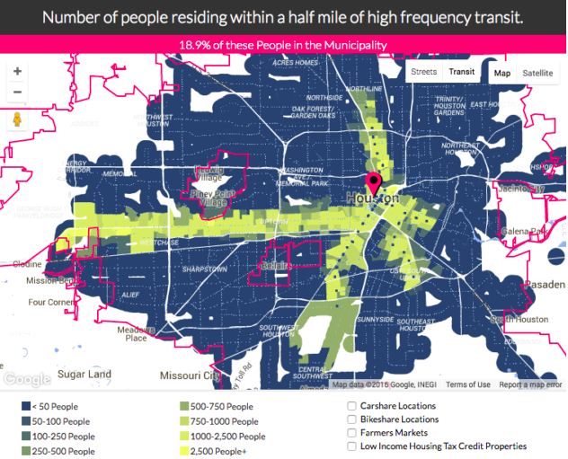
Dense cities that want to live in the real world of space and time, and that do not want to become dystopias that are functional only for the rich, need to use urban space efficiently. There is some simple and well-proven math about how to do this, which is also the math of how transit systems achieve high ridership.
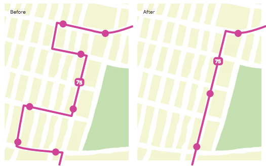
These cities need to organize themselves around frequent transit corridors, where big-vehicle frequent transit, bus or rail, can prosper, allowing the city to grow dense without growing vehicle trips.
Someday some of these corridors will be rail or Bus Rapid Transit. But the only way to grow enough corridors quickly, so that you cover much of the city with frequent service that can succeed in ridership terms, is to take frequent fixed-route bus service seriously. If you don’t do that in your land use planning, you’re going to end up building a city where fixed transit is geometrically impossible, and then you’ll have no alternatives when congestion begins to strangle growth.
Smart cities aren’t just the ones that chase the latest technology fads. They’re the ones that think carefully about the spatial, geometric problem that a dense city is. Because if it doesn’t work geometrically, it doesn’t work.