Auckland

Auckland: The New Bus Network is Complete!

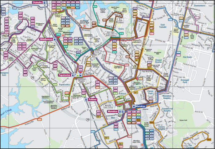
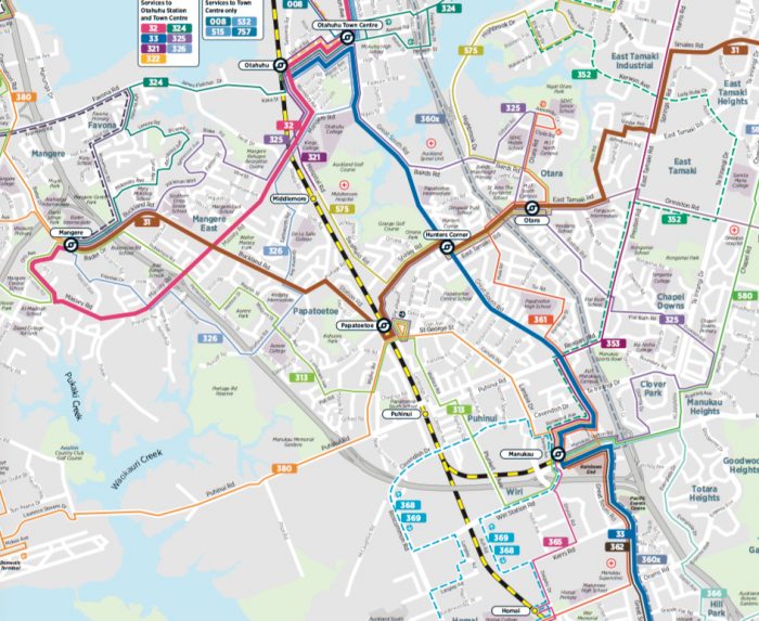
For the last three years, Auckland, New Zealand, has been rolling out a new bus network in different parts of the city.  Sunday, the final portion, the North Shore, got its new network, so the entire effort is complete.  Bravo!

I worked on the original design back in 2012 (with colleagues at MRCagney‘s amazing New Zealand office) and first explained it here.   While public comments have led to revisions and improvements, the most important layer, the citywide frequent network, is almost exactly what we designed.

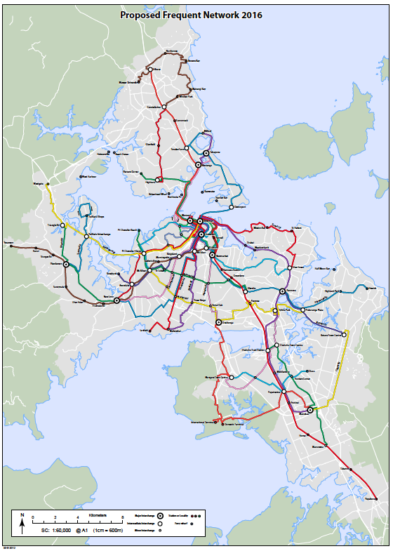
A 2011 sketch of what the all-day high-frequency network would look like when complete. (In 2011, only a tiny part of central Auckland had frequent service all day.)    (MRCagney)

Even more important than the network are the principles, which Auckland Transport explains here. We figured out these principles at the beginning of the process, and they should sound familiar to anyone who knows my work.  For example, this image still appears in most of my firm’s reports, showing two ways to serve an abstract city consisting of three residential areas (top) and three destination areas:

[The idea, explained fully here, is that in this simple fictional city, if you run three routes instead of nine, you can afford to run them three times as often, which means that the average wait is only 1/3 of what it was before.  Even if you have to change buses in the new network, which means you make this short wait twice, you’re still waiting only 2/3 as much as you did before (1/3 at the start of your trip, and 1/3 for the connection).  Hence the counterintuitive fact: a network that makes you change buses gets you there sooner.   Such a network is also simpler, three routes instead of nine in this case, with buses coming so often that you don’t need at timetable.]

An important complement to the bus network redesign has been a major increase in frequency on the city’s four commuter rail lines, which enabled us to offer outlying areas frequent connections to the rail line instead of a long bus route competing with it.  Now, the New Zealand government has funded a huge project to extend this network underground through the city centre, so it will function like a proper subway system.[1]  This will further strengthen bus lines connecting with it and further reduce the need for lines running parallel.

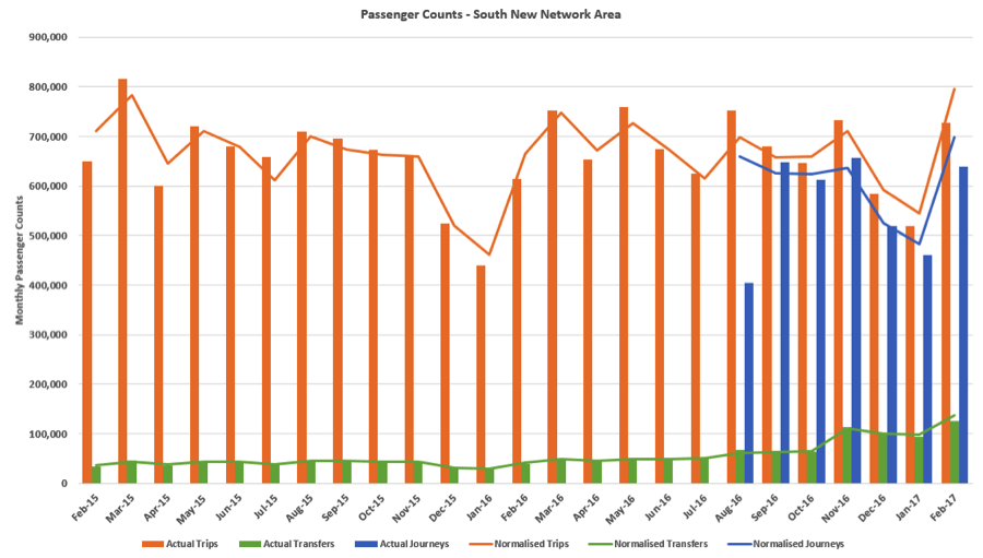
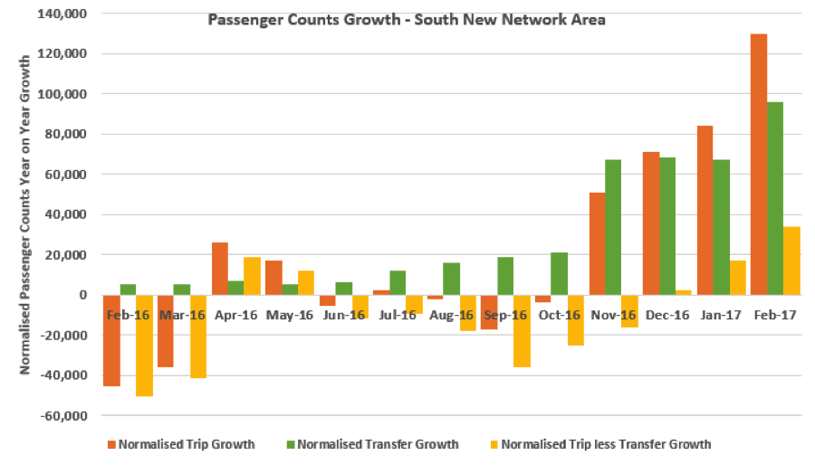
Each phase of the network has triggered gains in patronage — increases in total journeys, not just passenger boardings — so all that new frequency is clearly attracting new riders.

Many people ask me about phasing.  Does a new bus network have to be implemented all at once?  The answer in many cities, including Houston and Dublin, is yes: The geography of the city is so interconnected and interdependent that trying to implement a network in pieces is just too much work. The interim phase in which the network is partly new and partly old becomes a huge network design challenge in itself, as well as a challenge for communications and operations.

Auckland was an exception, though, because of the city’s shape.  The city is so riven by bodies of water that it functions almost like an archipelago.  The narrow points of connection between areas make those areas relatively easy to separate.  (This is why New York City, for example, can reasonably do separate phases for Staten Island, Manhattan, and the Bronx, although Brooklyn and Queens are inseparable.)

I’ve been back to Auckland several times since the network began rolling out, and it’s great to see this great Pacific city becoming more and more oriented toward great public transport.  I’ll be back there in late November, to speak at an Auckland Conversations event, and look forward to getting places sooner on the new frequent network.

Congratulations to everyone at Auckland Transport and the City for this great milestone.  The plan had many important authors and advocates, but if I had to call out one it would certainly be Anthony Cross, the tireless head of bus planning who conceived this project and pushed it through, in a struggle of many years.  I hope he’s happy today.


[1]  North Americans are encouraged to make wistful comparisons to the eternally-deferred San Francisco Caltrain downtown extension and New York Gateway project.  Further cause for antipodean triumphalism: similar projects are well-advanced in both Melbourne and Brisbane.

Auckland: Big Growth on the New Bus Network

In 2012, I worked with the transport authority of New Zealand’s largest metro area to design a new bus network for the fast-growing region.  A key idea was to replace a tangle of infrequent services with a simpler, more frequent network.  People would need to change buses a bit more, but they’d be able to get to more places sooner

Small parts of this network were implemented in 2015-16, but the first big slice was the South Auckland portion, which I discuss in detail (with maps) here.

South Auckland is about 1/5 of Auckland.  North Americans would recognize it as “inner ring suburbia”.  It has areas of very significant low income and disadvantage, but there are many barriers to walking, and the maddening, discontinuous street pattern makes it hard to draw remotely straight bus lines.

Auckland Transport implemented the South Auckland network at the end of October 2016, so it’s been running for just over four months.  Many network changes don’t show any benefits that early, but we’re getting a significant surge here.  From the March 2017 Board Report (starting on page 32):

Total South Auckland boardings in February (the number of times someone got on a bus or train) were  up about 19% from the previous February, when normalised — that is, adjusted to reflect different numbers of weekdays per month (and days in the month, in February’s case).  In this chart, the bars are raw data but the lines are normalized.


S auckland chart

But this chart is more helpful:


S Auckland ridership

Again, the new network went in at the end of October, so it’s clearly the cause of the sudden jump.

The growth in transfer boardings is almost 3/4 of the growth in boardings, so only about 1/4 of the growth in boardings is the growth in new passenger journeys [“normalised trip less transfer growth,” the yellow bars].  So the growth in passenger journeys is around 4%, not 19%.

(Yes, the lack of consistent counting of passenger journeys [“linked trips” in US parlance] is one of several things wrong with most ridership reporting.  A big jump in boardings can be just the jump in transfers, which means the network isn’t really serving more passenger trips.  Many transit systems have trouble counting transfers — indeed, some fare systems leave no record of them — and there are many estimation methods out there, s0 the reporting is hard to standardize.)

Note, too, that passenger journeys are growing at a steady clip after dipping down in the first month of the new network.  This is routine.  It takes time to discover the new network’s benefits, and for new passenger trips to appear as a result.  However, the need to transfer to complete formerly direct trips happened at once, so a sudden jump in transfers, and thus boardings, is understandable.

So if you were comparing this to other ridership figures, which tend to be about boardings, we’d say we’re up about 19% just four months in.  By contrast, the regional model in Houston suggested our redesign there might achieve +20% in boardings after two years (and net of external effects that have, in fact, utterly confounded the numbers.)

Four months in, a 4% growth in passenger journeys is spectacular.   This is the sort of growth I might hope for after a year.  And the trend-line is very promising!


Auckland: South Auckland Redesign Rolls Out

Back in 2012, I worked with Auckland Transport to design a completely new design for the city’s transit system.  (Auckland has a single city government covering the whole urban region, so you could also call this a regional plan.)

The old design — if it could be a design at all — had been the result of private operating companies designing their own routes to their own advantage, which led to enormous numbers of express buses into the Auckland city centre (where they created major bus congestion) but poor services for getting around locally or crosstown.  It was also just impossibly complicated …

Old network in southern Auckland. Can you see how to get anywhere?

Old network in southern Auckland, almost all infrequent. Can you see how to get anywhere?

The new network emphasizes all-day high-frequency services, connecting to each other in grid patterns and to newly frequent rail lines.  Read about that big picture, and its payoffs, here.

A small piece of the network, in the Green Bay area, was implemented last year, and achieved a 20% ridership increase (on no increase in service quantity) in the first year.  Now, the first really big piece has been rolled out across southern Auckland.  This area, formerly the City of Manukau, is relatively low-income, ethnically diverse, and features fragmentary, shredded street patterns that are a huge challenge to network designers.

A fragment of the old network is above.  Virtually none of it, including the train line, was frequent.  The overlapping lines with uncountable 3-digit-route numbers show local routes tangled up in express routes going all the way into the CBD far to the north, competing with the rail line.

Here’s the same slice of the new network (beautiful full map here):

New South Auckland network. Wide lines (31, 32, 33) are the Frequent Network

New southern Auckland network.  Wide lines (31, 32, 33) are the Frequent Network

Why the huge reduction in complexity?  Virtually all express buses to the CBD were replaced by buses connecting to the main rail line, which is now frequent.  Local lines were organized so that they form a logical network feeding into local hubs as well as to major rail stations.  Note that not all rail stations are bus hubs; the network concentrates only on certain rail stations so that buses connect with each other as well as with the trains, and so that consolidated station facilities can be built at these locations.  The biggest new hub, Otahuhu at the north end of South Auckland, has a huge number of buses feeding it, and got a shiny new bus-rail station for the new network’s opening day.

As always, there will be hiccups in the implementation process, as people adjust. But it’s great to see this plan, first sketched four years ago, on the street at last.

Can Design Learn from the New Zealand Flag Debate?

If you care at all about visual communication — and if you aren't blind from birth, then you do — you should be following the remarkable debate about the New Zealand flag.  National flags are so enduring that it is hard to imagine a graphic design task with higher stakes.  Revising one triggers a profound argument about national identity, which ultimately comes down to a couple of questions:

  1.  One or many ideas?  Can the nation come together around one image or idea, or must there me a mash-up of several to satisfy different groups or points of view?
  2.  Fashionable or enduring?  Graphic design is so much about fashion and fun that identifying an image that will make sense for decades is harder than it sounds.  Yet that's what a flag must be – and the greatest company logos have mastered this challenge as well.

To review, the current New Zealand flag looks like this:

2000px-Flag_of_New_Zealand.svg

The Union Jack and the Southern Cross, the latter a distinctive constellation that is also on Australia's flag.   (With all due respect to defenders of this flag, both images are about New Zealand's tie to other countries, countries that the nation's identity has lately been separating from. I also understand the view that flags should never change on principle; that is a different debate.)

The New Zealand flag seems disconnected from the evolving palette of national identity.  National  imagery rarely uses the flag's colors.  Sometimes it uses blue-green colors that echo the textures of the landscape; you will find these in the customs hall at Auckland Airport for example.  Increasingly, though, the government uses black.  The association of black with New Zealand comes from another image that is so universal that some visitors probably think it's the flag already:

2000px-NZ_fern_flag.svg

This image is most common in sports, as it's the logo of most national teams including the famous All Blacks of rugby, but it long ago spilled over into the general consciousness as an unofficial symbol of the country.  

If I may reveal botanical interests more suited to my other blog, this is not just any random leaf or frond.  It's based on the underside of the spectacular Silver Fern, Cyathea dealbata, one of the  tree ferns that define so many New Zealand rainforests (top on left, underside on right).

P1090269

Sports and tree-hugging in one image!  This would seem to make the silver fern a winner across the cultural spectrum.  It might also remind you of another former British colony that tired of its Union Jack, and forged a new identity out of botany:

Flag_of_Canada.svg

The Canadian flag was adopted in February 1965, so it just turned 50.  Like the Silver Fern in New Zealand, the maple leaf had been hanging around in Canadian imagery for a while.  So it's not surprising to see the fern so prominent in New Zealand flag ideas.

So how has the debate gone?  Well, the government's earnest committee canvassed the country and came up with these semi-finalists:

New_zealand_flags_01-818x635

It's remarkable how much consensus there was on which images matter: the Southern Cross, a gesture toward the old flag, plus two main expressions of the fern: the frond and the spiral form called the koru.  (The latter, common in Maori imagery, is based on the shape of a frond as it just unfurls.)  

When you look at that field of contenders, does your eye go to the busier ones or the simpler ones?  Mine went to the simplest, the ones with a single idea, not a collision of several, and the ones that looked enduring by virtue of not trying to be sexy.  For that reason, the original silver-fern-on-black still looked right to me.  

But the people who chose the four finalists felt differently:

Four-promo

… at which point, all hell broke loose.  There are many complaints, including that three of the four are too similar to represent a choice, and that #2 is already selling plastic plates:

But the real problems are these:

  • #2 and #4 are both mash-ups, obviously collisions of multiple unresolved ideas.  A mash-up suggests that the country is too divided to revere any single image.  If Canada — a far more diverse country in terms of landscapes and identities — could avoid this mistake, New Zealand certainly can.  (British Columbia is another matter …)
  • Except for #3, they are all over-designed, with an attention to today's graphical fashions instead of any thought about what might stand the test of time.  This is equivalent to saying that they call attention to the designer.

What do you gain, designer of finalist #1, by flipping half of the silver fern image into negative, and making the frond leaflets more rounded so that they no longer resemble the plant?  How is this better than the simple silver fern on black?  Only that a graphic designer obviously designed it, in a way that is supposed to look cool.

But a flag is supposed to outlast its designer, and the design fashions of the moment.  Remember, the Canadian flag was designed in the 1960s.  If their design competition had been seeking something as "contemporary" and "designed" as New Zealand's final four, they might have found inspiration in one of these:

Images-2

13340495-flower-power-groovy-psychedelic-hand-drawn-abstract-notebook-doodle-design-element-on-lined-sketchbo

Flower-power-groovy-psychedelic-hand-drawn-notebook-doodle-design-elements-set-on-lined-sketchbook-paper-background-vector_100479673

Fortunately, they didn't.  You can't tell, looking at the Canadian flag, that it's an artefact of the 1960s, and that's the whole point.  A flag has to have a sense of timelessness and simplicity, which is why you must reject  any design that calls attention to the cleverness of the designer or relies on design fashions of the moment.   The creativity it requires begins with the willingness to disappear as the creator.  None of the finalists displays this.  

How is this debate relevant to this blog's concerns in public transit?  If you really want to sell public transit, teach people to count on it.  Make it seem solid and enduring, not just sexy and ephemeral. Go for the simple, solid idea that will still make sense — practically and aesthetically — decades from now.  

London-underground-tube-train-sign-blank-english

And this principle extends even beyond graphic design, to debates about whether transit technologies should be chosen for "fun" or reliability.  

Do you notice how insecure companies change their logos and liveries more often than confident ones do?  Do you notice how they use flashy look-at-me images instead of clean and enduring ones?  

Flashiness, fun, and novelty may attract customers, but only simplicity and reliability retains them. Which message do you want to put forth about your transit system, or your country?

for the right transit planner, a dream job in new zealand!

DSCN0418Are you a professional transit planner with 3+ years experience and a commitment to breaking through old paradigms and raising the standards of the profession?  If so, my New Zealand colleagues at MRCagney may be looking for you.  They are open to hiring from worldwide, so if you've ever dreamed of living in New Zealand, this may be your chance.   Here's the listing.

I have a keen interest in this hire, because I'll probably be working with this person!

MRCagney is small and focused sustainable transport firm with offices in Brisbane, Sydney, Melbourne, Auckland, and Singapore.  Built around a group of former transit agency executives, it now does a range of work but is closely associated with BRT, bus network design, and public transit management, with many projects across Australia, New Zealand, Southeast Asia, and the Middle East.

I worked for them fulltime for five years when I was based in Sydney (2006-2011), and I'm still on their payroll part time, helping out with the occasional network design study.  In 2012, for example, I worked with them on a redesign of Auckland's bus network, which is being rolled out over the next few years, and we did a similar project in Darwin earlier this year.   MRCagney is really the Australia-NZ firm for cutting-edge transit planning, which is why I stay involved with their work as much as I can.   I like to think I've had some influence on MRCagney's transit planning values, so if you like what I've written on public transit, and have your own ideas about how to put these ideas into practice, that's probably an advantage!

Please pass this on to other professionals who might be ready for an adventure Down Under.  It's an exciting time to be a transit planner in that part of the world.  


auckland conversations: my presentation on how bus networks liberate

Last Friday I gave a lunchtime talk to an impressively large audience at the Auckland Conversations series.

In 2012 I was the lead planner (with colleagues at MRCagney) on a redesign of Auckland's bus network that will dramatically expand the extent of frequent all day services.  I wrote about some of the benefits a year ago.

However, the plan is encountering resistance, especially in the CBD, from certain folks who believe that buses are intrinsically unimportant, and that aesthetic objections to buses are a reason not to value the liberation they provide.  

So I took that on, including extensive discussion of the contrasting examples of Paris and Portland.  The video is here!

auckland postcard (speaking here thursday!)

DSCF5578I'm back in New Zealand for the next two weeks, which is always a pleasure.  I'll be teaching three sessions of my course (all booked out, alas, but there can always be more) and doing a series of private briefings.  

But I'll also be doing a lunchtime talk in downtown Auckland this Friday, as part of the Auckland Conversations series.  My topic is How will an integrated public transport network create a city for people?  RSVP here!

The "integrated public transport network" in question is more or less this one.  My biggest project for 2012 was a complete redesign of Auckland's confusing tangle of infrequent bus routes, working with Stuart Donovan and my other excellent New Zealand colleagues at MRCagney.  This project is now being rolled out, starting with the southern part of Auckland next year.  

Auckland is a very exciting city for public transit right now.  An antiquated and infrequent commuter rail system is being converted to useful rapid transit, first by running more trains but more durably through an electrification project.  The bus redesign will bring useful all-day frequent service to a huge share of the population, as these striking maps demonstrate.  

Finally, if you're not in Auckland, my most important post from here is this one, about expanding our notions of why you might paint a bus.  

branding individual routes: too many colors, or the gold standard of legibility?

 What might we learn from this bus? (click to enlarge)


Inner_Link_bus_in_Auckland crop

Inner Link is one of four Auckland bus lines — all very frequent and designed to be useful for a wide range of trips — that have buses painted specifically for the purpose.  The other three are Outer Link (orange), City Link (red), and Northern Express (black).  In each case, the paint job is all about making it look easy to hop on.  Note that the bus assures you of the maximum fare you'll pay, and that the list of destinations along the top of the bus gives confidence about exactly where this bus will take you.  (For an Aucklander, these names are all familiar landmarks, so anyone can mentally string them together into a general sense of route.)  

It's important, too, that this is one of Auckland's newer buses.  The big, clear windows are important.  In fact, if it weren't for the maddening bus wrap, this bus would be entirely transparent, so that you could see the people on board and even make out the city beyond it.  This bus arises from European designs that are intentionally gentle on the eye, and whose transparency starts to undermine complaints about a "wall of buses."

When I first saw the branding of these buses in Auckland, I found them irritating.  These buses were announcing simple, legible, frequent routes in a way that marketed them effectively enough, but did nothing to convey that they are part of a larger network of services designed to work together.  Of course, the reality of today's network in Auckland (unlike the one Auckland Transport has in the works) is that it is a confusing tangle of infrequent and overlapping services that is almost impossible to make clear.  [PDF]  

Akl chaos map sample

In the context of all that chaos, you needed these strong route-level brands like Inner Link to stand out as something useful.   And now that we plan to create over 20 bus routes that are as clear and legible as this one, the question arises, should we continue to brand them this way, each one separately, perhaps in a lively diversity of colors from goldenrod to teal?

Compare this to what Los Angeles Metro did, dividing its fleet of 1000+ buses mostly into just two colors, red for Rapid and orange for Local.  This has helped everyone see the faster Metro Rapid buses, but how much more might be achieved if you could paint a bus with both icons and information that would celebrate its role as, say, the Venice Blvd. Rapid?

The marketing and legibility question, of course is:  Would the diversity of looks (perhaps in the context of shared design elements that mean "Rapid") make the system look simpler or more complicated?  In Los Angeles I'm not sure.  In Auckland, where the system as a whole could hardly look more complicated than it does today, the call seems easier.  

The issue for operations is the risk of fleet diversity.  In almost any transit agency, the operations folks will tell you they need maximum flexibility to deploy any bus on any route.  In some big-city agencies I've worked with, operating bases ("depots" in British) store buses in long stacks, where buses can be sent out only in the sequence that they came in the previous night.  Every new factor of fleet specialization becomes a new threat to getting the right bus on the right route every morning — an admittedly heroic effort if you've toured some of the grimmer, overcrowded facilities involved.

So a separate color for every route would be a non-starter in most of North America.  Yet if we designed operating bases so that you could access any bus, or even could just have much shorter stacks, it's not obviously outrageous.  For each route, you'd paint enough buses to run just 80-100% of the midday fleet requirement.  You'd never have more painted buses than you could use.  You'd also have a supply of generic buses that could be added to any route, either as replacements for buses in the shop or as supplemental peak service.  And you'd only do this for routes with high all-day frequency seven days a week and relatively little additional service added at peaks.

In certain contexts — especially in a case like Auckland where the whole city must learn a new story about the usefulness of buses — it might make sense.  Even if we end up with goldenrod and teal.

auckland: how network redesign can transform a city’s possibilities

When a public transport network has grown cumulatively over decades, but has never been reviewed from the ground up, it can contain an enormous amount of waste.  Careful redesign is the key to unlocking that waste and generating vast new public transport mobility.  Our new plan for Auckland, New Zealand, now open for public comment, is a dramatic example of what can be achieved.  ("Our" because I led the intensive network design work, with a great team of planners from Auckland Transport and my colleagues from MRCagney.)

If you want to get around Auckland at any time of day, on a service that's coming soon, here's where you can go on today's network (or more precisely, a "business as usual" network extended to 2016)

Akl existing
Under the proposed plan, which costs no more to operate than the existing one, here's where you'd be able to go, at any time of day, on service that's coming soon.

Akl proposed

The network still includes coverage to all corners of the city that are covered now, and ensures plenty of capacity for peak commuters into the city.  But meanwhile, it defines an extensive network of high frequency services around which future urban growth can organize to ensure that over time, more and more of the city finds public transport convenient.

What's the catch?  Only the geometrically inevitable one: more people will have to make connections from one service to another, and the fare system will need to encourage rather than penalise that.  

Whenever someone tells you that it's too expensive or hard to encourage people to make connections, ask them how expensive it is to run the only the first network above while spending enough money to run the second.  Networks that are designed to prevent transferring must run massive volumes of half-empty and quarter-empty buses and still have trouble delivering frequencies that make the service worth waiting for.  The waste involved can be colossal, as you can see from the amount of service we were able to redeploy in more useful ways with this redesign.

To see a bit of the structure clearer (and also because it's a cool graphic), here's the central slice of the drawing of the proposed frequent network, by my MRCagney colleague Nicolas Reid.  It's currently all over the media in Auckland, helping people assess the plan.  By streamlining it calls attention to the logic to the network — a logic that's sometimes easy to lose track of when following the details of every right and left.  Look at the whole thing.

Auckland network

I'm very proud of what our team achieved working with the excellent folks at Auckland Transport, and I hope the plan will be further improved as a result of public feedback, as good plans always are.  But as Aucklanders begin discussing the plan, I hope they stay focused on the core question:  Are you willing to get off one vehicle and onto another, with a short wait at a civilised facility, if this is the key to vastly expanding your public transport network without raising its subsidy?  

That is the real question before Auckland now.  The rest is details.

the photo that explains almost everything (updated!)

You've seen photos like this. A large group of people, with images comparing the amount of precious urban space they take depending on the mode of transport they use.  This new one is by Australia's Cycling Promotion Fund.

CanberraTransportPhoto_x3_3600px

This photo makes at least three important points, two of them probably not intended.  In this one image you can see that:

  • Bike racks on buses (and most other transit) can never be more than a niche market

The rack on the bus in pic #1 carries two bikes, which is great for those two people.  But if all the bikes in pic #2 try to get onto the bus in pic #1, we have a geometric impossibility.  Bike racks are already as large as they can be if the driver is still to be far enough forward to drive safely.  A non-folding bike inside a transit vehicle takes the space of several passengers, so could fairly be accommodated only at several times the fare.  In the ideal sustainable future, you will have to park your bike at the station, or return your rental bike, just as Europeans do.  If transit does accommodate your bike, you really should pay a fare premium that reflects the rough number of passenger spaces displaced, or the supply/demand ratio for 2-3 bike racks vs 20 people wanting to use them.

 Dreamers along these lines may well be right about many suburban areas, where demand is sparse and the land use pattern precludes efficient transit.  But when all the people in this picture want to travel, driverless cars may take less space than the cars shown here, but they will still take far more space than a bus would.  The scarcity of space per person is part of the very definition of a city, as distinct from suburbia or rural area, so the efficiency with which transport options use that space will always be the paramount issue.  

(Of course, this very thought experiment presumes that we will actually achieve, and culturally accept, driverless cars that require very little space between them, in which the prevention of ghastly accidents — especially with pedestrians and bikes who may appear with zero warning and minimal stopping distance — is achieved through the absolute infallibility of human-designed hardware and software.)

To make the same point more generally:

  • In cities, urban space is the ultimate currency.  

We spend too much time talking about what things cost in dollars and not enough about what they cost in space.  That, of course, is because urban space is perversely priced to encourage inefficient uses of it and discourage efficient ones.  If you're going to claim to be able to visualize how technology will change the world of 2040 — as the techno-futurists claim to do — you should also visualize what a political system ruled by people now under 40 would look like.  These people are much less emotionally attached to cars, care about environmental outcomes much more, and value urban space much more than their parents do.  Given that the revolution in urban pricing has already begun (see the London and Singapore congestion charges, and the San Francisco and Auckland dynamic parking systems), isn't it foolish to assume that today's assumptions about how we apportion urban space will still rule your techno-utopia?

UPDATE:  A reader points out one other key point, which is that

  • the photo understates the space requirements of bikes compared to the other two.  

Once you put these three systems in motion, the cars and bus will need more space in one dimension — forward and back.  However, in motion, the mass of bikes will expand in two dimensions, it will need to be both longer and wider for all the bikes to move safely.  This could have been rectified in the photo by consciously spacing the bikes to a distance where riders would feel comfortable at a brisk cycling speed that ensures not only stopping distance but also space for passing.  Masses of cyclists on a recreational ride may all agree to ride in tight formation at the same speed, but in daily life cycling infrastructure must accommodate the the fact that people in a cycling crowd will have different desires and intentions around speed, which affects lateral spacing and stopping distance.