Legibility

Paris: The Triumph of the Bus Stop

Do you think bus service is never as “permanent” as rail service?  Well, it depends on how much infrastructure you build, and how proudly it announces the bus service as an essential part of the cityscape, both as icon and as opportunity.

Each time I visit Paris there’s something new in its public transit, but these new bus stop signs, now standard across the city, are remarkable.

img_1190

They’re around 4m (12 ft) high, towering over the bus shelter to which they’re attached.  At night they are the most prominent informational icons in the streetscape, by an order of magnitude.

Look closer:

Version 2

Every stop has a name, reaffirming your sense of your place in the city.  (At night, these are actually the easiest locational signs to read, so they have navigational value extending beyond transit.)  For each route, there’s the number, the endpoint (indicating direction of travel) and the number of minutes until the next bus arrives.  If you know the network, you don’t even have to look down to know where you are, and when the next bus is coming.

Here’s one in the daytime, when the little realtime displays are harder to catch in a photo.

img_1045

I don’t have a good pic of the entire shelter, but it has everything you’d expect of a rail stop, including maps of each route, a diagram of the bus network, a diagram of the metro and regional rail network, and timetable and fare information.  It also has more extensive realtime information displays, showing the next several buses departing.

On the other hand, it doesn’t have the extraneous things that my architecture and built-environment friends often suggest, such as distinctive architectural designs or “community hub” features like coffee vending or (yes) lending libraries — all of which have been explored.  A big city needs lots of bus stops, so the ideas that matter are the ones that scale.  In any case, the more you respect your bus system, the more you can celebrate it for what it is, rather than expecting it to entertain us in ways that distract from the liberty it provides.

When I lived in Paris in 1986, the buses and bus shelters were like what most Americans are used to: basic, functional, but sometimes dirty and poorly maintained.  It was presumed, back then, that the Metro and regional rail systems were the serious transit, and that the buses didn’t matter much, and the infrastructure reinforced that message.

All that has changed.  Buses are so nice that you can scarcely distinguish them from trams (streetcars).  Many streets have car-free lanes that buses can use.  Now, with these pillars of information, bus stops are even easier to find than metro stations, and almost as easy to navigate.

There are several principles at work here:

  • The more subways you have, the more surface transit you need.  This excellent bus system operates right on top of the world’s densest metro network (in terms of stations/sq km).  Almost everyone in Paris is near a metro station, but there are still plenty of markets (short trips, trips along paths not followed by metro) where surface transit is the right tool.
  • Unless you already have streetcar tracks everywhere, the only surface transit that can cover your whole city, soon, is bus service.
  • So if you want an effective transit system for everyone, you have to convey that the bus system matters, through network design, branding, and infrastructure.
  • The order is important.  First get the network design right, then develop branding that works with the network design.  Finally, conceive infrastructure that serves and celebrates both.

I could quibble with Paris on that last point.  As with most bus networks, Paris’s seems to be more complex than it needs to be, though a modest simplification is underway, as you can see by playing the map here* .  The signage doesn’t help us distinguish major routes from minor ones.  Imagine the extreme transparency that would arise from fusing Paris’s level of bus signage with Barcelona’s commitment to extreme simplicity and legibility in network design.

But the big point is this:  Buses can be as liberating and efficient as your city wants them to be.  The more efficient and liberating they are, the more they deserve to be celebrated in infrastructure.  The bus stop is one of the biggest signals, to everyone in the city, about the community’s attitude toward buses and their customers.


* At this page, you can move the map left or right to see the changes.  The current network is on the left, the proposed one on the right.  It’s simpler but not that much simpler, and it still doesn’t help you distinguish major routes (high frequency, long duration) from minor ones (lower frequency, short duration).

Basics: Public Transit “Integration” or “Seamlessness”

When you hear the word integration or seamlessness in conversations about transit, it usually means making it easy to make trips that involve multiple public transit agencies or operating companies.  (In the US we are generally talking about entangled government agencies, but in countries where private operators control patches of the network, the issue is the same.)

The San Francisco Bay Area has long been one of North America’s most difficult integration challenges, so it’s a good laboratory for exploring the issue.  If you can get transit integration right in the Bay Area, you can probably do it anywhere.  The Bay Area’s particular challenge is that it has no recognized central city.  Instead, it’s named after an obstacle, the Bay, and its geography of bays and hills provides natural psychological divides.  Wherever you live in the Bay Area, most of the Bay Area is “across the water” or “over the hills” from you, and this matters enormously to how people perceive issues as local or regional.  (Los Angeles, mostly a city of vast continuous basins, could not be more opposite.)

Screen Shot 2015-08-03 at 11.31.30 AM

The San Francisco Bay Area, with county lines


Fig1-WholeBayArea BS2_REV3_040915

Map of Bay Area transit agencies (SPUR, “Seamless Transit” 2015)

The key types of seam are:

  1. Fare barriers, where a trip involving two agencies requires paying both agencies’ fares, and sometimes also keeping track of two kinds of ticket or pass.
  2. Information barriers, such as the lack of a clear map.  (In many regions, the only regionwide map, if it exists, is more like a diagram of turf.  It’s designed to clarify what agency controls what rather than help people understand their travel options.)  Other information barriers include information systems that don’t describe how to use other agencies’ networks to complete common trips.
  3. Service Design Barriers, where a route ends at an agency boundary even though almost everyone on the bus is trying to go further.
Regional-Transit-Diagram

A typical old regional transit diagram, showing areas of turf but no sense of what service might be useful (no indication of frequency, for example).  (MTC)

For decades, it’s been easy to propose that some grand merger of agencies would solve problems of integration, but the obvious problem was you would have to merge the whole Bay Area into one transit authority serving almost 8 million people, in a region around 100 miles long.  That population would mean little citizen access to the leadership, while the huge area would mean that people planning your bus routes may be working in an office 50 miles away.  It just doesn’t work when the sense of  citizenship is as understandably decentralized as it is in the Bay Area.

What’s more, if you value transit-intensive core cities, places like San Francisco and Oakland, or if you want your city to be more like those places, you have an especially strong reason to want local control.  These places need more transit than the whole region wants on average, so they will struggle to get adequate service from a regional transit agency, whose decisions will tend to converge on the average regional opinion.

Many North American regions are seeing conflict around this issue, and are evolving a fascinating range of solutions.  Many of these solutions involve additional funding from the cities that want more transit than the regional average.

Some core cities are proud to have their own city-controlled transit systems separate from what regional agencies do (San Francisco, Toronto, Chicago).  Some pay their regional transit agency for a higher level of service in the core city (Seattle, Salt Lake City).  Some run their own transit systems overlaid, often messily and confusingly, on the regional one (Washington DC).   Many more core cities are going to face this issue soon, especially if regional politics continue to polarize on urban-exurban lines.

Apart from the issue of urban-exurban differences in the need for transit, there are also real challenges when a single transit agency becomes enormous, especially if it provides local service over a vast geographic area.  Los Angeles is a great example.   As an undergraduate in the 1980s, living in the region, I marveled at what I assumed to be the stupid chaos of provincialism.  The region had a big transit agency, which has evolved into what we now call LA Metro, but many cities within the region ran their own transit systems, which were tangled up in each other, and with the regional agency, in complex ways.  As an undergraduate, I assumed that progress would mean merging all this into one giant agency that could provide the same product everywhere.

And yet: in those days, everyone hated the regional agency, but loved their city ones.  And there were good reasons for that that weren’t anyone’s fault, and still aren’t today.  You could get your city’s transit manager on the phone, but not the regional one.  Small city governments can fix a bus route and put up a new bus shelter in the time it would take the regional agency to organize the right series of meetings.  Again, nobody’s at fault there; these are natural consequences of smallness and bigness — in corporations as well as in governments.

Which is why, even in Los Angeles, the trend is not toward mergers.  Today, many city systems in the county are doing excellent work at their local scale.  LA Metro has improved massively as well, of course, but its costs are still high; more important, it’s still very big and therefore inevitably feels distant to many people — again, not the fault of the folks working there.

Meanwhile, a clearer negotiated boundary between regional and city functions is slowly starting to emerge.  One idea, for example, is that a key role of city systems is to run services that don’t meet regional standards for ridership, but that the locals feel to be important.  The division of labor among agencies is not what anyone would design from scratch.  But great work has been done over the years to build clearer relationships, or what I will call, later in this post, “good fences.”

City-operated transit is growing more popular in North American for another excellent reason:  Most of transit’s ability to succeed is already controlled by city government: specifically the functions of land use planning and street design.  If a city government feels in control of its transit, it is more likely to exercise those other functions in ways that support transit rather than undermine it.  San Francisco’s recent decision to combine traffic and parking functions with transit under one city agency shows a new way of thinking about the need to get this right, but it would be impossible if San Francisco relied on a big regional agency for its transit service.  Whenever someone proposes to turn a city transit system over to a consolidated regional agency, I have to point out that integrating in one dimension (between geographically adjacent services) means disintegrating in another (between key functions of city government.)

So there’s no simple answer.  City control creates a nasty patchwork of geographic integration problems across adjacent cities in a region.  The big regional agency has a different integration problem, which is with the land use and street design functions of municipal governments that don’t control their transit and therefore have trouble caring about it.  Whichever thing you integrate, you’re disintegrating the other.

What’s the answer?  It’s for each region to feel its way through the inevitable tensions to its own solution.  But I’d propose we start old fashioned idea made famous by a Robert Frost poem:

Good fences make good neighbors.

Neighbors have an easier time being friendly if they have a very clear agreement about where their boundary is.  Collaborating with your neighbor to mark the boundary, and fence it if need be, is a peacemaking gesture.  This is as true of neighboring landowners as it is of nations.  And it’s certainly true of transit agencies.

What does it mean to have a clear sense of boundary?

It’s not just that both sides agree where the boundary is.  It’s also that it’s easy for both sides to live with the boundary, and work across it as need be.  For nations, it’s much easier to manage a boundary that runs across a natural barrier, so that the natural boundary reinforces the agreed boundary — the Rio Grande River between the US and Mexico, say, or the Great Lakes along the US-Canada border.  The worst possible national boundary is something like the 49th parallel, the US-Canada border in western North America, an arbitrary line that runs perpendicular to most mountains and valleys.  Only the extreme friendship and cultural affinity between the two countries makes this boundary workable.

All that is true of transit agencies as well.  Let’s talk first about local networks, and then, separately, about the relationship between networks of different scales.

Boundaries between Adjacent Local Transit Agencies

A bank of hills or a water body means that there are limited points of access across the boundary, called chokepoints, and this in turn means people are used to going out of their way to cross that point.  That means, in turn, that a well-placed transit connection point adjacent to the bridge or pass is an easy place for transit agencies on the two sides to converge.

On the other hand, a boundary that runs across a flat expanse of urban area, so that many people are literally across the street from the other side, is a problematic transit boundary.  In this case there is decentralized demand in all directions crossing the boundary at many points.  This makes it harder to bring both agencies to a shared focal point for connections between the agencies.  It also means there are lots of relatively short trips flowing over the border, and these benefit from a continuous network of service rather than an interrupted one.  As in many US states, California transit agency boundaries tend to default to county lines, and where these create that problem, it’s a mess for transit.

Some of this wisdom is already encoded in the boundaries of the East Bay agency AC Transit.  Near the Bay, the border between Alameda and Contra Costa counties cuts across dense urban fabric, so it would be an awful place for a transit network to end from the point of view of either side.


Fig1-WholeBayArea BS2_REV3_040915_0

Regional transit map, with boundary between Alameda and Contra Costa Counties highlighted red. Note that AC Transit extends across boundary next to the bay (SPUR report)

Recognizing this, AC Transit was constructed to unite the two sides of the county line where the urban fabric was continuous, while dividing from other agencies along natural hill and water boundaries, even where the latter are not county lines.  This is an important example for many US regions where counties are the default planning units, and arbitrary boundaries drawn in the 19th century (or before) risk turning into walls that sever transit access.

For AC Transit, the “good fences” solution was to put the border in a place that worked well for both sides — worked well for transit customers, that is, not for anyone’s desire for turf or empire.  That tends to mean looking for the natural chokepoint and putting the boundary there.

This observation also helps to clarify the city transit option.  Even in big urban areas, some cities have a geography that makes it easy for much of the transit to be city-controlled, typically because of natural chokepoints along the edges that help isolate the city-scale network from the regional one.  On the other hand, if the city boundary is logically pierced by long, straight local transit corridors that logically function both within the city and beyond it, a municipal network is less viable.

Screen Shot 2015-08-03 at 12.59.36 PMBurbank, California is a good example of a city where most main streets are parts of much longer logical lines running deep into adjacent cities, so its city limits would make especially poor transit boundaries.  Burbank therefore profits from its reliance on LA Metro, which runs long, continuous lines across city boundaries many of them converging on Burbank’s downtown.  The regional network is also, logically, the local one.

Screen Shot 2015-08-03 at 1.00.05 PMNearby Pasadena (considered together with Altadena) has good geography for a larger city role.  It has hill barriers on three sides — only the east edge is really continuous with other dense urban fabric — so fewer of its internal corridors necessarily flow into other cities.  (Areas whose density is so low that they might as well be wilderness as far as transit is concerned — San Marino in this case — count as natural barriers to some degree.)  Another important feature is that Pasadena has a frequent regional rapid transit line running through, so its local lines don’t need to extend far out of the city to make regional connections.

So Pasadena could run most of its local transit system if it wanted to, because a logical network would consist mostly of internal routes.  Burbank could not, because most of its local service is logically provided by routes that continue beyond the city limits.

Do not quote me saying that Pasadena’s transit should be more local.  I am not saying anything about what the regional-local balance should be in these cases, but merely observing how the geography makes the opportunities larger or smaller.  One value of Pasadena being served by the regional agency, for example, is that it can eventually be part of a larger high-frequency grid, with all the liberty that brings.

Local – Regional Transit Boundaries

All that is about what happens between local networks.  But another “good fence” can be a clear division of labor between local and regional services.   Regional services that are designed as rapid transit (widely spaced stations for fast operation between them, relying on local transit connections to get closer to most destinations) do not need to be the same agency as the local service meeting them; in fact, this can be a very clean “fence.”  Obviously you have to work on the specific problems of integration: information, fares, etc., just as adjacent local agencies do.  But there’s little need to merge or change boundaries in these situations.

There will always be seams in a transit journey, just as there will always be the need to make connections.  The conversation should not be about how to get rid of seams but how to put them in the right places, so that they work for both sides, and how to manage them so that travelers can flow through them easily.

Another way of thinking about the geographic issues I’ve been laying out here is that if you require a connection to continue your trip, there should be a rich payoff in terms of destinations you can reach.  The same is true for any hassles created by seams.  It’s like planes: it’s a drag to change planes, and especially to change between airlines, but it’s kind of cool, while you are changing planes, to look at the departure board and think about all the other places you could also get to via this connection.  What’s more, all those connections are crucial to making your flights viable for the airline, even if you don’t use them.

The logic of connections is the logic of good seams in general.  They happen in places where it already makes sense for transit services to be discontinuous — either because of a natural boundary or because of a clear division of labor between regional and local service.  Those “good fences”, once found, can make for happy neighboring transit authorities, which will find it easy to work together for the sake of the customer’s liberty.

Sure, let’s regionalize the right things: fare media, information systems.  (An often-neglected one is service change dates, so that timed connections between agencies don’t get broken because the agencies change their schedules at different times.)  Some mergers may make sense, such as between BART and Caltrain to create a regional rapid transit agency.

Big transit agencies and little ones are both excellent things.  The trick is to get the fence right.


UPDATE: For a book-length academic analysis reaching a similar view, see Donald Chisholm: Coordination without Hierarchy.  1992, UC Press.  H/t David King.
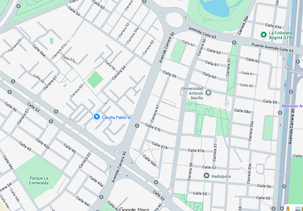
San Francisco: A world-class transit map unveiled

A few years ago we assisted San Francisco Municipal Transportation Agency in rethinking how they talk about the various services they operate.  Our key idea was to classify services by tiers of frequency, while also distinguishing, at the highest frequency only, between faster and slower services.  In extensive workshops with staff, we helped the agency think through these categories and the names to be used for them.

It's great to see the result coming out on the street.  The old-fashioned term "limited," for example, been replaced by "Rapid," a new brand that emphasizes speed and reliability improvements as well as frequency and widely spaced stops.  

But the biggest news is that a new network map, by Jay Primus and David Wiggins, is about to debut.   Don't open it yet!!  Before you do, look at it in a fuzzy small image:

Muni_map_2015

Notice how much information you can get just from this fuzzy picture.  Most transit maps are total nonsense at this resolution, but in this one, even though you can't even see the legend, you can see the structure.  All you need to know is that bigger, brigher lines are more useful lines, because they tend to be faster or more frequent.  In other words, this works just like any coherent street or map (paper or online) in which the faster roads are more visually prominent.  Any good map is legible at multiple levels of attention, including very zoomed out like this, and in loving detail of every right and left, which you'll also admire if you zoom into the massive PDF.

Why has it taken so long for transit maps to get this clear?  Well, first of all, you have to figure out that frequency, not speed, is the primary equivalent of speed in a highway map.  Highways and streets can all be ranked by their design speed, but in transit, frequency trumps speed in determining most kinds of utility, and speed distinctions matter most where frequency is already high.

(The exception, high speed but low frequency service, tends to be commuter rail and commuter express bus service.  That service is so intrinsically specialized and complex that it makes a complete mess if you put it on the map with the all-day frequent routes.  These ephemeral routes must be faded out; on this new map they are the weakest lines of all.  The previous map was chaotic precisely because it used the strongest color — red — for these most specialized and ephemeral services, concealing the structure of interdependent service that is running all the time and that vastly more people will use.)

What are the other barriers to maps of this clarity?  Well, you have to decide whether your goal is information (helping people understand their options) or marketing (which at its worst means deliberately confusing people so that they do you want them to do).   I have always argued that in transit, clear and beautiful information is the best marketing, but many professional marketers disagree.  

This map is glorious because it's 100% information.  Services aren't highlighted because someone thinks that they serve "target markets" or "more important demographics", for example.  Everything is mapped, and named, according to its potential usefulness to anyone.  The more diverse the range of people who'll find a service useful, the brighter the line is.

Of course, it doesn't show everything, but that's also why it's clear.  I'm sure I will be bombarded with comments pointing out that they don't show how San Francisco's network connects to the wider region's, and that they don't show how transit integrates with cycling, walking, private transit, Segways, and whatever else.  Including too much non-transit information is also a great way to make transit maps confusing.  This map is just what it is, a map of San Francisco's fixed route transit network.  It's also, in my experience, one of the best in the world, something even the world's best transit systems could learn from.  

How do I find a hotel near good transit? Not (yet) via google!

A recent post discussed Jeff Howard's hotels near transit maps suggested looking at Google Hotel Finder, a utility tucked away within Google Maps that purports to help you find a hotel based on travel time from some location. A user plops a pin on the map, and the tool draws isochrones based on drive, transit, and walk times, which supposedly show you the area of the city where hotels are within that travel time of your destination.

Screen Shot 2015-03-02 at 11.35.06 AM

So far, so good – I put a pin in downtown Portland, and Hotel Finder shows me a big blob in the center of the city that I can get to by transit within 15 minutes. It looks like there will be lots of hotels I can choose where I can quickly take transit into downtown. However, when we look a bit more closely, we can see a big problem with Google's approach.

Screen Shot 2015-03-02 at 11.34.53 AM

In this image, I have moved the pin to a corner near Reed College in Southeast Portland. This is a residential area bordering a low-density industrial district and the campus and fields of a small, exclusive liberal arts college. It is served by just one bus route, the 10-Harold, every 30 minutes. Yet according to Google, from this location, I'm just a short 15-minute trip from outer East Portland, or the inner Eastside Industrial District.

The problem here is that Google is providing an isochrone of transit access that does not consider frequency, i.e waiting time.  They assume that the bus shows up right when you need it..  

Once I'm on the Harold bus, it's true that I might be able to take it from 28th far out into the east side in just 15 minutes. But depending upon when I arrived at the stop, I could wind up spending up to 45 minutes making the trip. If we assume an average wait of 15 minutes, or half the headway, the area shown by Google as within 15 minutes of the pin is actually more like 30 minutes!

Imagine you are a person who is coming to a city for business, and you picked a hotel expecting to be able to travel to your meeting by transit in just 15 minutes. Yet when you walk out to the stop, or check a trip planing app, you find that you will wait longer than that just to catch the next bus! You might be late to your meeting, and the tool you used to pick the hotel would have failed to direct you to accommodations that met your desire to be a short transit trip from work.

A more useful version of Hotel Finder would add waiting time. This would alter the isochrone in response to frequency, and more accurately show the area (and hotels) within a short transit trip of the desired location. 

We are surprised to see this kind of misleading info from the crack team at Google Transit.  In presenting transit travel times that don't consider waiting, they are talking about transit as though it worked just like cars, doing a disservice to everyone who wants to consider transit when the choose a location.

How do I find a hotel near good transit?

Map_of_hotels_near_washington_dc_metroHere's news you can use, or at least news I can use as an absurdly frequent flyer.  

All of the standard travel shopping sites make it very hard to assess the transit options from a hotel's location.  At most they have distances and sometimes car travel times.  So I often spend too long doing research, and pay too much for a hotel close to my destination when I might easily have stayed further away more cheaply if I knew good transit was there.

This, therefore, is a really good tool.  In the case of Washington DC, it helps you see all the hotels that are close (objectively close, not hotel-marketing-close) to a subway station.  It's the work of Jeff Howard, and he's also done one for Atlanta's MARTA subway.

You can get hints of similar output from Google, very crudely, by pointing Google Maps at a city and then specifying, say, "hotels near a DC Metro station," but Google is easily confused by excessively clear requests, and to Google, "near" means car-near, not transit-near.  Someday, maybe Google will understand "hotel within 400m of a frequent transit stop," or even "hotel within 30 min frequent transit travel time from ___".  But that's clearly a way off, and Google often seems more interested in interpreting vague search requests than replying to clearly stated ones.

In any case, even a competent search engine wouldn't produce Jeff Howard's very useful feedback about hotels.  Click on a station and there's a writeup about each station area, including a map showing the hotel's exact relationship to the station, and links to the hotels themselves, including a reservation widget.  Nice work, Jeff!


defending new york’s subway from british sneers

Guardian journalist Bim Adewunmi recently traveled from London to New York and slammed the subway as compared to her beloved Underground.  The blowback has been delightful.  She seemed especially angry about the information system that isn't exactly what Transport for London would do.

The city’s subway map is dense and needlessly complex. Where in London the Central line (red) is distinct from the Piccadilly (dark blue), which is markedly different from the Hammersmith and City line (pink), New York’s map has designated the same forest green to the 4, the 5 and the 6 lines. The B, D, F and M all rejoice in exactly the same shade of violent orange. … Why would you do this? The whole thing resembles a child’s approximation of a city transit system: it makes no sense.

She's talking about branching lines.  If she were from Paris, whose elegant Métro is nearly branchless, she'd have a point.  But what a comment for someone from London!

In New York's map, the common color helps you navigate the core part of a line while the numbers or letters help you sort out the branches.  This is a very common way of making branching lines clear.  Meanwhile, in London, where transit is presumably designed by sober adults, we have this:

Northern Line map

No 4, 5, and 6 to confuse you!   No, just a beast called the Northern Line even though it's both northerly and southerly, consisting of two entirely different lines through the central city.  Is there a direct train from Waterloo to Mill Hill East?  How would I know? As Clive's Underground Guide helpfully explains:  "The pattern of service … tends to change with each new issue of the timetable."  

You see, Bim, Americans like maps and nomenclature systems that actually indicate where their train will go!   In London I'm sure you just somehow just know what the next Northern Line train might be up to.  But all that aristocratic just knowing that you Brits do is exactly why you lost your Empire!  

😉

email of the week: googling your freedom

From Jeffrey Bridgman:

Google maps is showing me my freedom to stay a bit more and chat now.

It says that this route runs every 15 minutes from 5am to 11:30pm, which means if I get talking with someone, I don't care that I'm missing the 8:27pm bus since there'll be another one in about 15 minutes. That's a great improvement from the "Catch the next bus at 8:27" directions it used to tell you.
Good-transit-directions
 
 
I think we're just seeing the beginning of this.  We don't just want directions, we want options!


how google (or you) could change the game

Google could transform how many people experience transit in about 15 minutes.  Well, maybe a few days.  They have the tools to do something that's a big effort for the transit agencies: Frequent Network maps.  

But in fact, any app-maker could do it too.

Nate Wessel's guest post, on why trip planners can never replace or substitute for maps, gives us the clue. 

Spokane sliceFor the last three years, this blog has been preoccupied with the visualization of frequency. Frequency is freedom.  Reducing the wait is the essence of what makes transit resemble the freedom we associate with cars, and it's also crucial to allowing multiple lines to function as a network. 

As this comes to be better understood, the concept of frequent network mapping is gradually spreading through the transit industry.  I first made the case here, and explored some details here.  The idea is spreading.  If you don't believe me, just explore this blog's Frequent Networks category (let me know if you encounter other examples I should feature).  

Frequent lines are so special — as the network useful to busy people who can't build their lives around a timetable — that they need to stand out.  If you haven't seen a map of the Frequent Network in your city, I contend that you really don't understand how your transit system works.  As I argue at the links above, frequent network mapping can be transformative in helping people understand how a transit system actually functions, and why frequency is worth caring about.

As Nate argues, and as I argued a few years ago, no trip planner will ever substitute for maps. What's more, no map of a single trip we care about will substitute for a map that actually shows you the network, just as most of us need to see maps of our city.  The Frequent Network is especially crucial to see, and not just for the general public.  Powerful people form ideas about transit from looking at maps, and if they can't see frequency, they are being misled about how the network works.

Still, it takes time for ideas to penetrate a transit bureaucracy.  Google, though, could do it tomorrow, by just setting up a little interface that reads midday frequencies out of the timetable data they already have, and draws a Frequent Network map.  OK, quick automated mapping is often ugly.   It might take a few weeks to make it beautiful.  You might also want to give the user control of the frequency threshold.  Service every 15 minutes is frequent in Phoenix but not in San Francisco.

Actually, it doesn't even need Google.  Given public GTFS feeds, anybody can build this app, right?

Imagine arriving in an unfamiliar city and wanting to see where you can get to easily on transit.  Or imagining thinking about a location decision, and wanting to make sure there's frequent service there, going to the places you go.  Simplistic tools like WalkScore's Transit Score won't help you!  You need to see the network yourself.  

Imagine that the resulting map is so useful that it comes to replace the convoluted transit information in most travel guides, which can't do much more than draw a map of a subway system, or give you a bunch of phone numbers if there isn't one.  Tourists, too, don't like waiting long.

What am I missing.  If this makes sense, give me some credit for the idea, and take it away.

guest post: nate wessel on why google transit will never be enough for small to medium-sized systems

Nate Wessel lives in Cincinnati, Ohio where for the last few years he's been working to improve public understanding of the local transit system. In 2011 he designed and published his own map of the system  and he now writes the Cincinnati Transit Blog. Nate has a degree in urban planning from the University of Cincinnati from where he graduated this past June.


I've heard quite a few times that Google Transit and similar technologies have made hand-rendered transit maps outdated. Being myself a maker of hand-made, tangible maps and having spent the last couple of years physically working with a lot of maps, I find myself with a bit of a gut reaction to this common claim.  It's more than just a reaction to an existential threat though. My reaction is to an idea that would toss the baby out with the bathwater. Not only are lovingly created, tangible transit maps incredibly valuable to our understanding of the cities we live in, they're essential to the widespread use of transit. We'll need to go back to basics.

What do maps do? What are maps? Why are they?

Maps are like Cliffs-Notes for the physical world. We don't have time to read the whole book but we still need to get an idea what it's about before the test. You'll probably never manage to explore the entirety of one mid-size city let alone a country or the whole world. Yet we still want to see what's out there, where we could go if we wanted to and what we'd find when we got there. Understanding the shape and nature of the whole world or even one city through direct physical experience is a practical impossibility.

We all need an understanding of the world beyond our fingertips; that's absolutely essential to modern human existence. It's why we have novels, to pick one example. A story from another life lets us share an experience we haven't yet had and perhaps never will. It lets us plumb the depths (and heights) of our own emotions and thoughts by momentarily opening ourselves up to the author's. We don't necessarily have to go there ourselves to learn something of love or sorrow(or downtown). Our innate curiosity pulls us to see what's possible in the world and within ourselves.

The same goes for everything on TV, in print, and many things on the internet. Most media lets us reach beyond our own personal experience to learn something of the world we can't see directly. We absolutely need these things. They give us an understanding of the broader world and let us contextualize our own existence. They show us what's normal, and more importantly what's possible for ourselves; where we can go and what we can do. Kids can't dream of being astronauts if they've never heard of one. We can't speak seriously of knights in shining armour and chivalry and honor and of other deeply interesting ideas until we've read of their existence and felt something of it ourselves. In exactly the same way maps show us what's possible in the physical world. They tell us that Spain is a place in Europe, that Queens is connected to Manhattan by subways and bridges, and that it's not similarly connected to Britain. We can't think of taking transit until we know what transit does and doesn't.

The other critical thing maps (and some other media)do is provide us with answers to specific questions. These might be:

  • "Which line can I take to Queens?"
  • "Are there coffee shops within walking distance of my current location?"
  • "Exactly how much will the bus cost?"

Filling this need for specific information is in part why the encyclopedia was so revolutionary during the Renaissance and why the internet can be so powerful today. The amount of precise information available to people is just exploding. The age of science and empiricism has given us the idea of bulk 'information' as something that can succinctly and precisely answer an isolated question. "Where is the nearest bike shop?" We now keep stock of them in a Google database that can return the answer in milliseconds. Often you can ask the most esoteric questions of the Internet and find a succinct and satisfying answer in less than a minute. That's stupendously useful for travellers and college students with deadlines.

So maps (and other media generally) have two big functions: First to inform broadly and second to answer specifically. The informative function must necessarily precede the precise answering function. We need to know what's generally possible before we can know what exactly to ask. We need to know that transit is even an option before we can ask how exactly to use it.

Answering specific questions with specific answers is what Google Transit does well. Here's how it works:

  • You tell Google Transit your location and exactly where you want to go.
  • You tell it when you want to go there(usually now).
  • It decides exactly the fastest way to do it, with perhaps a second option if it's a close call.
  • It puts this exact path on a map and narrates directions like "turn left" or "wait here".

In many circumstances, this is quite useful. Many people, if they're taking a one-time trip to somewhere they don't normally go, will just want a quick answer; if the trip is possible, a computerized map can tell them exactly how to get there and exactly how to get back. That's often a very handy thing.

But Google Transit totally misses the first function of maps: informing us about the world, sating our curiosity, and showing us the possible. Google transit doesn't tell us anything about where transit goes generally. It makes us ask questions like "how do I get from exactly  here to exactly there right now?"

Without a basic understanding of what's possible it's left to hope that "here" is a decent place to start and that "there" is even a realistic possibility. Downtown Cincinnati for example has transit operating on just about every street, but you can't even spot it in the Google Transit interface before inquiring about a specific trip.

Downtown_cincinnati

When we ask questions without knowing that a reasonable answer even exists, we're sometimes confronted with answers like "no results" or "there's one trip three days from now at 3:29am". Without a broader understanding of how the whole thing works, we don't know what to ask or if the answer we got doesn't sound right. Worse, when we get these disappointing answers to the wrong questions, we get confused and frustrated. Transit users need more guidance than "not possible" or "how about Tuesday?"give us. Also, some specific answers that serve us well for the moment will be misleading in the future. Here for example…

19_Suggested

…Google Transit suggests we take the #19 northward, but says nothing of the invisible #17 that runs parallel to it at more than twice the frequency. You can easily imagine someone who's once looked up their route on Google Transit regularly letting a #17 pass by while they wait for a #19 and complain about headways. Similar situations must happen a thousand times a day.

Exploring a transit system with Google Transit is like blind men trying to understand an elephant by touch. This part is thick, this part is bumpy, we don't know how any of the parts attach to each other, and the whole thing is constantly, inexplicably moving. A thoughtfully hand-rendered transit map tells us what the elephant really is. It doesn't go into detail about the dimensions of it's toenails, but tells us of it's overall size, shape and temperament. It tells us that you might be able to ride the thing and that you probably don't want to try poking it with a sharp stick. Once we know these basics we can begin to ask exactly what the trunk is for.

That's why hand-rendered system maps continue to be completely relevant in the heyday of the computer. A map like that of DC's Metro tells us more about the city and how to use the transit system than any GTFS feed ever could on it's own.

<Wmata

A hand-rendered map must necessarily simplify a system, showing only some lines and only some landmarks. To do so it makes value judgements, something a computer has never yet been capable of. It does most of the hard work of understanding for us because a map-maker must understand the transit system before he can make a map of it; it's not just a matter of dumping all the routes into a GIS program. That deeper understanding of the transit system is an experience most people don't yet have and it's exactly what they're looking for when they explore a system map. Similarly, when they explore a novel they may be looking for a deeper understanding of the human condition, history, or their own lives. In either case, they're most essentially looking for their possibilities. "What is there?" "What is within my reach?" What is possible for me?

It seems like most big American cities put these questions, at least so far as transit is concerned, largely to rest decades ago with their famous metro maps but that many small and mid-sized cities, particularly those that primarily use buses, provide little if any coherent, holistic map of how their system operates. They often seem content with either no system maps at all or only topographically accurate maps that de-emphasise and confuse the areas that can benefit from transit the most: those that are dense and well served by multiple lines.

Cincinnati_Topographical_Map

Dense areas by definition get less space than their human value warrants on a topographically accurate map. Every famous transit map, whether it's DC's or New York's or London's does just the opposite; exploding dense, important areas like Downtown Manhattan and condensing suburban service. They do this not only because that makes them easier to draw, but because that emphasis on the dense is typically the actual emphasis of the transit system itself. A map that embodies the logic of a transit system is one that tells us most truly how the system works and most basically what we can do with it. We need something of that understanding before Google Transit can work well. We need to know what the elephant is.

But that deep understanding of a transit system and of a city is so different for each system that no computer program could ever yet describe every system well.  Google maps can't yet do it. It's something that just can't be automated.

Google Transit can give us the answers but it can't give us the questions. And that's why it will never be enough for a transit agency to publish schedules to Google Transit without also publishing a substantial and thoughtfully developed system map made by people who are more than passingly familiar with the transit system and with the city.


branding individual routes: too many colors, or the gold standard of legibility?

 What might we learn from this bus? (click to enlarge)


Inner_Link_bus_in_Auckland crop

Inner Link is one of four Auckland bus lines — all very frequent and designed to be useful for a wide range of trips — that have buses painted specifically for the purpose.  The other three are Outer Link (orange), City Link (red), and Northern Express (black).  In each case, the paint job is all about making it look easy to hop on.  Note that the bus assures you of the maximum fare you'll pay, and that the list of destinations along the top of the bus gives confidence about exactly where this bus will take you.  (For an Aucklander, these names are all familiar landmarks, so anyone can mentally string them together into a general sense of route.)  

It's important, too, that this is one of Auckland's newer buses.  The big, clear windows are important.  In fact, if it weren't for the maddening bus wrap, this bus would be entirely transparent, so that you could see the people on board and even make out the city beyond it.  This bus arises from European designs that are intentionally gentle on the eye, and whose transparency starts to undermine complaints about a "wall of buses."

When I first saw the branding of these buses in Auckland, I found them irritating.  These buses were announcing simple, legible, frequent routes in a way that marketed them effectively enough, but did nothing to convey that they are part of a larger network of services designed to work together.  Of course, the reality of today's network in Auckland (unlike the one Auckland Transport has in the works) is that it is a confusing tangle of infrequent and overlapping services that is almost impossible to make clear.  [PDF]  

Akl chaos map sample

In the context of all that chaos, you needed these strong route-level brands like Inner Link to stand out as something useful.   And now that we plan to create over 20 bus routes that are as clear and legible as this one, the question arises, should we continue to brand them this way, each one separately, perhaps in a lively diversity of colors from goldenrod to teal?

Compare this to what Los Angeles Metro did, dividing its fleet of 1000+ buses mostly into just two colors, red for Rapid and orange for Local.  This has helped everyone see the faster Metro Rapid buses, but how much more might be achieved if you could paint a bus with both icons and information that would celebrate its role as, say, the Venice Blvd. Rapid?

The marketing and legibility question, of course is:  Would the diversity of looks (perhaps in the context of shared design elements that mean "Rapid") make the system look simpler or more complicated?  In Los Angeles I'm not sure.  In Auckland, where the system as a whole could hardly look more complicated than it does today, the call seems easier.  

The issue for operations is the risk of fleet diversity.  In almost any transit agency, the operations folks will tell you they need maximum flexibility to deploy any bus on any route.  In some big-city agencies I've worked with, operating bases ("depots" in British) store buses in long stacks, where buses can be sent out only in the sequence that they came in the previous night.  Every new factor of fleet specialization becomes a new threat to getting the right bus on the right route every morning — an admittedly heroic effort if you've toured some of the grimmer, overcrowded facilities involved.

So a separate color for every route would be a non-starter in most of North America.  Yet if we designed operating bases so that you could access any bus, or even could just have much shorter stacks, it's not obviously outrageous.  For each route, you'd paint enough buses to run just 80-100% of the midday fleet requirement.  You'd never have more painted buses than you could use.  You'd also have a supply of generic buses that could be added to any route, either as replacements for buses in the shop or as supplemental peak service.  And you'd only do this for routes with high all-day frequency seven days a week and relatively little additional service added at peaks.

In certain contexts — especially in a case like Auckland where the whole city must learn a new story about the usefulness of buses — it might make sense.  Even if we end up with goldenrod and teal.