We’re excited to share the next stage in our work in Great Cleveland, where the transit agency, GCRTA, has hired us to help think through their goals and different ways that their transit network can be designed to meet these goals in the next few years, and to help imagine what the possibilities may be with modest increase in operating funds in the future. For our readers in Cleveland, our last system redesign survey on is now open. Learn more about the networks and let us know what you think!
In May of this year, we made a post about two budget-neutral alternative networks that illustrate what the transit network could look like if the agency shifted its focus more towards attracting higher ridership, and what the network would look like if shifted towards maximizing coverage. You can find out more about these alternatives here.
We surveyed the public on these alternatives, and RTA conducted a series of public meetings throughout the county. The result of the public process suggested that many people saw the value of the frequency improvements of the High Frequency Alternative, but that most people would not be in favor of a reduction in coverage to achieve the frequency improvements.
Based on this input, we worked with RTA staff to design two network concepts that illustrate how the network could look if it were designed with a slightly greater emphasis on generating high ridership, but without reducing the overall coverage area from today. These networks illustrate for the stakeholders and the agency’s Board of Trustees the potential outcomes of this policy choice using only today’s funding levels and illustrate what sort of network those same design priorities could produce with additional funding for bus service.
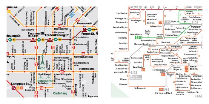
You can click each map below to explore a larger annotated version.
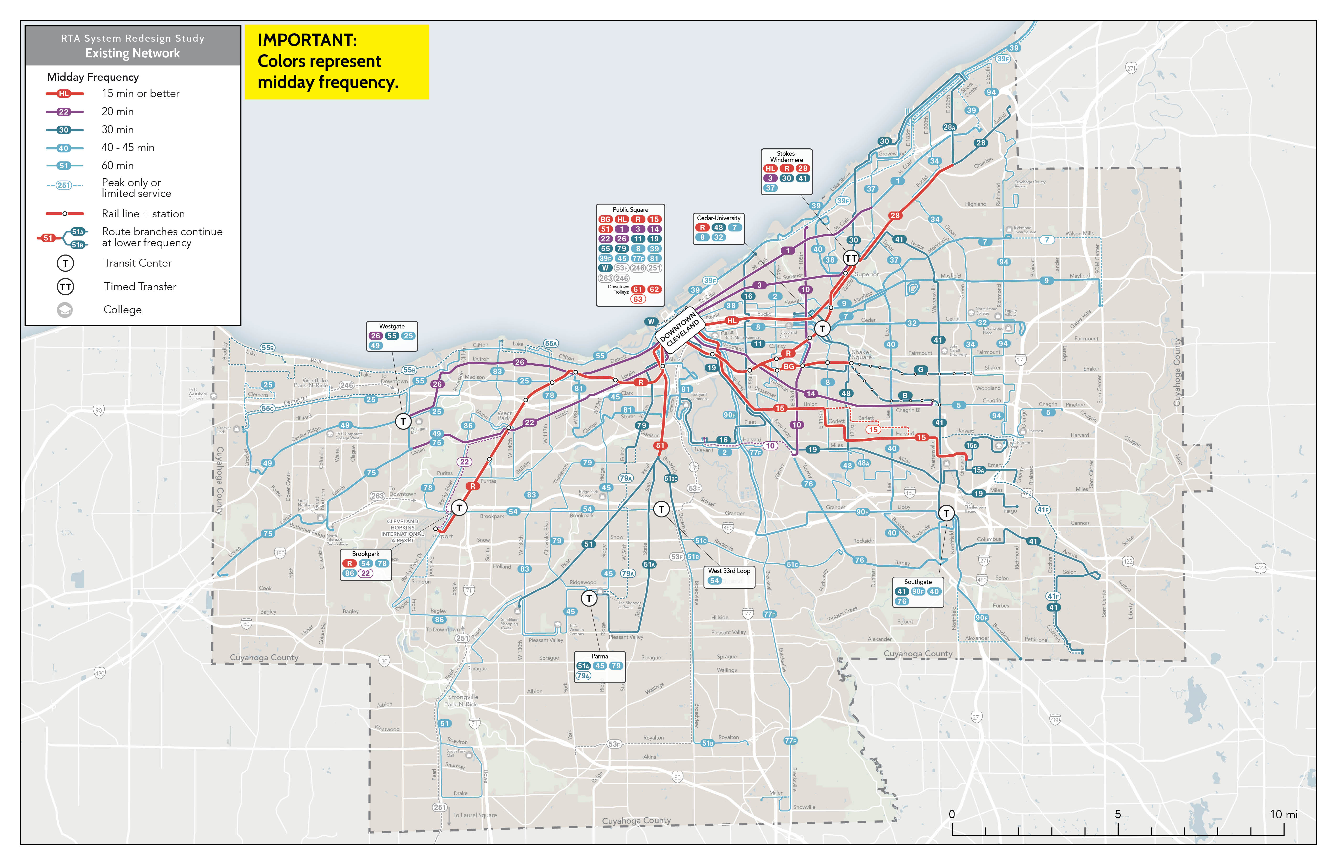
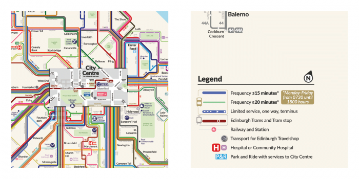
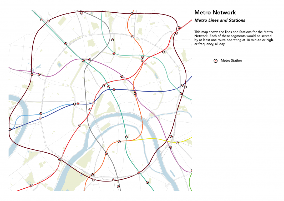
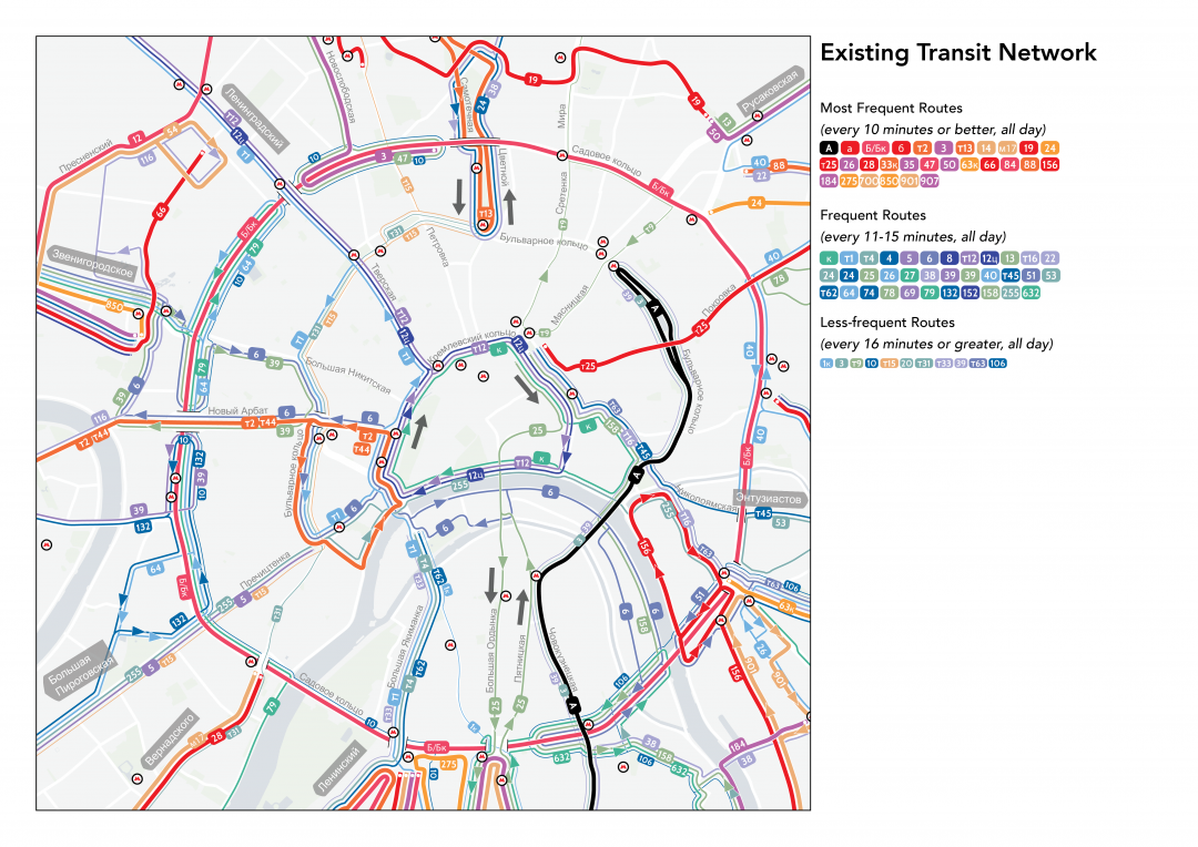
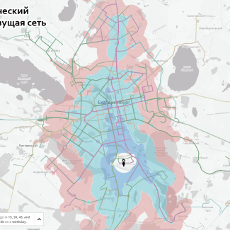
RTA Existing Network
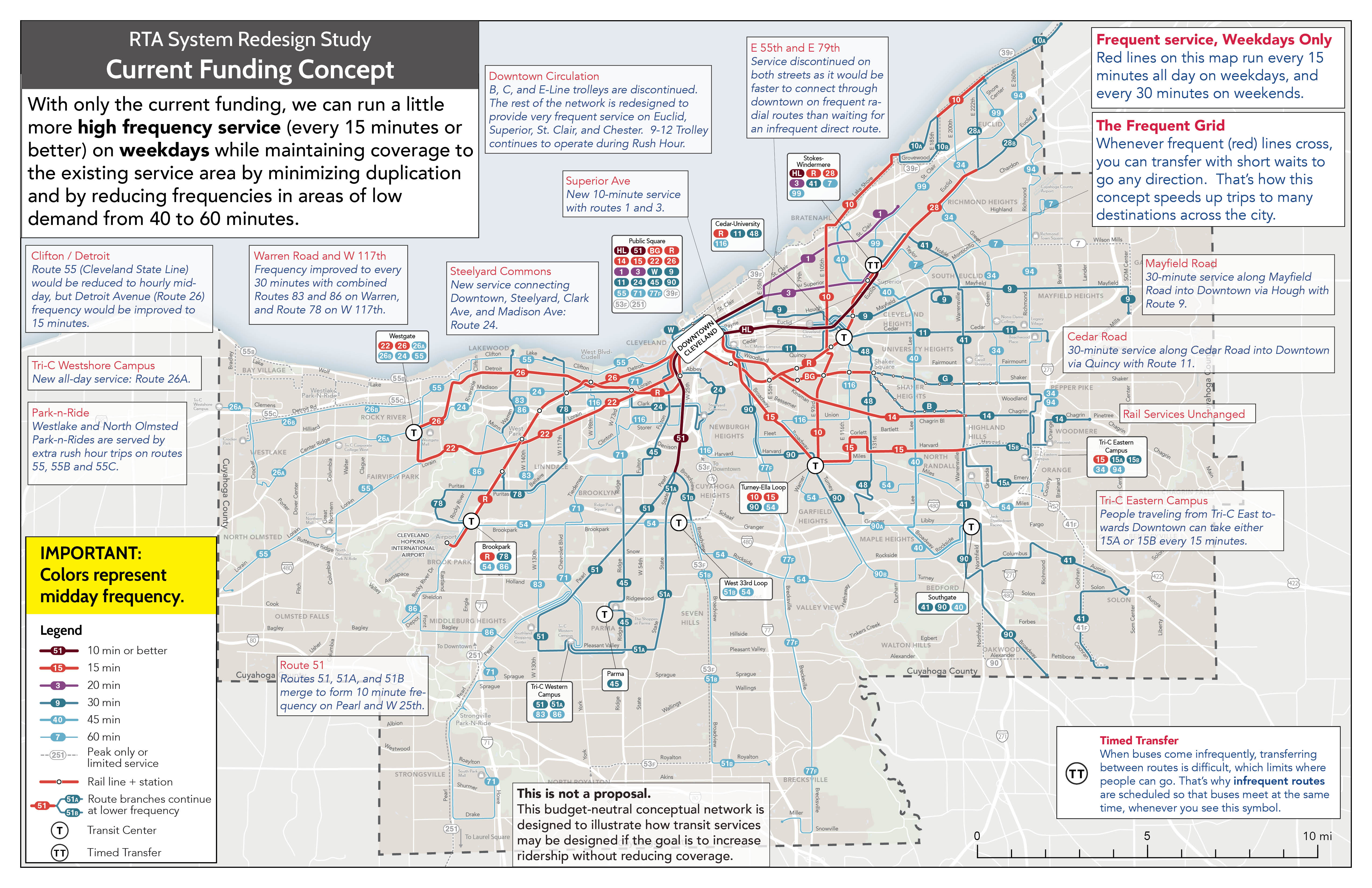
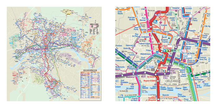
Current Funding Concept
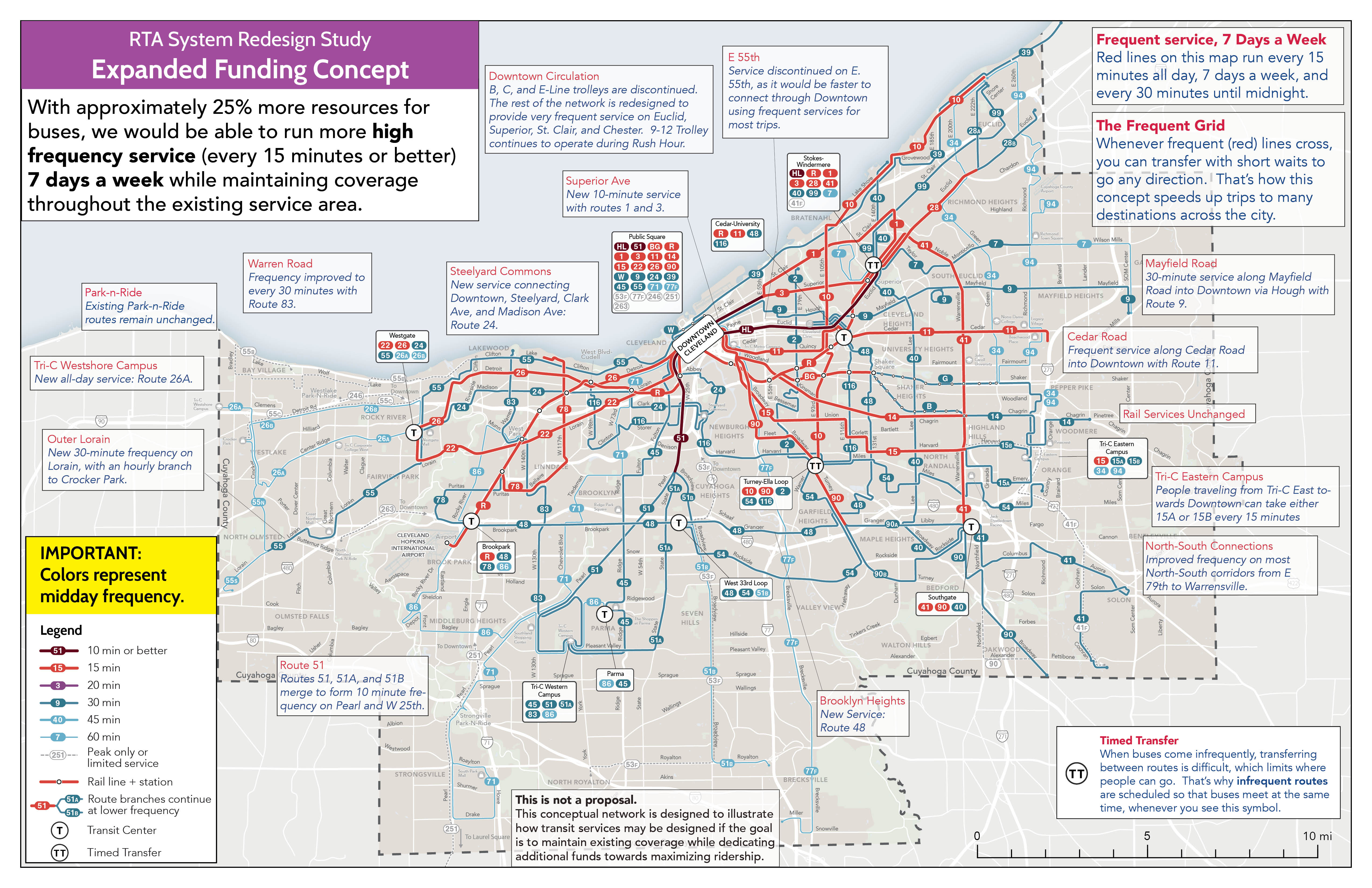
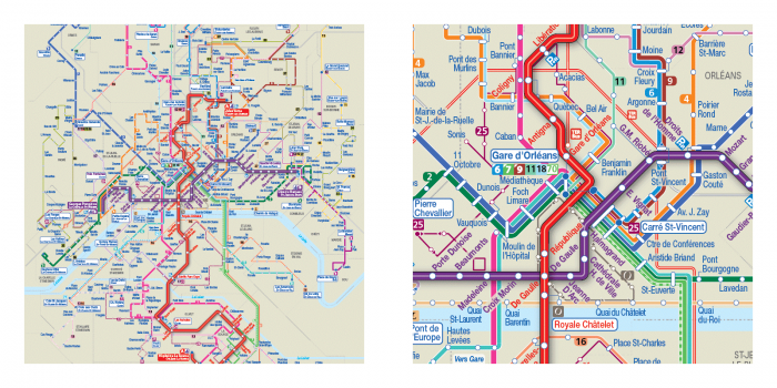
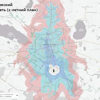
Expanded Funding Concept
Remember, ridership and coverage and the opposite ends of the same spectrum so at the same funding level and without reducing coverage areas, opportunities to add ridership-focused service are very limited.
The Current Funding Concept tries to do this by minimizing duplication in the network, and by making some difficult tradeoffs about where to increase and reduce frequency. While everywhere that is served today would continue to have transit service with this concept, some lower-density places would see their frequency reduced (usually from every 45 minutes to every 60 minutes). Some key improvements include frequent service on busy corridors like Detroit, Lorain and Kinsman (all currently every 20 minutes), and frequent crosstown service on E 93rd and E 105th (Route 10).
These and other improvements are possible by reducing service levels elsewhere in the network. For example, the Center Ridge corridor on the west side of the county would be served every 60 minutes by a branch of Route 26 (which continues via Detroit towards downtown). Today, this corridor is today is served every 45 minutes, so this is a reduction in frequency, but it does come with the benefits of a one-seat ride downtown, and an extension to the new community college campus at the edge of the county (Tri-C Westshore).
Closer to downtown on the east side, low-frequency crosstown services on E 55th and E 79th would be discontinued with this design. Today, because of the crosstown routes’ low frequency and proximity to downtown, many trips along these corridors can be made more quickly by traveling in and back out along more frequent radial services (such as the HealthLine BRT, or routes 1 and 3). Yes, that would mean having to transfer, but as we’ve explained in a past post, “transferring” can be good!
These hard choices are characteristic of a no-growth redesign; in this case, the network was designed to improve ridership potential and expand the frequent network, within the constraint of maintaining the current coverage area.
The Expanded Funding Concept deploys about 25% more bus operating resources that today’s network. With this greater resource level, this concept can increase the usefulness of the transit network in almost every part of the county that is served. Some key improvements include frequent crosstown service on W 117th in the west and Warrensville Center in the east, and on key radials like St. Clair, Superior, Quincy and Cedar. 30-minute service would be provided on corridors like outer Lorain, W 130th, and Granger where only infrequent or no service is available today.
More Information
RTA is conducting a survey in English and Spanish and public meetings on these concepts now, so if you are in Cleveland, head on over to their website to find out more: http://riderta.com/systemdesign.
We’ve also put together an interactive webmap (similar to what we were able to deploy in Dublin in 2018) that you can use to explore the network and compare some travel time isochrones for each concept: https://rtanetworkconcepts.com/viewer/. In these maps, blue areas are newly reachable with the network concept, purple areas are reachable with both the existing network and the concept, and red areas are where you can travel with the existing network that is no longer reachable with the concept. You can also click the “View Routes” button to explore the network structure of each concept.
Here’s a quick comparison for the Tri-C Western campus showing the area that would be reachable in 60 minutes with the Expanded Funding Concept:
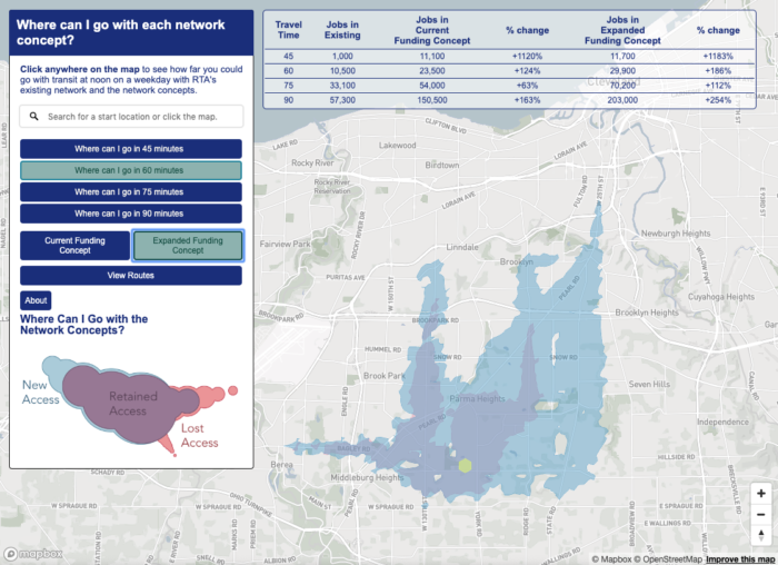
With the Expanded Funding Concept, 30-minute service would connect TriC’s western campus to the W 130th, Pearl, Ridge and State corridors. Since the campus is only served with hourly routes today, this produces a big expansion in the area reachable from the college (the blue area shown on the map).
Finally, much more detail is available in our mini-report, which you can view here: http://www.riderta.com/sites/default/files/events/RTASRSPresentation201909.pdf


 As more and more of the work of outreach and documentation of transit planning projects moves online, new opportunities have emerged to communicate the true impacts of these plans. Techniques first deployed by open-source software developers, stimulated by the ever-growing capability and adaptability of web mapping software and abundance of GTFS data, are now well-documented, established practices. We are constantly adapting these tools as part of our efforts to clearly explain the outcomes of such projects to the people who will be directly impacted by them.