Eight years ago, I experienced 10 seconds of Elon Musk’s attention. The occasion was my criticism of his idea, now being implemented by his Boring Company, that the future of urban transportation was cars running in tunnels — tunnels that he claimed to be able to build so cheaply that there would just no longer be any barrier to building as many as we might need. It was clear to me at once that this was a very low-capacity solution to a problem that required much higher capacity — the kind of capacity only provided by real public transit.
I have written several other articles on these themes over the years, many mentioning Musk as a technicolor example of common fallacies in tech industry thinking about urban transportation. In the new edition of my book Human Transit, I laid out a more thorough critique of the most developed example of the Boring Company vision, the “Vegas Loop” that serves the Las Vegas Convention Center and nearby hotels. It had just been approved for a large citywide expansion featuring over 60 stations. I had studied whatever I could find explaining the concept — which wasn’t much — and explained why I felt that a system that sort-of worked with four stations would be a fiasco with more than 60.
But I must admit that until last week, I hadn’t actually ridden it. Now I have.
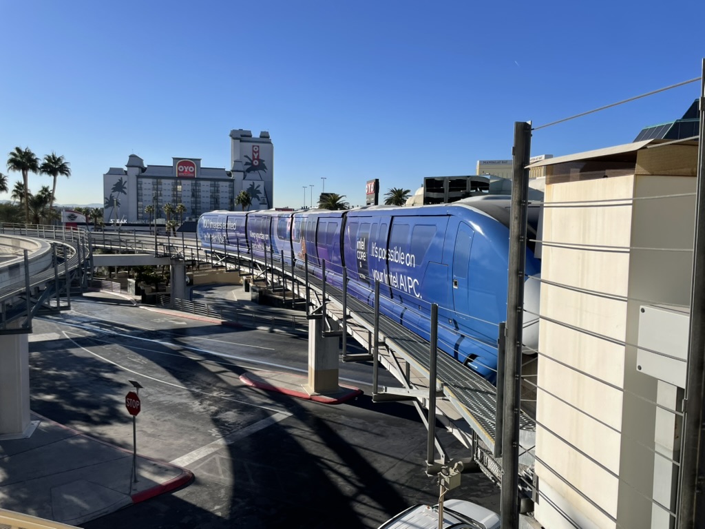
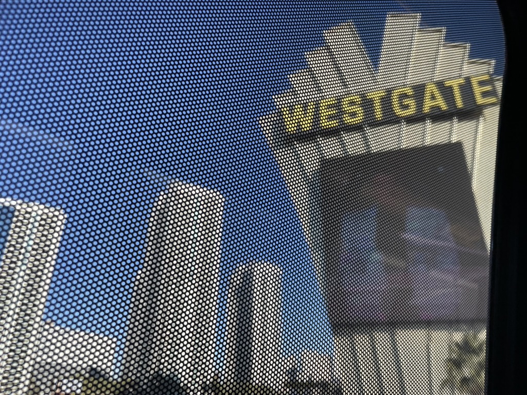
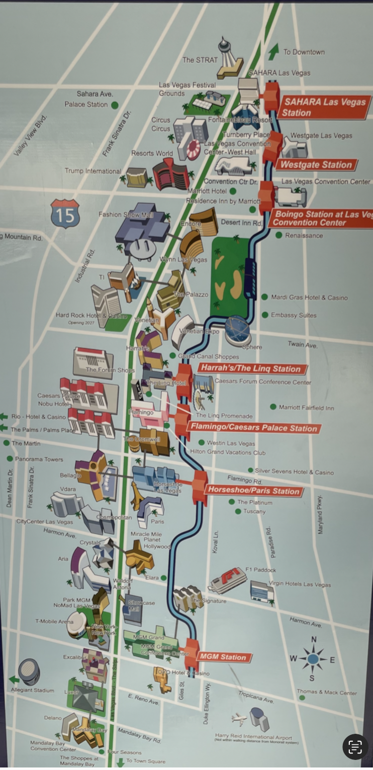
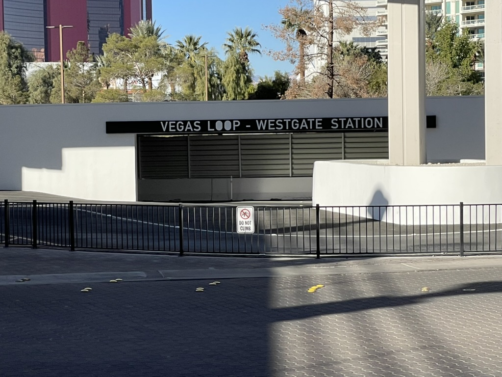
Last weekend I found myself in Las Vegas for my nephew’s wedding, and had a few hours to spare. So I did some walking, rode the monorail, and tried the Loop. Until recently, the service had been confined to stations within the Las Vegas Convention Center complex, and thus not always open to the public. But now there are two stations outside that complex, Westgate and Resorts World, so I rode from one to the other.
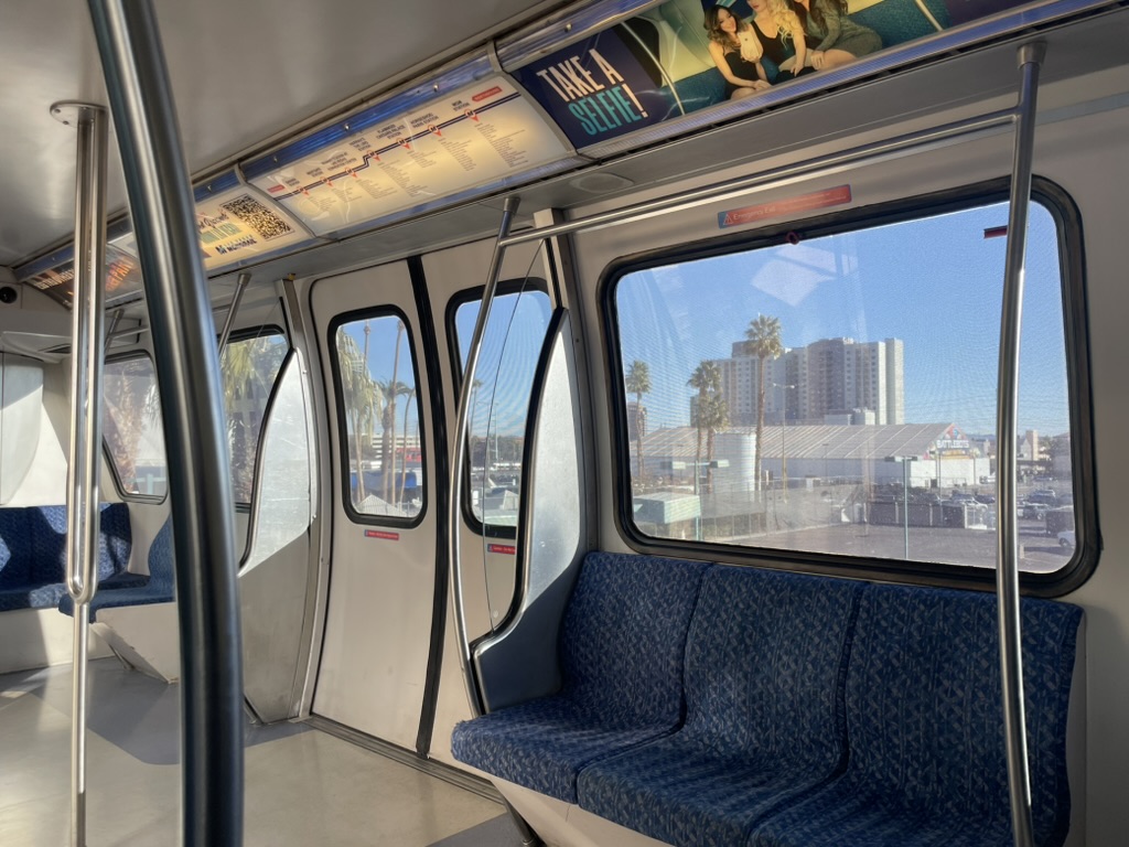
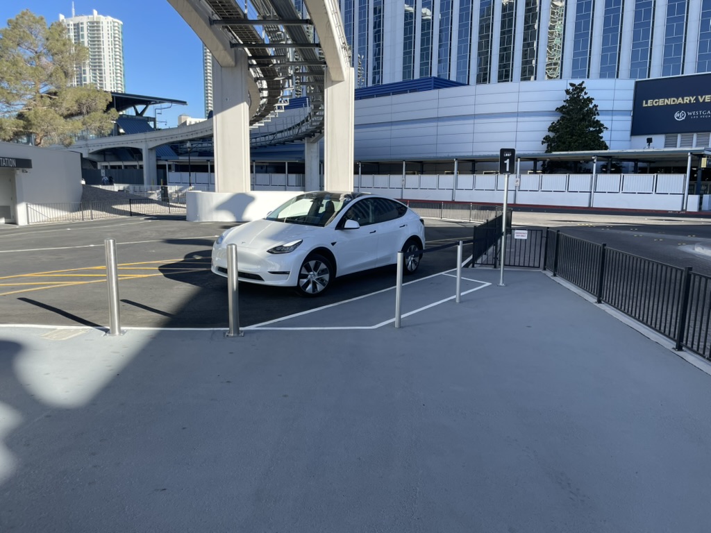
The monorail delivered me to Westgate station, where a short walk took me to the Westgate Loop station.
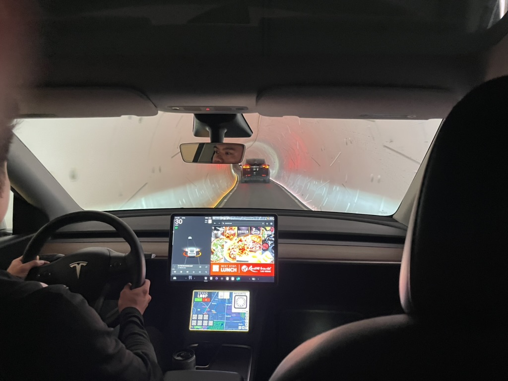
An attendant was there to help me pay my fare with a QR code, and pointed me to a car. It was about 9:30 on a Sunday morning, so I knew I wouldn’t be seeing the Loop’s alleged ability to handle big crowds. Instead, there was Tesla parked at the station, with a friendly driver. One odd detail is that he was parked on his left, so that I had to go into the roadway to board on the right. Other than that, it was exactly like boarding an Uber or Lyft Tesla, including the perennial difficulty of hooking up the seatbelt.
Once I was secured, we took off, driving slowly through the narrow tunnels. Two screens provided ample distraction, about half of it advertising.
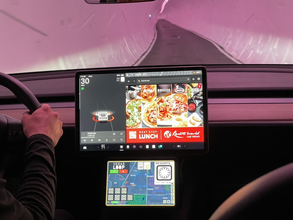
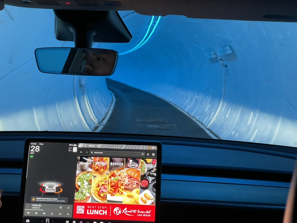
Famously, the colors of the lights in the tunnels change — as lights do all over Las Vegas. This was supposed to make it feel modern or fun. What I saw instead was the narrowness of the tunnel, barely wider than the car. I wondered about emergency exits.
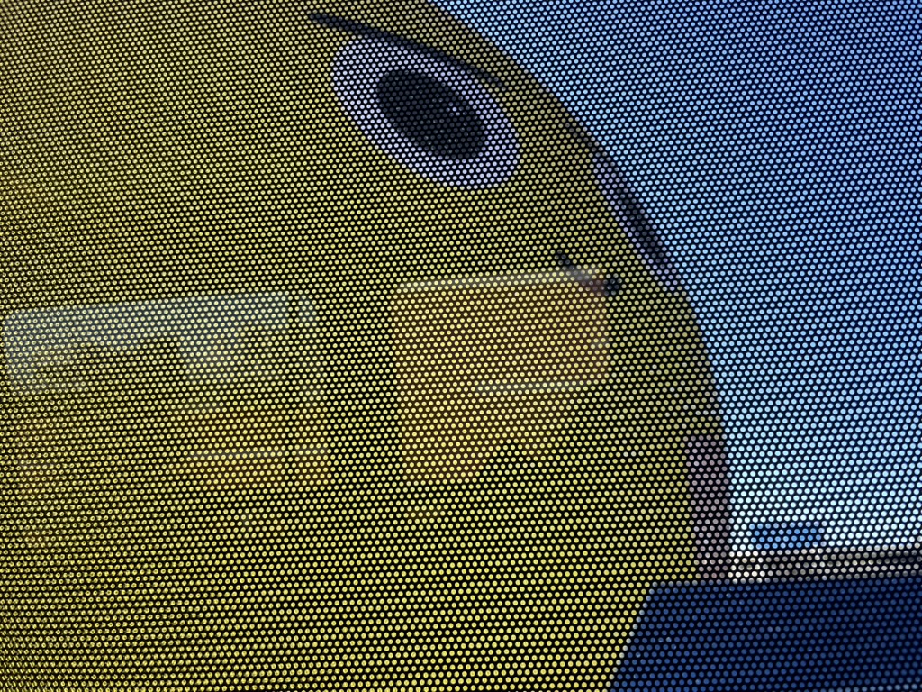
Finally, we arrived, queued behind one other car, at an underground intersection, with a standard red-and-white-striped barrier blocking our path. A man was standing around in a bright yellow jacket, much like the people you’ll see standing around in many kinds of transport infrastructure, not doing much but presumably ready to jump into action as needed.

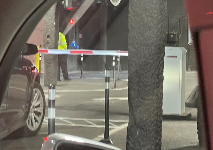
Looking to my right, the view partly obstructed by the screen’s reflection in the window, I saw we’d arrived at a complex underground intersection. There was a little booth for the man, as though he might be going to collect tolls. Except for the reflected screen, it all looked like infrastructure from 1970 or so.
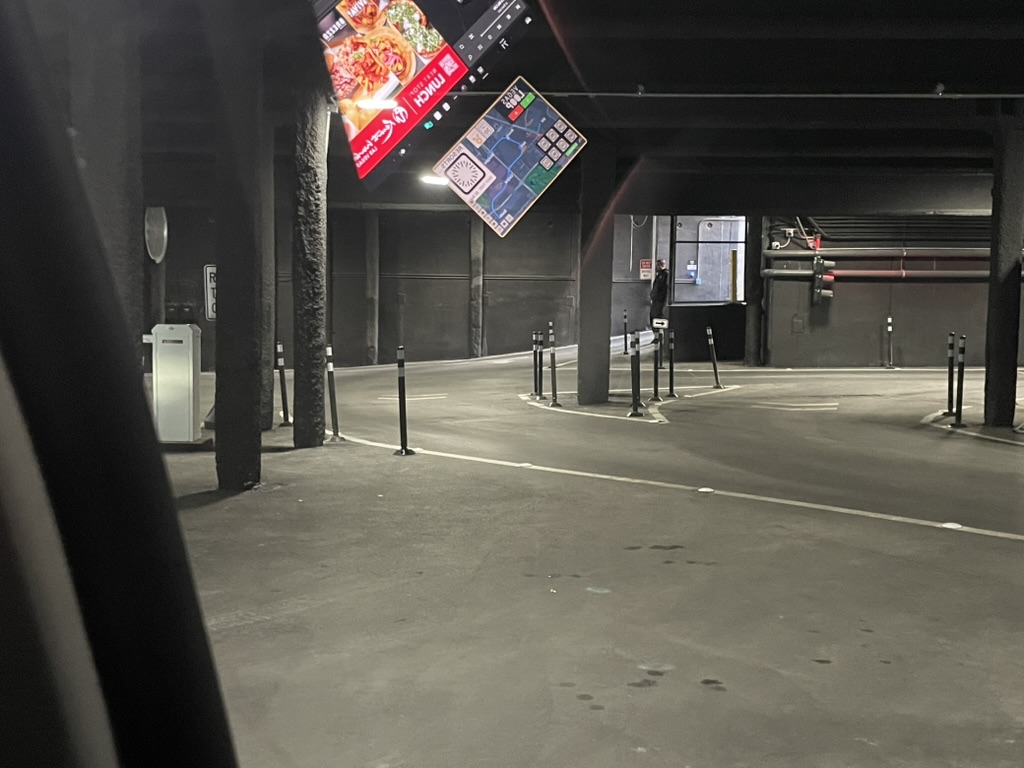
We waited here for over a minute, which happens sometimes in public transit but is very much not the Boring Company pitch. It appeared that the next bit of tunnel we needed to use was “single-track,” used by cars in both directions, so we had to wait for an oncoming car to come out of it. Then, our barrier lifted and we went on our way.
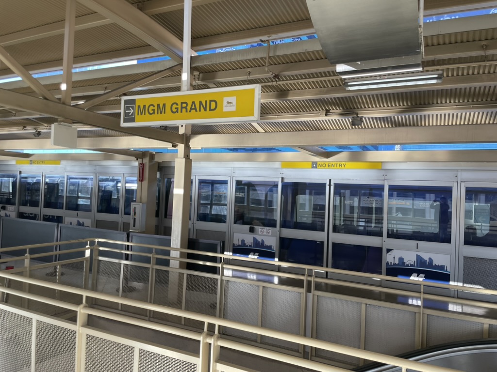
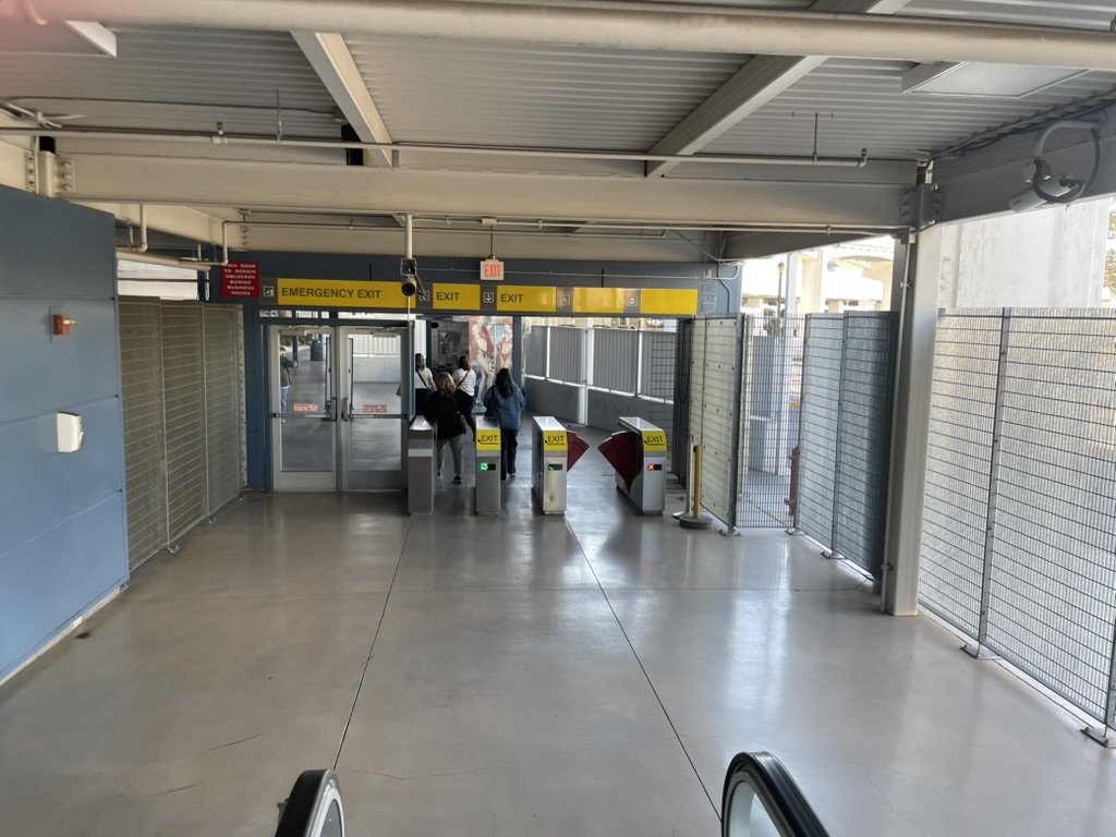
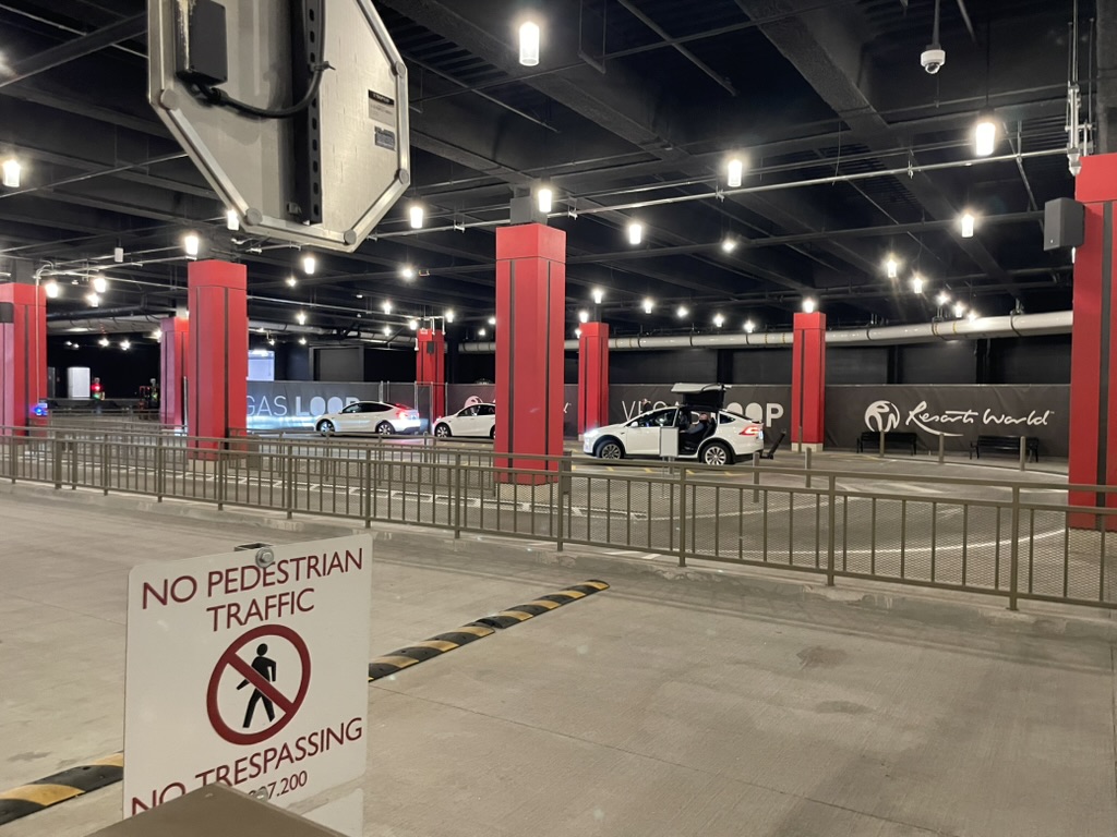
We arrived at our destination, a trip of about 4 minutes of which one was spent waiting at that intersection. This station, deep under Resorts World, had the same features: A QR code to pay the fare, an agent in a yellow jacket, and some people standing around.

Walking out, I gazed back at the station. It looks exactly like three Uber Teslas lined up at a curb in a parking structure, a space dominated by roadways that scream “keep out” to the pedestrian.
So, I tweeted:
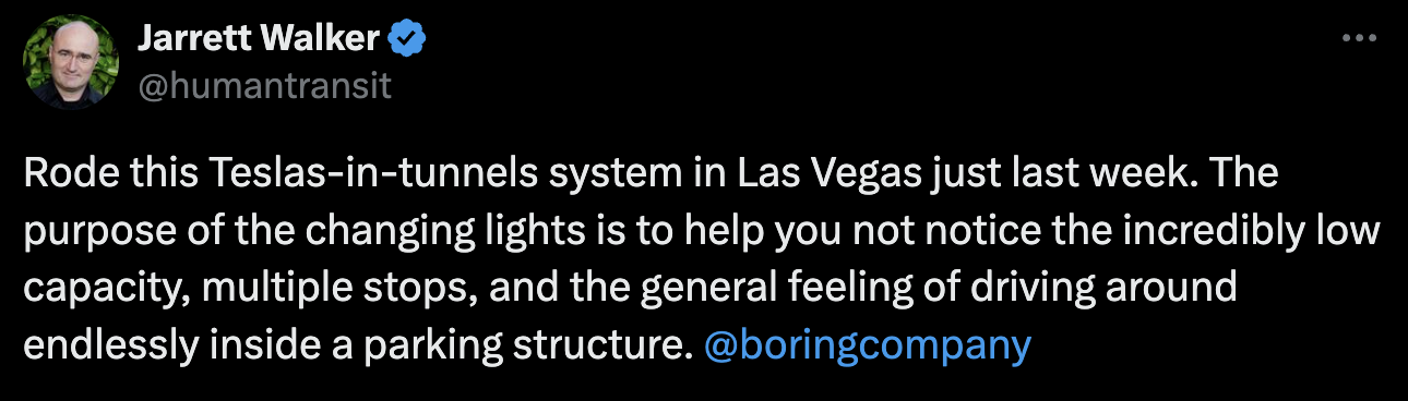
My most loyal reply-guy was right there in an instant.
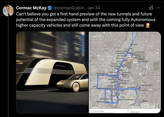
And this was the perfect reply to make my point! To a certain kind of tech fantasist, their vision is so self-justifying that the only people who would question it must be those who haven’t experienced it yet. This guy really thought that somehow, riding a Tesla through a tunnel (as opposed to reading and watching videos about it, which I’d done at length) would be a revelation that would overcome all my professional doubts about how such a low-capacity system could possibly scale. At the same time, he was sharing images of the much better Vegas Loop of the future, with an extended network and sexier driverless vehicles. This amounted to admitting that experience of the current demonstration project is not adequate to convey how cool this is, and how that coolness will supposedly someday get me to stop thinking about math.
Fortunately, there are a few journalists who share my skepticism about this project. ProPublica did a recent piece focused more on the project’s failure to keep up its agreements with local governments that allowed it to be built. They note that the big news event in May 2023, the Clark County Commission’s approval of the expansion plan, featured an opaque agenda item that didn’t even mention the Vegas Loop explicitly. More importantly, they note that the kind of justification document that would exist for any publicly funded project just doesn’t seem to exist. The Boring Company does not seem to want to show their math, either on their own website (where they should expect curious transport geeks to be looking) or in a submission to local government.
It’s remarkable to me that the Clark County Commission approved this, with the head of the convention bureau calling it “the only viable way” to manage traffic on the Las Vegas Strip. Obviously, if there are no other options, there’s no need for analysis, but every transport planner knows how absurd that is. Other options include:
- extending the monorail north to downtown and south to the airport, or
- building a proper rail subway (the most expensive option) or
- developing light rail or BRT on the surface of Las Vegas Blvd, taking 1/3 of the traffic capacity but carrying far more than 1/3 of the corridor’s person trips, so that traffic won’t get worse as a result. (San Francisco’s Van Ness Avenue, where this was done in 2022, is now a great proof-of-concept.)
Was it easy to say yes because the Boring Company wasn’t asking for public money? Certainly, but they are still taking something valuable: an enormous amount of underground real estate in public streets. This will have the effect of preventing a properly scaled subway from ever being built because its path will be blocked by this warren of too-small tunnels.
I don’t expect to influence the debate in Las Vegas from afar. The region has its own distinctive politics, and a particular notion about how to serve and entertain people that is unrelated to the principles of liberating urban transport. But like many, I do find it fascinating as a case study, one that other cities should think about.
If this technology escapes from Las Vegas and threatens a bigger, denser city, that will be a more critical battle. In 2022, Vox’s Avishay Artsy and Alissa Walker did a roundup of the state of action at the time, noting all the elected officials around the US who were expressing vague support for Boring Company projects. But they also noted that the company tends not to follow through when they encounter the typical legal and infrastructural complexities of almost any large city. Is some of this excessive regulation? Maybe, but some of it is just people demanding that before you build something this impactful, you should lay out the math, and answer questions, to prove it’s the best alternative. That’s all I’d be asking too.