Portland: Big Transit Service Changes in SW Hills

Here is a little deep dive into how bus network designers think, with an example from very close to (my) home.

Over the past year, our firm has been working with the Portland area transit agency, TriMet, on the “Forward Together” project, which developed a plan for the next several years of bus service improvements.  (The plan will eventually represent about 10% more service than the agency ran in 2019, but TriMet is still recovering from post-Covid workforce shortages, so it can’t do everything at once.)  The plan went through major public outreach and was adopted earlier this year, and a few items have already been implemented.  Now, (August 27, 2023) they are rolling out what will probably be the most controversial part of the package, a series of big changes in Portland’s southwest hills.

The Forward Together plan was motivated by twin goals of ridership and equity.  In general, the plan retains and expands services that either:

The plan includes a major expansion of the Frequent Network in high demand areas, and new local routes in underserved suburban areas with large low-income populations.  Where TriMet was running services that are justified neither by ridership nor by equity, the plan reduces or even eliminates those services.  That’s because even though the total service budget is growing, TriMet is also trying to align its services with current goals, rather than just continuing to run services designed around the goals of the past. I wouldn’t recommend this in every city, but this is the answer to the specific problem posed by TriMet’s limited resources and the goals they have adopted.  

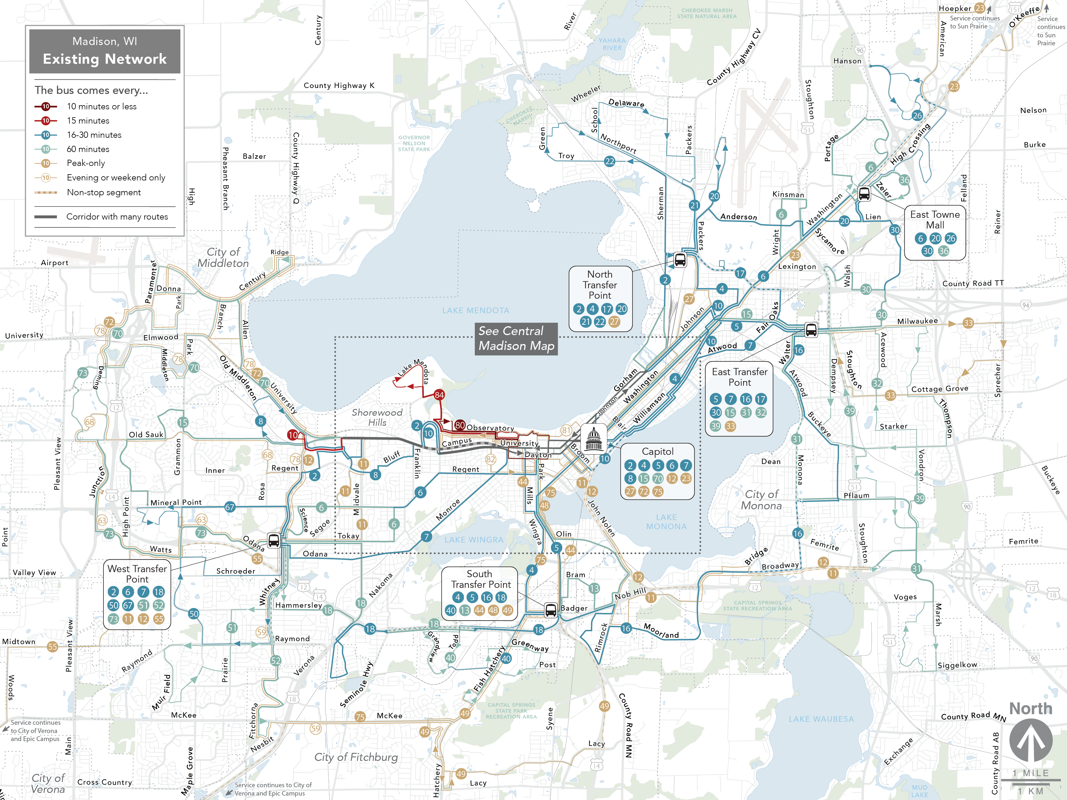
Let me give you a quick tour of SW Portland, using TriMet’s map of the old (2022) network.

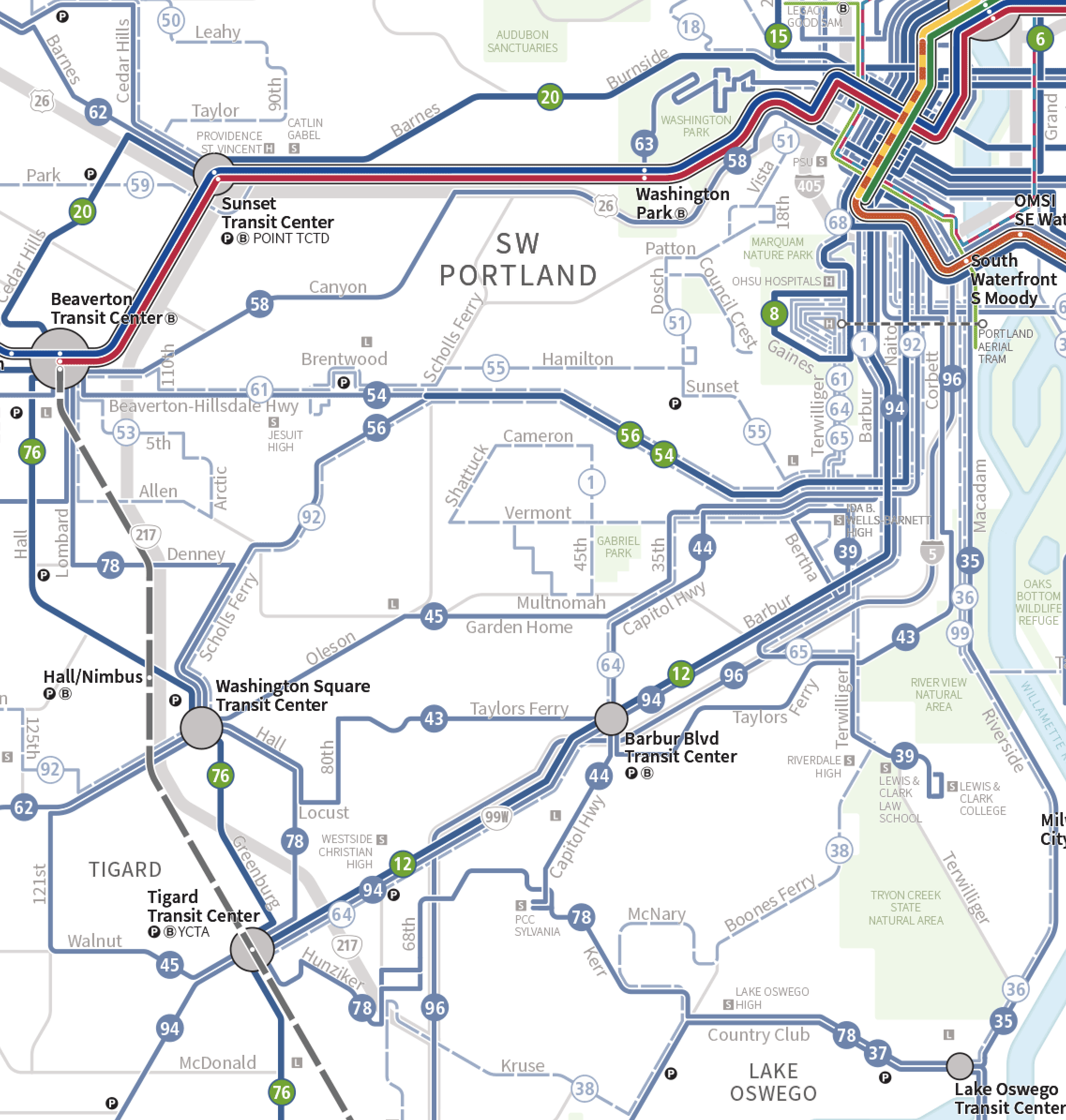
TriMet network in 2022, before the changes. Green number shields and wider lines denote high frequency. Dashed lines run only briefly (mostly rush hour only). Map by TriMet.


Downtown Portland is in the NE corner of the map, where all of the colorful light rail lines converge.  Immediately west of downtown is a bank of steep hills, running north-south.  Just southwest of downtown, where you see Line 8 ending in a loop, is a huge hilltop complex of medical destinations, including the Veterans Hospital and the old part of the Oregon Health and Science University campus.  This area, called Marquam Hill, is one of Portland’s biggest transit destinations outside of downtown.

Along the west and south edges of the map are the inner-ring suburban cities of Beaverton, Tigard, and Lake Oswego along with the Washington Square Mall.  That ring, linked by orbital lines 76 and 78, is typical older suburban fabric with some dense centers but heavy car orientation.

TriMet’s mapping style makes all the bus routes blue but distinguishes the Frequent Service Network (every 15 minutes all day) with a slightly wider line and a green number sheld.  You can see that there are two big frequent corridors in SW Portland: 54 along Beaverton-Hillsdale Hwy and, further south, the 12 along Barbur Blvd.  Except for those two corridors, inner SW Portland (excluding the inner-ring suburbs) is mostly  low-density and relatively affluent.

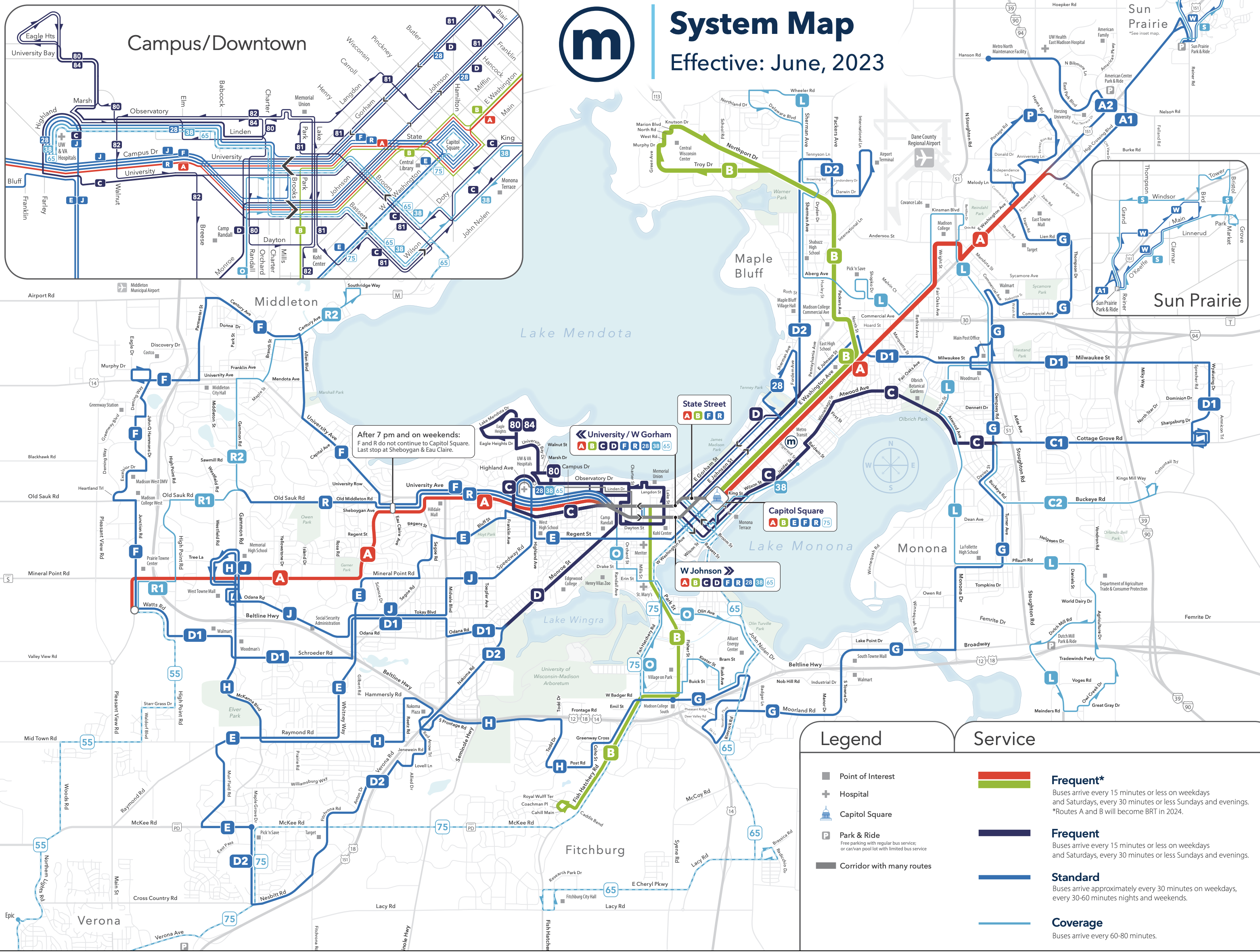
With a focus on ridership and equity, and the drop in downtown commuting due to ongoing work-from-home, this area just had to be rethought. Here is the new network as of August 27, 2023:

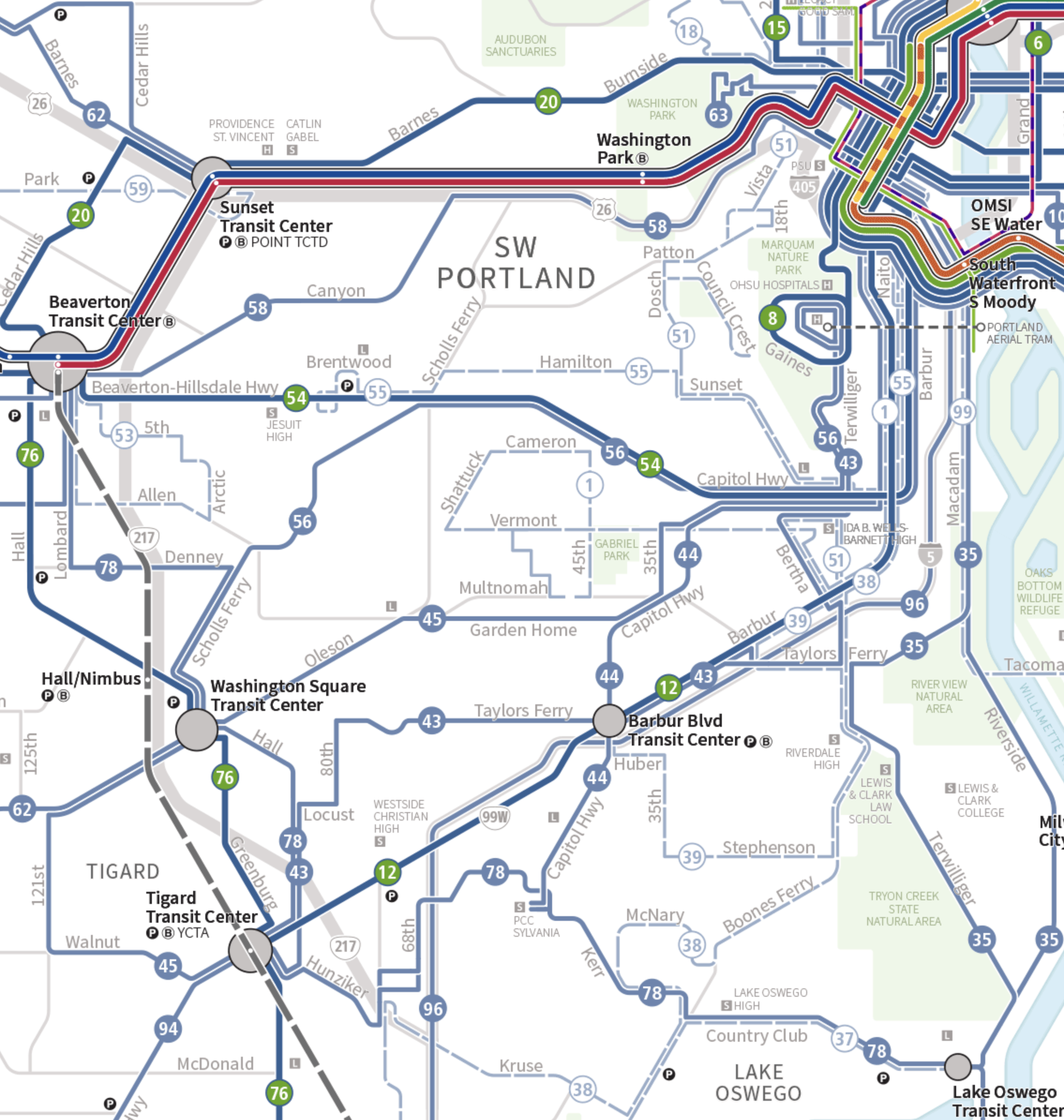
New TriMet network, same color scheme as the map above. Map by TriMet.


As I mentioned, the plan does delete some services that meet neither ridership nor equity goals, mostly all-day local routes in affluent low-density areas that had little ridership except at school times.  Some of these are reduced to school-hour trips only, and a few, such as the 50 in the NW corner of the map, are dropped entirely.

In addition, this redesign seeks ridership and equity with two other big moves:

  • Shift in focus from peak to all day.
  • Shift in focus from office commute destinations to destinations of diverse workers and visitors.

The old network also had a number of services geared to bringing office workers downtown.  As in most US cities, there are fewer of these commuters than there were, and like many agencies, TriMet has heard that it needed to provide better service to a more diverse audience, not just office workers but also everyone else traveling all the time for all kinds of purposes.  So some specialized downtown-oriented services were removed.  In the old network, for example, Line 94 in the southwest corner of the map approached from suburbs beyond Tigard and went all the way into downtown duplicating Line 12.  That was no longer justifiable, so in the new network those riders will need to use Line 12 to complete their trips.

But the biggest and most complicated reworking, encompassing all of these issues, happened at Marquam Hill.  At Portland’s largest medical destination, the network had become too focused on rush hour, even though medical workers and patients come and go all day.

The hill has long had Line 8, a Frequent Service bus to downtown, and it also has a cute aerial tram to another medical campus nearby.  It also had a big network of rush hour express routes from all directions, numbered in the 60s.  These routes duplicated all-day services and mostly helped people avoid transferring.  That can be justified only if the buses were full, and they no longer were.  They ran only at rush hour, which meant they were not useful to many of the lower-income people working shifts all around the clock at the hospitals.

We needed to rework this to remove some of the duplicative rush hour service, and to provide a more useful all-day pattern of service from the south.  In the old network, you could get to Marquam Hill from the south only at rush hour.  To do this, we revised two of the lower-ridership southwest lines (43 and 56) so that instead of going downtown, they’ll go to Marquam Hill.  Where they cross Line 54 in the Hillsdale district, just south of Marquam Hill, people coming off of outer part of these lines will need to transfer if they are going downtown, but people from all over the southwest will be able to use these lines to get to Marquam Hill much more directly.

This is an inconvenience to some existing downtown riders, so we selected routes where that would affect as few people as possible.  We chose Line 56 for this role because much of this line duplicates the Frequent Line 54, which is being upgraded to be Frequent all the way to Beaverton.  The segment along Beaverton Hillsdale Highway served by both 54 and 56 is where most of Line 56’s ridership is.  Only riders from the Scholls Ferry Road segment of 56 will need to transfer to reach downtown, and this is not a high-demand area.  Meanwhile, the segment of Beavertion-Hillsdale Highway where 54 and 56 run together has many low-income apartment areas where people depend on transit.  Instead of giving them duplicative routes to downtown, the new arrangement gives them direct Frequent service to downtown (54) and a direct bus to Marquam Hill.   There’s no avoiding some duplication here, but this change makes it less wasteful and more useful.

As for Line 43, this issue is rich with memories, as I lived near the intersection of Terwilliger & Taylor’s Ferry as a teenager.  I was at TriMet as a teenage intern when the current shape of the line was designed, and while I used it I knew it would always be a poor performer.  Much of the line is close to the more frequent Line 12 on Barbur, and if you are west of where the two lines cross, the 43 is so slow to downtown that it makes sense to transfer to the 12 for a faster trip.  That’s one reason why we felt that only a small area (between Barbur Blvd. Transit Center and Macadam Ave) would be affected if we reoriented this route to Marquam Hill, an area that had neither high ridership nor a high priority on equity grounds.  (It does have one business district, which we served another way; read on.)

Just south of there, the plan removes Line 39 from Lewis & Clark College, prompting the biggest outcry in the public outreach.  Lewis & Clark is a liberal arts college located on what is effectively a cul-de-sac for transit.[1]  It’s not on the way to any other destinations, so it has to justify its service all by itself.  Ridership was poor, and the campus was running its own shuttles to downtown.  The final design here divides Line 35, which runs along Macadam Avenue just west of the river, and sends half the service via Terwilliger & Taylor’s Ferry — not directly to Lewis & Clark’s front door anymore, but within a short walk. This change restored direct all-day downtown service from the business district at Terwilliger & Taylor’s Ferry, which was losing it with the removal of Line 43.  I’m normally very resistant to this kind of splitting of service because it reduces frequency.  Here, however, it was the right solution because the segment of Riverside Drive that loses half of its Line 35 service is very low-density, very affluent, and has almost no ridership.

There’s a nice side effect of this change: new all-day service to the main gate of Tryon Creek State Natural Area, one of Portland’s most spectacular wilderness parks. A great new opportunity for people to get out into nature on transit.

You can explore the whole plan, and the justification for each part of it, in our Forward Together final report, which is online.  There you’ll find both an explanation of each change, and also a description of the how the plan was revised in response to public outreach.  Not everyone will like these changes, but they will help TriMet create a more efficient network that’s useful to more people, and more people who really need it.


[1] The neighborhood beyond Lewis & Clark, called Dunthorpe, is very, very low-density and affluent. Before the big redesigns of 1979-82 it had its own bus route from downtown, evidence of how completely oriented toward coverage (rather than ridership) the system was in those days.  Today, nobody would think of running buses into Dunthorpe, probably least of all the fortunate folks who live there.

Amtrak’s Long Distance Trains: Not Just “Land Cruises”

Last week I wrote about the tension that the US national rail carrier Amtrak faces between ridership goals — which require focusing on its best markets — and coverage goals — which require covering the entire country.  I was applying a framework that I developed for urban public transit, but that seemed relevant enough to be useful in discussing Amtrak.  The post attracted a great comment thread with lots of lively disagreement.  So let me briefly respond to the commenters’ main objections.  To be clear, though, I am not an intercity rail expert, so I am intentionally keeping a high altitude on an issue with lots of rich detail.  I may be wrong, and if so I’m sure commenters will say so, with receipts.

To recap:  Amtrak sees its biggest growth opportunities as corridors linking major cities under 500 miles.  (This is also the ideal distance for high-speed rail, but Amtrak’s plan is about providing medium-speed service even as high-speed rail is developed in parallel.)  The company’s new vision document, Amtrak Connects US, is almost entirely about investing in such corridors, serving trips lasting a few hours at most.  But the US also has huge states with small populations, and there, Amtrak runs its multi-day long-haul trains.  Worldwide, only Russia, China, and Canada have longer passenger train lines than the US.  The Chicago-Los Angeles train formed by the Texas Eagle and Sunset Limited, is almost three times longer (in both time and distance) than the longest line in Europe.

Amtrak’s long-haul trains have two roles: they are marketed as a scenic and relaxing way to travel between cities if you’re not in a hurry, but people also use them for access to towns along the way.  (I was thinking of the first market when I carelessly called them “land cruises, and the objections of many rural readers is understandable.)  These services do as well as they do only because they combine both markets , so each kind of user depends on the other for the total package to make sense. You can see the “land cruise” role competing with the local access role in the service design. For example, these trains sometimes follow routings selected for scenery but not population, most obviously in Montana where the Empire Builder‘s far-northerly routing goes through spectacular Glacier National Park but misses all of the state’s largest population centers.

Amtrak’s Empire Builder. Map: Jkan997 at Wikipedia.

Many commenters objected that these can’t be coverage service because their ridership is actually pretty high, so I should be clear that by ridership I always ultimately mean ridership divided by operating cost.  These trains are expensive to run.  I will not delve into the arguments over Amtrak’s accounting for these trains, but it’s easy to see that they can’t be using labor very efficiently.  The many rural stations need staff, all of them serving just one train at a time.  The long runs require crew to rotate in and out of duty on board, so those people need places to sleep.  The frequent delays mean that employees (both on the train and at the stations) often work longer than their scheduled shifts, incurring overtime.  It’s all very labor intensive, compared to short train lines where you turn over passengers quickly and most your staff can go home every night.

Meanwhile, the fares, if you don’t get a private room, are almost zero.  Portland, Oregon to Wisconsin Dells in central Wisconsin, coach, nonrefundable, a month out, is currently showing a fare of only $128, which is about 6.5 cents per mile.  A similar coach seat on the Northeast Regional train from Washington DC to New York with the same features is $31 or 13 cents per mile, twice the cost for a service that almost certainly costs Amtrak less to provide on a per passenger basis.  So the cost of these services lies not just in their inefficiency but in their low per-mile fare, which of course is what keeps them affordable enough to have a lot of use.

So can these services be justified by their ridership?  It depends entirely on whether you count ridership in passengers or passenger-miles.  If you want long-distance services to look good, you count passenger-miles, which values one person going ten miles as much as ten people going one mile.   In the urban transit context, there is a similar suburb-vs city debate.  If you want to make long-haul suburb-to-city service look better than shorter runs within the dense city, you cite passenger-miles, but some inner city folks will object that those long distances are a side effect of poor land use planning and location choices, not an actual benefit.  The benefit lies in how many actual human beings have gotten to where they’re going.  There’s no objective way to decide the question between measuring passengers and measuring passenger-miles.  It comes down to what kinds of trips you value.  A rural-urban divide is unavoidable on that point, because long distances are the defining fact of rural life.

My other question about the “rural lifeline” case for the long-distance trains is: Do these services really match the pattern of rural demand?  Probably not.  If you were optimizing a network for access to rural communities, it wouldn’t look much like these long-haul lines. Instead, it would look like a robust set of links between smaller centers and nearby larger ones.  Most rural intercity travel demand isn’t for the thousand-mile trips that Amtrak makes.  It’s more local, under 200 miles, with smaller centers usually needing access to larger ones that have more jobs, essential services, and onward transportation options.

This, of course, is the role of a robust bus system, working with trains as appropriate.  The major Australian states, for example, have publicly funded intercity bus+rail systems that connect most rural towns into their nearest larger center, with onward connections, bus or rail, to the big city.  This pattern is most likely to connect small towns to the destinations most useful to them.  As commercial intercity bus services wither in the US, there will be an increasing role for state funding and management of similar services.  I’ve beaten this drum before, but right now, in the US, rural transit between towns is mostly provided by county-level agencies with minimal state coordination.  Every county line is a potential barrier for travelers on those services.  At best adjacent counties have to make deals to allow service to flow over county lines to serve the trips people need.  What’s missing is often a network managed and funded by the state, running many of the lines that commercial carriers once ran.  Pieces of that might be rail, but a lot of it is probably logical bus networks that may cross the state but don’t cross half the country.

Does that mean the long-haul trains shouldn’t exist?  Not necessarily.  Personally, I’d love to see more of them.  Overnight trains are having a renaissance in Europe, and this suggests new markets where some useful rural service could be combined with overnights between bigger cities.

But still, Amtrak is right not to focus on these trains as part of a ridership-maximizing strategy.  Right now they are part of how Amtrak meets its competing goal of covering the whole country.  But because this has become an exercise in counting states, and thus Senate votes, the result is such thin coverage that most rural communities don’t have access to it. Even towns with stations may not have service in the right direction, or at a useful time of day, or with the decent on-time performance that comes only from shorter lines.  Most of the lifeline access that the rural US needs is logically provided by robust bus networks, managed by states if they can’t make a profit. By all means let’s keep and celebrate the long-haul trains, and expand them as appropriate.  But let’s not let them distract us from what it would really take to provide liberating transportation to rural America.

Amtrak’s Endless Ridership-vs-Coverage Problem

Amtrak is about to see more Federal funding than it’s had in decades, and is finally in the position to talk about major growth. But their “Amtrak Connects US” vision document is worth reading to notice two things: They continue to face a conflict between ridership goals and coverage goals, and they don’t feel that it’s safe to talk about that openly.

To review:

  • Ridership goals are served by concentrating good service where there are lots of people to benefit from it.
  • Coverage goals are served by spreading service out so that you can say everyone got some, regardless of whether people ride.

Ever since I did the first scholarly paper on this in 2008, I’ve been helping transit agencies face this problem honestly and make clear decisions about it.  Pretending that you are doing both just produces confusion and unhappiness, because these goals are mathematically opposite. They tell network designers to do opposite things. Rhetoric can paper over the problem but won’t resolve it.

For years, Congress has berated Amtrak for not being profitable (which would require ridership) while demanding that it run service to every corner of the country (coverage).  The high-ridership thing for Amtrak to do, as the report makes clear, is to focus on improved frequency and travel time for trips of under 500 miles, a distance where rail service between city centers can effectively compete with flying between airports, and this in fact is what the plan recommends. But that means the improvements won’t be everywhere.

Yet when it comes to highest-level summary, the report seems pressured to de-emphasize its own recommendations. Here are the seven bullet points that form “Amtrak’s 15 Year Vision” (p9). I’ve labeled each with whether it refers to ridership or coverage.

  • Add service to 160 new communities, large and small, while retaining the existing Amtrak network serving over 525 locations. [Coverage]
  • Provide intercity passenger rail service to the 50 largest metropolitan areas (by population).  [Ridership]
  • Serve 47 of the 48 contiguous states, expanding corridor passenger rail service in 20 states and bringing new corridor passenger rail service to 16 states.  [Coverage]
  • Add 39 new routes, and enhance 25 routes.  [Coverage]
  • Introduce new stations in over half of U.S. states.  [Coverage]
  • Expand or improve rail service for 20 million more riders annually—which would double the amount that the state-supported routes carried in fiscal year (FY) 2019.  [Ridership]
  • Provide $800 million in total Amtrak revenue growth versus FY 2019. [Ridership]

While ridership is the focus of the actual policy, four of these seven points emphasize coverage instead.  Three of the them count states, which has nothing to do with ridership or population but does matter when counting votes in the Senate, the US’s ultimate enforcer of coverage-oriented thinking.  Amtrak takes pride in serving 46 of the 48 contiguous states, though most rural states are served only by “land cruises,” trains that take 2-3 days to cross distances of over 1000 miles.  These provide useful access to some rural towns but are much too slow for travel between major cities, and their schedules — once a day at best — are almost guaranteed not to be going when you need them.  Amtrak recognizes that these trains are not a growth market.  The future lies in the shorter more frequent links under 500 miles, but the obsession with state-counting in these high level bullet points shows how Amtrak must dodge the obvious in its rhetoric.

Even more striking, Amtrak does not seem to feel it has permission to draw a map that would show what they’re actually doing.  Here’s a bit of the mapping that comes with the document:

Sample of mapping from Amtrak’s report.


Colors are used here to show where some service is being added, but this map tells you nothing about the actual levels of service on each line. It’s misleading about the pattern of existing service — where frequency is massively concentrated in the Boston-Washington “Northeast Corridor” — and also about the degree to which different corridors are proposed to be improved.  In short, it’s a coverage map, designed to emphasize how many places are affected rather than what the benefit is. Meanwhile, a quick internet search turns up a map of 2015 Amtrak frequencies that gives you some sense of how unevenly service is actually distributed:


Frequency based map of Amtrak in 2015.

Amtrak wouldn’t draw its own map in this style, so somebody else did a put it on the internet.  (This, by the way, is how the idea of showing frequency on local transit maps caught on in the US in the 2000s and 2010s: With encouragement and advice from this blog, impatient advocates drew the maps when the transit authority wouldn’t and this helped give the transit authorities the courage to do it themselves.  Today, at least in the US, most major agencies show some indication of frequency in their mapping.)  Sure enough, Yonah Freemark has already drawn a frequency based map of the Amtrak plan!

Yonah Freemark’s frequency map of the Amtrak plan.

But you won’t find this map in Amtrak’s report, and I can imagine the internal conversation over why.  “It will make it look like we hate North Dakota!” Yes, indeed, in the US there are many states with two senators and very few people. Amtrak is planning for ridership, so it doesn’t propose to improve service there.  Ignoring North Dakota is an inevitable consequence of a decision that ridership is the goal.

So we get a report that lays out a ridership-driven plan — higher frequencies where there are lots of people — but doesn’t dare say that at the highest level of the document: the bullet points and map that everyone will look at even if they don’t read the text.

I’m not criticizing Amtrak here! This is probably exactly the appropriate framing for their political situation. But you should read this document to practice reading for ridership-coverage tension, to help you recognize when this contradiction is hiding inside your own transit authority’s thinking or rhetoric.

Request for Information: Inspiring Uses of Data to Explain Bus Service Priorites

For a research project I’m doing, I’m looking for especially inspiring examples of a public transit authority using performance data to explain why they are deploying some services and not others, in the context of limited resources.  I’m especially interested in examples of efforts that:

  • Explain the goals that underlie the service decisions, and how these intersect with the data to produce decisions.
  • Help the public see whole-of-network consequences of service decisions, rather than just talking about the performance of each line or route as though it were a separate product.

In this effort, I’m not thinking about service redesigns, so much as everyday decisions about how much to prioritize improvements to one area rather than another, given lots of needs and limited resources.

Welcome your thoughts in the comments.  Thanks!

The 100 Most Influential Urbanists, Past and Present?

Planetizen has done its “100 Most Influential Urbanists” list again.  The voters were readers of Planetizen, who tend to be US urban professionals and advocates.  I’m honored to be there, at #42, along with many, many people that I admire.

You can ask all kinds of questions about this list.  It’s admittedly US-centric, citing folks from other countries based mostly on their influence on the US discourse.   I also wish it didn’t try to compare living people with figures from the past, which is impossible.  Living people are almost all biased in favor of the living.  So I wouldn’t make much of the fact that I’m #42 while Hippodamus of Miletus (498-408 BCE), came in only at #85.  Hippodamus has certainly been more influential, and not just because he had more time.

You can also use the list to start fun arguments about what urbanism is.  Is it a field of study and action, or does it imply an ideology? If the latter, should some of these people — like Thomas Jefferson and Frank Lloyd Wright — be considered anti-urbanists, since their vision of the ideal human settlement was really more rural than urban?  Does anyone whose work affects cities count, and if so, who doesn’t count?

For better or worse, though, people love lists.  If you’re a list-lover, I hope you enjoy this one. Don’t take it as any authority about who’s more important than whom. But if browsing it leads you to discover the work of someone who inspires or intrigues you, it will have done its work.

Poll: The 100 Most Influential Urbanists?

Planetizen is running a poll to create a list of 100 Most Influential Urbanists.  They last did this in 2017, when I was honored to be #57. They now have a new list of 200 nominees, partly based on public nominations, and want the public to rank them. I’m honored to be shortlisted again.

Personally, I’m not sure don’t how to vote in a survey that mixes figures from throughout (Western) history with people living today.  That mixing feels unfair both ways. People who lived longer ago have had more time for their influence to be felt. On the other hand, the living tend to be strongly biased toward other living people. Do those two unfairnesses cancel each other out? Probably not, except maybe among historians.  The bias toward the living is overwhelming. I’m not really the 57th most influential urbanist ever, because there have been countless influential people, in cultures all around the world, in all the millennia that there have been cities.  So I’d have had an easier time figuring out my vote if I hadn’t had to choose between people I know well and people who lived 2500 years ago. It’s like being asked if I prefer apples or Shakespeare.

Note, too, that the survey is asking how influential people were, not whether that influence was good or bad. The list contains several people whose net impact on urbanism has been negative in my view, including Robert Moses, Le Corbusier, and Elon Musk.  Will they be assessed purely on the magnitude of their influence and not its direction?  Perhaps historians can be called upon for such godlike moral neutrality, but I find myself struggling to give such figures fairly high marks for “influence,” since I would be contributing to their influence by ranking them.

But methodologically questionable as they always are, people love lists.  So whatever method you use to make these mysterious choices, I hope you have fun with it.  Vote here.

Akron: Welcome to Your New Network

New network in the core of Akron. Red = every 15 min, dark blue = every 30 min, light blue = every 60 min.

by Evan Landman

Akron METRO launched their reimagined bus network on June 4th!  Jarrett Walker + Associates assisted the agency in developing the new service plan over the past 2 years.

You can download the full map here.  On this page there’s also a side-by-side trip planner showing how any trip is made differently in the new network than the old one.

Despite dealing with the same operator shortage as all transit agencies have faced, METRO were able to implement nearly the entire service plan on Day 1, which included the following key elements:

  • 5 new high-frequency 15-minute corridors.
  • 3 new 30-minute routes in addition to 5 existing 30-min routes
  • New regional connections to greater Cleveland (which also implemented a JWA network redesign last year.)
  • Expanded weekend services, particularly on Sundays.

Old network for the same area. Red = every 15 minutes, purple = every 20 minutes, dark blue = every 30 minutes, light blue = every 60 min. Pale orange lines were less frequent than every hour.

Before the new network was implemented, METRO’s most frequent routes ran only every 20 minutes. The new network establishes frequent service to many key destinations and neighborhoods, including major hospitals, the University of Akron, and other important civic institutions. The Reimagined Network was designed to provide frequent and convenient service in busy places where many people need to travel to, while continuing to offer lifeline services in places where and for people for whom transit is essential.

With the new network, the median person in Summit County who lives near a bus route can access over 54% more jobs with a 45 minute transit trip; these outcomes are even larger for lower-income people and people of color, who are more likely to live in central Akron, where the new network’s most frequent routes are concentrated. This was achieved without a reduction in coverage – about 1% more people are now within a short walk to a transit than with the old network.

JWA congratulates METRO on the successful implementation of this plan. We’re proud to have assisted the agency in developing a new bus network that responds to the travel needs of today’s riders, and establishes the foundation for ridership growth in the future.


Los Angeles: A Major Expansion of Rail Transit Access

Los Angeles’s Regional Connector is open.  It’s a small piece of subway — less than two miles, with three stations, but it utterly transforms the rail network of Los Angeles, making trips across downtown much faster.  Here’s LA Metro’s quick diagram of the change:

It’s simple: In the network as it existed until this weeekend, light rail from north and east, called Line L, only came to the northeast edge of downtown, while the two lines from the south and west (Lines A and E) only came to the southwest edge. Traveling across the center thus required making two transfers, using the Line C & D Subway.  The Regional Connector rearranges these lines to that all services flow across downtown and out the far side. Much faster trips across downtown mean greater access to opportunity for many people across the city and beyond.

I’ve written before about the difficulty of getting regional focus on these core-city projects.  LA Metro did a good job with this one, starting by branding it the Regional Connector.  It may be in downtown Los Angeles but it’s not for downtown Los Angeles.  It’s for the entire region.

We’re Hiring!

Our firm has two openings for transit planning professionals in the US!

  • Transit GIS Analyst / Planner in Arlington, VA or Portland, OR.  Read about it and apply here.  This position closes July 16, 2023.
  • Senior Associate / Principal.  This one will be open until filled.  We are looking for someone who wants to join us at a senior level who would expand the range of our practice.  Read about it and apply here.

Read more about our firm here, and please spread the word!

Madison: Welcome to Your New Network

Today, the city buses in Madison, Wisconsin began doing something new, thanks to a network redesign project that our firm developed with our friends at Madison Metro.  Core parts of the network will run frequently all day for the first time.  More important, many travel times across the city will be much faster, because the plan deemphasizes four satellite transfer points that had been a big source of delay.

Here’s the city’s map of its new network.  (Click to enlarge, or see the original here.)  Lines A, B, C, and D are all frequent (every 15 minutes all day) out to the point where they branch.  (A1 and A2 refer to branches of Line A.)


Line A is designed to match the path of the forthcoming Bus Rapid Transit project, while Line B is the next BRT project after that one.

How much better is this?  Here was the old network, in our style where red lines indicate high frequency:

The old network was all infrequent, except for the University of Wisconsin’s shuttle routes 80 and 84. The new network, by contrast, has four frequent lines (A-D) covering all of the densest inner city and radiating outward in several directions. But the oddest feature of the old network was the four satellite transfer points located just a few miles out from the city center. Most of the outlying area was on feeder routes, requiring a connection at one of these points just to reach downtown or the University of Wisconsin. These points did make it easy for people to travel locally within their area, but on balance, they did more to obstruct trips than they did to enable them.

Our plan largely deemphasized these facilities.  Now, most of the city is on a direct route to the center, with much faster travel times.  Satellite hubs can be valuable to foster a network that serves trips in many directions, but the South, East, and North Transfer points were too close to the center to serve as good hubs, and none of them had significant destinations at them that could benefit from the converging service.  East Towne Mall, further out to the northeast, has a better future as a hub, both because it’s far enough from downtown and because it is a destination in its own right.   The same may be true of West Towne Mall on the west side (where the new network’s A, H, and J routes converge.) However, even if those hubs emerge, the main radial services (Line A) will flow through them, not be interrupted by them.

We had a great time working in Madison.  The city has many engaged advocates and stakeholders who provided great feedback, and many elected officials gave the project a lot of time and attention.  We hope the new network will help people in Madison go to places they’d never have gone to before, to do things they might never have done.